Affiliate links on Android Authority may earn us a commission. Learn more.
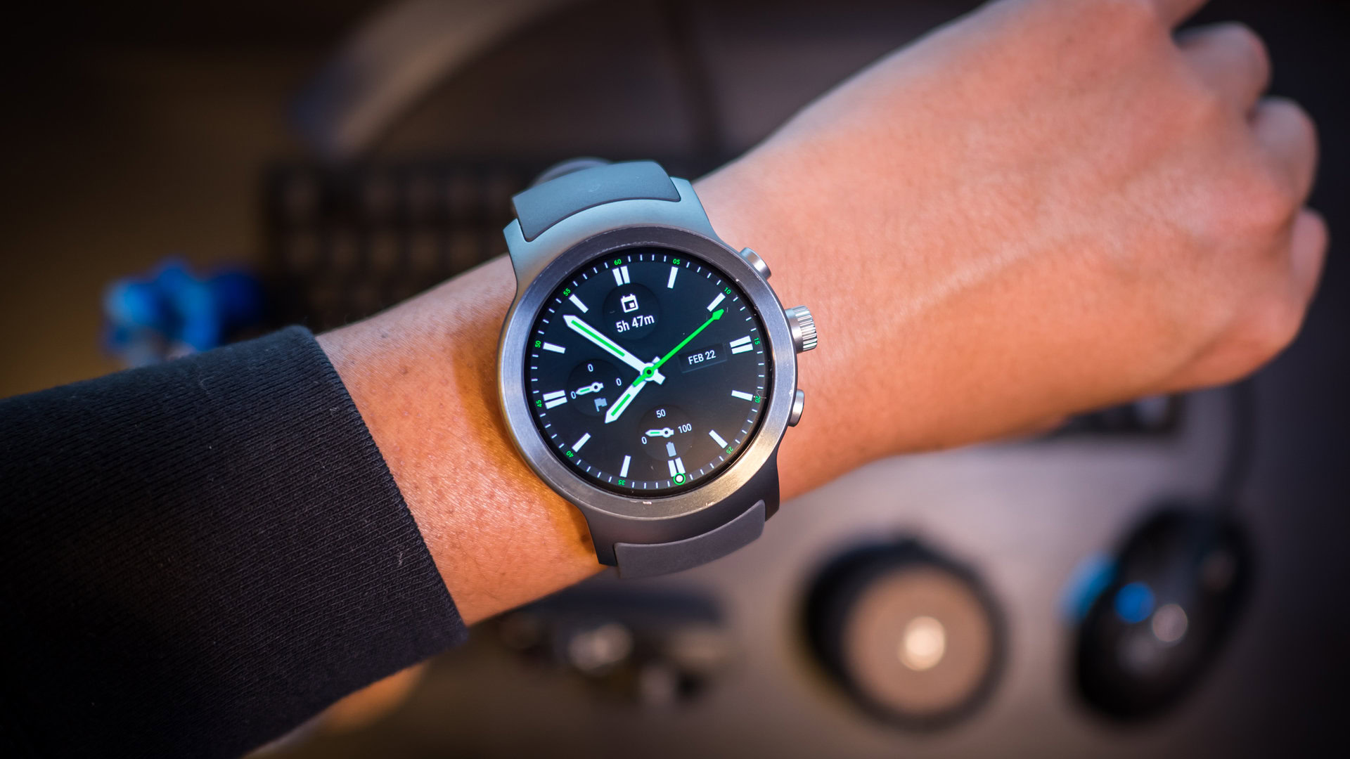
LG Watch Sport and Watch Style review
Published onFebruary 23, 2017
LG Watch Sport
What we like
What we don't like
Our scores
LG Watch Sport
Android Wear 2.0 has finally come, and it brings with it a lot of enhancements that were sorely needed in Google’s wearable platform. But before we even get to the new bits in the software, let’s talk about one of the first smartwatches that bring Android Wear 2.0 to the masses. Both are able to leverage certain features from the new platform, making them a good showcase for the future of wearables in Google’s perspective.
This is a review of the LG Watch Sport and the LG Watch Style.
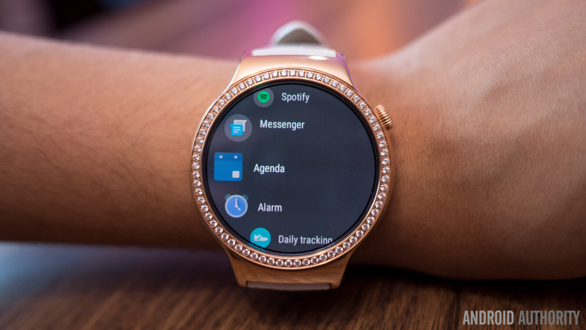
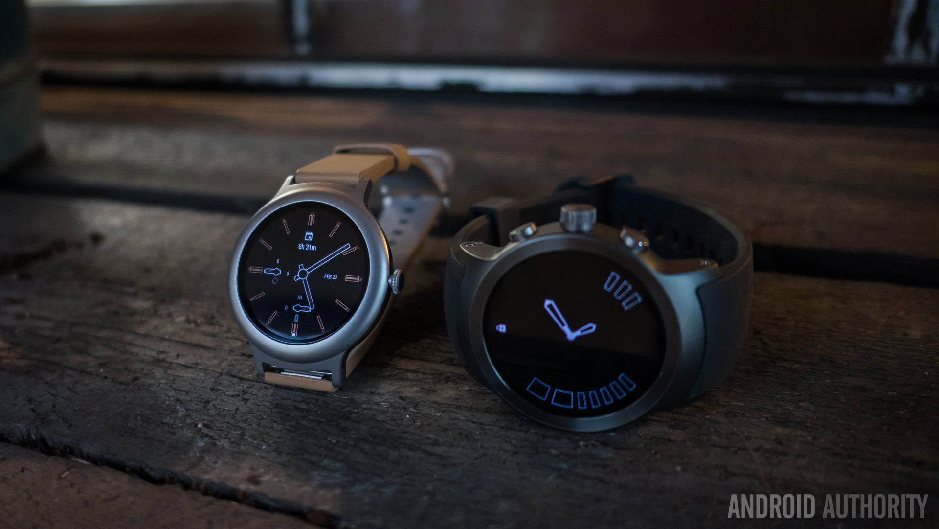
Quick note: This review and its score focuses on the LG Watch Sport, as it is the more featured-packed watch and it showcases all of the features that Wear 2.0 brings to the table. The LG Watch Style lacks a few of these features, but we will only touch upon it where applicable.
Design
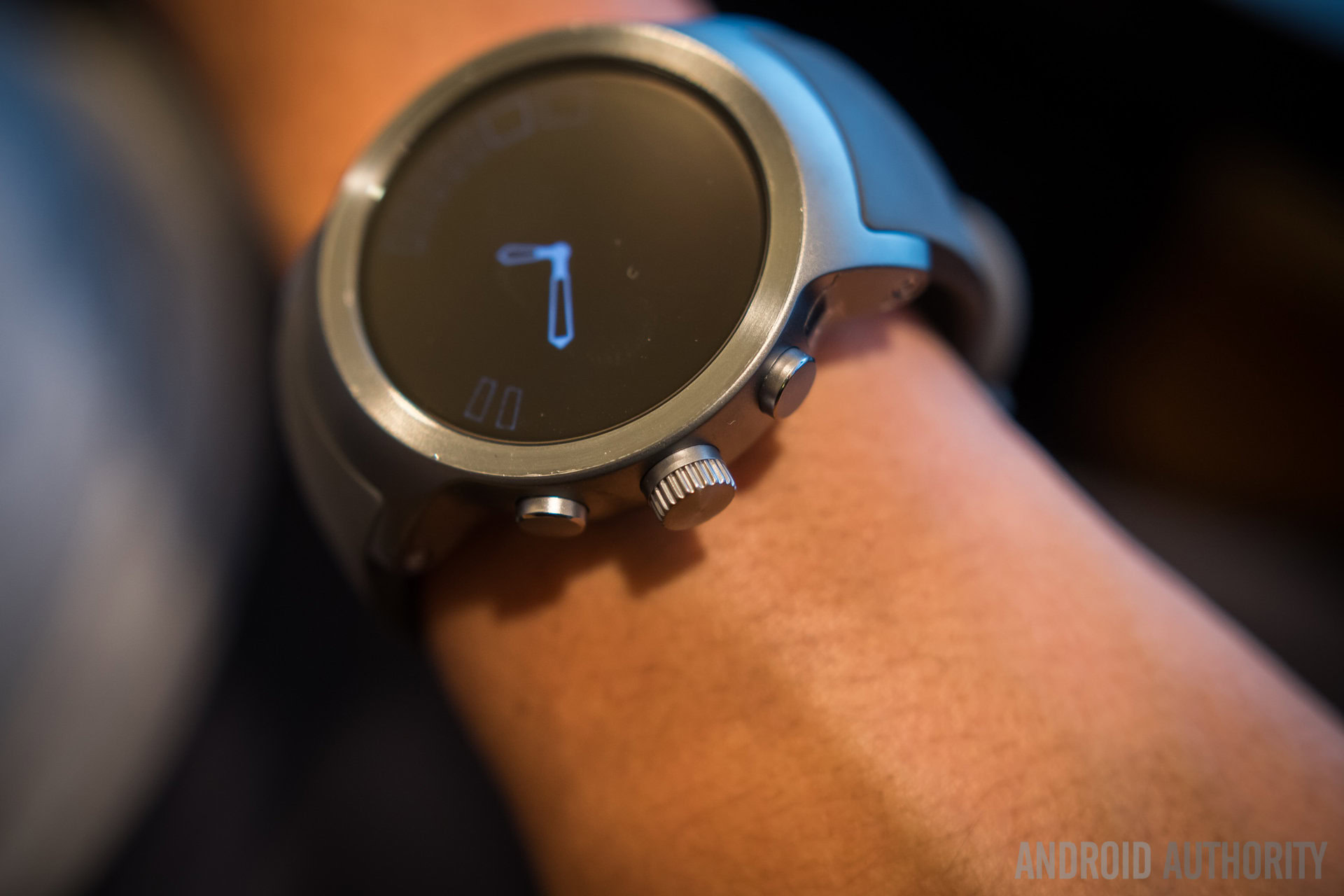
The LG Watch Sport is definitely the chunkier of the two devices, and its size is likely to put off some of the more casual users of Android Wear. Its larger body helps to house a number of additions, like an upgraded microphone/speaker combo compared to the Style, a SIM card for cellular network activity outside of just Wi-Fi and Bluetooth connectivity, the heart rate monitor, and a couple extra buttons.
Those buttons come alongside the new rotating crown, which is a wonderful new way of navigating around the interface. While it is not a new idea, it is an addition that Wear has sorely needed. Much of the navigation still relies on touching and swiping on the screen, but the crown is great where it counts – scrolling through different elements and reading long notifications. The two buttons that flank the crown are programmable shortcuts, but by default they activate Google Fit workout tracking and Android Pay.
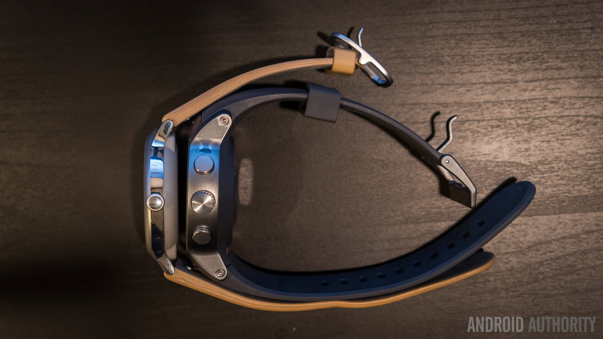
Turning the body of the LG Watch Sport shows the heart rate monitor, but the entire backing can be removed using a special tool included in the box. This exposes the SIM card tray and the actual module for the heart rate monitor. This explains the larger size of the body.
The size of the watch is not one of its better points – even for me, the watch is a little bigger than is truly comfortable and this large form factor looks to be a trend for Android Wear 2.0 enabled watches, especially those that are going to bring more than the bare minimum of features. The other sore point for the Sport is the fact that the bands cannot be changed – this isn’t a huge deal for the most part as the watch looks pretty good already, but it definitely lowers the customization aspect quite a bit.
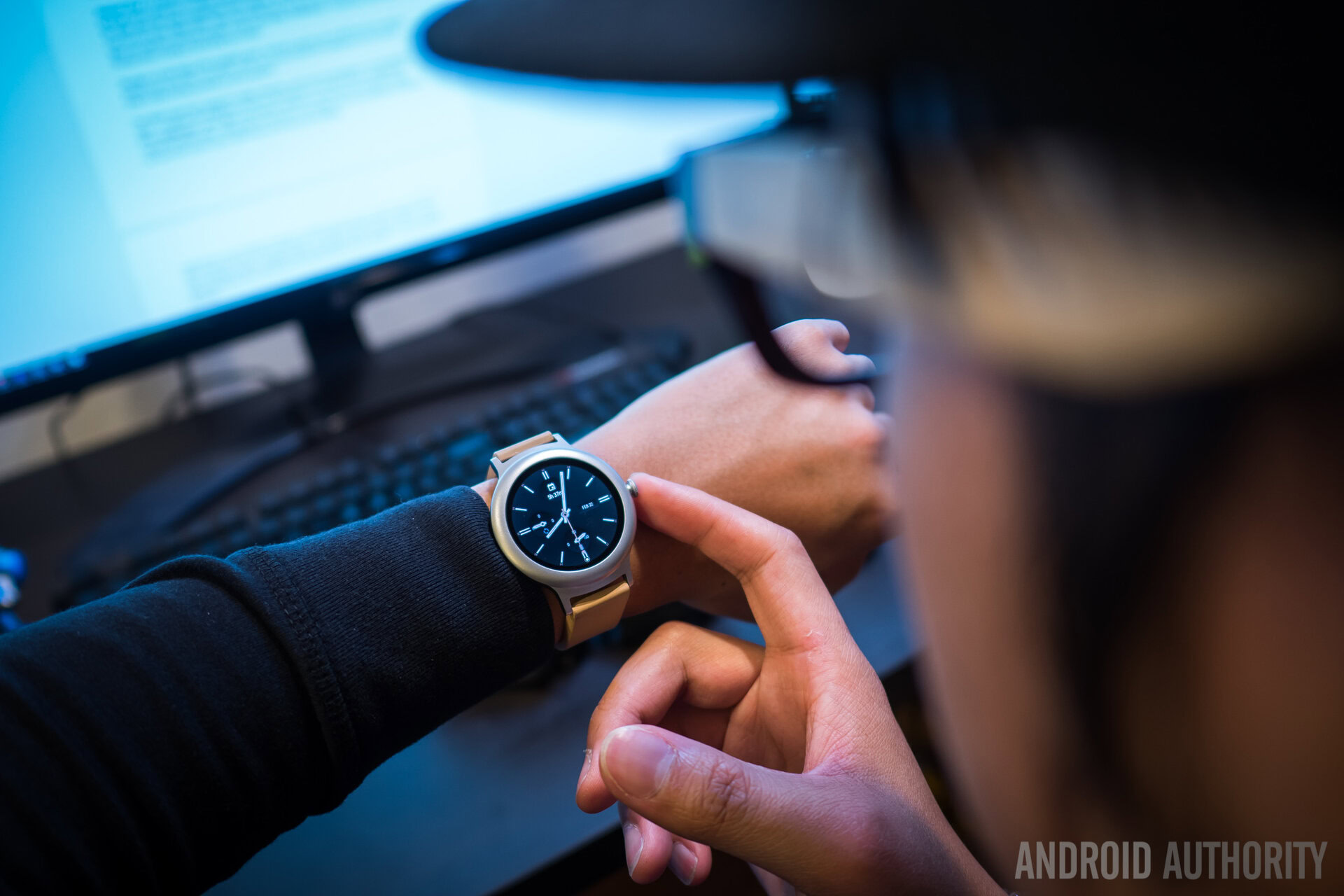
Speaking of the bare minimum, enter the LG Watch Style. Our own David Imel wore the watch for a number of days and felt that it was definitely more accessible for the less hardcore user. The Style sacrifices the heart rate monitor, SIM card support, extra buttons, and Android Pay support in order to provide the barebones experience – it is definitely just a smart wearable notification center.
What was odd to us was how stiff the band felt due to its connection mechanism – the flat profile of the watch would bleed off of our wrists and then the band comes down at a sharp angle. Those bands can be changed, however, compared to the all-inclusive package of the Sport.
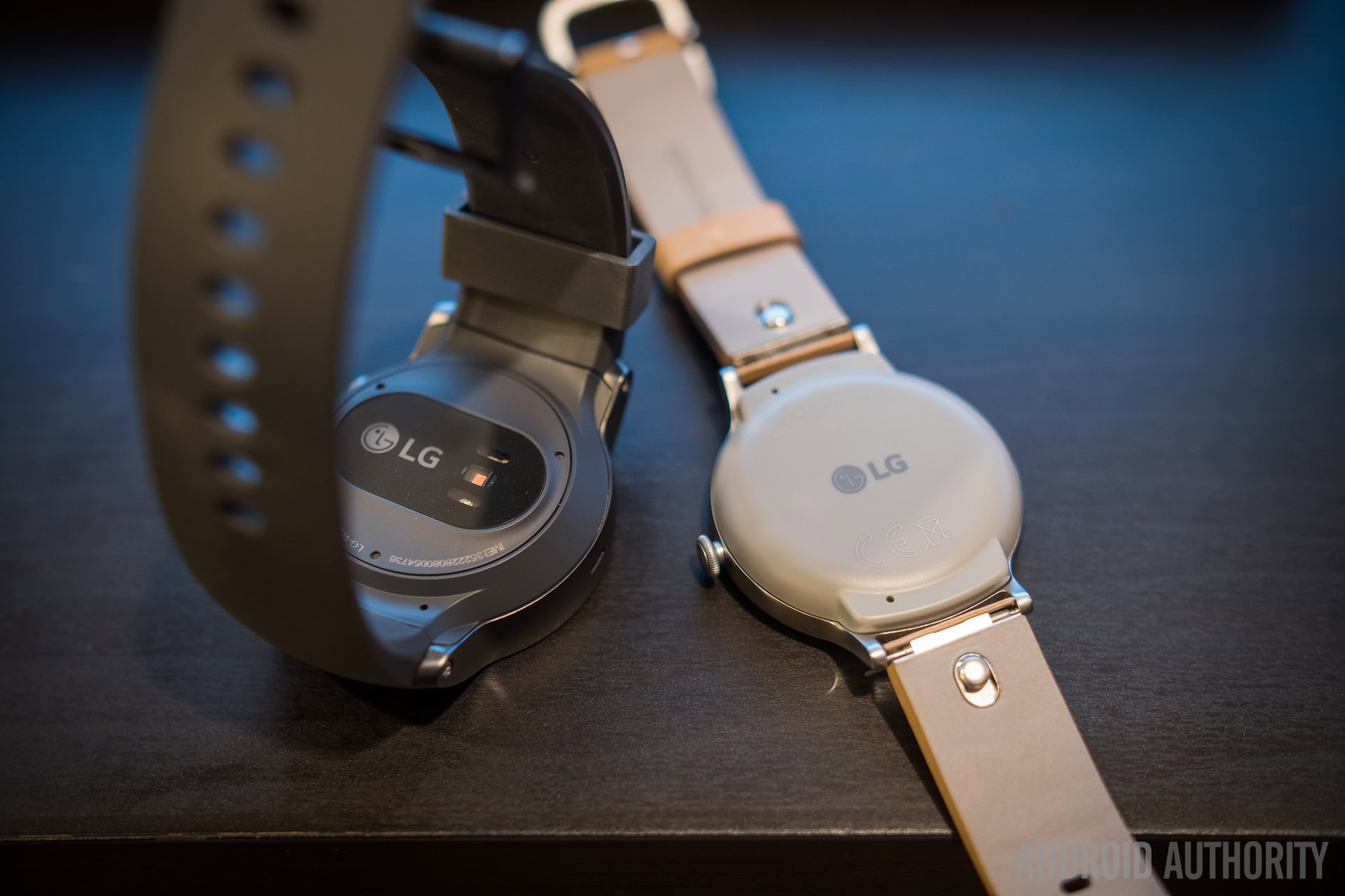
Overall, the LG Watch Style is smaller and definitely less conspicuous, but it also comes off looking a little too generic for its own good. That’s mostly okay though – it is less about the hardware and more about the software that it is powering.
Display
Both watches sport full touchscreen displays, though the Sport is a bit bigger with a 1.38-inch 480×480 resolution screen, compared to the 1.2-inch 360×360 resolution panel of the Style. Both screens are protected by Gorilla Glass 3. That larger screen on the Sport is definitely appreciated for longer form notifications and navigation, but the Style is still reliable enough for the same tasks like swiping on the new Wear 2.0 reply keyboard. David felt that the responsiveness of the display on the Style had a few periodic hiccups, but I didn’t have those issues with the LG Watch Sport.
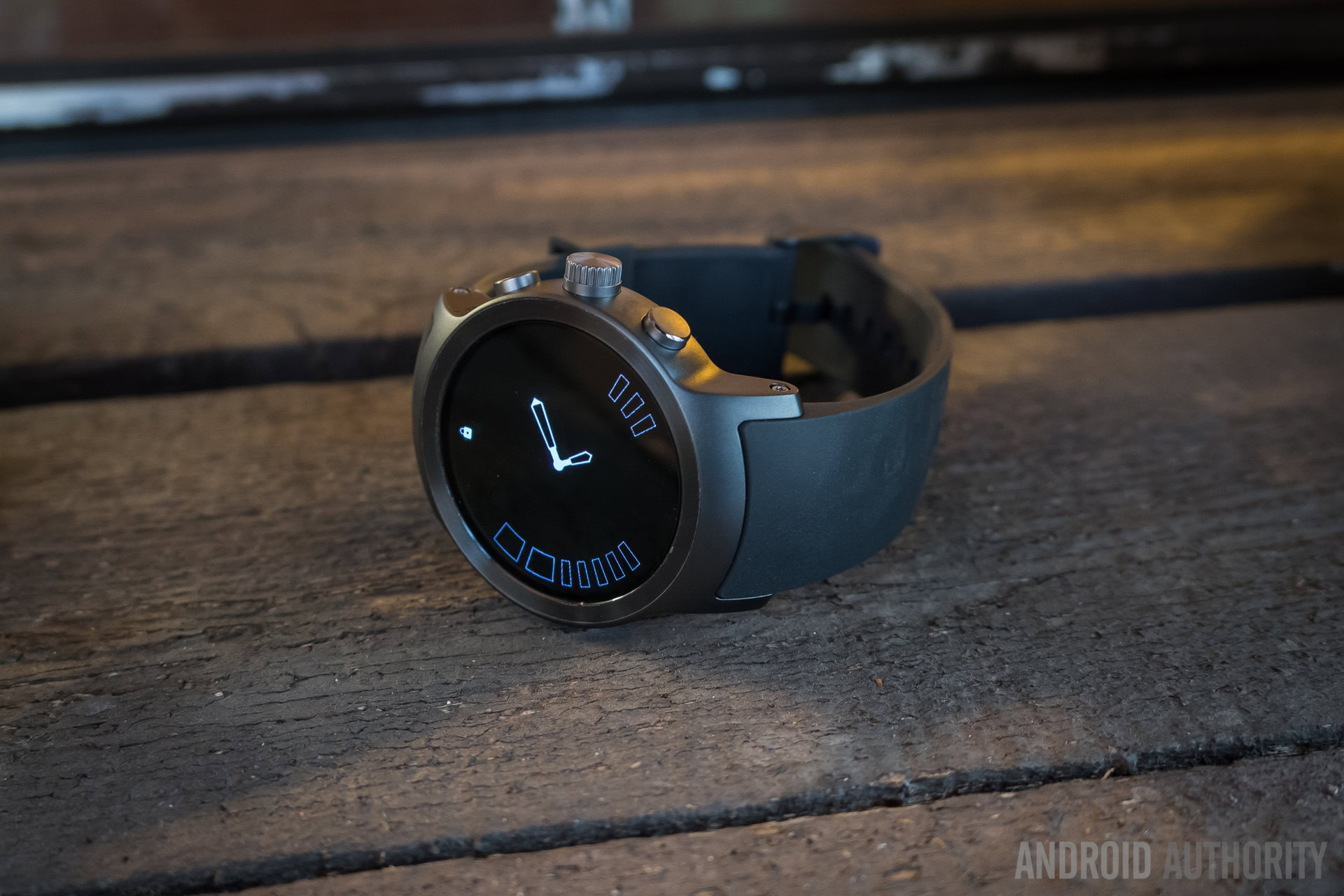
Always-on display functionality is, of course, available and is a nice way of keeping the watch presentable when not in use, but it will obviously bring down the battery life quite a bit. Brightness is also not a problem for either of these devices, as they both remained viewable even in broad daylight.
Android Wear 2.0 gets more of the credit for leveraging the screen space better, but we give credit where credit is due and award the Sport some good points for a high-end display experience.
Hardware
As it has probably become really clear by now, the LG Watch Style is lacking a lot of the features that we are about to mention from the Watch Sport. It is best used as a notification-centric app-enabled wearable – you won’t be tracking too much fitness with it despite a IP67 rating, which is itself even outmatched by the IP68 depth resistance rating of the Sport.
Android Wear 2.0 doesn’t require the kind of power that regular Android on smartphones needs, but that doesn’t keep the LG Watch Sport from providing as much as it possibly can. Both it and the Style sport the same Snapdragon Wear chipsets, but the Watch Sport brings 768MB of RAM over the 512 of the Watch Style. There has hardly been any issue with either of the watches, as apps and interface elements all slide in and out smoothly. Notifications, in particular, have had no hiccups when coming in and acting up on them.
Storage is a relatively new thing in the wearable space, and both watches have 4GB that can be used for storing local music files. From there, users can connect Bluetooth headphones to the watch in order to listen during workouts or just in general.
The Watch Sport has support for cellular networks, and it can be leveraged in a couple different ways – a separate SIM card that connects to all networks or one that is set up via services like AT&T Numbersync, which allows your phone’s number to be mirrored to the watch for usage outside the paired range. Taking calls on the Sport is serviceable, then, but is definitely something we found best used in a pinch, rather than as the main way of talking.
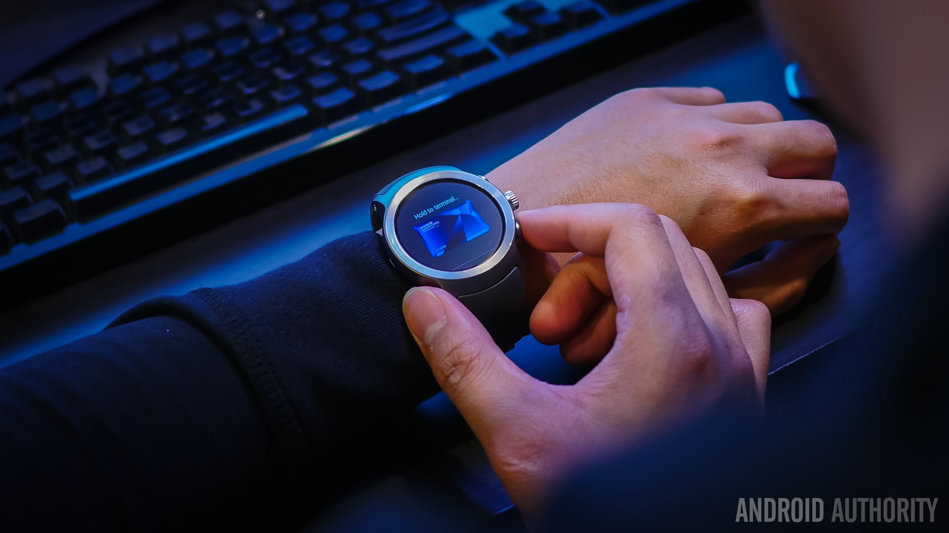
Android Pay is new to Wear 2.0 and the LG Watch Sport is the one to get if you want to pay at stores using your wrist. It works well enough – just press the bottom button to trigger it, pick a card, and hold up the NFC enabled watch to any support terminal. Especially if you are already using Android Pay, this feels even more like the future is at our fingertips, or on our wrists, in this case.
Fitness is a bigger focus in Wear 2.0, and the Watch Sport includes GPS alongside all of the connectivity options for tracking hikes, runs, and walks. The heart rate monitor is about as good as it can be for a wrist mounted unit, and adds to the fitness data that Google Fit records. Google Fit on Wear has been given more workouts that could please weightlifters too, as the watch tries to understand and record when reps of any given movement occur. However, a large watch like this might not make the most sense in certain fitness situations.
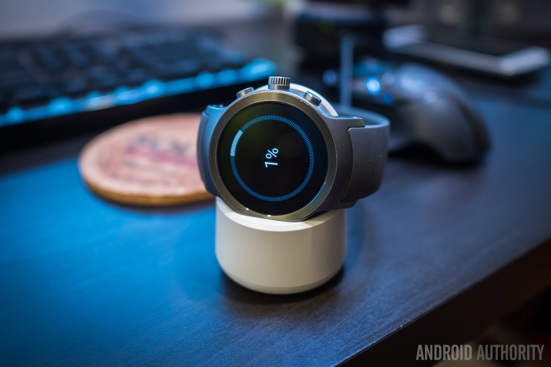
Battery life obviously favors the larger device, but the Sport also has a lot more features to power. The Watch Sport has a 430mAh battery over the 240 unit of the Watch Style. A charging cradle takes care of getting the battery up to speed for the Sport, but charging the device takes upwards of two hours – this makes quickly topping up the watch with power a little bit tougher than we would have liked. While David had just over a day’s worth of battery life even with a fair bit of usage throughout, I found that the Sport required a little more diligence to get over the one day hump.
Always-on Display is a big battery drain, but to make sure that I got a day and a half from the Sport, I also turned off the Gesture to Wake feature. That way, the watch display would not light up after most movements of my wrist – that would only happen if I hit the button. Without these measures, the watch would get through a solid workday but would require a top up in power before bed if I wanted to track sleep using Sleep as Android.
Software
Which brings us to the software, the portion of this review that has gotten the biggest update from previous Android Wear devices. It took quite a while, but Google has finally brought refinements to the platform that were sorely needed. Not only does it look a lot better, but functionality has been given a big boost in Android Wear 2.0.
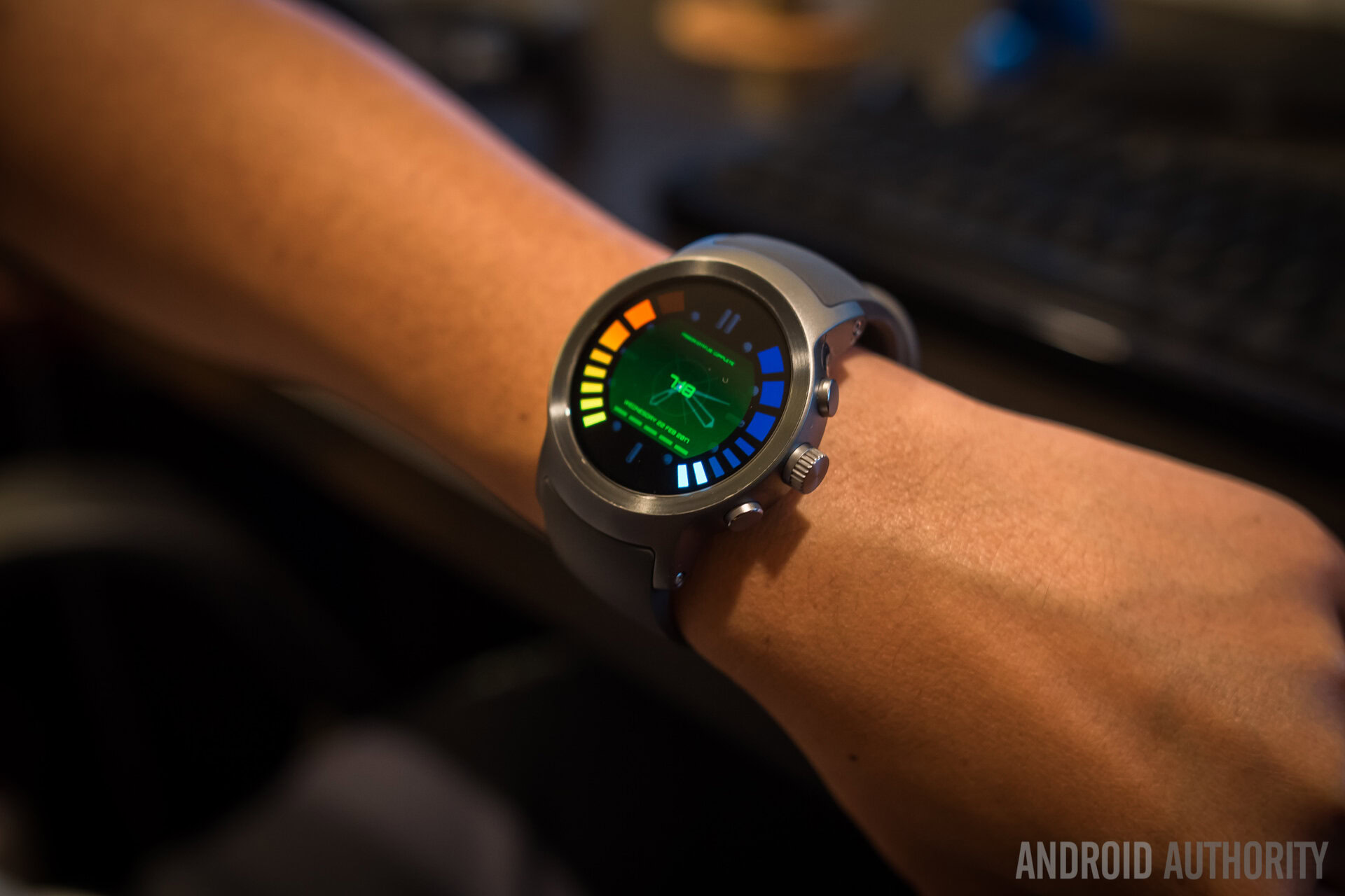
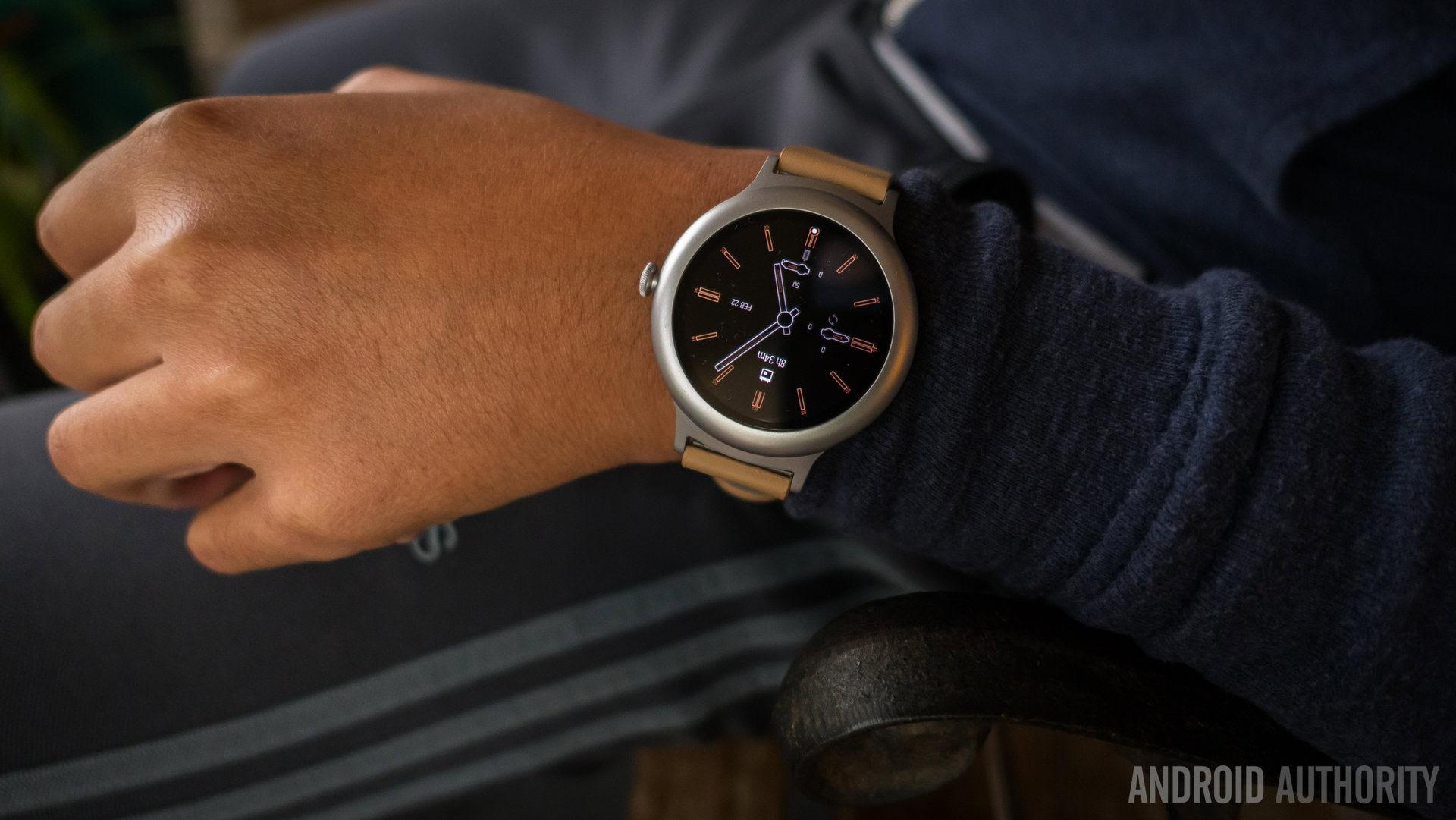
Let’s start with the watchfaces, the first thing that users see. “Complications” is a weird name to use for this new functionality, but Android Wear 2.0 now allows developers to leverage appropriate parts of the watchface to show off data from their applications, making each compatible watchface that much more useful at a glance. Not all watchfaces support this yet, but that is the nature of software upgrades.
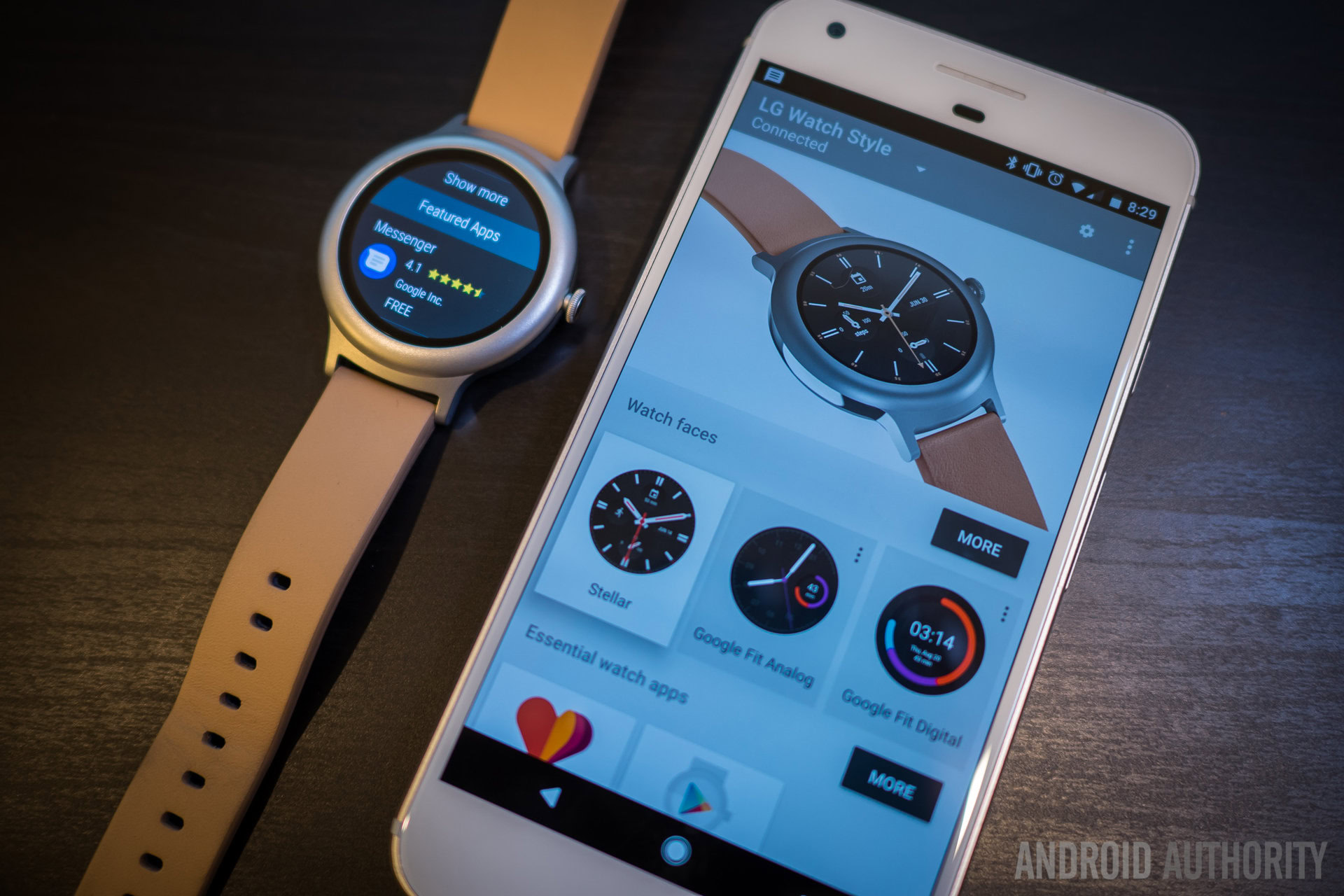
And this holds true for the updated app ecosystem, as well. Android Wear basically has its own Play Store that is accessed on the watch itself, and apps can be installed on the watch without needing to use the phone. This comes in a couple different flavors – general searching and discovery in the Wear Play Store to find apps or via a populated list that matches watch applications to ones that are already installed on the paired smartphone. A ton of apps found in the Wear Play Store are still just companions to their smartphone counterparts, but that should change overtime – having a functional, standalone watch version of Google Maps or Hangouts is pretty nifty, and we’re looking forward to seeing this continued evolution.
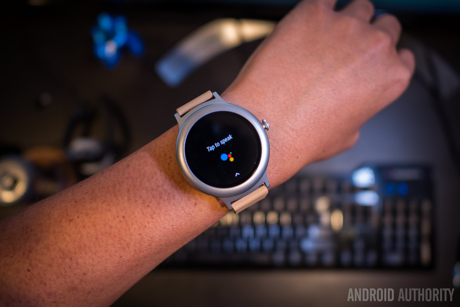
On the functionality front, Google Assistant has also been included in the Wear 2.0 update, bolstering the voice enabled searches and actions of these smart wearables that much better. Plenty of useful functions have been transferred over to the convenience of the wrist, including asking simple questions and activating different installed applications.
All of these new features come in a shell that looks a lot better, thanks to a move toward Material Design and a streamlining of the interface at large. I have maligned the cards method of notifications in Android Wear for a while now, and I’m personally very happy to see them go away. Notifications first show up over the watchface for a few seconds before tucking away underneath, to be scrolled up using swipes of the rotating dial. Though they are still a one-by-one setup, making notifications full screen instead of cards that needed so many extra taps and swipes is a proper step forward.
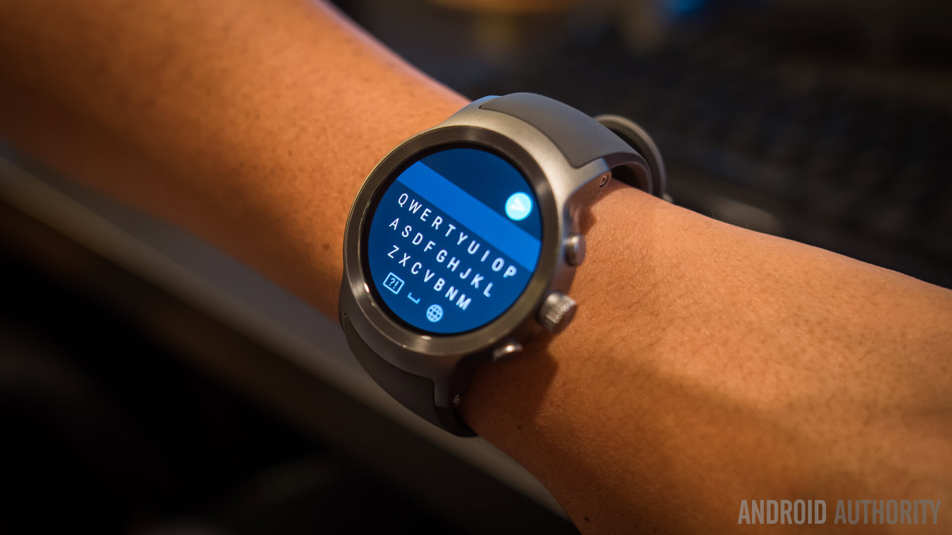
Not to mention the updates to mainly messaging actions that have been added in – responses don’t have to rely on mainly voice input anymore, as a full keyboard can be swiped on for text responding. Though the small screen doesn’t lend itself to the most comfortable keyboard experience, it is serviceable enough when users take the time to get it right.
And that is basically the crux of the new Android Wear software – and, ostensibly, the devices: Wear was always a “make it work for you” platform, but now the 2.0 update makes that diligence a little easier to bear. Minimizing the number of taps and swipes required to get stuff done on the LG Watch Sport and Style have made them better smart wearable companions than pretty much any previous Android Wear device that we’ve used in the last two years since the wearable OS’ inception.
Wrap up
Unfortunately, all of that good still comes at a rather high asking price – the LG Watch Style is obviously the less expensive of the two, starting at $249. The feature-packed Watch Sport is $349 on the Google Play Store, putting it squarely in competition with other fitness oriented Android Wear devices and the Tizen powered Samsung Gear S3. But in either respect, the watches are still a bit steep in price for anyone that isn’t already big on smartwatches. Especially to enjoy all that Android Wear 2.0 has to offer, having to pay almost half of what a smartphone costs is a tough sell for new adopters of smart wearables.
The Watch Style will be a better fit for those who want a more accessible experience all-around, but users who opt for it have to accept its omissions. That said, the LG Watch Sport is a great showcase of Wear 2.0, itself an update that should make any Android Wear user quite happy. If you have a watch that will not be getting the update to Wear 2.0, moving to a newer wearable is highly recommended – and we’ve already been given a great device for doing just that.
The LG Watch Sport is a great showcase of Wear 2.0, itself an update that should make any Android Wear user quite happy.