Affiliate links on Android Authority may earn us a commission. Learn more.
(Updated) One M9 won't see many aesthetic changes, new videos and images prove it

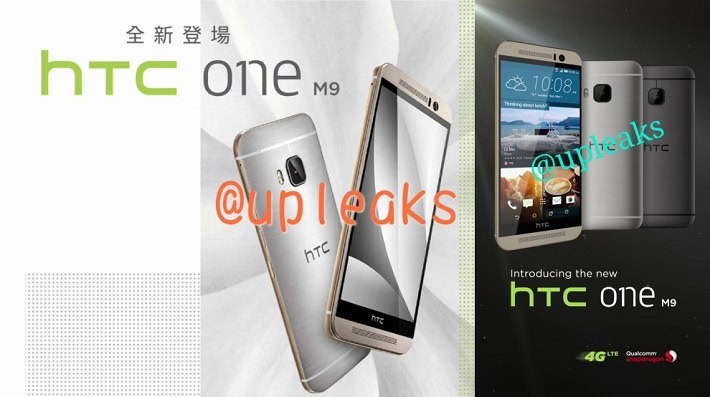
Over the weekend new press renders arrived to the web, showing off the HTCOne M9 in what allegedly was its final form. For those that had been hoping that Evleaks’ claim of a true redesign was right, the latest images certainly made the idea less likely. Still hoping that the One M9 doesn’t end up looking near-identical to its predecessor? Unfortunately, the latest batch of news is here to dash all your dreams.
Earlier today, Upleaks brought a few new images that helped further cement the idea that the One M9 will be a pretty minor update in terms of aesthetics. If images above aren’t enough for you, the leaker has now introduced three videos that should destroy any shred of doubt that remained. The new videos show off Sense’s new location-based app widget, the Sense theme engine and give us a clear look at the phone’s design. If this really is the M9 – as all signs now point to – that means the phone won’t be ugly by any means, but it won’t exactly see a major jump forward in design either.
Update: @upleaks has deleted his/her Twitter account and the YouTube videos. We’ve replaced them with mirrored versions uploaded by Phandroid.
What do you think? Okay with HTCpulling a Samsung-like move of sorts, or does HTC’s lack of changes make you less excited for HTC’s latest flagship? As a curious side note, it seems that @upleaks is currenly not on Twitter anymore, though we have no clue as to why the page has seemingly been removed.