Affiliate links on Android Authority may earn us a commission. Learn more.
Google reveals the winners of its 2016 Material Design Awards
October 19, 2016
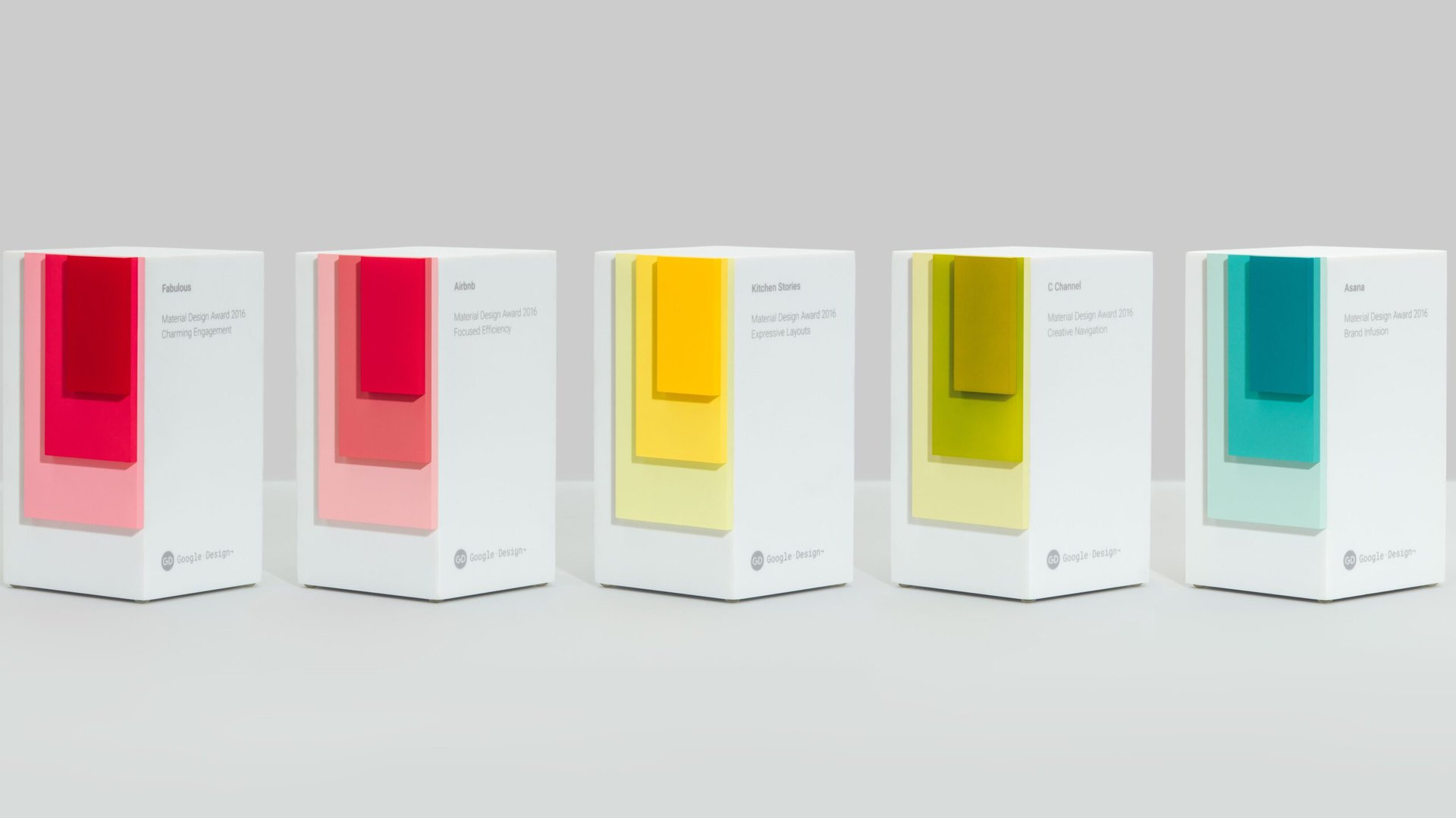
Google has revealed the winners of the 2016 Material Design Awards, which honors applications that best use the company’s Android app design style. This is the second year for these awards, which cover five different categories.
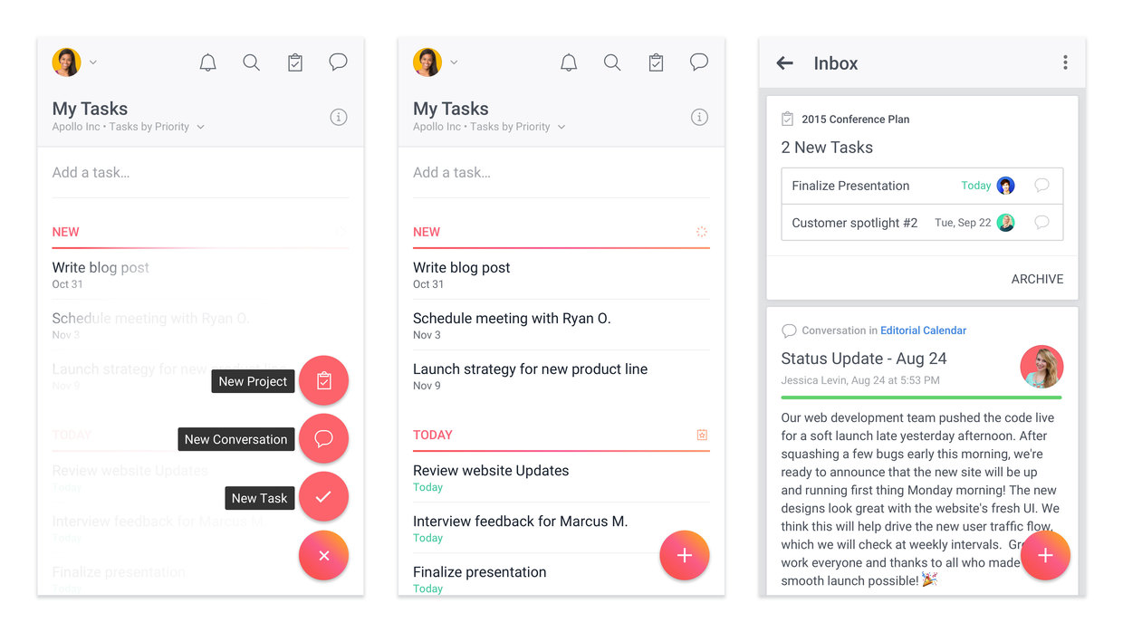
Asana: Team Tasks & Projects won the Brand Infusion category. Google stated:
With so much functionality built into the app, it would be easy for Asana’s visual identity to become diluted. But Asana’s design team thought through the brand experience at every turn. Subtle gradients are applied to the floating action button, as well as in moments of more casually paced user communication. The product logo is echoed in the circular outlines around icons that show up while editing a task.

The winner in the Charming Engagement category is the “happiness trainer” app Fabulous – Motivate Me! Google said:
The app’s charming illustration style makes an immediate impression, inviting users into their first experience of goal-setting. The crisp state transitions and pleasing goal completion animations keep up motivation—even experiences beyond the in-app functionality are carefully considered, with bold notification styles, a well-developed soundscape, and email reminders that feel personal and direct.
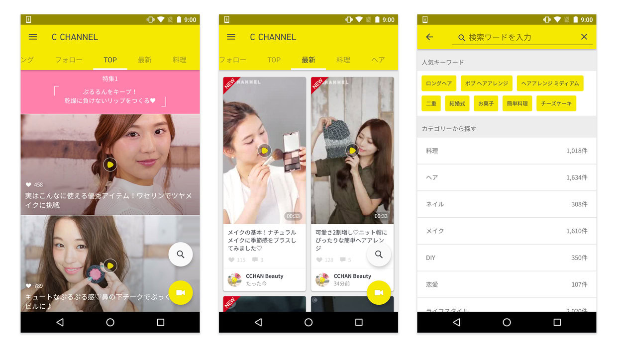
The Creative Navigation award went to the Japanese-based app C Channel, which offer “tips and tricks” videos. Google said:
C Channel organizes content into a series of tabs that can be traversed easily with a simple swipe. This engaging, gestural journey through the product continues even when videos are playing, allowing users to advance seamlessly between clips with a vertical fling. The overall positive vibe of the app—there’s only a like button and no down voting—celebrates the ideas and trends within the community.
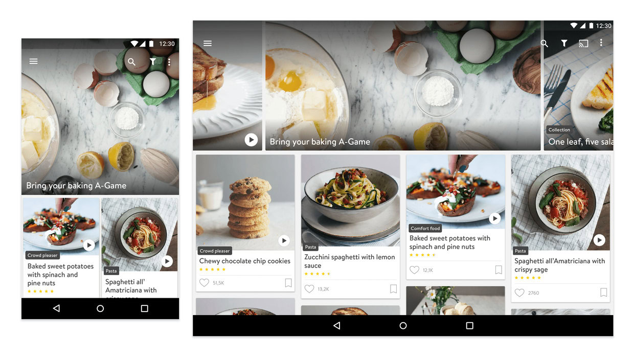
The Expressive Layouts winner was the recipes app Kitchen Stories. Google stated:
Kitchen Stories excels at creating effective, easy-to-scan layouts for recipes across a variety of screens and sizes. Home cooks will be happy to have their tablets in the kitchen: content is organized smartly, minimizing the number of times you’ll need to touch messy fingers to the screen. The attention to craft shines through at other moments in the app experience as well, from the precise positioning of type, to the playful use of the logo as a textural element on background surfaces.
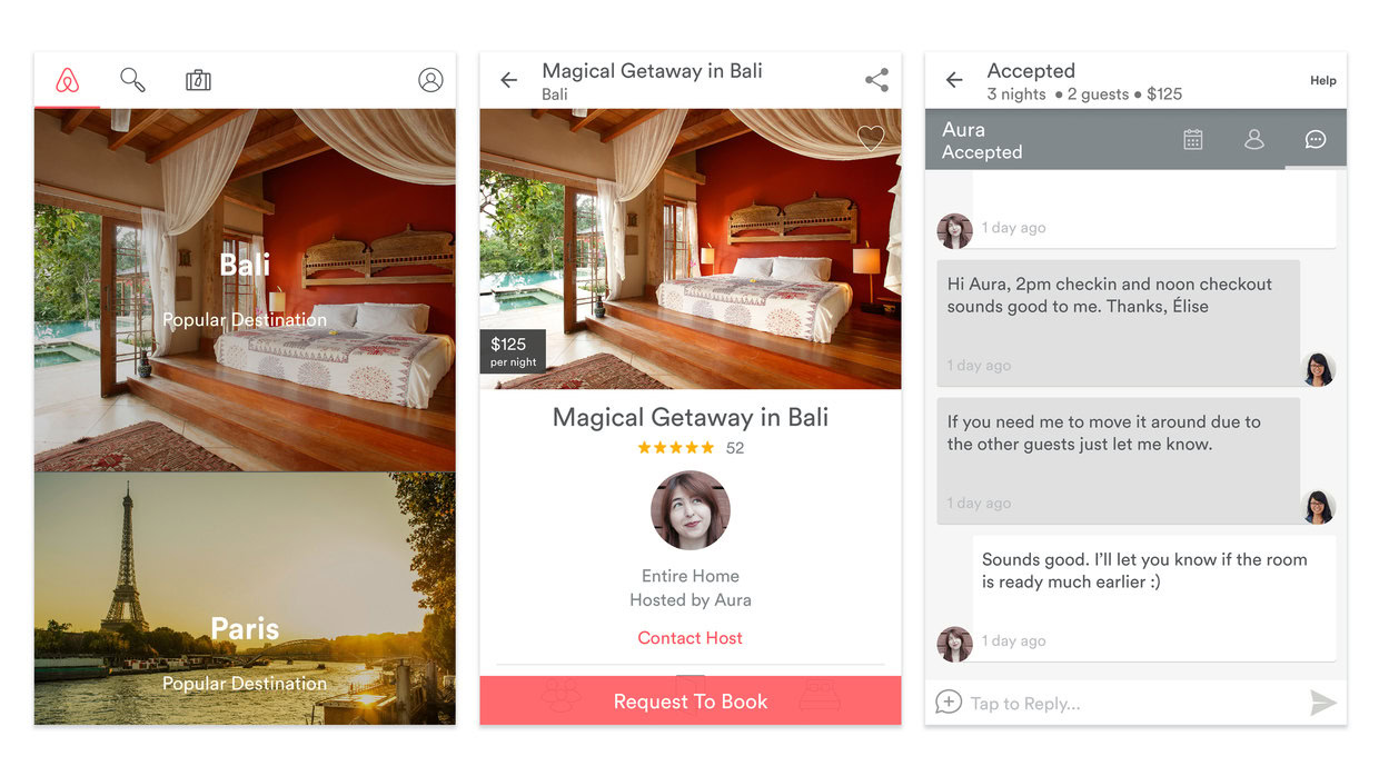
Finally, the Focused Efficiency winner went to the Airbnb Android app: Google said:
Essential tasks are satisfied through precise design, routing users clearly and briskly from sign in, to browsing, to booking a reservation. By neatly segmenting larger goals into smaller steps, Airbnb is able to sidestep the appearance of complexity, making the overall experience feel comfortable.
All five app winners will be officially honored with their Material Design awards as part of the SPAN LA conference on October 27.