Affiliate links on Android Authority may earn us a commission. Learn more.
Material Design: like it, love it or find yourself somewhere in between?
November 7, 2014

Last summer we first learned about Google’s Material Design language, since then we’ve slowly but surely seen traces of it roll out to various Google and 3rd-party apps. And now with Lollipop rolling out, Google has been pushing hard to bring Material Design to as many apps as possible, while also encouraging outside developers to do the same.
The honeymoon phase is (mostly) over now, and we are very familiar with Material Design and Google’s guidelines. With that in mind, this Friday Debate we ask what you think of Material Design. Are you in love with what Google is doing, indifferent or completely turned off by it? Additionally, do you think OEMS and 3rd party developers will do a good enough job of adopting the MD style.
Robert Triggs
Aesthetically I still find Material Design pretty horrible. The updated Gmail, Google+, and Inbox apps are pretty nasty to look at, I really dislike the color scheme. Furthermore, I can only hype myself up so much over animations that I’m going to have to look at thousands of times. But my biggest complaint with Material Design, for all its tawdriness, is that it also overly complicates what should be simple interactions. Let me explain.
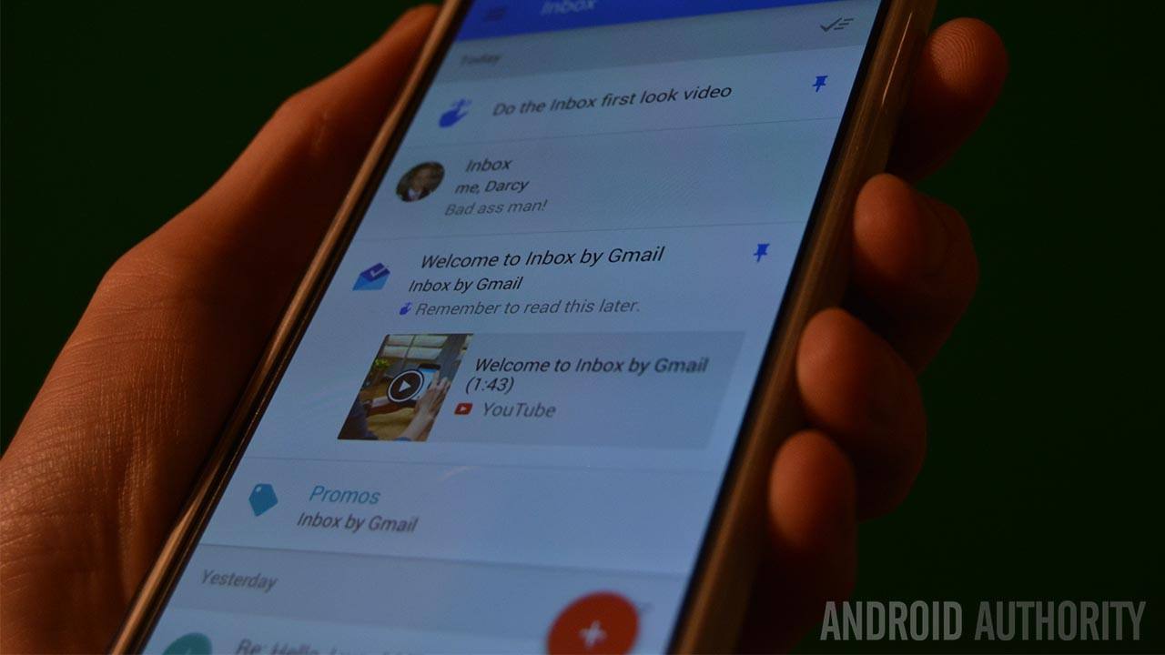
The Floating Action Button, for instance, exists to move important actions from a bar at the top closer to the user’s thumb. Clever, to some extent, but not really necessary. Thing is, this circle will end up housing almost anything, replacing easy to identify icons with a more ambiguous menu, see Inbox. The new side-menu looks nice and pops out with flair, but it hasn’t replaced the old three dot options icon and what goes in this menu doesn’t appear to be clear cut either.
Even Google’s own apps have become a maze of busy contradictory elements, which is only going to worsen when third party developers attempt to take it up. Is content supposed to be sorted by a swipe (Newsstand), a drop down menu (G+), in app (Play Store) or in the side-menu (Inbox)? Is the FAB supposed to disappear as you read on, because sometimes it doesn’t? Occasionally you don’t even start new actions from the FAB (like setting your mood in G+), instead they’re in the side-menu (Hangouts). Settings are now usually listed in the side-menu, but sometimes they’re still hidden behind the three dot icon (G+). If Material Design doesn’t unify the user experience across apps then what is the point?
There are seemingly more menus and options scattered throughout Material Design apps than before, when these could simply be housed in a bar or menu at the top. Reaching what I want should be easier, but the more advanced app options are often now tucked away behind extra animations, icons, and menus. I get the feeling that Material Design is a lot of flash at the expense of basic user interactions. (edited)
Bogdan Petrovan
I am a bit torn about Material right now – on one hand, I love what Google has done with Lollipop. On the other, I feel that the implementation of Material in Google’s apps is less impressive than what I expected. It may be because I haven’t really tried the complete experience yet (the apps’ transition to Material isn’t complete yet and I don’t get all the fancy animations on my KitKat Mate 7). But, so far, the materialized apps I’ve tried – Gmail, Calendar, Maps – haven’t really delighted me in a way great design should.
I think the problem is Material is too minimalist, in a way that evokes times when designers were limited by technology in what they could achieve. Or, as Luka put it in our group chat, it sort of looks like the ’90s. Google has been trying to compensate this bareness with rich animations – and that works t0 some extent – but the problem is many users won’t be able to enjoy them for months or at all.
I’d like to see Material tempered with lush imagery, the way Google itself encourages designers to do in its guidelines. I think the clean typography and blocks of strong colors are complemented by richer imagery. Google Calendar does that to some extent, by using images of city skylines or Googley graphics representing each month. The Music and Movies sections of the Play Store are probably the best example, though. However, not all apps can use images in a way that makes sense – see Gmail.
I think that Josh Topolsky was right when he suggested to Matias Duarte during their FORM 2014 fireside chat that mobile digital designers are pushing too far the flat and minimalist approach. Apple’s exaggerated skeuomorphism was wrong, but I’d still like to see more richness in Google’s mobile design. After all, we have these powerful devices that are able to render gorgeous imagery and graphics, and we’re using them to show text and colored cards (that’s an exaggeration, but the idea holds). Take Microsoft, who pushed itself into a corner with the Metro design of Windows. Google is far from that, but that lesson shouldn’t remain unlearned.
Jonathan Feist
For me, the jury is still out on Material design. Here’s the thing, until I use it in full force on an Android 5.0 Lollipop device for a while, I just don’t want to make judgements.
Does it sound like I am not very fond of Material Design so far? It shouldn’t.
I will freely admit that the default soft pastel color palette is not to my liking, I like strong colors. But that is where my complaints end, so far.
Truth is, it was the Google Play Store app that first made me stop and appreciate Material Design, it flows fairly well and looks pretty slick, but a week later it just feels normal. Perhaps feeling normal is a good thing, but the awe is certainly gone.

I’ve not been displeased with Holo design, but Material Design really is growing on me, and it is all in the details. Little things that you don’t really notice unless you are looking for/at them, things that don’t matter at all to function.
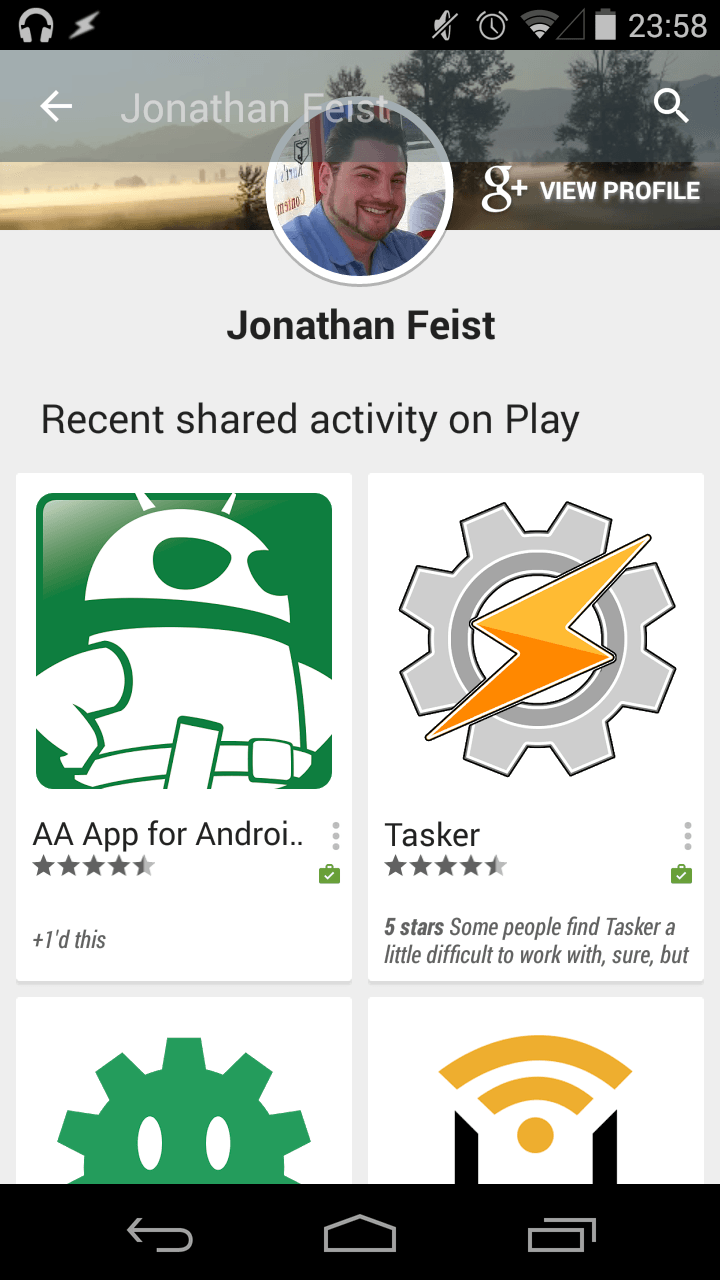
Take the Play Store snapshot above. Look how the top bar goes transparent as I scroll down the page. It is perhaps a cluttered and confusing still image, but the full transition animation just feels good.
I suppose that is exactly what I am trying to say here. Forget the scientific measurements, Material Design feels good, even if it doesn’t really look all that good. Android is long over due for some feel good, so I will embrace Material Design and jam on that ‘Check for Updates’ button to get Lollipop on my devices as soon as possible.
Joseph Hindy
Material Design is a slippery slope. On one hand, it does inject a lot of color and imagination into Android after KitKat effectively gutted Android of both of those things. However, on the other hand, I do believe it is often too much and there are some apps that simply don’t need that much color and boldness.
The Google Play Store, for instance, is an amazing example of a great place for Material Design. It has a lot of content, a lot of colors, and a lot of sections. Material Design doesn’t only serve to make the giant store front bold and colorful but also serves a function. If you see a giant blue banner, you’re in Books, if it’s green then you’re in Apps. It does an amazing job of highlighting content by using large images and well design product pages that give people info quickly.
On the other hand, there are a bunch of applications that don’t have that much content and therefore don’t need that much color. The problem, in my opinion, is that Material Design was designed for apps that have a lot of stuff going on and the simplicity with the basic geometric shapes and bright colors works to compliment the complexity of the application itself. That’s why when you see things like the Google Play Store with Material Design, it looks impressive and amazing.
However, on apps that are already really simple and don’t have a lot of complexity, Material Design is wasted. Let’s look at Gmail. All it does is send and receive emails. It doesn’t need to be simplified any more through its UI because (with Holo) it was already pretty simple. In this case, the simplicity of Material Design clashes badly with the already simple premise and mechanics of Gmail and that’s why you have that “welcome to the first grade, student!” look and feel.
I personally think Google should’ve maintained two design languages. Material Design and Holo. Holo was perfect for apps like Gmail and other applications that are simple by nature. When content is already that simple, it looks better with a UI that is capable of getting out of the way so that users can engage with the content. Material Design, on the other hand, seems to work better when the app can do a lot of stuff and the floating action button and simplistic, minimal design help to augment the experience rather than getting out of the way of it.
In other words, there are simply some instances where an application can’t be simplified any further than it is right now and those apps can’t bring anything new to the table by adding Material Design. In these cases, Material ends up being a distraction from the content rather than a frame from which people can engage with content efficiently. For those apps, they should probably stick to Holo because that does a better job of framing simple content in apps that don’t have that much going on.
Overall, I’m 50/50. There are some apps where Material Design is going to look amazing. There are others where it’s just going to be too much.
Thank you for being part of our community. Read our Comment Policy before posting.