Affiliate links on Android Authority may earn us a commission. Learn more.
Material Design - What UI developers need to know!
Published onApril 29, 2015
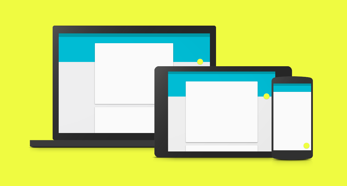
Google introduced the Material Design paradigm during its IO 2014 developer event. Since then, they have actively encouraged all android app developers to ensure their apps conform to the Material Design specifications. Google has taken the lead on this, upgrading all their apps with Material specs. With Android Lollipop, material design is baked into the OS.
The Material Design spec is a pretty extensive document and we have gone over this document for you, and picked out some of the more important points.
Introduction
The major focus of the material spec is to produce a visual language that provides a unified experience across different platforms and device sizes. While material began with Android, it is being gradually rolled into websites and Chrome OS. Android devices now vary from smartwatches, through phones and automobiles to TVs. Material specifies object look and feel, interaction with other objects, interaction with the user, animations and colors.
What is material?
The material design specification is a very detailed and extensive document, covering not just Android device UI/UX elements, but also Chrome OS and web apps.
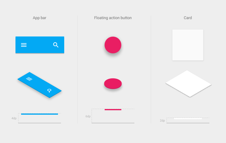
At its most basic, material design is influenced by real world materials and physics. Rather than having 3D widgets (like buttons), every thing is flat, and laid out on top of each other, or at different elevations. While the width and height of widgets can be different, the depth of all visual elements remain at 1dp (density independent pixel).
The environment is 3-dimensional, with the z-axis used for layering only (not perspective). Within the material environment, virtual lights illuminate the scene, providing shadows for widgets based on the widget’s elevation.
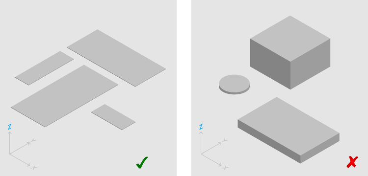
Rather than a button being a 3-dimensional object with depth, it remains flat, like a piece of paper, and the content is like a drawing (or painting) on the piece of paper. Content can take up only a part of the material, and can morph on the material.
In addition, the material can change shape (becoming larger or smaller, or even changing from a circle to a square), can merge with another material, and can be split. All material objects have a resting (or default) elevation, which can change due to user interaction. However, if an object changes its elevation, it should return to its resting elevation as soon as possible.
Animations
Animations are a big part of material design. Transitioning between activities should be animated, with shared element transitions. This provides a cue for users as to where the action is. Motion of objects should follow an asymmetric pattern, rather than a linear pattern. Objects that are scrolling of screen should not slow down at the edge of the screen. Also, smaller objects should move faster than bigger objects (giving the illusion that smaller is lighter).
Also, apps should provide a responsive animation when users interact with an object. The ripple effect is a great way to achieve this, where a ripple like effect is observed from the point of contact on an object.
Transitions between activities (or content) should be smooth, and designed to guide the user’s attention in a structured manner. When multiple objects are transitioned in or out, the movement should be choreographed consistently.
Morphing icons from one type to another is another highlight of a well crafted material app. It provides feedback to the user on the change of functionality, as well as presenting the user with a feeling of attention to detail and superb craftsmanship.
Icons, Colors and Fonts
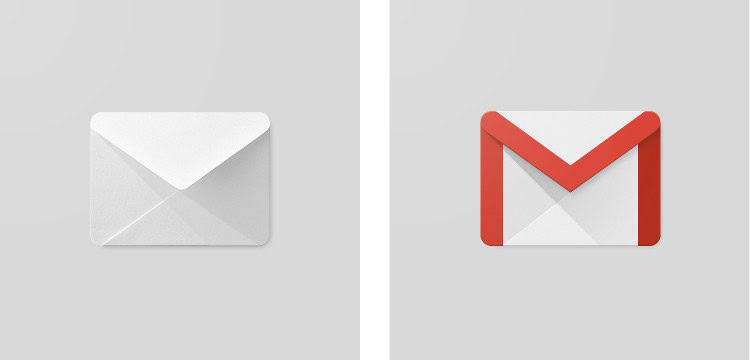
Product icons are expected to be flat, visually distinct, with colors that reflect the brand. You are encouraged to use simple shapes, with as little complexity as possible. Shadows should be shown with the assumption that there is a light source at the top left of the icon, hence, shadows are to the bottom right of the icon. Below is the Gmail icon as a sample. For in-depth iconography, visit the icon design page.
The material color palette specifies and provides rich, unexpected and vibrant colors. Colors in an app are usually of three major types, the primary color, used for objects like toolbars and large color blocks, the secondary color, usually used for the status bar, and the accent color, used for components like switches, sliders and action buttons. Never use the same color for both primary and accent. Also, never use the accent color for body text color. Rather, use the accent to highlight a portion of text (like a web link).
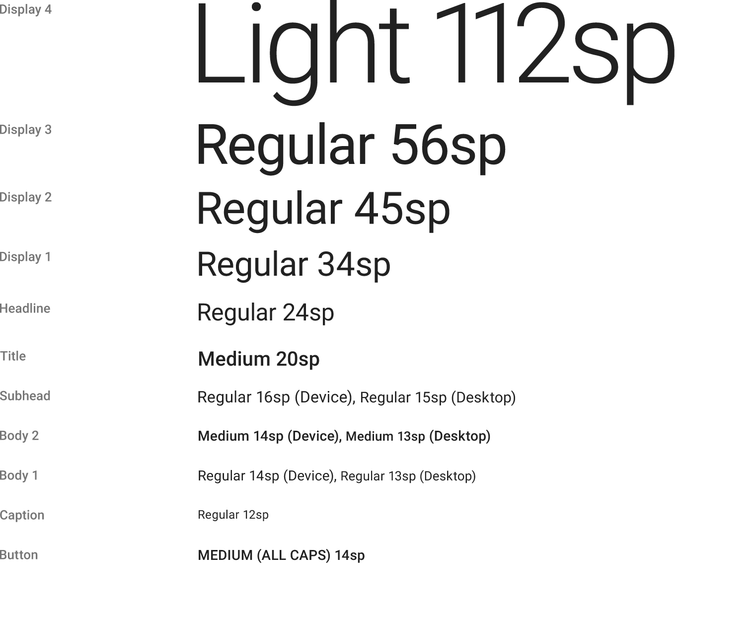
Material also specifies a set of font sizes, that have been specially designed and researched for maximum reading comfort under typical usage conditions. This can be found here.
Layout
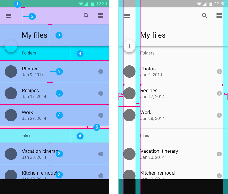
Material Design also specifies a detailed layout structure, for both portrait and landscape modes, as well as for different device sizes. For example, in a mobile device in portrait mode, the screen edge margin should be 16dp for both left and right margins, while the content associated with an icon should begin from 72dp from the left. The toolbar should be 56dp, list items should be 72dp and space between content areas should be 8dp. Take the time to read through the recommended layout metrics and keylines on the material design site.
Components
Material Design specifies behaviour and look & feel of a large number of UI components and widgets. Some of the most used, and/or new elements include
Buttons
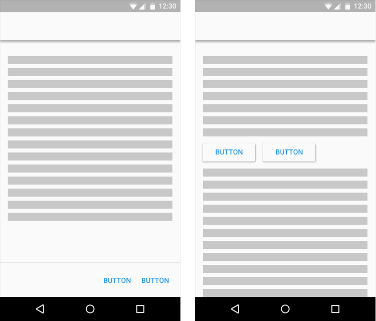
There are three main types of buttons, Floating Action Buttons (discussed below), Raised Buttons and Flat Buttons. Raised buttons should be used on spaces that contain other content. Flat buttons should be used for toolbars, dialogs and persistent button areas.
Floating Action Buttons (FABs)
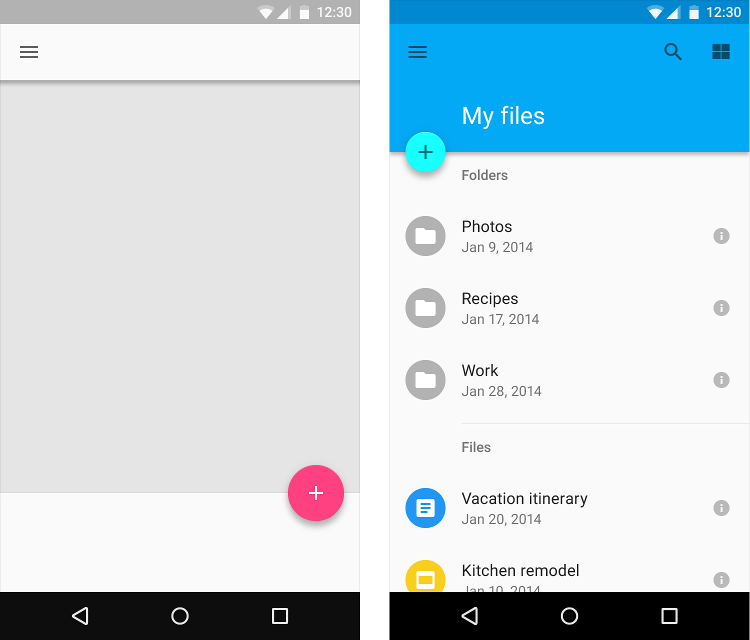
This is used for a promoted action, which is the expected primary action in a given application page/activity. There should be only one FAB per screen, although a FAB can expand, when clicked, to show additional related actions. FABs should be used for positive actions like Create, Dial, Share, and not for destructive actions like Delete or Cut.
Cards
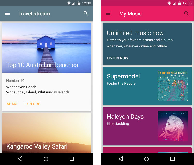
A card is a component that contains different, but related, elements that serve as an entry point to more detailed information. The width of cards should not change, but the height can vary. You should use a card layout when displaying content that:
- Can have different data types (images, video and/or text).
- Won’t be directly compared to other cards.
- Can have different lengths
- Has content that can be interacted with (like buttons).
- Will likely have more than three lines of text.
Snackbars, Toasts and Tooltips
Toasts are used to show a message to the user as feedback from the application. Snackbars are also used to provide feedback to the user, but can be swiped away, and should contain no more than one action.


Accessibility
Accessibility refers to the ability of people to navigate, understand and use a product successfully regardless of any physical disabilities. To ensure maximum accessibility, imagine using your app without sound or color, and with a screen reader and/or voice control only. The material specs recommends a usability and accessibility checklist that involves using your app:
- Without sound
- Without color
- With high-contrast mode enabled
- With the screen magnified
- With a screen reader (no visible screen)
- With voice control only
- With a combination of the above
More information about accessibility design styles can be found on the Google accessibility site and the material design accessibility page
Roundup
The material design specification is a very detailed and extensive document, covering not just Android device UI/UX elements, but also Chrome OS and web apps. The design is quite well thought out, and, when followed properly, results in apps that are easy to navigate and integrate well with the Android platform.