Affiliate links on Android Authority may earn us a commission. Learn more.
Material Theming is Google’s answer to app designers’ woes
Published onMay 9, 2018
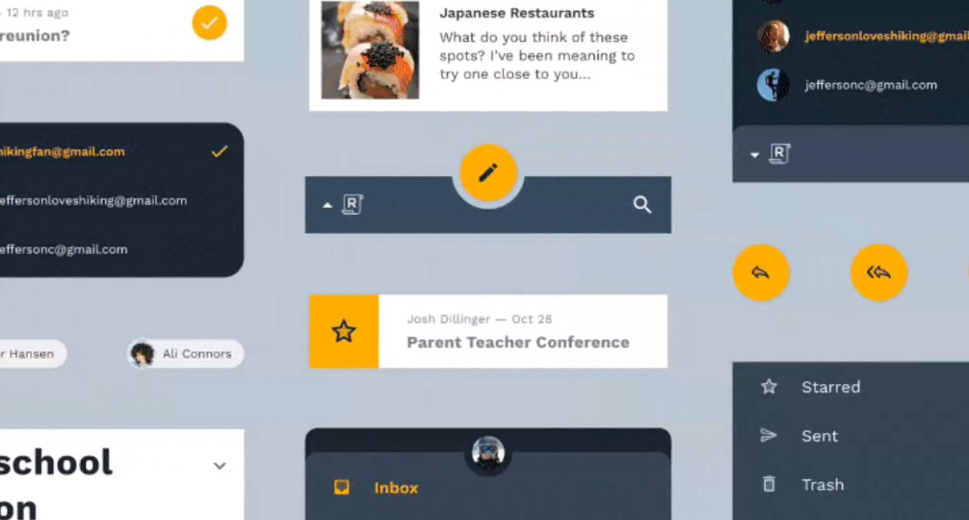
- Material Design is Google’s guide to Android app design, but Material Theming is the tool to actually implement that design.
- Google announced Material Theming and its companion site, Material.io, at Google I/O 2018.
- Finally, designers will be able to easily work within Material Design right from step one of the design process.
Google first announced Material Design – its universal design language for Android and the web – at Google I/O 2014. Since then, millions of Android apps (including the entire Google Suite) have adopted the design aesthetic, bringing uniformity to Android’s UI.
However, that doesn’t mean that Material Design’s implementation was perfect. Ask any Android app designer about the Material Design guidelines, and you’ll get an earful about the issues and complications present with Material Design’s rules.
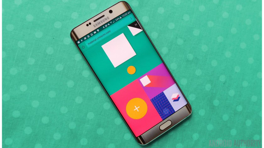
That’s why at this year’s Google I/O, Google is introducing Material Theming (via Fast Co Design), along with a new website called Material.io. Google hopes that Material Theming will help designers feel less restricted by Material Design and simultaneously make it easier for even novice designers to make their apps beautiful.
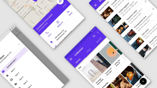
Material Theming is a plugin for the prototyping application Sketch. Developers use Sketch to create the overall aesthetic of an application to give developers and investors a better idea of how everything will look together. Using Material Theming, designers can quickly and easily apply Material Design guidelines to their work, without having to comb through each and every element to ensure it complies.
Material Theming also solves another problem designers faced, which was sameness. Since Material Design is a vast and pretty complicated system, many designers just stuck to the core tenets of the language to avoid diving too deep. This resulted in many apps looking remarkably similar to each other, with non-Google apps looking like they were made by Google.
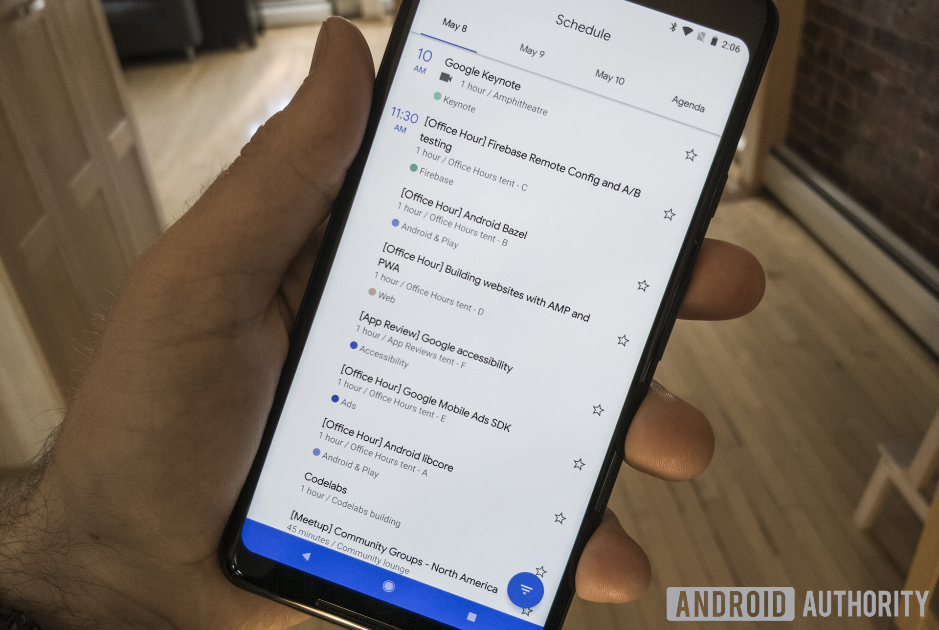
Now, using algorithms built-in to Material Theming, designers can simply click a few times and apply Material Design across their entire body of work. If they don’t like certain things the algorithm chooses, they can change it, but the changes will always adhere to Material Design’s guidelines.
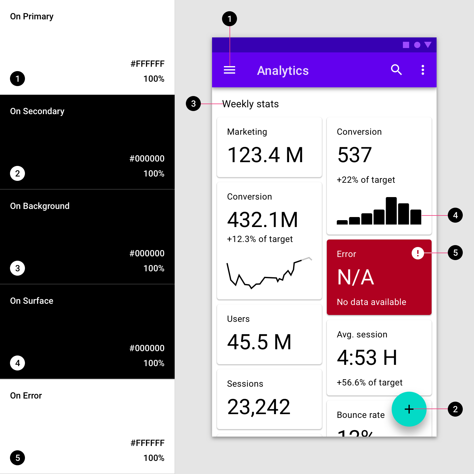
Certain aspects of app design like fonts, spacing, colors, etc., are all included in the initial rollout of the Material Theming plugin. However, more design aspects – or “systems” as Google refers to them – will be added in monthly updates to Material Theming. These new systems could include animations, stroking, shadowing, and more.
Google hopes that Material Theming and the companion site Material.io will give designers plenty of tools to create beautiful apps that adhere to Material Design while still being unique enough to differentiate the apps from Google products.
In the future, Google hopes to try to develop the ability for Material Theming to make design decisions based on abstract thoughts rather than basic color schemes and the like. For example, an app that’s focused on meditation could be described as “calming,” and Material Theming would theme it appropriately. Then, designers could complement abstract design thoughts with structured design ideas, like, “I want my app to be calming with a blue tone with soft edges.” Material Theming would then pop out the design.
This is all hypothetical at the moment, but at least Google is ready to give designers the tools they need to work within Material Design. After all, it’s one thing to hand designers a giant rulebook and say, “Here are the instructions,” and another thing to hand them a tool chest and say, “Here are the tools.”