Affiliate links on Android Authority may earn us a commission. Learn more.
Apple promised me a new iPhone, but all I got was last year's iPhone... for now
September 28, 2024
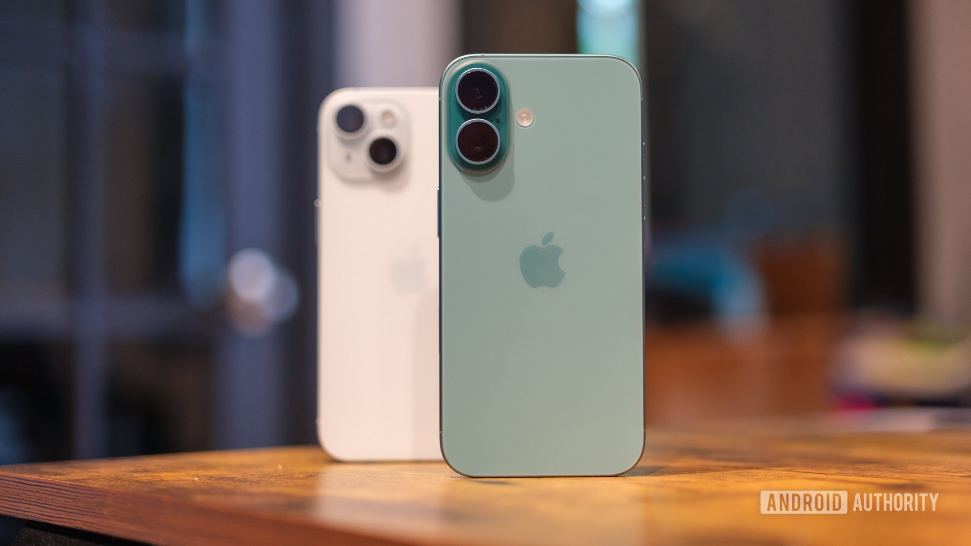
Someone smarter than me once wrote that the more things change, the more they stay the same. I’m sure it was conceived with a much deeper context in mind, but it’s become surprisingly applicable to Apple’s annual iPhone launch.
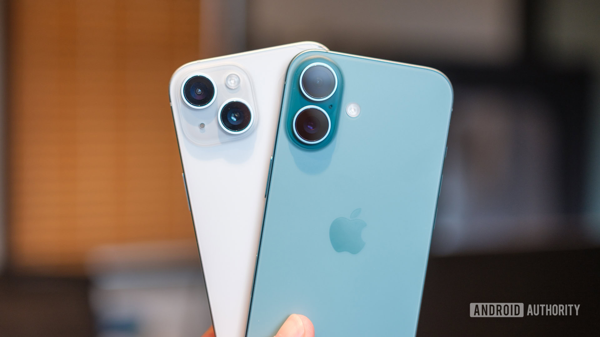
See, I know that the latest iPhone is called the iPhone 16, and it comes with the future promise of Apple Intelligence features, but what’s in a name when those shiny new features haven’t arrived yet? I was promised a new iPhone, but right now, the iPhone 16 mostly feels like the iPhone 15 with its cameras twisted in a new direction.
A couple of hardware wrinkles short of excitement
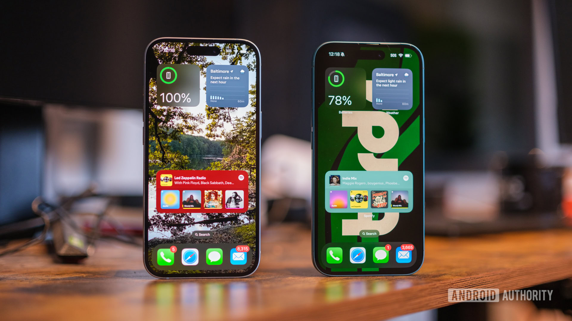
Alright, so I might have oversimplified how similar the iPhone 15 and iPhone 16 feel just a little bit — but not by much. From the front, they’re almost indistinguishable, with identical 60Hz displays, very similar bezels, and the pill-shaped Dynamic Island sitting front and center. Oh, and the iPhone 16 still doesn’t come with an always-on display — that remains a Pro-level exclusive. Outside of the camera orientation and a few new color options, the frosted glass back panels are a good match, too — though that’s more of a cause for excitement than disappointment. At least the familiar fit and finish means I knew the iPhone 16 would feel good in the hand as soon as I took it out of its box.
When you shift your eyes around the aluminum frame, however, you’ll notice that Apple made a few changes when it jumped from the iPhone 15 to the iPhone 16. No, it didn’t bring back the SIM tray on US models. The mute switch has been supplanted by the action button — a multifunction control first introduced on the iPhone 15 Pro series. It sits in the same natural position as the previous switch, right above the volume rockers, and offers the freedom to toggle one of about a dozen functions with a single press.
Apple added two new buttons, but they take some getting used to.
At first, I thought it seemed like a clever way to jump into a favorite app, but after my first few days with the iPhone 16, I’m not so sure. Instead, I find myself opening apps like I always have and have remapped the Action Button to function as my mute switch. As I said, the more things change, the more they stay the same.
The other new button that sits along the edge of the iPhone 16 is, well, not really a button. Instead, it’s what Apple calls the Camera Control, and it’s designed to give you control over your camera settings without having to swipe through menus on your display. Instead of reaching around the edges of your display, the Camera Control allows you to swipe through things like your aperture, photo style, and zoom with a few light presses of the capacitive not-quite button. It’s a neat idea but not one that comes naturally to a new user.
At first, you might think that the Camera Control is the only way to interact with its small set of menus. That’s not true. Instead, it’s much easier to use the Camera Control to trigger the menus and then swipe along your display to zoom in and out much faster. I’m also still learning where the Camera Control sits, as I’m not used to having a button sit so low on the side of an iPhone.
Is the iPhone 16 different enough from the iPhone 15?
Software as a second thought
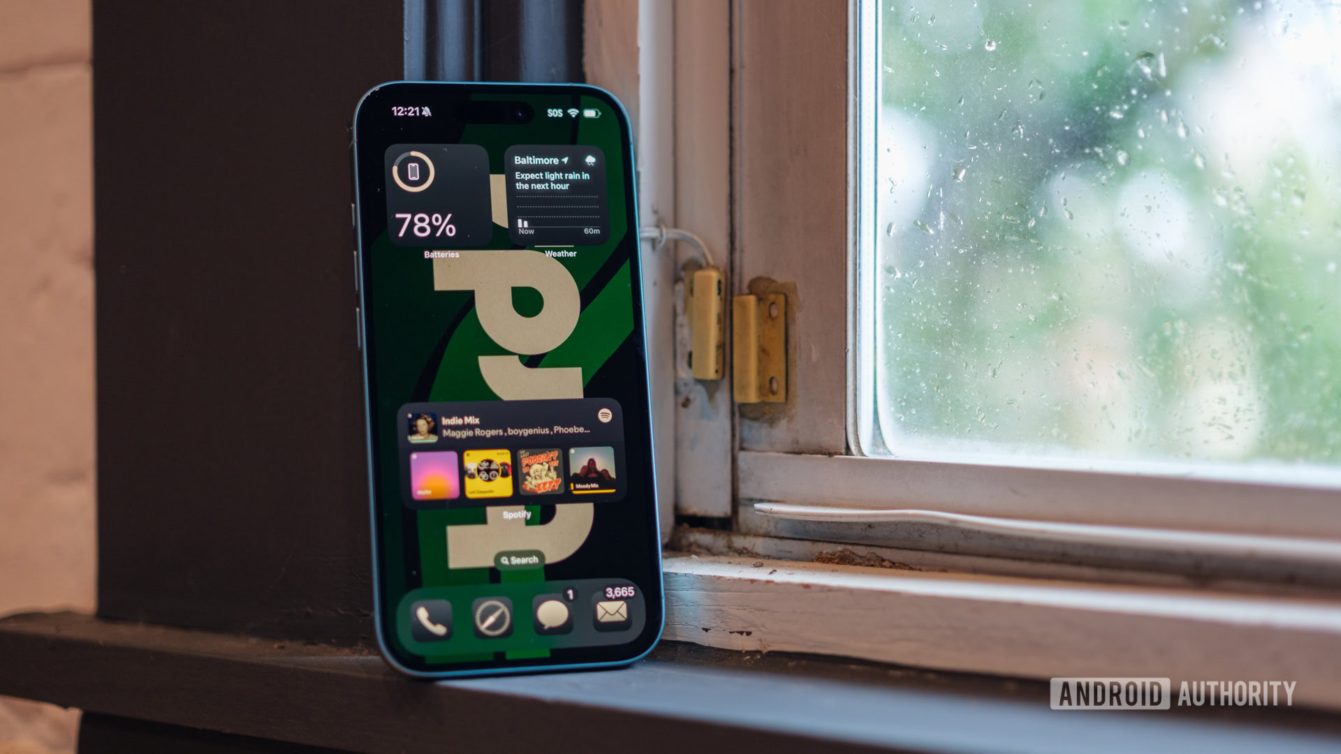
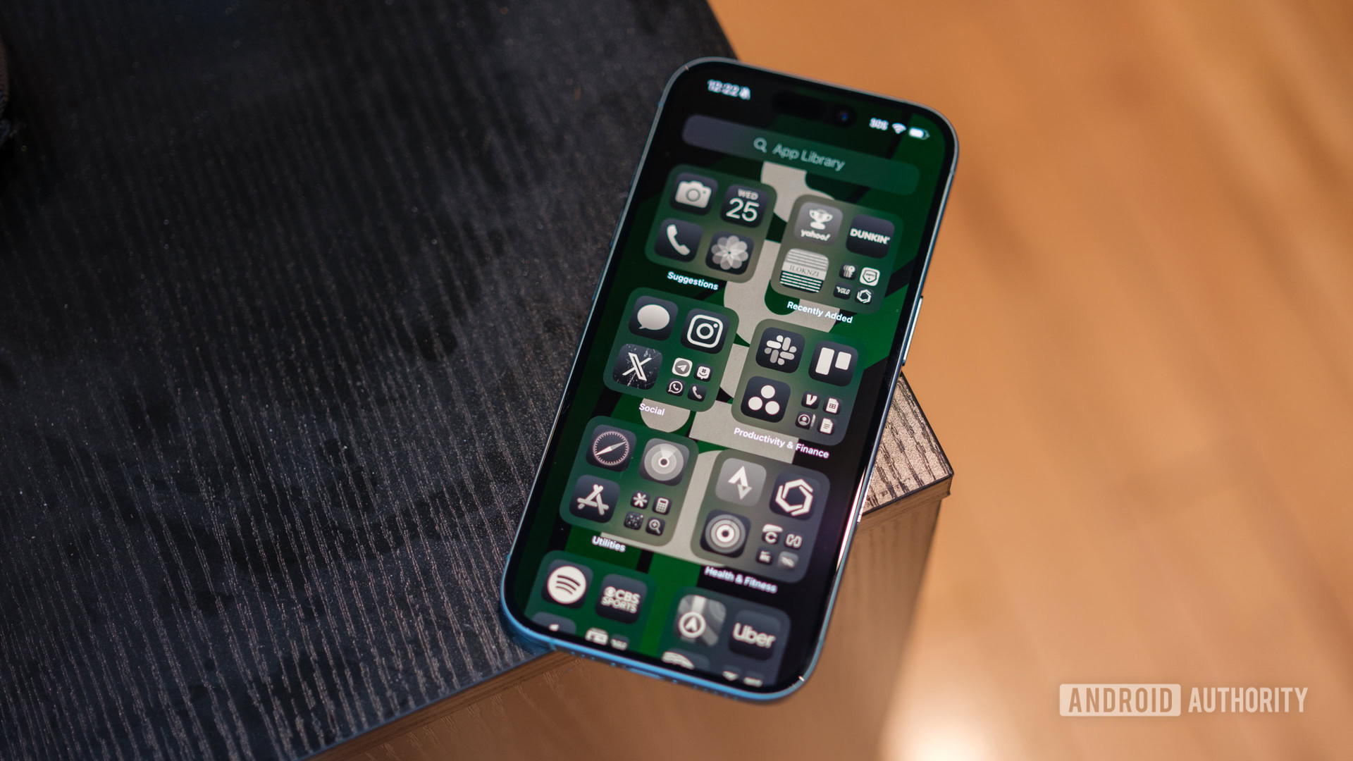
While there are a few clever hardware buttons that make the iPhone 16 feel a little bit different from the iPhone 15, I can’t say the same for its software — though, again, maybe that’s not a bad thing. Apple rolled out iOS 18 to its entire lineup of supported devices just before the iPhone 16 series began shipping, which meant that I could load it up on my iPhone 15 while I waited for my new phone to arrive. It felt like snooping on my gifts ahead of the holidays — sure, I got an early dose of excitement, but I couldn’t help feeling like I was skipping one of the joys of setting up a new iPhone.
Don’t get me wrong, I was happy to clean up my home screen, shifting folders to where I could reach them and ditching the apps and widgets I’d previously used as ballast at the top of my screen. I was also happy to try RCS messaging with my dad again, especially now that some of the beta quirks have been worked out. I was even happy to start learning my way around the revamped Photos app, which is much easier to organize, even if the interface looks slightly more complicated at first.
And yet, I still think that the iPhone 16 should have been the first to get iOS 18, even if it was ready just ahead of launch day. I think it should have been used as the reason to grab a new iPhone, especially in the face of hardware tweaks that feel largely optional. While you could skip the Camera Control and keep your Action Button programmed as a mute switch like I have, saving software wrinkles like the ability to customize your Control Center and color-match your app icons would have at least made the software experience on the iPhone 16 feel fresh and new.
Apple Intelligence? It’s not here yet
Of course, the real reason that the iPhone 16 feels a lot like the iPhone 15 is because of Apple Intelligence — or rather, the lack of Apple Intelligence. Apple spent the largest portion of its fall keynote talking about its progress in developing AI for the iPhone, but none of it is here yet. We’ll start to see the first fruits of Apple Intelligence in beta form starting sometime in October when iOS 18.1 rolls out, but until then, they’re just kind of a pipedream.
When I first unboxed and set up my iPhone 16 Pro, I did a cursory check for any trace of Apple Intelligence — you know, just in case. I found none. No new Siri animation, no new writing tools, just the same reliable iPhone experience that I’m used to. Somehow, it’s more disappointing than the half-baked features that some Android OEMs have launched, like the ability to generate wallpapers from a specific set of prompts.
Would you gladly pay today for Apple Intelligence tomorrow? I'm not sure I would.
And yet, I know that Apple has lofty goals for AI on the iPhone. When things like the new, more conversational Siri and generative Image Playground roll out, they’ll probably be nicely polished. I’m even excited about the ability to type questions to Siri, as I don’t always love to ask my silliest queries out loud.
However, I have to temper my excitement for everything (or anything) to do with Apple Intelligence because I have no idea when it’ll arrive on my iPhone 16. Sure, the first features might land in a month or two, but it sounds like many of the heavy hitters will have to wait until 2025, and even then, they’ll be in beta, too. Now that I think about it, paying today for the promise of AI features tomorrow has become a little too popular with recent flagship launches — and it’s not just Apple.
It’s starting to feel like a bad habit
In the immortal words of former president George W Bush, “Fool me once, shame on you. Fool me — you can’t get fooled again.” Only this time, I feel like I’ve been fooled, or at least anyone looking to upgrade their phone has been fooled over and over again. We’re promised exciting new features, but they often take several months to arrive after launch — long after we’ve started paying for our expensive new phones. Right now, my irritation is centered around Apple and its promise of upcoming AI features, but Google and Samsung have done the same thing to me in the past year or so.
Samsung seems determined to sell me on generative Galaxy AI features that feel half-baked, like the ability to draw anything on top of an existing picture with Sketch to Image or turn friends and family into cartoons with the Portrait Studio. Both are creative, but I don’t think either makes my life better. Nor do they really encourage me to spend the extra $100 for a new Galaxy Z Flip 6 when I quite liked the previous model.
All I want is a phone that's ready to go right out of the box.
Google did something similar when it announced Zoom Enhance, which would sharpen your zoomed-in photos, alongside the Pixel 8 series. It then took nearly a year to launch the feature, rolling it out on the day the Pixel 9 series broke cover. And sure, I’m willing to give Google a bit of a pass because it has a habit of stringing out its Feature Drops, but it hardly seems like a fair way to market a $1,000 smartphone.
If not for the significant improvements to Magic Editor, the revamped, AI-powered Pixel Weather app, and the incredibly conversational Gemini Live, I probably would have given the Pixel 9 Pro plenty of grief for the features it’s missing. After all, it did the opposite of Apple — launching the Pixel 9 series long before Android 15 was ready to roll out. And yet, it feels like Google is setting the best example for on-device AI.
I have no doubt that the iPhone 16 will eventually feel like a new device. One day, I’ll be able to pick it up and use the Camera Control as if it were second nature and rely on the updated version of Siri to get me the answers I need. Right now, though, it feels like I just have last year’s phone in a pretty new color.
Thank you for being part of our community. Read our Comment Policy before posting.


