Affiliate links on Android Authority may earn us a commission. Learn more.
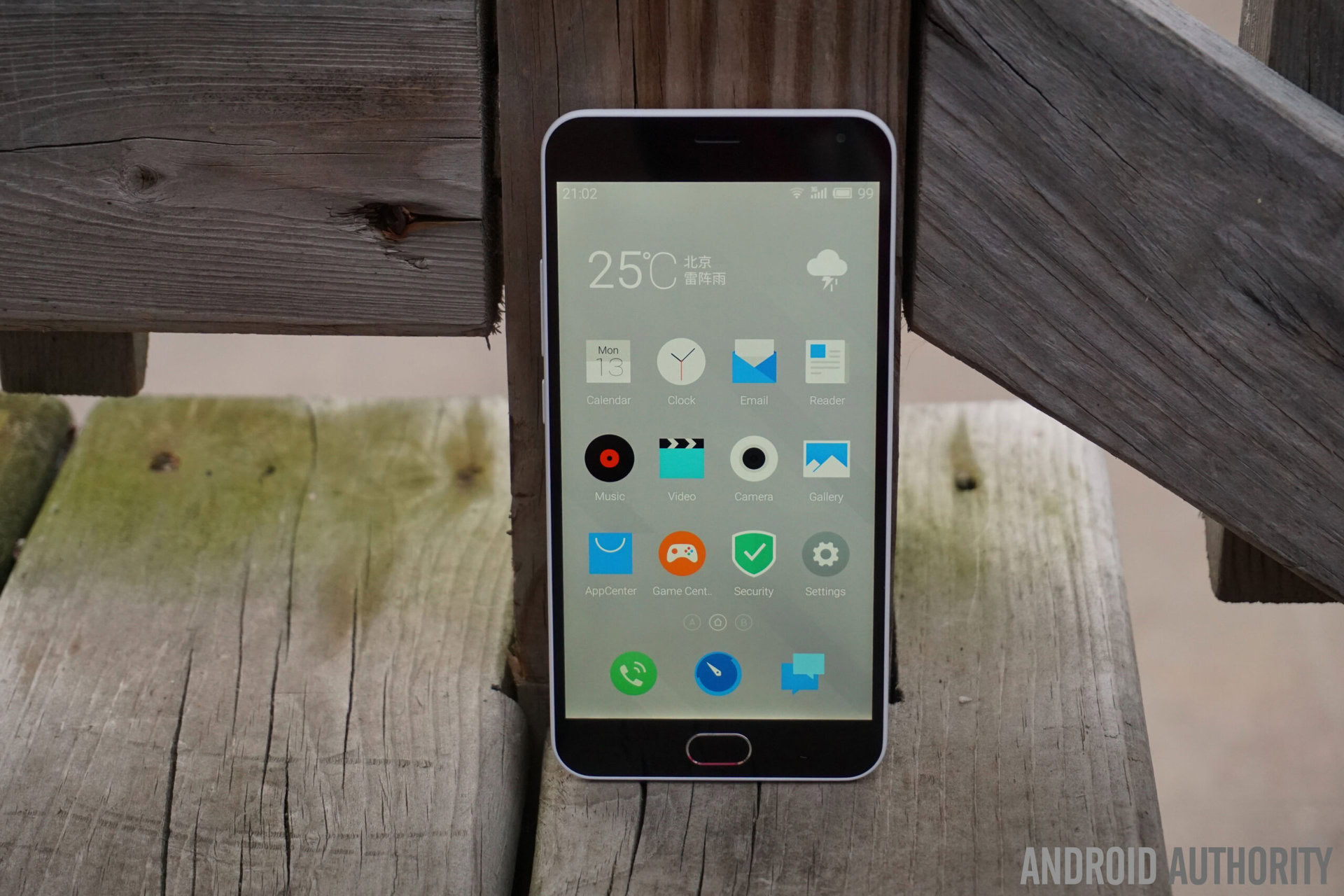
Meizu M2 Note
What we like
What we don't like
Our scores
Meizu M2 Note
The M1 Note has not been around for a particularly long time, but that hasn’t stopped Chinese OEM Meizu from releasing its successor. Does this latest low-cost offering from Meizu prove to be worthy of an upgrade? We find out in this detailed Meizu M2 Note review!
Design
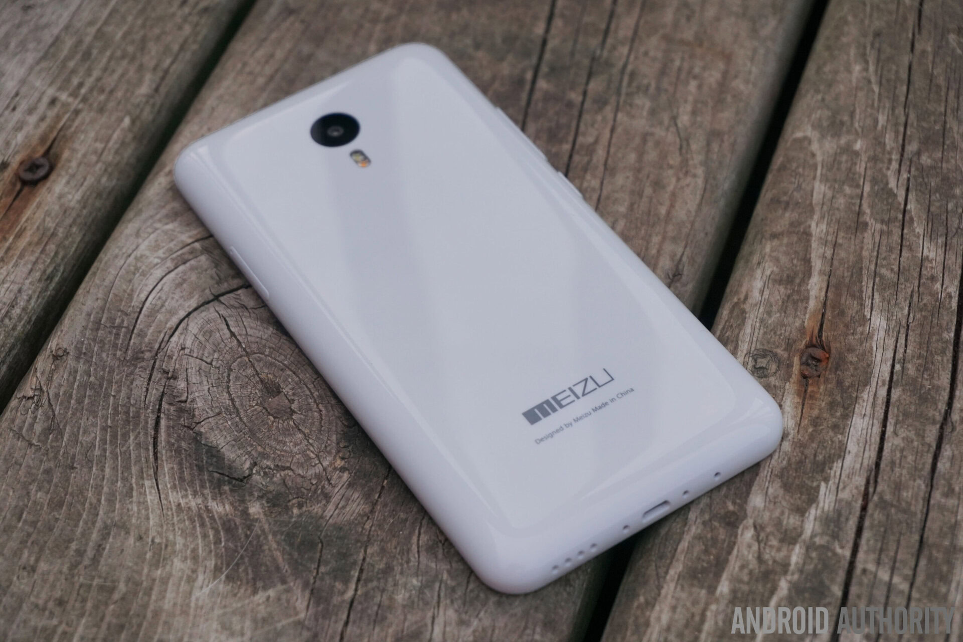
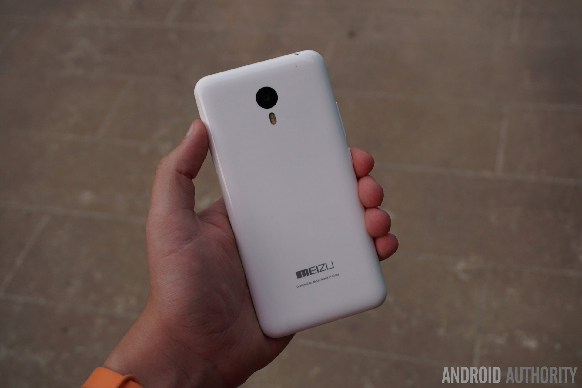
Things largely remain the same between the M2 Note and its predecessor as far as the design language is concerned. The inspiration behind its aesthetics remains very obvious, down to the available color options. That said, the lack of creativity doesn’t translate to a poor design. The polycarbonate unibody design with a glossy finish and the rounded edges and sides at the back make for a device that feels great in the hand and sits nicely in the palm. The curves aren’t as prominent as seen with the M1 Note though, allowing for a better grip overall.
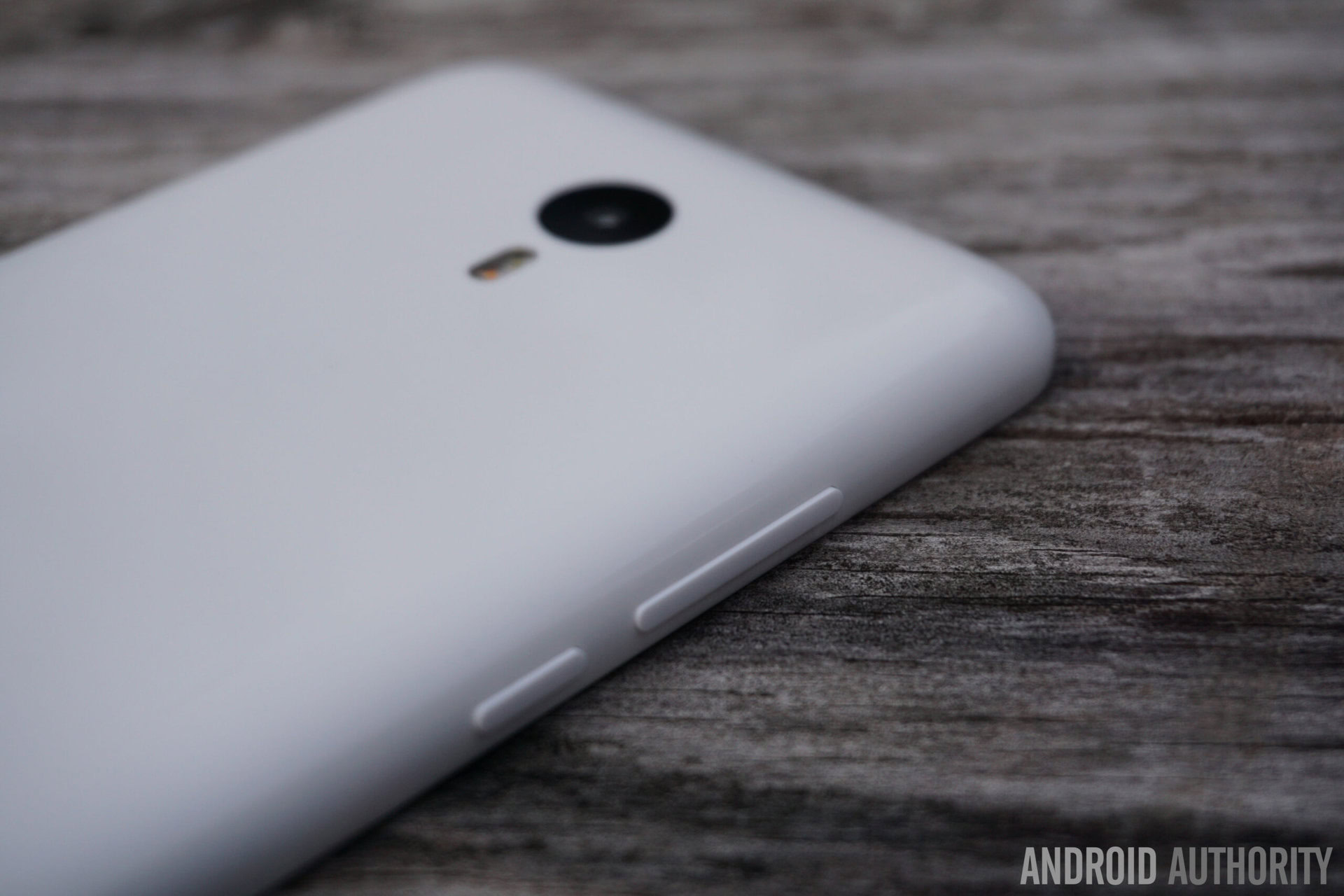
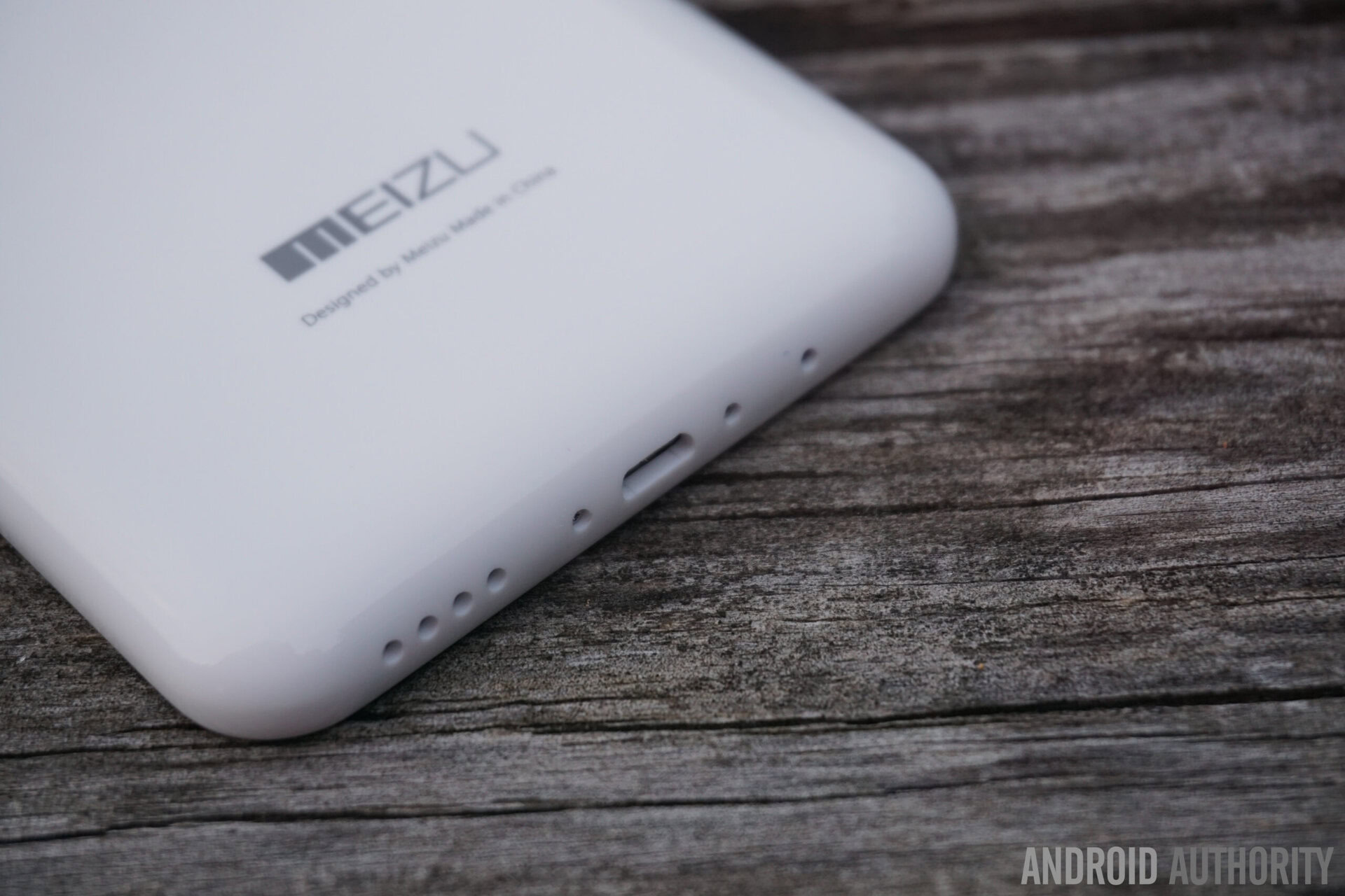
Going around the device, the volume rocker and the power button are found on the left side, which is a much appreciated change with regards to the power button, having been moved from its place at the top, as seen with the M1 Note. The buttons allow for a solid tactile feedback, and are all within easy reach. The dual SIM card and microSD card slot combo is on the opposite side. The headphone jack and the microUSB port are found at the top and bottom respectively, with the single speaker unit found next to the latter.
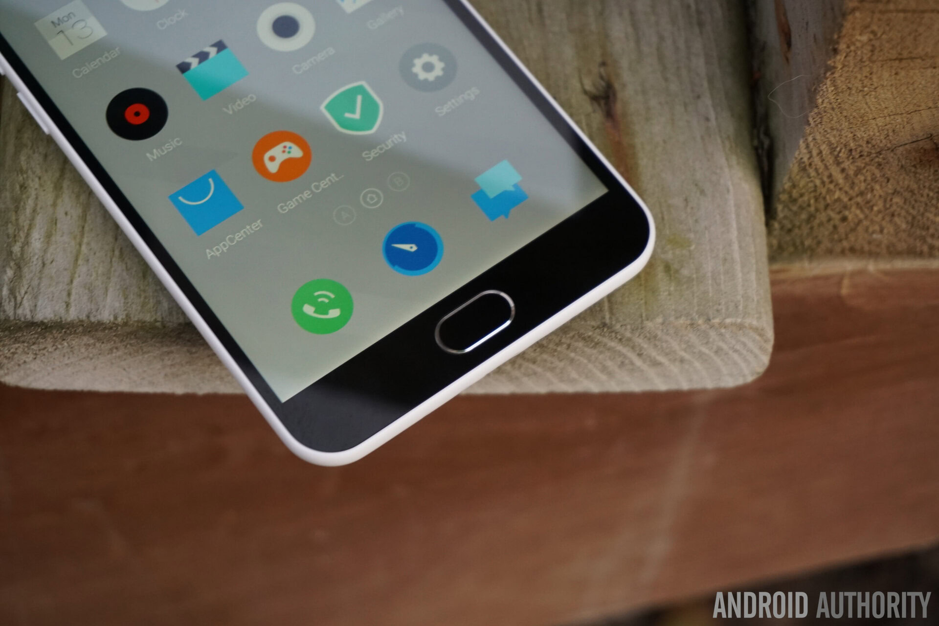
Apart from a few cosmetic changes and the shift in placement of the power button, the most notable change is the addition of a physical home button up front, replacing the circular capacitive key that also doubled as a notification LED. The new button no longer glows of course, but does provide a better navigational experience, with it acting as both a home button and a back button. Unlike its more expensive sibling though, the Meizu MX5, there isn’t a fingerprint scanner integrated into this tactile button though. Notifications are also now indicated by a traditional notification LED found above the display.
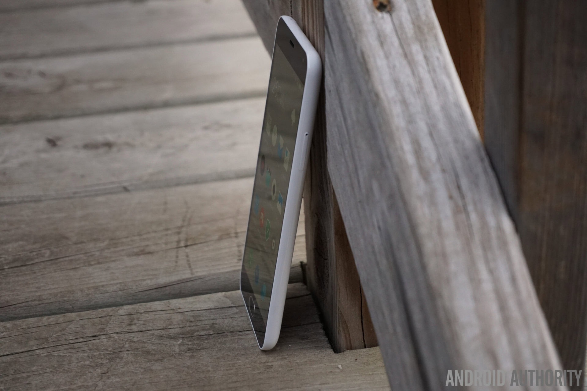
An incredible trend we’ve been seeing in the Android smartphone world is the fact that price is no longer entirely indicative of build quality, and that is certainly the case with this smartphone. The design may not be particularly unique, but the build quality is solid and certainly doesn’t feel cheap. And that goes beyond what the sub-$200 price tag of the Meizu M2 Note would suggest.
Display

The M2 Note retains the fantastic display of the original – its 5.5-inch IGZO display features a 1920 x 1080 resolution, resulting in a pixel density of 403 ppi, with everything protected by a Corning Gorilla Glass 3 panel. This display also brings with it everything we loved about the original, including excellent viewing angles and brightness, and with the colors even more vivid this time around.
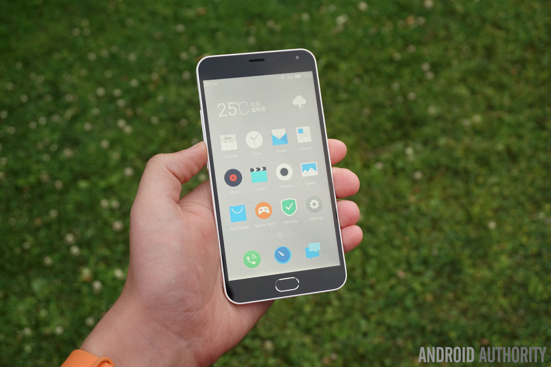
There are a few additional aspects to the display as well, such as the adaptive brightness, which works well and is responsive to changes in the environment. There’s also a new system setting that gives you control over the color temperature, that can be useful given this display’s tendency to generally lean towards the warmer side of things.
As was the case with the M1 Note before it, Meizu continues to provide fantastic displays with even their low-cost offerings, and this screen is certainly the best we’ve seen when compared to other smartphones that fall in this price category.
Performance
Under the hood, the Meizu M2 Note packs an octa-core 64-bit MediaTek MT6753 processor, clocked at 1.3 GHz, backed by the Mali-T720MP3 GPU and 2 GB of RAM. What is quite odd is the fact that the processing package is actually clocked at a lower rate than what was found with its predecessor, even if the processor of the latter is older. This made the M2 Note feel slower than the previous iteration, which was also reflected in the benchmark scores, which were, on average, about 25% lower.
That said, general performance with the M2 Note is still quite good, even if not entirely at par with some of its direct competition. The availability of 2 GB of RAM is a big plus though, and multi-tasking is smooth. There is also a slight step back as far as the GPU is concerned, but the device is still able to comfortably handle most games without noticeable performance issues.
Hardware
The M2 Note comes with 16 GB or 32 GB storage options, further expandable via microSD card by up to 128 GB. It’s important to note though that the second SIM card slot of the device is what also functions as the microSD card slot, so it will be up to the user to choose between enjoying the benefits of expandable storage or dual SIM capabilities.
The device also comes with a standard suite of connectivity options, and also fixes some of the GPS issues faced by its predecessor, though there still is some room for improvement. The M2 Note also allows for high-speed internet access via 4G LTE, but a compatibility check with your local network carrier is recommended before buying. Unfortunately, the device is limited to HSPA+ on the AT&T and T-Mobile networks in the US.
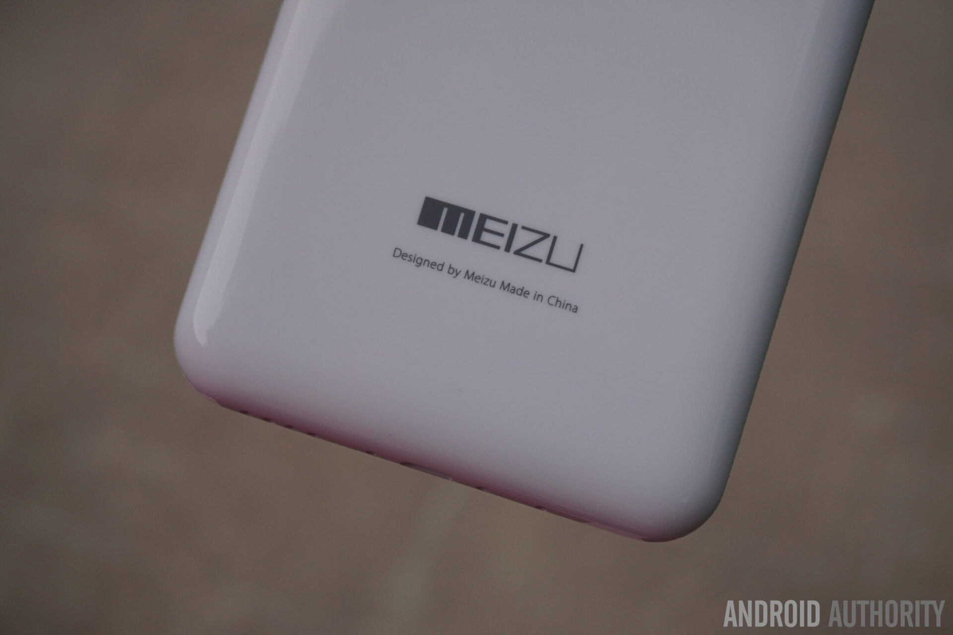
The audio quality provided by the single speaker unit at the bottom of the device continues to be the same between generations, and while it does get fairly loud, some distortion is seen when set to the highest volume. As is also the case with any speaker found in this position, it is very easy to cover it while holding the phone in the landscape orientation.
On the battery front, the M2 Note packs a large 3,100 mAh unit, which allowed for a very impressive battery life; the device comfortably lasts through a full day even with some heavy usage. With the brightness set to auto and while using HSPA+ for most of the day, the device lasted for around 14 hours, with just over 4 hours of screen-on time, with usage that included taking a lot of pictures and using navigation for 20 minutes.
Camera
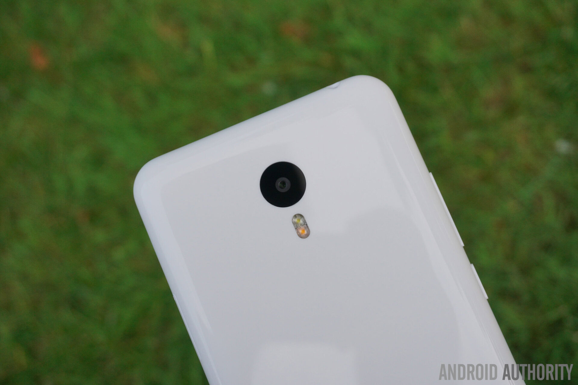
The Meizu M2 Note packs a 13 MP rear camera and a 5 MP front-facing shooter, which, at least on paper, is an impressive camera package for a device at this price point. The image quality is somewhat inconsistent though, as there are some misses along the way, in particularly related to issues with exposure. That said, some good shots are definitely possible, and the images feature good color and detail reproduction.
As far as the camera application is concerned, the interface is fairly simplistic, with an auto mode that is very easy to use. Surprisingly, there is a respectable amount of manual control available as well, that will allow you to truly cater the shot to your liking.
Software
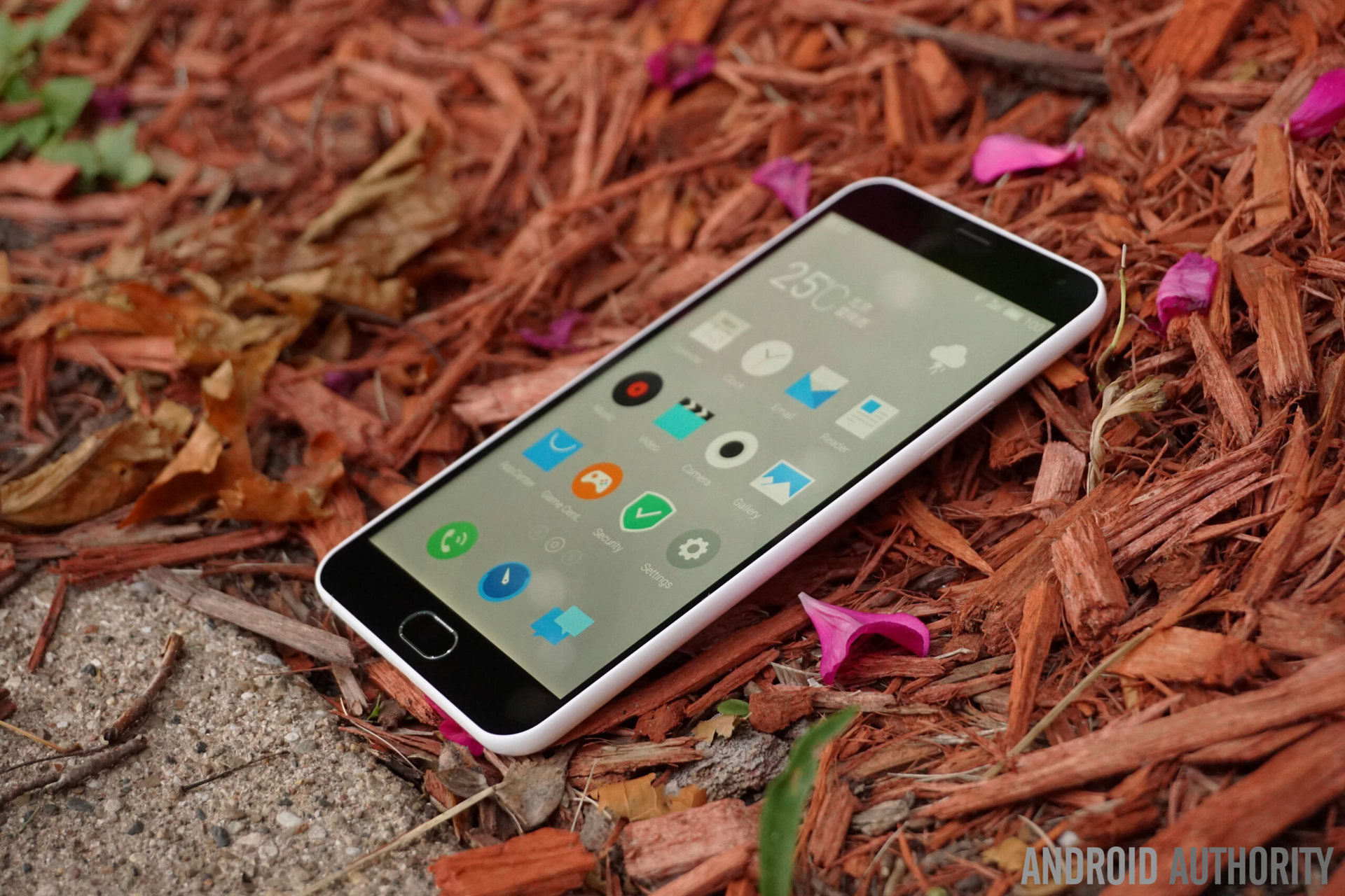
On the software side of things, the Meizu M2 Note ships with the Flyme OS 4.5.1, a forked version of Android based on Android 5.1 Lollipop. As has been the case with previous iterations of this OS, Meizu does get a lot of things right, especially in its latest form, but a few flaws unfortunately happen to show up.
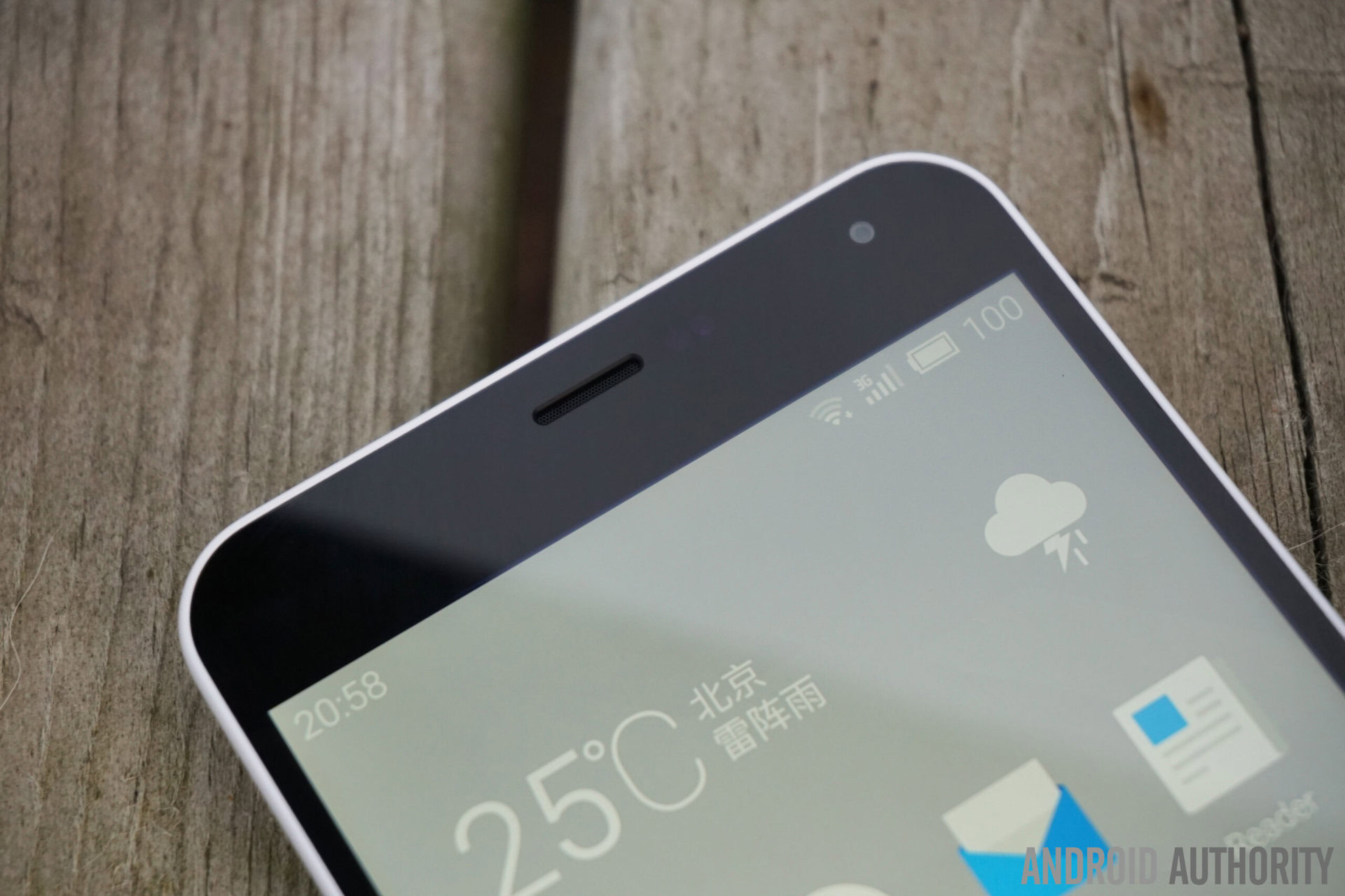
It’s important to note though that a lot of these issues are due to the fact that the intended market for this particular version of the device is China, and things should be a lot different when it makes it way to consumers in other international markets.
For example, as expected, there is no Google Play services available out of the box, and while there are a few Google Installer applications in the Meizu App Center, features like Google Now are still missing. The voice assistant and Drive mode system are both limited to Chinese, and there is also a slew of pre-installed Chinese applications that aren’t useful, unless you know Chinese that is. Luckily, these can be uninstalled, so they won’t be taking up any precious storage space. For now, users will also be limited to free features only, as you will be unable to purchase any music subscriptions, apps, or themes. Finally, the default keyboard isn’t very good for non-Chinese speaking users. As mentioned though, it will all be a very different story with the international version of the device.
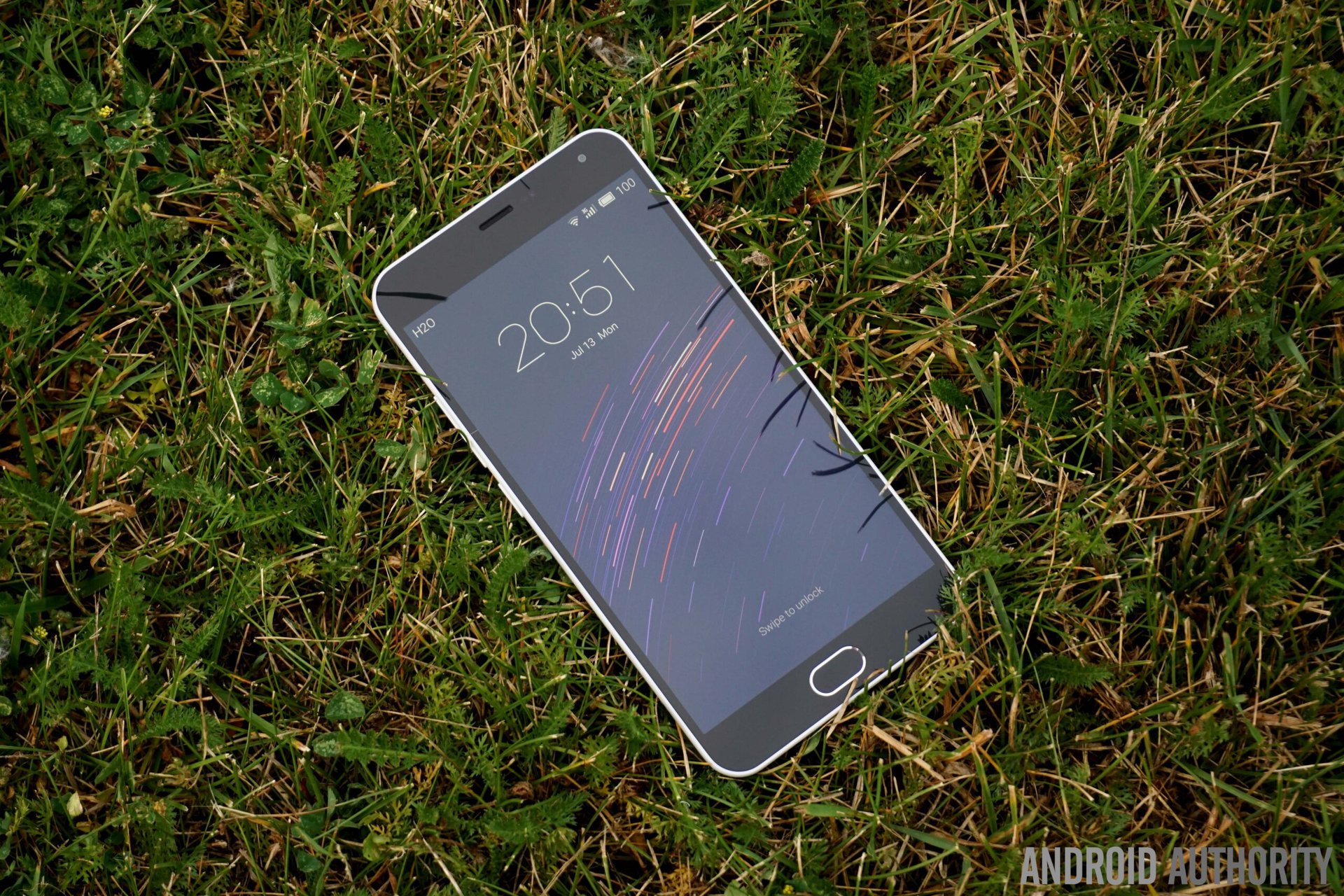
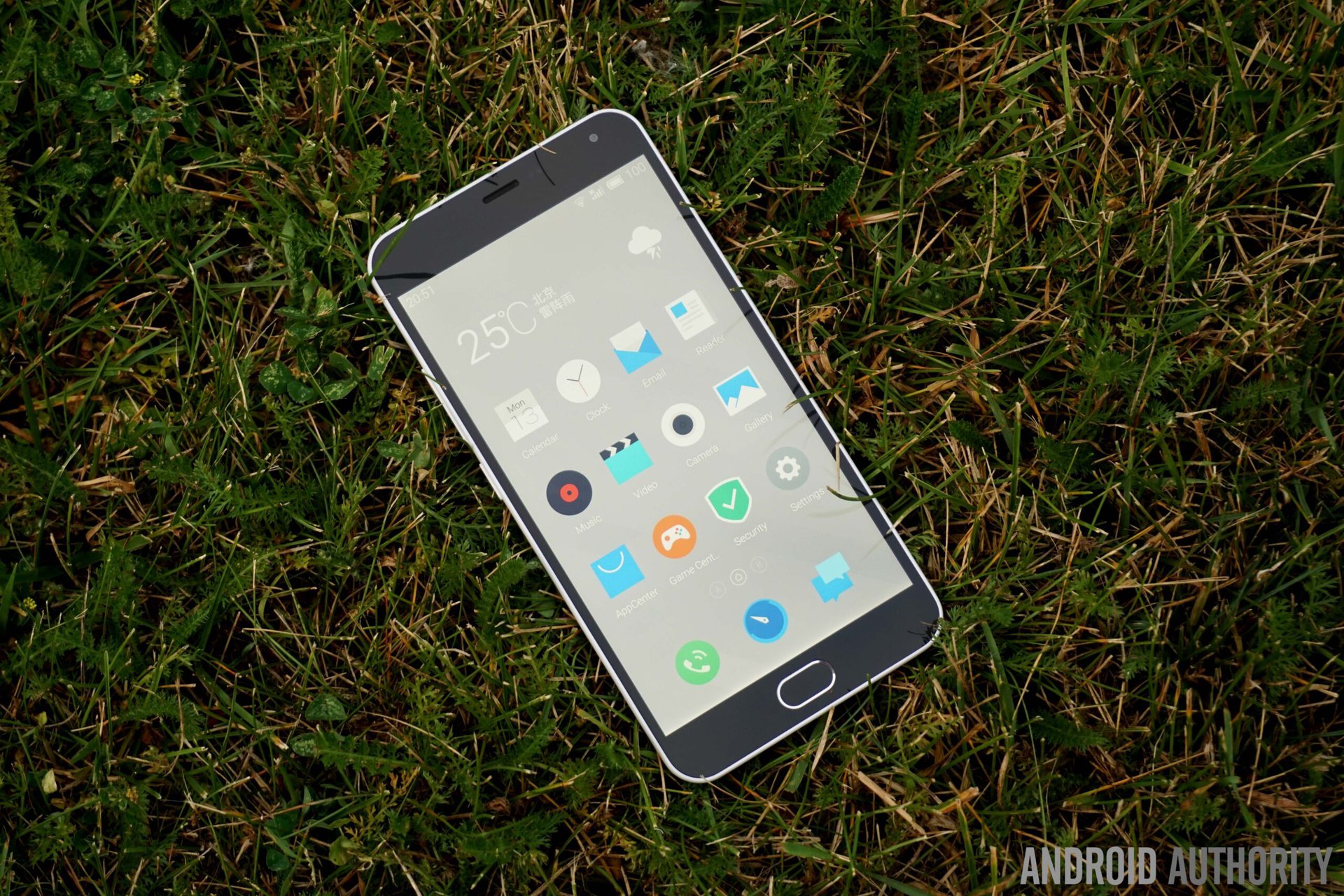
Some other more general issues have to do with the launcher itself, which likely isn’t going to be any different with an international version. For starters, as we’ve seen before from various other Chinese OEMs and Meizu as well, an app drawer isn’t available, which can take some getting used to, and will leave you dependent on folders to keep things organized and avoid cluttered homescreens. The notification dropdown lacks a Settings shortcut, which means that the only way to get to the Settings is to find the app, which is also very watered down when compared to stock Android. The lockscreen also doesn’t display any notifications, which is actually a very surprising implementation, which definitely will require some adjusting to.
These negatives aside, there is a lot that is great with the software experience as well. For starters, the gesture wakeup feature is fantastic, and letter gestures can be customized and added to directly open a particular app, with the device executing everything very quickly. You also have the ability to choose which apps can be launched from the lockscreen with a swipe to the left or right.
The system apps are all beautifully designed, and the music app comes with a large collection of free to stream music. The Tips application is very useful, Smart Touch is a fun feature to use, and the device also packs power saving modes that go beyond what is offered with stock Android. Finally, the transitions between the various elements of the UI are consistent, and provide a very nice visual experience.
Specifications
| Display | 5.5-inch IGZO 1920 x 1080 resolution, 403 ppi |
|---|---|
Processor | 1.3 GHz octa-core MediaTek MT6753 Mali-T720MP3 GPU |
RAM | 2 GB |
Storage | 16/32 GB expandable via microSD up to 128 GB |
Camera | 13 MP rear camera with dual LED flash 5 MP front-facing camera |
Connectivity | HSPA, LTE Cat4 150/50 Mbps Wi-Fi 802.11 a/b/g/n/ac, dual-band, Wi-Fi Direct Bluetooth 4.0, GPRS |
Sensors | Accelerometer, gyro, proximity, compass |
Battery | 3,100 mAh |
Software | Flyme OS 4.5.1 based on Android 5.1 Lollipop |
Dimensions | 150.9 x 75.2 x 8.7 mm 149 grams |
Colors | Grey, White, Blue, Pink |
Gallery
Pricing and final thoughts
The Meizu M2 Note hasn’t seen an official release in the US and other markets outside China, but can be picked up on Amazon, priced at around $175, though the price does tend to fluctuate. Of course, checking for compatibility with your network carrier is highly recommended if you decide to pick this device up.
So there you have it for this closer look at the Meizu M2 Note! Since the M2 Note was released just a few months after its predecessor, there isn’t enough of a leap between generations to leave M1 Note owners upset. That said, the M2 Note does bring some improvements to what was already a good device, the most notable addition being the availability of microSD expansion, even if it involves sacrificing dual SIM capabilities.
A more refined look and feel certainly help, and the M2 Note continues the tradition of bringing quite a lot to the table at an extremely budget-friendly price tag. The competition in this space has been growing over the past year or so, but an international version of the Meizu M2 Note will certainly give all those a run for their money. While not without its issues, the M2 Note does stand out, by managing to shine in areas where many low-cost devices don’t.