Affiliate links on Android Authority may earn us a commission. Learn more.
Meizu m3 note
What we like
What we don't like
Our scores
Meizu m3 note
Despite its relatively young age, Meizu’s m series has earned a reputation for offering some of the best user experiences at affordable prices. We were impressed from the start of the note lineup, which we echoed in our Meizu m1 note review, and also found its arguably premature successor, the Meizu m2 note, to be excellent in somewhat different ways.
More Meizu Coverage:
After nearly a year later, our Meizu m3 note review is here. Is this smartphone truly outstanding in a manner similar to its predecessors or does it simply fade into the massive sea of affordable smartphones? Let’s find out with our comprehensive Meizu m3 note review!
Design
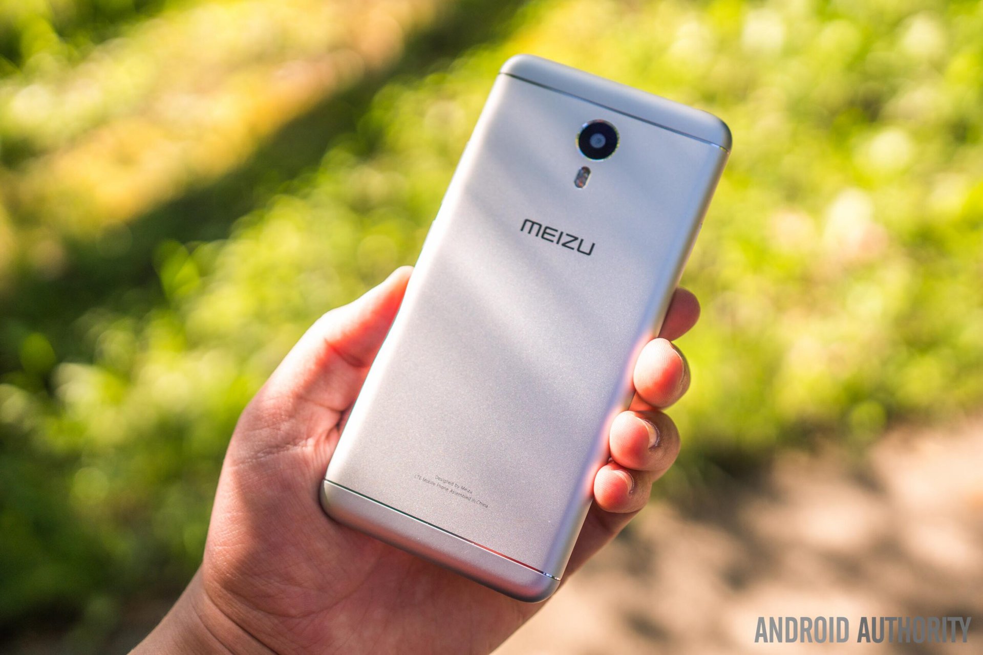
It is very difficult to deny that the m3 note's design is both sharp and assertive
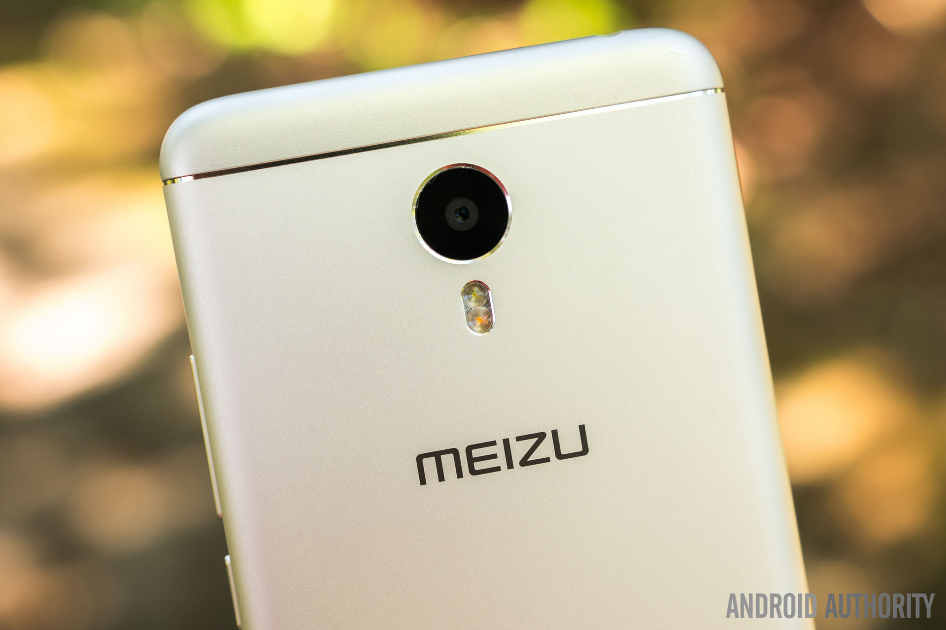
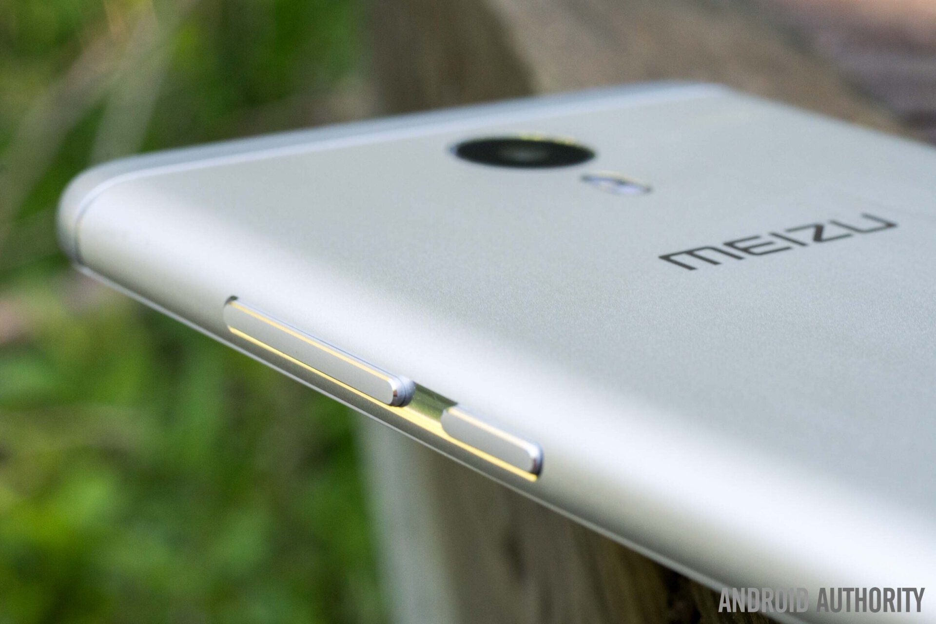
Instead of utilizing the iPhone 5C-like colorful glossy plastic found on several previous m models, Meizu has constructed the m3 note almost entirely of aluminum. Although one could argue that this change takes away from the iconic character of previous iterations, it is very difficult to deny that the m3 note’s design is both sharp and assertive. Premium design aspects such as the seemingly engraved antenna lines, symmetrical bottom, and 2.5D curved front glass are rarely found integrated so well at this price point.
The build quality here is also quite remarkable, something that can’t often be said about phones in this price category. The power and volume buttons, which have gone from the left side to the right side with this iteration, are tactile and feel solid. The m3 note also feels great in the hand overall, and the curved aluminum edges are most definitely appreciated.
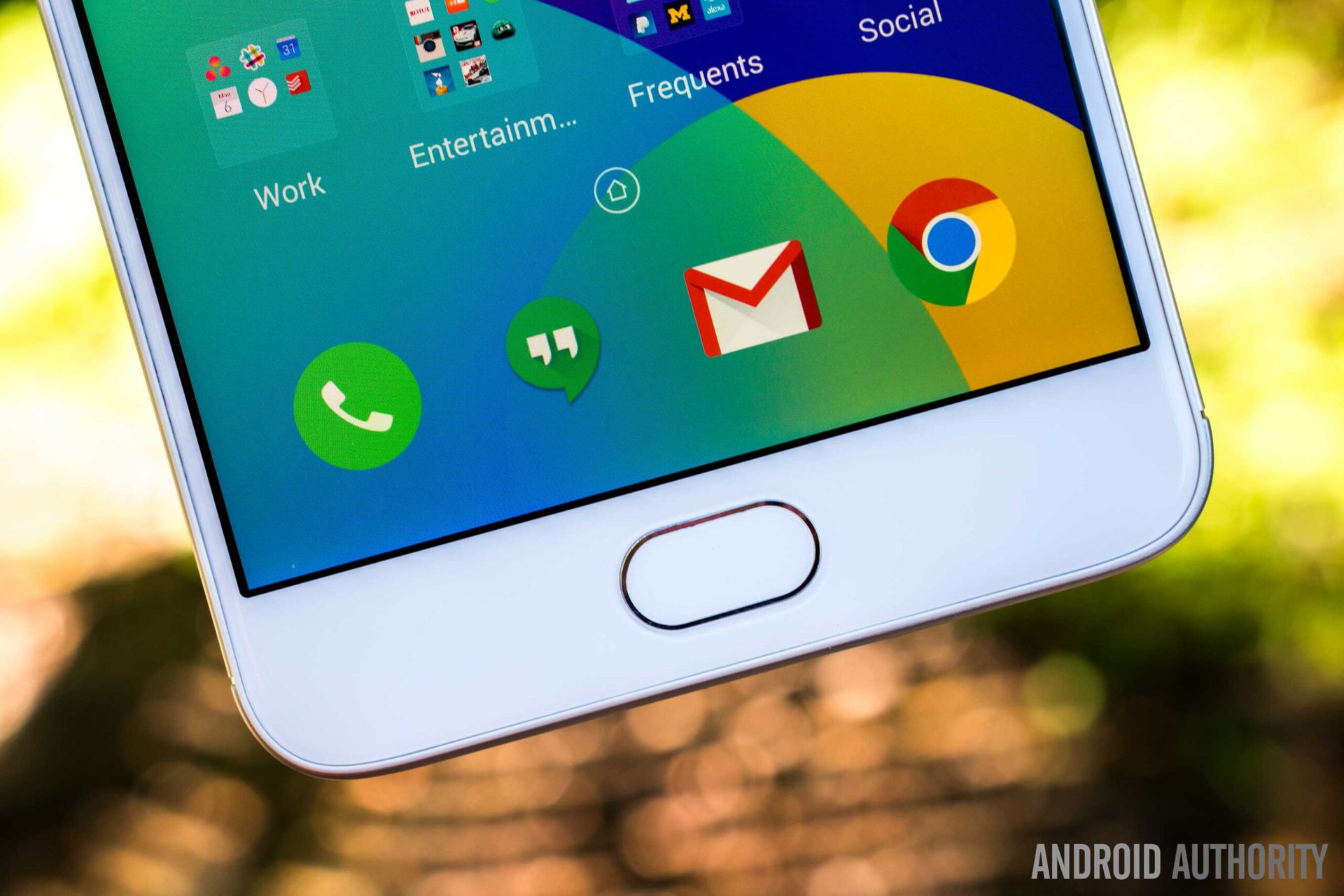
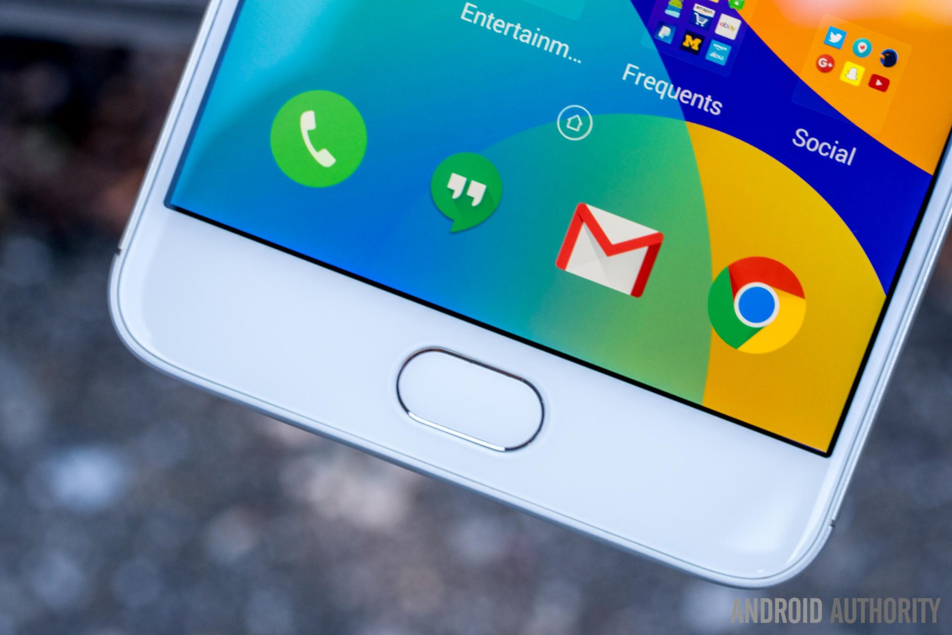
Instead of following the traditional three-button Android navigation key layout, Meizu has implemented a single button on the front of the m3 note. A press down on this physical button will take you home, whereas a tap will take you back. When wanting to switch apps, you can simply swipe up from either side of the physical button to access Flyme’s multitasking menu. In my opinion, this is a much more intuitive way to interact with your phone, even if it may take some time to get used to.
Some may consider the design to be too derivative for their liking
It is fair to say that the combination of the single physical button as well as several other design aspects makes the m3 note appear very similar to the iPhone. This is nothing new, however, as Meizu has long found inspiration in Apple products. One could argue, however, that for many end users, what matters most is how well the phone looks and feels in the hand, rather than how similar it appears to a competing smartphone. Still, some may consider the design to be too derivative for their liking.
Display
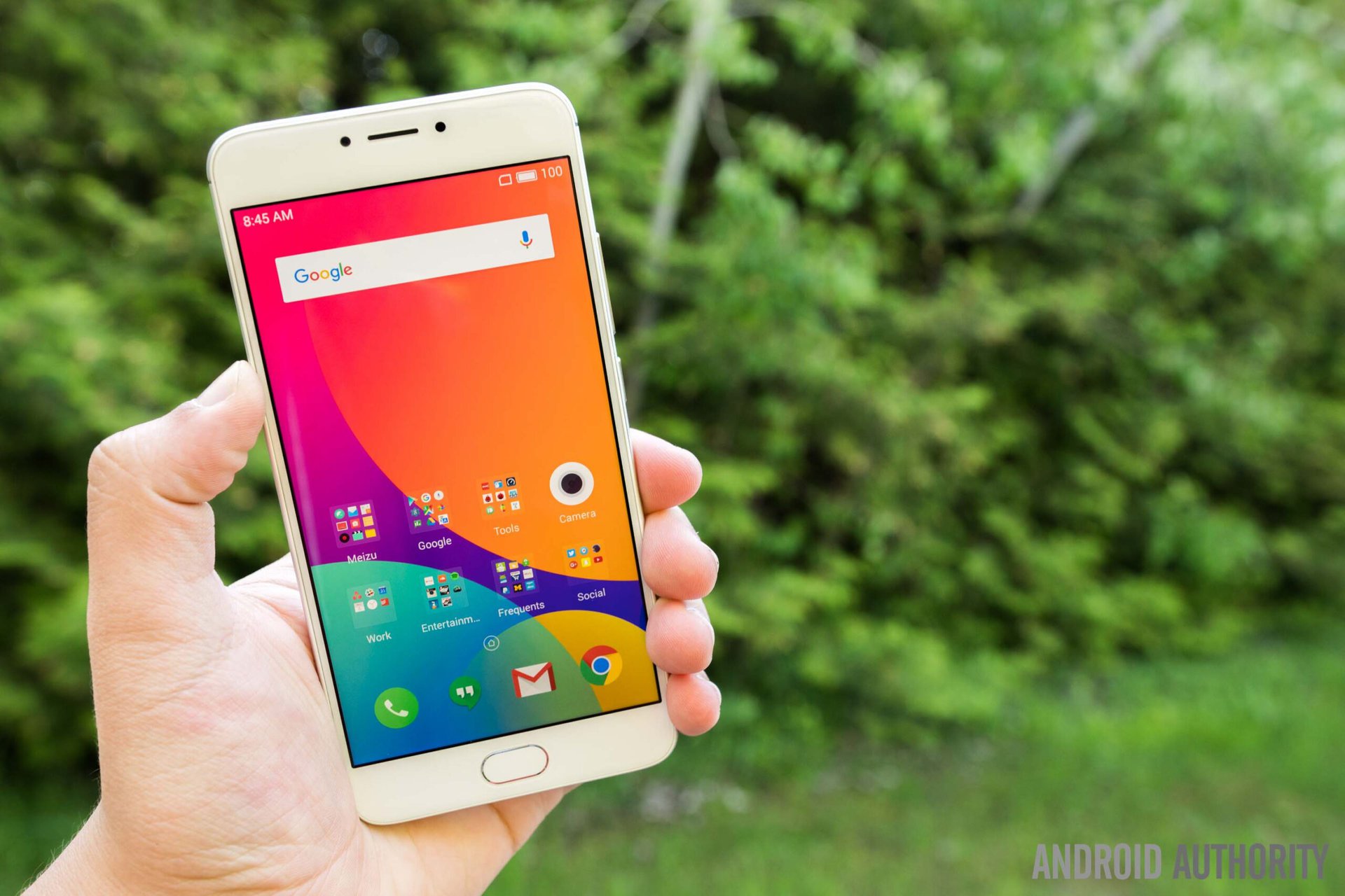
Better than the Redmi Note 3's display, but not quite on par with its predecessors
Sadly, Meizu has ditched the wonderful IGZO panels found on the m1 note and m2 note in favor of a more traditional, presumably less expensive panel. Although the m3 note retains both display size and resolution, at 5.5″ and 1080P, it lacks a bit of the vividness and saturation of the displays found on its predecessors.
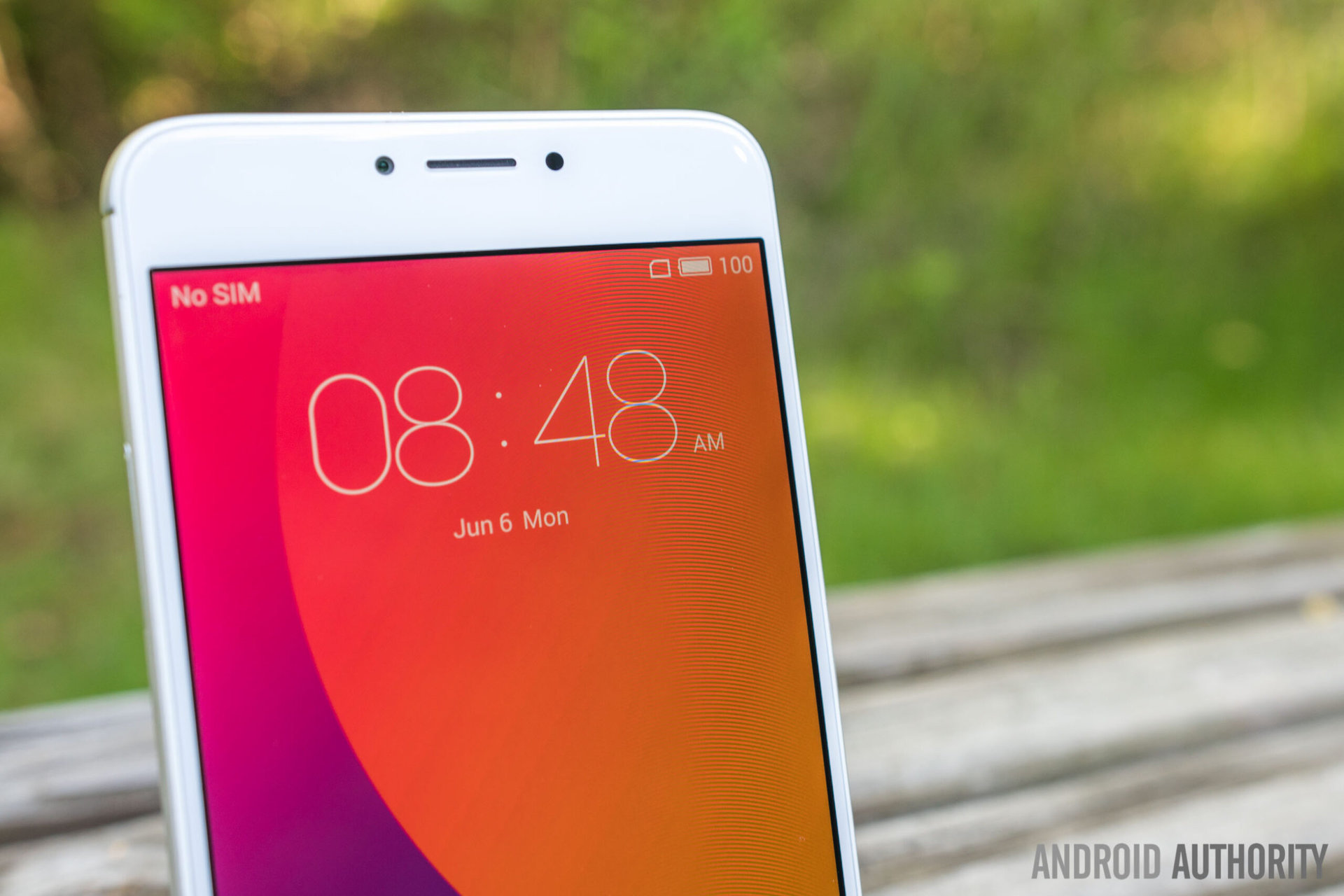
Despite this, the m3 note’s display is still better than most in this price category as it offers excellent viewing angles, good contrast, and the option to make slight adjustments to the color temperature. I found sunlight readability to be mediocre, however, and color reproduction could have definitely been better.
For scratch and shock resistance, the glass is coated with Dinorex T2X-1, which seemed to perform well as I did not notice any scratches on my unit after a few weeks of use.
Performance
While many manufacturers like Xiaomi have transitioned to using Qualcomm‘s mid-range processors in budget devices, Meizu has chosen to stick with MediaTek for the m3 note. That shouldn’t come as much of a surprise, however, given the current circumstances between the two.
With that said, the m3 note is using a MediaTek Helio P10, which could be considered comparable to the Qualcomm Snapdragon 617. Overall performance is still decent for the price, however; apps are sometimes noticeably slow while loading, but performance was otherwise fairly good.
You can purchase the m3 note with either 2 or 3 GB of memory. Light-to-moderate multi-taskers should be fine with the 2 GB model, but heavier multi-taskers may want to check out the 3 GB model.
Higher-end games like Asphalt 8 struggled with slow load times and very low frame rates
Unfortunately, gaming performance was very poor on the m3 note in my testing. Although the most popular casual games seemed to play fine, higher-end games like Asphalt 8 struggled with slow load times and very low frame rates, even in “performance mode.” It appears that the Mali T860 MP2 GPU simply isn’t enough to drive these titles. This is truly disappointing as even the m1 note had no trouble in this department.
Hardware
Since the m3 note is an unlocked dual-SIM smartphone, you can use two individual SIM cards simultaneously. If the phone’s 16 or 32 GB of storage isn’t enough and you are willing to give up one of the SIM card slots, you can expand the phone’s storage via microSD, up to 256 GB.
Call quality seemed to be mediocre in my testing
Although the m3 note fully supports 4G LTE in countries where it is officially sold, those living more peripatetic lifestyles may have trouble acquiring more than 3G or even 2G signals in some countries. In the United States, for example, the m3 note is limited to HSPA+ on AT&T and T-Mobile. Call quality seemed to be mediocre in my testing, and although my earpiece sounded fine, callers said that they sometimes had difficulty understanding me. Unless you make many calls, however, this is unlikely to be an issue.
Meizu has embedded a fingerprint reader in the physical home button, and I found it to be fairly fast and very accurate. It’s always great to see fingerprint readers, especially at this price, as they offer much more convenient security.
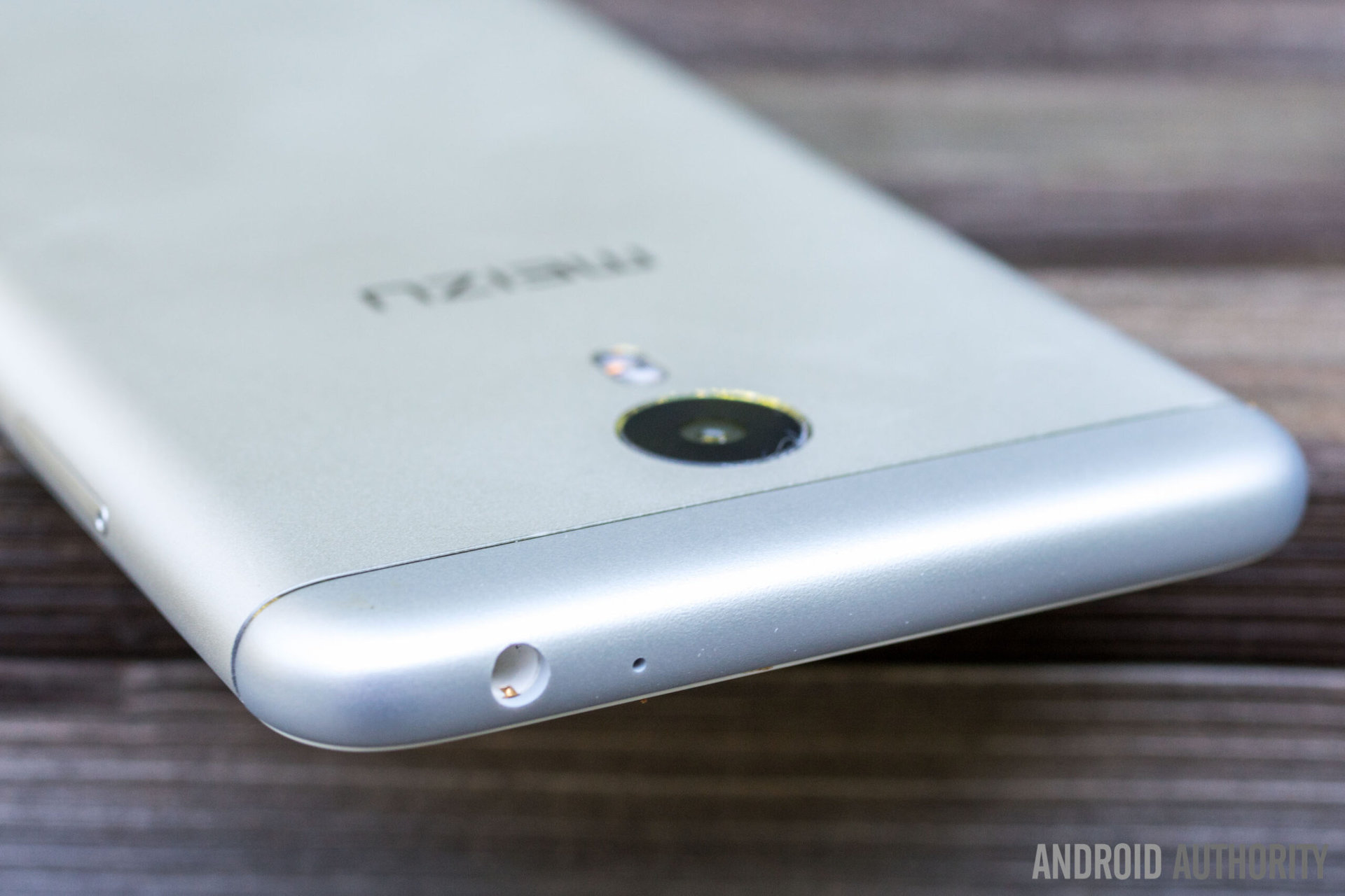
The m3 note is using the older non-reversible microUSB standard, and although it may disappoint those who have already made the switch to the growingly ubiquitous USB Type-C, it will likely appeal to those who do not wish to purchase brand new cables. It’s difficult to criticize Meizu here, as they have yet to make the transition for their budget smartphones.
The single side-firing speaker on the m3 note is reasonably loud, but moderately distorted, especially at higher volumes. It certainly does the job, but it’s not a step up from the m1 note nor the m2 note.
Battery Life
Thanks to its 4100mAh non-removable battery, the m3 note is able to provide excellent battery life. During my time with the device, I consistently achieved about five and a half hours of screen on time with twelve to twenty-seven hours of use. On one occasion, I used the phone for a day and a half, but still achieved a very respectable four and a half hours of screen on time.
Battery life on the m3 note is better than the vast majority of smartphones, including flagships like the Samsung Galaxy S7. This, of course, is very impressive considering the phone’s price.
Camera

The Meizu m3 note’s 13 MP rear camera offered average performance for the phone’s price. Sadly, captured images often lacked detail, were surprisingly soft, and lacked the dynamic range required for higher contrast scenes. Although the camera offers images with just the right amount of saturation and accurate color reproduction, excessive noise, regardless of lighting conditions, often distracted from the overall picture.
Meizu M3 Note camera samples:
The camera’s autofocus did not perform as well as I had hoped either, as it often seemed slow and sometimes refused to focus entirely. Unfortunately, it seems that the m3 note does not offer much of an upgrade over the m2 note in the camera department. Although there have been some minor camera software improvements, the quality of the m3 note’s camera seems to be very similar to that of the m2 note.
Software
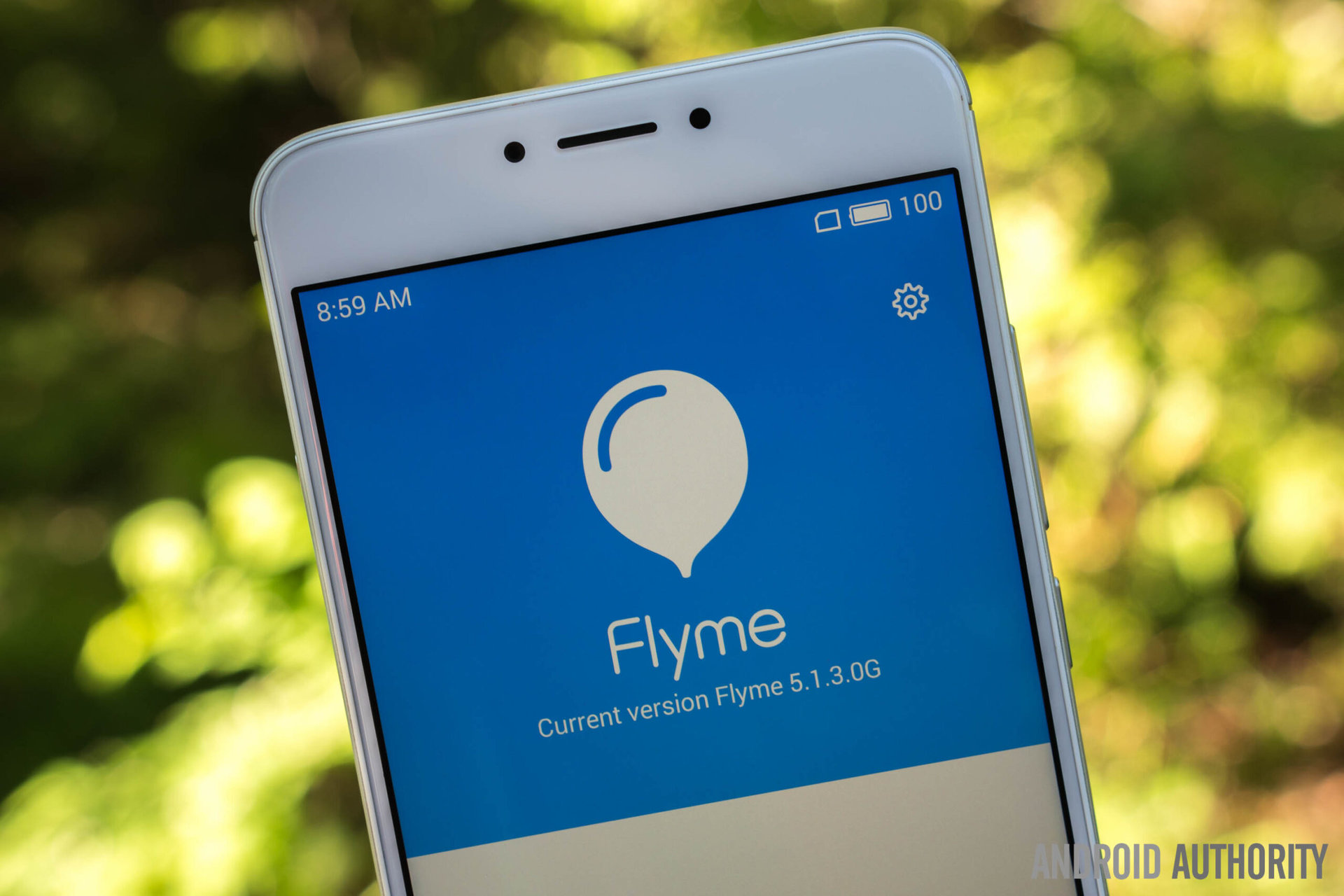
Out of the box, the Meizu m3 note runs Meizu’s custom Flyme 5 OS, over Android 5.1 Lollipop. It would have been nice to see Android 6.0 Marshmallow, as it has been out for nearly a year now, but Flyme does do a nice job at substituting features like fingerprint reader support.
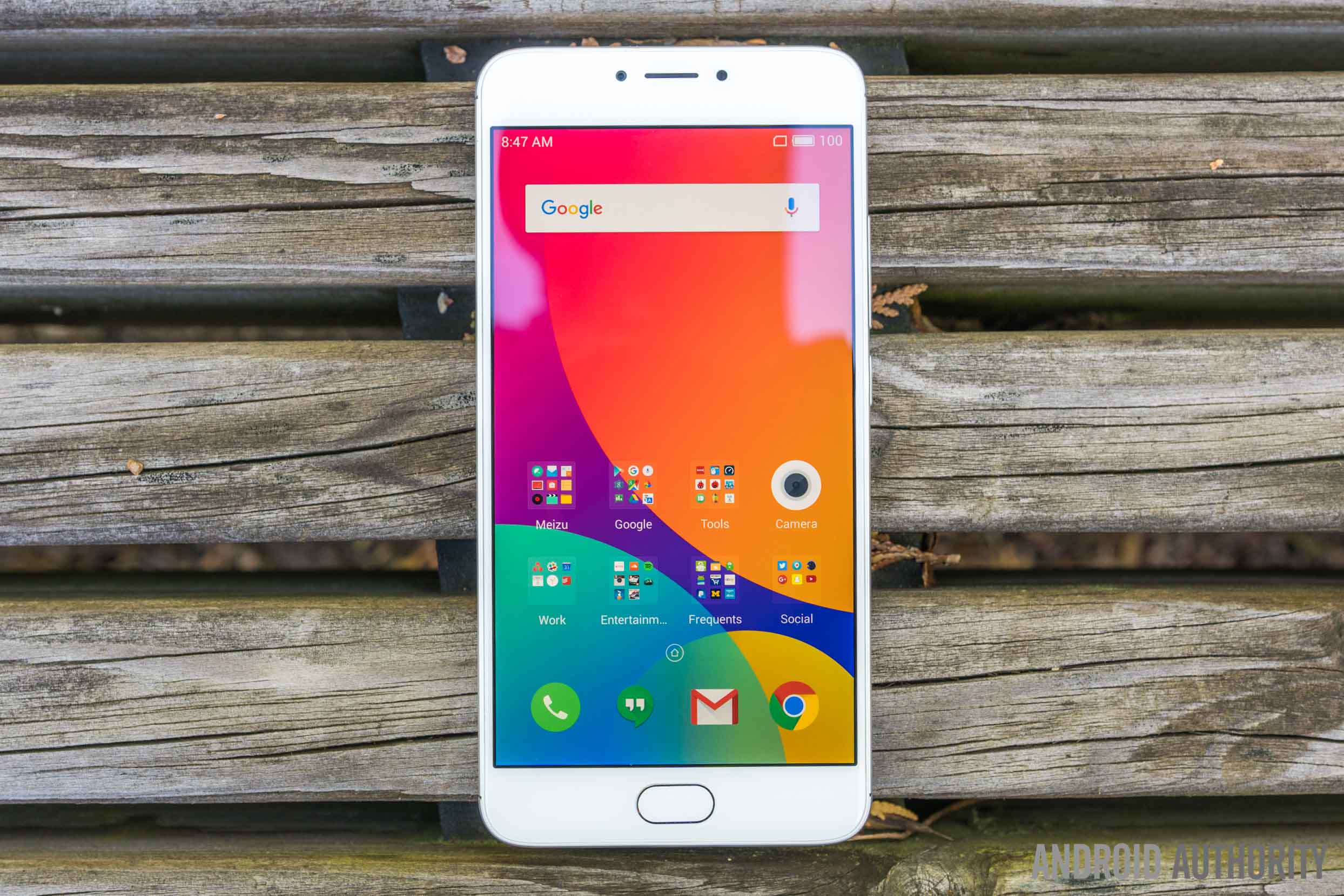
Overall, Flyme is dramatically different from stock Android, and it’s probably fair to view it as a glorified spinoff of iOS. With that said, Flyme is one of the most well refined and polished Android skins out there. Flyme 5 is easily Meizu’s best skin yet, and I was ecstatic to see small but major improvements like the addition of a settings shortcut in the notification panel (finally!) and a redesigned beautifully animated multitasking menu. My excitement extended to seemingly previously established stock apps as well, thanks to Meizu’s excellent design and implementations.
I really enjoyed my time with Flyme 5
Despite its departure from stock Android, I really enjoyed my time with Flyme 5 and feel that this is one of the m3 note’s best aspects. Users can also look forward to future updates, which are sure to only improve the experience further. While Flyme 5 won’t be to everyone’s tastes, it is easy to get accustomed to and once you’re used to it, it’s a pleasure to use.
Gallery
Price & Conclusion
The Meizu m3 note is available in China starting at 799 RMB (≈$120) and can be imported from third-party resellers for about $200. In India, the pricing is comparatively a bit higher at 9,999 Rupees (≈$150). The base model includes 16 GB of storage and 2 GB of RAM, but another model with 32 GB of storage and 3 GB of RAM is also available. Each model is available in multiple color options, depending on the region.
The Meizu m3 note packs a very large punch for its price with its premium design, excellent battery life, and exceptional software experience. However, its lack of U.S. availability, poor gaming performance, and unimpressive camera do not help the m3 note stand out. And now that Flyme 5 is available on Meizu’s older hardware, there’s nothing particularly compelling about the m3 note. With the exception of its new design and fingerprint reader, the m3 note simply does not improve on what was already established with the Meizu m2 note.
More Meizu Coverage:
If you’re okay without a metal design and fingerprint reader, the Meizu m2 note is likely the best fit for you, if you can get it for a bit less than the m3 note. Otherwise, the Meizu MX5 is also still a great option, for a bit more. With the MX5, you’ll be getting a much better display, better performance, and a better camera. If you’re willing to venture outside of Meizu’s turf, the slightly better Xiaomi Redmi Note 3 is also a great alternative to the m3 note, and is sold at the same price in India.
We want to know, do you think Meizu’s approach to this update was too passive? Would you actually buy an m3 note over an m2 note, just for the refreshed design and fingerprint reader? Let us know in the comment section below!