Affiliate links on Android Authority may earn us a commission. Learn more.
Meizu MX4 Pro Unboxing and First Impressions
December 15, 2014
There are a growing number of companies in markets such as China and India that are increasingly giving the big names in the world of Android a run for their money. Their lack of penetration in western markets is also slowly changing, with these OEMs making a bigger push towards a more global presence, with devices that go head to head with the latest and greatest, while featuring more affordable price points. One such company is Meizu, that apart from its flagship smartphone, has a great high-end large form factor device on offer as well. Before diving into a full review, today, we’ll be taking a look at the unboxing, and giving you our first impressions about the Meizu MX4 Pro!
Unboxing
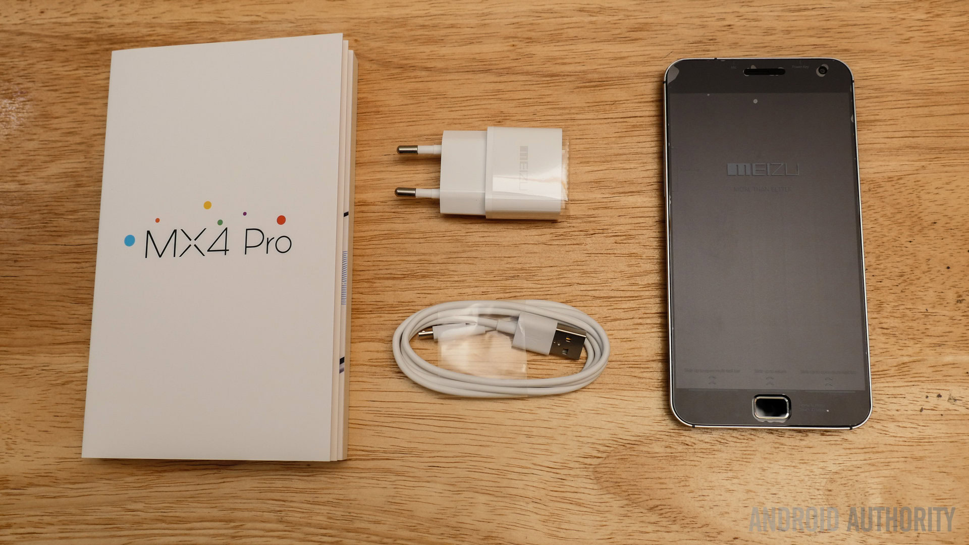
If you’ve watched the unboxing videos of any of the previous Meizu devices, what you get in terms of the packaging and content is pretty much identical. Opening up the white box shows you the USB wall charging adapter, and the booklet that houses the device itself. In the booklet is also some key user guides and other documentation. A slot under the booklet is where the microUSB cable is, and while there is another slot that will likely hold earphones, it was empty in the case of this review unit.

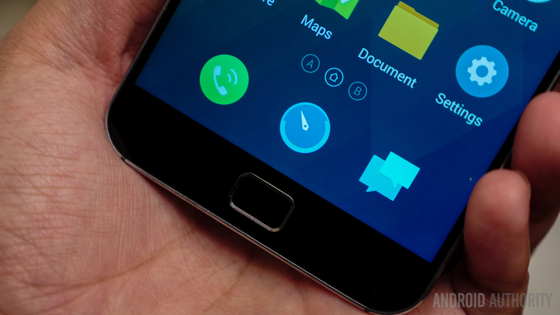
Opening the booklet shows you the device in all its glory, with the plastic covering the screen also including information on some of the various features available on this device. Unlike its smaller sibling, the Meizu MX4, that comes with a capacitive home button, the Pro iteration features with a physical home button with an integrated fingerprint scanner.
You might like: Best Meizu MX4 Pro cases & covers
First Impressions
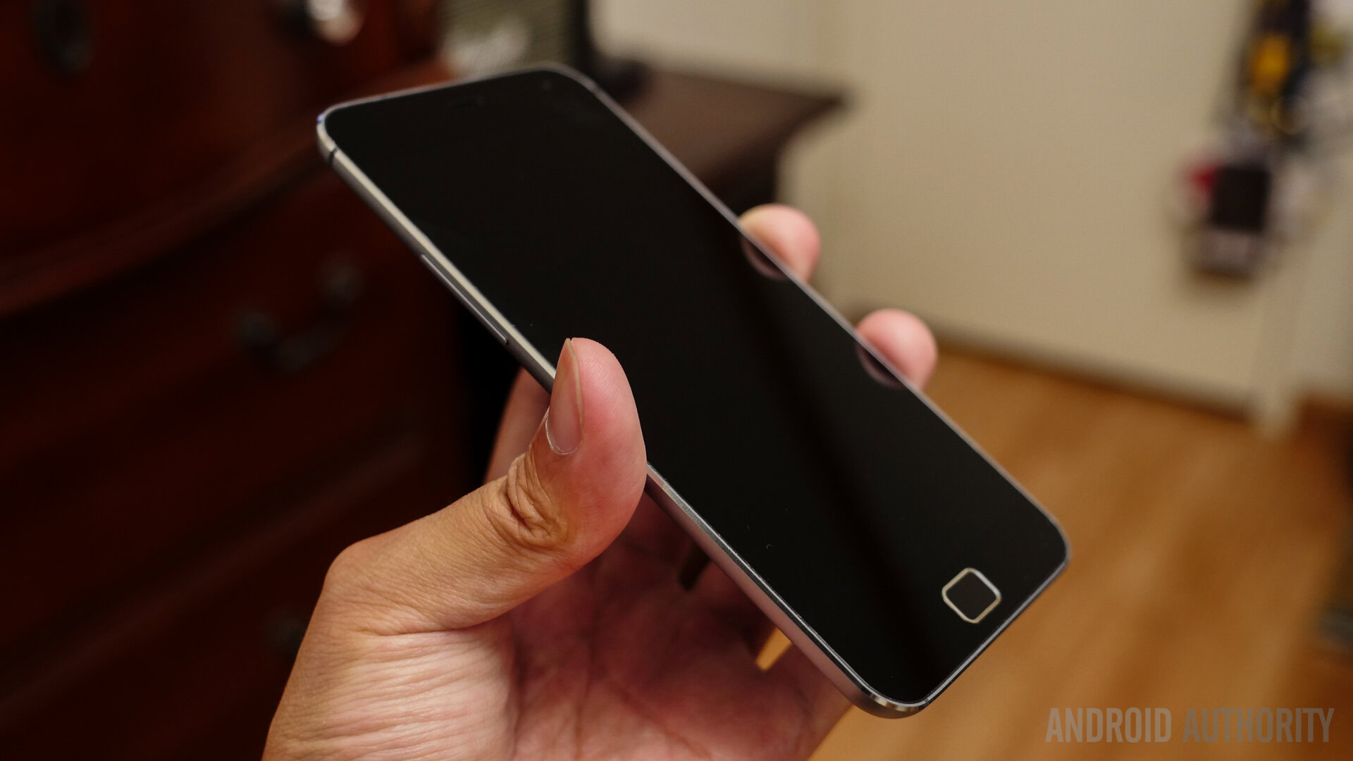
In terms of design, the Meizu MX4 Pro is basically a larger version of the flagship MX4, with a design language that will remind you of the iPhone 3GS. A metal frame combined with a curved back allows for a great feel in the hand despite its larger footprint. Going around the device, the volume rocker is found on the left side, the power button up top, along with the microUSB port and a speaker at the bottom. While some might question the inspiration from Apple and Samsung, especially because of the tactile home button up front, there’s no denying that the MX4 Pro looks and feels great.
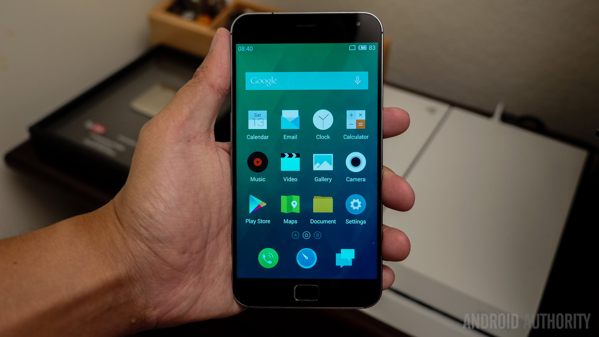
Powering up the device takes you directly into the homescreens, with almost no setup required, which already quite crowded with a slew of pre-installed applications and widgets. Without the presence of an application drawer, you are limited to using folders to stay organized and keep the user interface clean.
The notification drop down comes with a Quick Settings menu, that can be further extended to access the full list. What makes the Flyme OS a little different are its unique navigation properties. Apart from the physical home button, all you have to do is swipe up from the bottom of the display to open the Recent Apps bar, and while in an application, a set of software keys, including a menu button, show up to help navigation within an app.
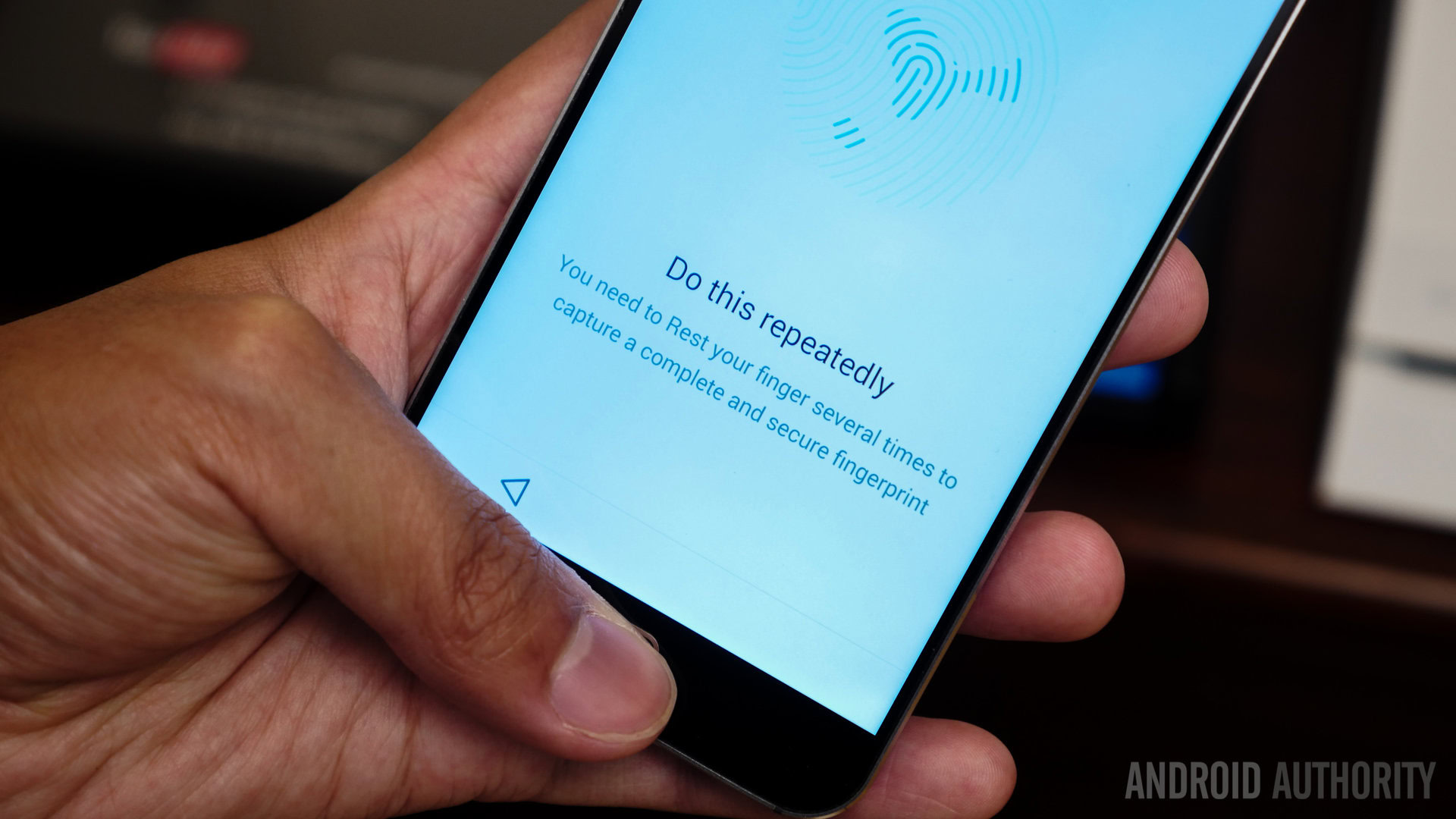
As mentioned, the home button comes with an integrated fingerprint scanner that can be used to unlock to device, and is also compatible with a few applications. The implementation of the scanner is quite similar to what we get with the OPPO N3, except for its placement. All you have to do is hold you finger on the scanner to unlock the device, even if it can’t be used to go straight to the homescreen, without first needing to press the power or home button.
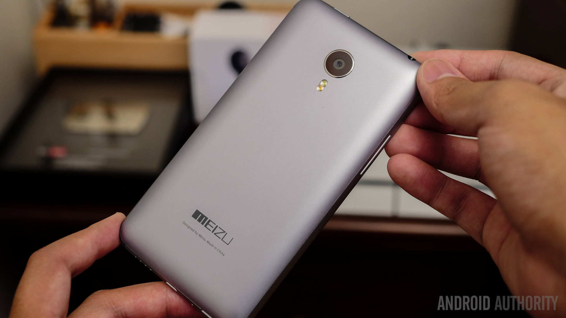
The Meizu MX4 Pro continues to add to the great design elements of the Meizu MX4 and the MX3 before it, with the standout feature being the ultra-thin bezels on the left and right side of the display. The thin bezels, along with the curved back, not only make the device look good, but feel great in the hand as well, despite boasting a larger 5.46-inch display.
We’ve already reviewed the Meizu MX4, and can’t wait to put its larger sibling through the ringer, so stay tuned with Android Authority for the upcoming review of the Meizu MX4 Pro!