Affiliate links on Android Authority may earn us a commission. Learn more.
Microsoft Launcher 6.0 impressions: Testing the Surface Duo's launcher
Published onJanuary 15, 2020

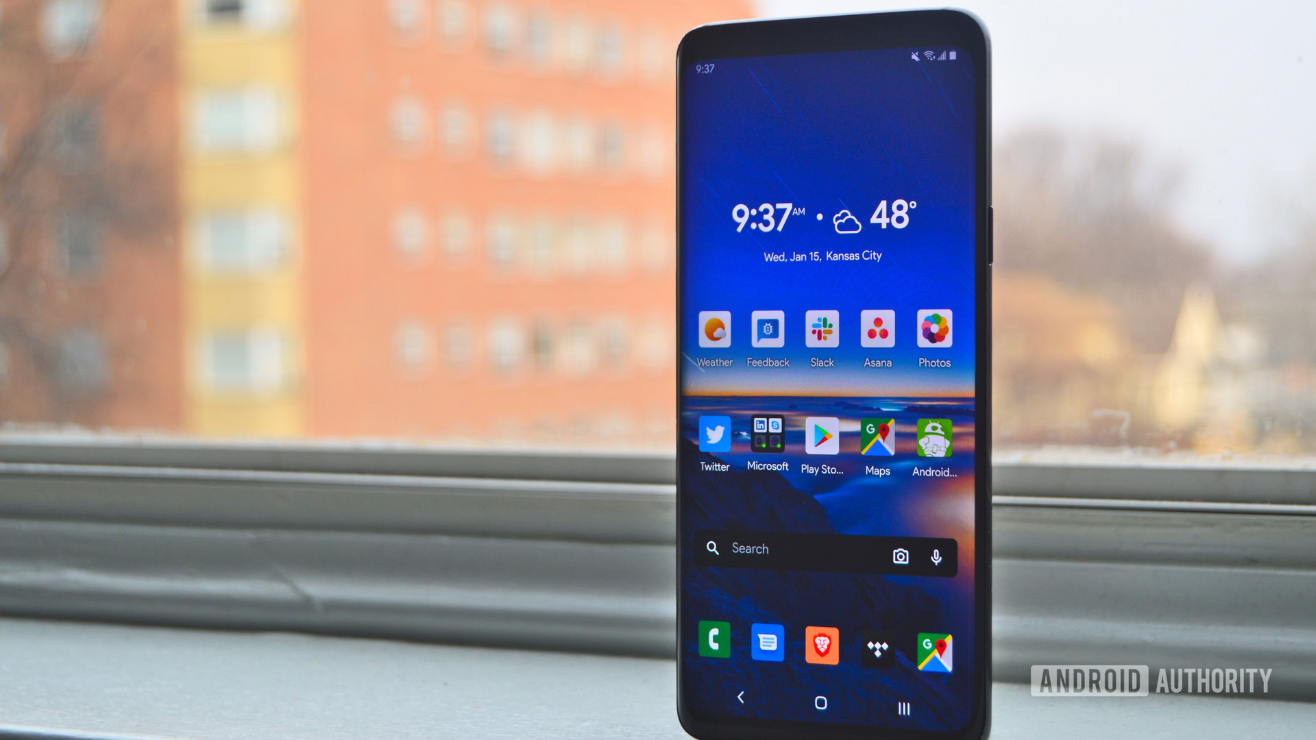
The Microsoft Launcher has been around for some time. Before it was rebranded as such in 2017, it was known as the Arrow Launcher. But a lot has changed since then, and with the impending Microsoft Surface Duo, the company has big plans for its launcher. So, now that the new and improved Microsoft Launcher 6.0 is available in the Play Store via an alpha preview, we thought we would take it out for a spin to see if it will be ready for the Duo.
Read also: Does anybody know what the Surface Duo is supposed to be?
Microsoft Launcher’s new look and feel

Some of the main changes Microsoft has made with the 6.0 launcher update include tweaks to the overall look and feel. The most dramatic come by way of the home page, introducing a more cohesive design language that’s more in line with Windows 10.
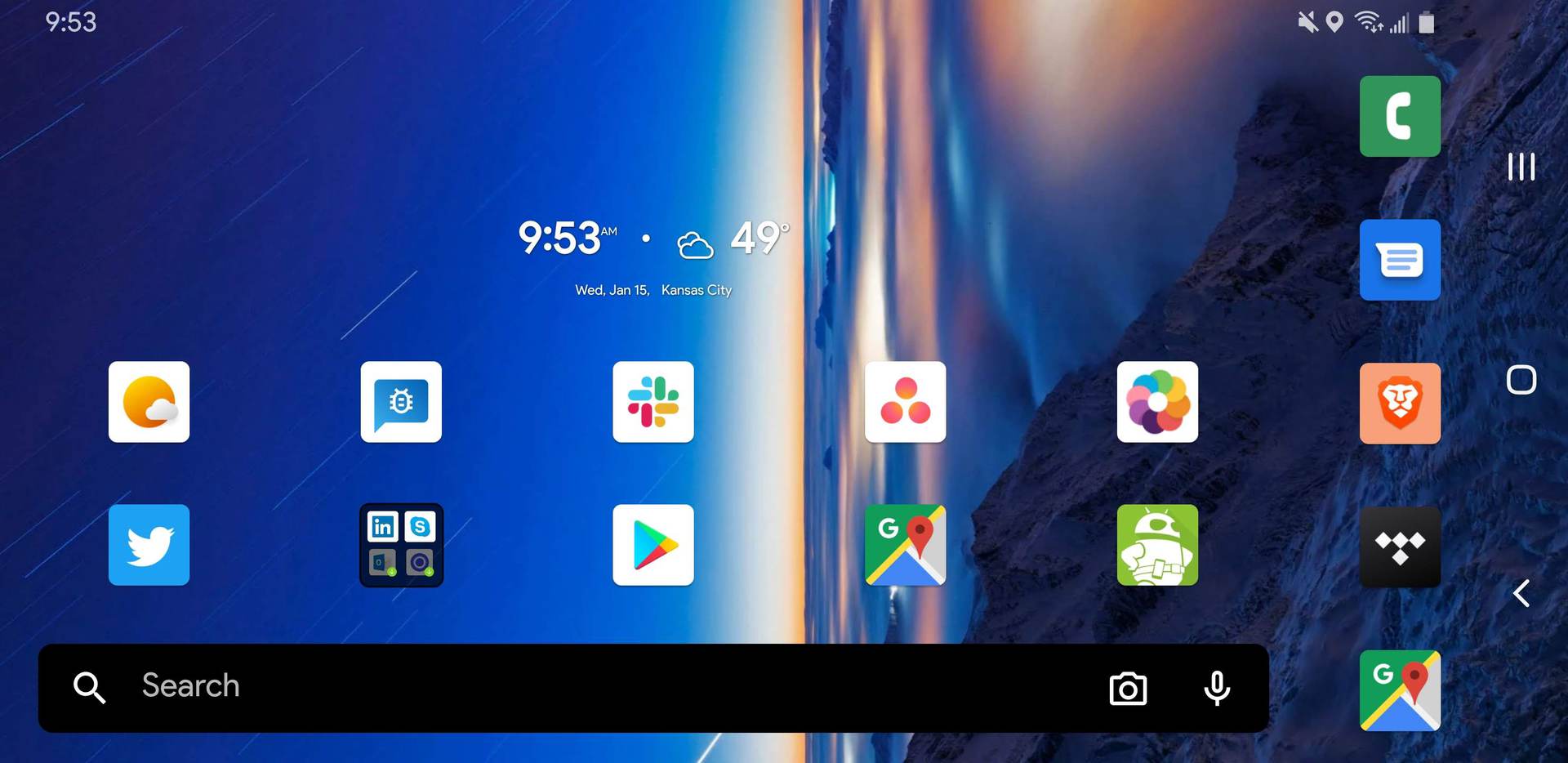
Firstly, Microsoft has implemented a new landscape mode that will rotate automatically, given the user has auto-rotate enabled. This is a feature a few other launchers may provide, but it hasn’t been available in Microsoft Launcher until now.
Related: 15 best Android launcher apps to make your home screen perfect
This new landscape mode could make for a better tablet experience. And with the Microsoft Surface Duo offering both tablet and standard smartphone form factors, this tweak should help users better take advantage of the device’s screen real estate.
There are a few other changes Microsoft has made that users will also find incredibly useful. One of which is new and enhanced dark and light modes. Both modes look great throughout the entire UI, and this revamp includes custom transparency blur effects and more overall spit and polish.
Some of the other UI tweaks include slightly more rectangular elements with rounded corners like the search bar, improved animation fluidity, and memory usage optimizations. We also get shortcuts to easily download any Microsoft apps, a Bing wallpaper which is updated daily, and several other settings that allow the user to tweak the launcher ’til their heart’s content.
There are a few hiccups here and there in the launcher’s overall performance, but it is currently in alpha, so that’s to be expected.
The new dock
Another tweak Microsoft has made in the 6.0 update changes how people will use the dock. Before 6.0, a swipe up from the dock gave users quick access to device settings toggles like Bluetooth, Wi-Fi, and airplane mode, as well as twice as many of their favorite apps than is typically available with a standard dock.
Now, users only have access to the second row of apps, and Microsoft has omitted the toggle panel. This feels like a regression on Microsoft’s part, but for all we know, it could be planning to reimplement the toggles before the launcher is finished.
Read also: Make/receive calls from your PC with the Your Phone app, now available to all
There are also a few general UI tweaks to the dock and app drawer in this latest update. These include the updated transparency blur effects, the removal of the app drawer button, a slightly bigger and more prominent design, and more fluid animations.
Not everything with the dock has changed in Microsoft Launcher 6.0, though. In recent versions of Android, users typically access their device’s app drawer with a swipe up from the bottom of the home screen. Though that’s true with Microsoft Launcher, users will still need to do so further above the dock than they are accustomed to as not to expand its second row, meaning your muscle memory may need some retraining.
Microsoft Launcher’s Google Now alternative
The left-hand Google Now screen has always been one of the shining features of stock Android setups. In recent years, launchers and OEMs have included Google Now into their launchers, while others have developed substitutes.
OnePlus is a prime example here, offering its own alternative called Shelf. Microsoft Launcher is also a Google Now replacement offender, but like OnePlus, its implementation isn’t bad.
Related: Here are the best Microsoft Surface laptops and tablets
As far as functionality is concerned, not much has changed in Microsoft Launcher 6.0. With a swipe right, users still get access to Microsoft’s Glance, News, and Timeline pages, which offer quick access to current events, tasks, appointments, and even sticky notes that are all easily integrated with Windows PCs. Where this section has really changed is in its design.
Like the rest of Microsoft Launcher’s updated design elements, the search bars and info cards see an updated boxy redesign with rounded corners, the new transparency effects, and an overall cleaner presentation. This Microsoft Launcher Glance redesign embraces the Windows 10 aesthetic significantly more than before, making its desktop integration both more visually and functionally seamless.
Right now, Microsoft Launcher 6.0 is in alpha via the launcher’s preview app, meaning it isn’t quite finished yet. Plus, Microsoft has quite a while to iron out any wrinkles before the Surface Duo lands later this year. Regardless, Microsoft’s take on the Android home screen offers quite a few usability and UI enhancements over the competition. From what we can tell, the app’s future is genuinely promising, but we will have to see its implementation on the Surface Duo before we give it a final verdict.