Affiliate links on Android Authority may earn us a commission. Learn more.
Motorola Moto 360 (2nd Gen.) unboxing and initial setup
September 21, 2015

Motorola just recently took the wraps off its second-generation Moto 360 at IFA 2015, and we already got the chance to go hands-on with the wearable. Our review unit has landed on our doorstep, and we’re not planning on wasting any time getting this device set up. We’ll of course bring you a full review in relatively short order, but for now, here’s our unboxing of the Motorola Moto 360 (2nd Gen.).
![11_Mot_360_StyleSport_Combo_0116_LftWtchMtl_V5_RGB[5][3]](https://www.androidauthority.com/wp-content/uploads/2015/09/11_Mot_360_StyleSport_Combo_0116_LftWtchMtl_V5_RGB53.jpg)
Unboxing
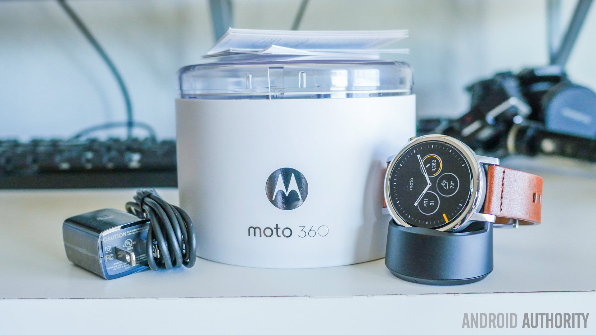
Motorola is yet again sticking with the cylindrical packaging for the Moto 360, but this time the device comes in a clear plastic case, giving you a good look at your new wearable. After taking off the tape and removing the top portion of the packaging, the Moto 360 is shown off in all its glory.
It’s easy to see that the second-generation Moto 360 is much more premium than last year’s iteration, thanks to its metallic case and new lugs. The device itself is very easy to remove from the packaging. Underneath the Moto 360 you’ll find some standard documentation, the wireless charging dock and a MicroUSB cable. It should be noted that the charger that came with last year’s Moto 360 isn’t compatible with this year’s device, which is unfortunate. Overall, though, we’re still really happy with the design of the charging cradle. Not only is this the easiest way to charge any smartwatch out there, the charger also allows the Moto 360 to act as a little bedside clock when it charges.
Oddly enough, the MicroUSB cable that comes in the box can’t be removed from the plug adapter, which is definitely an odd move. It could be more cost effective for Motorola to manufacturer the charging docks this way, but we aren’t entirely sure. The wireless charger still uses MicroUSB, though, so you should be able to use any other charging cord that you wish.
Initial setup
The setup process is actually pretty easy. We didn’t really run into many issues when pairing the Moto 360 with our Samsung Galaxy Note 3. It did take a little while to sync applications from the phone to the watch, so you’ll want to be patient when it comes to this step.
After the pairing process was complete, we took a look around the Moto 360’s hardware. The heart rate sensor is still present on this year’s device, and so is the premium-feeling Horween leather watch strap. This time around you can customize the Moto 360 via Moto Maker, which makes it easy to mix and match straps and different colored casings to suit your needs.
Motorola has also made available a 42mm option, which is a bit smaller than our 46mm variant. The 42mm model is better suited for those with smaller wrists, and there’s even a “women’s edition” Moto 360 which also comes in at 42mm. Other than the size difference, the “women’s line” is simply used to designate different styles of watch straps.
All versions of the Moto 360 (2nd Gen.) come with a 1.2GHz Qualcomm Snapdragon 400 processor, 512MB of RAM and 4GB of on-board storage. The 46mm variant comes with a 1.56-inch LCD display with 360 x 330 resolution, while the 42mm versions come with a 1.37-inch LCD display with 360 x 325 resolution. Both sizes come with Gorilla Glass 3.
The big differences between the two generations of the Moto 360 come in the form of hardware, with the second-gen model sporting a power button that sits at the 2 o’clock position, rather than the 3 o’clock position. The new Moto 360 also comes with some redesigned lugs which will make changing out watch straps much easier.
Now looking to software, the Moto 360 isn’t much different from any other Android Wear watch on the market. You’ll still need to rely heavily on swiping between cards and menus. There are a good amount of custom watch faces, though, which can be customized through the Motorola Connect app on your phone. With the Connect app, you can change the colors of Motorola’s pre-installed watch faces, and even add/remove the date from each one if you choose.
So, there you have it – our unboxing and first impressions of the Moto 360 (2nd Gen.)! Motorola made some big improvements to the smartwatch this time around, and we’re excited to see how these changes play out as we spend more time with it. We’ll of course bring you a full review in the coming weeks, but for now, feel free to leave a comment below if you have any questions and/or thoughts.
Thank you for being part of our community. Read our Comment Policy before posting.