Affiliate links on Android Authority may earn us a commission. Learn more.
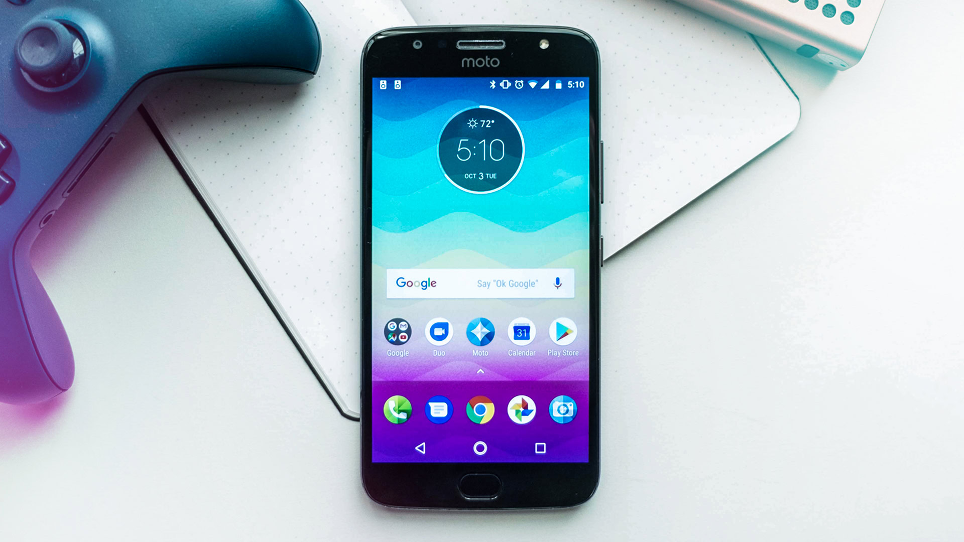
Moto G5S Plus review: this is a budget phone?
Published onOctober 11, 2017
Lenovo Moto G5S Plus
What we like
What we don't like
Our scores
Lenovo Moto G5S Plus
What exactly quantifies a budget smartphone? Is it a price point resting below a certain level? A lack of any flagship-level features? Or an outdated design compared to today’s standards?
The answer is different for almost everyone, but one thing is for certain: Lenovorola knows how to refine a design, generation after generation. This is the Moto G5S Plus review.
Design
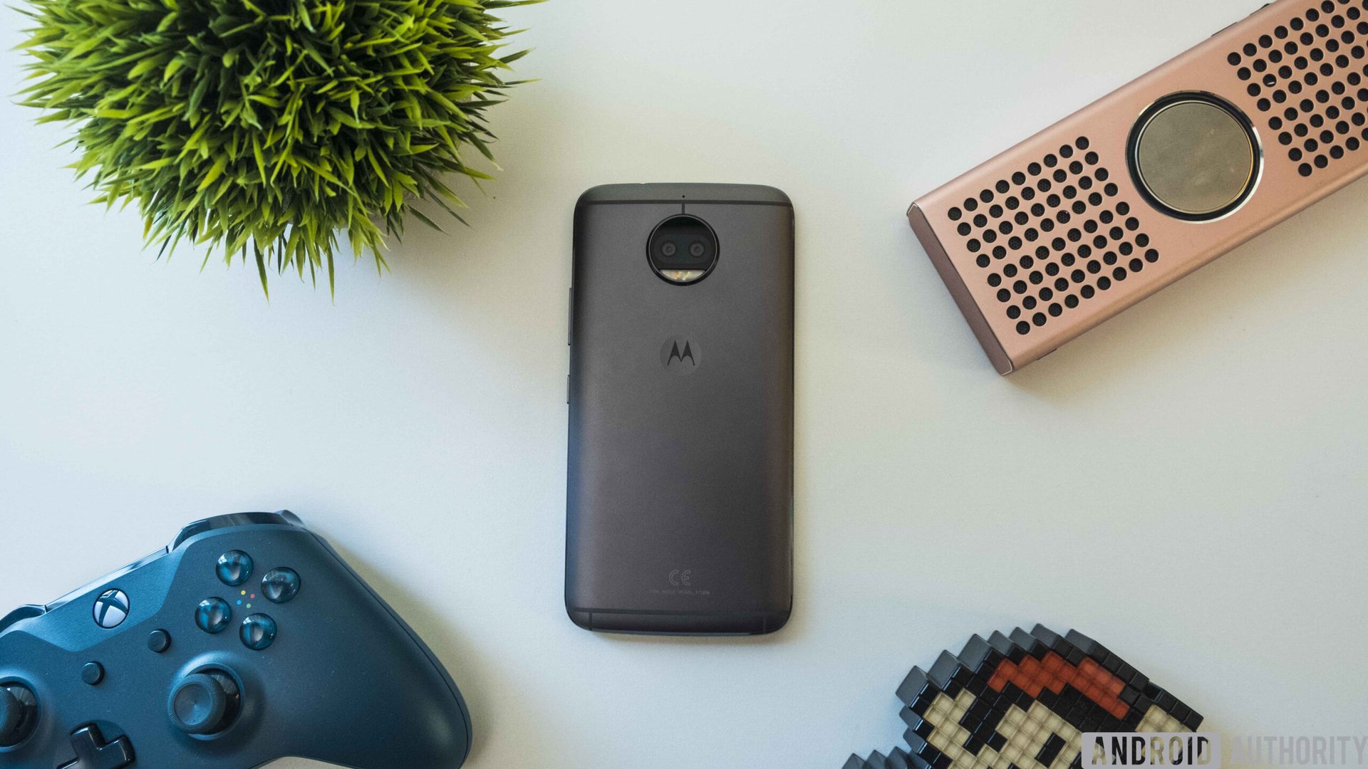
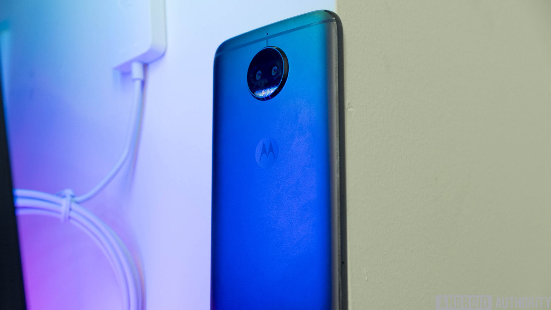
The Moto G5S Plus is definitely a step up from the Moto G5 Plus, which had a similar layout but felt like it was much more pieced-together than a solid chunk of metal whittled down into the shape of a handset.
The Moto G5S Plus really fits the profile for a solid modern-day smartphone
With a rounded all-metal design reminiscent of something like the OnePlus 5, the Moto G5S Plus really fits the profile for a solid modern-day smartphone. While the screen might be a bit large for some users at 5.5 inches, it feels like it adds to the media experience more than it detracts from usability.
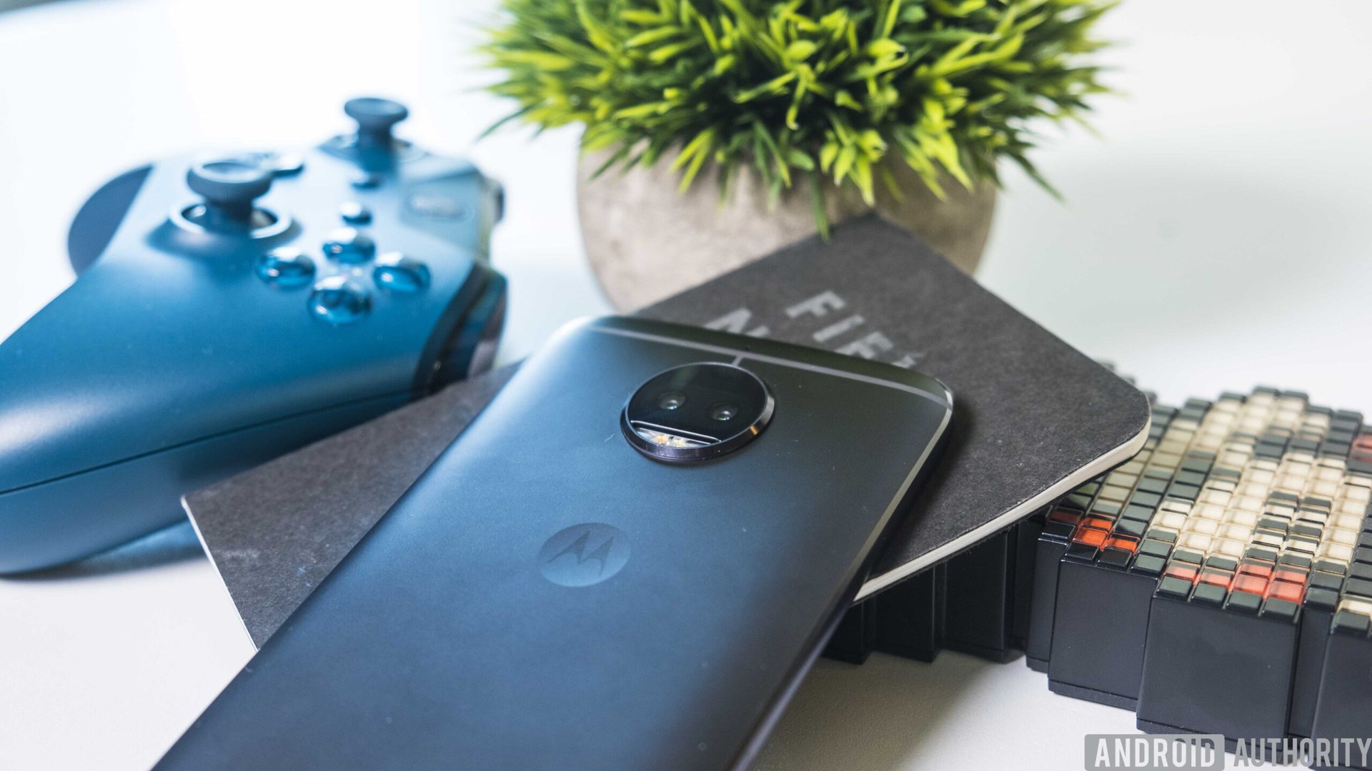
The Moto badge on the back of the phone becomes an indent yet again, which makes me nostalgic for the first generation Moto X. This aids in the overall feel of the device in your hand, since your index finger naturally lands in the general area of the dimple.
Above the dimple you’ll find the Moto camera bump that’s been present for the last couple of generations. This time, the company has actually managed to pack in two sensors, which brings the device up to date with many of today’s flagships.
I found the power and volume rockers to be exceptionally clicky and pronounced, sticking out a fair bit more than other options on the market. They jut out about twice as far as the Moto G5 Plus’ buttons, so it’s clear that the company took in user feedback and acted on it in the next revision. These buttons are also made of the same metallic alloy as the phone itself, so they feel very premium.
On the bottom edge you’ll find some a mono downward-firing speaker and a micro-USB port. The headphone jack – yes, it has one – sits on the top edge of the device. I personally like this placement, since I listen to a lot of podcasts while my phone is in my pocket.
The Moto G5S Plus is extremely fast to wake when you tap your finger to the reader
There is a fingerprint reader on the front of the phone and it is extremely fast. I don’t know if my Pixel XL has just become slower over the last year, but the Moto G5S Plus feels even faster to wake when you tap your finger to the reader. It’s also really sensitive. This became problematic a few times though, as the phone would sometimes wake while it was sitting in my pocket.
The only caveat I’ve had with the design of this device is that the metal rim seems to scratch and chip fairly easily. Over the week or so that I’ve had it I’ve noticed a number of scars appear on the trim, especially where the screen meets the exterior. While this isn’t a huge deal, it makes an otherwise premium-feeling device seem just a little less exceptional.
While the overall design of this device isn’t incredibly original, it’s still very good. I hope Moto continues to refine upon it for Moto G generations to come.
Display
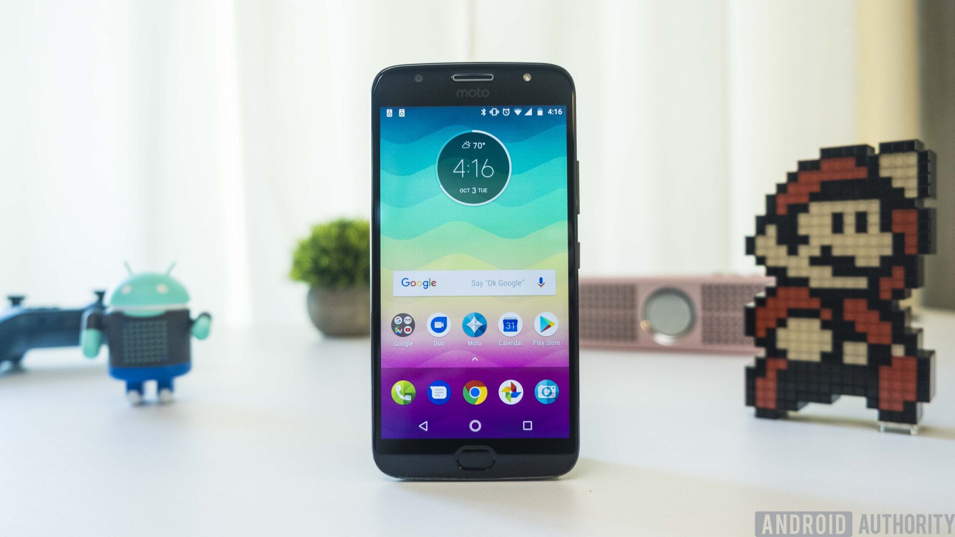
Despite its design, this is still a budget device. Because of that, Motorola included a Full HD 1080p display in this phone. Is that bad?
Not in the slightest.
I’ve said this before, but using 1080p displays in smartphones barely makes any difference at all in overall usability, and this is no exception. The 5.5-inch LCD panel does just fine in almost every circumstance, and 401 ppi is perfectly fine for most people.
The Moto G5S Plus’ display felt quite bright even at all-but minimal brightness, so I was still able to keep the device on the ultra-low end of the brightness scale while using it outdoors. Colors pop very nicely, and I never felt that I wanted something more punchy.
Sure, this phone doesn’t have the new bezel-less style like many flagships on the market today, but it feels like it uses up the space of the bezels quite well. There is a “moto” logo at the top that could probably be removed to make room for a bigger screen, but this has become an essential part of Lenovo’s branding, so I can understand why they kept it.
Performance & hardware
Surprisingly, Moto doesn’t really skimp that much when it comes to hardware and raw specifications, despite the Moto G5S Plus’ low starting price. The phone’s Qualcomm Snapdragon 625 does a more than a decent job for a majority of the things you’ll be using your phone for.
There are two versions sporting different amounts of RAM and internal storage. One packs 3 GB of RAM and 32 GB of internal storage for $229, while the heftier 4 GB / 64 GB model will cost an additional $70. I had the latter for this review. I’ve been very happy with the performance this option has been giving me, but I’m sure the baseline model would do just fine as well. Both models also have a micro-SD slot, so you can easily take all your music and other media with you when you upgrade.
The G5S Plus is packing a 3,000 mAh battery, which is about average for a device of this size, but pairs very, very well with the FHD display.
The handset lasted two entire days on one charge, which left me with a smile on my face at the end of it all
The handset lasted two entire days on one charge, which left me smiling. I unplugged it Sunday morning before heading out of the house, and the device died just as I arrived home Monday evening. I was able to snap a screenshot immediately before this though, and I came away with four hours and forty-three minutes of screen-on time. Pretty admirable.
The G5S Plus charges using the Micro-USB port at the bottom of the phone. It supports Moto’s TurboPower charging capabilities, so assuming you have the correct brick, you should be able to juice the phone up quite rapidly. While I would have loved to see a USB Type-C port here, this is just one of the compromises Moto had to make to keep the device at this price point.
The bottom-firing speakers get quite loud, though they lack bass. Moto’s default ringtones and alert sounds are also quite shrill and annoying, so you’ll want to keep this thing on vibrate or change the system sounds to something easier on the ears.
I was very disappointed to find that Motorola has not included an NFC chip in this phone. I use Android Pay every single day, and I was really confused when I went to pay for my groceries and nothing happened when I tapped the reader. This is a huge detriment for me, and we’ve seen how people react when small features like this are overlooked.
Overall the device has solid components. For $229-$300 it’s going to be tough to find such compelling features in 2017.
Camera(s)
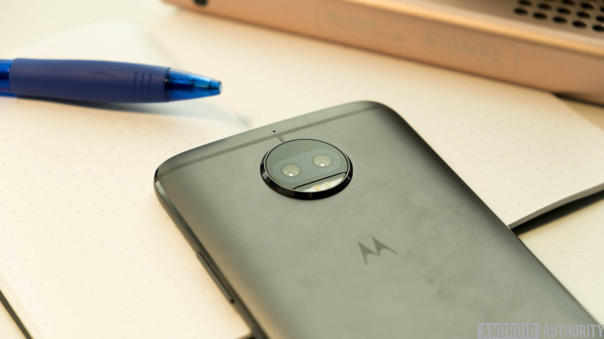
The Moto G5S Plus features a pair of dual-cameras, both with 13 MP sensors, and an 8 MP front-facing selfie camera. But as we’ve seen previously, sheer numbers don’t tell more than half the story of a camera’s actual quality and functionality.
The secondary camera on the G5S Plus only handles depth effects and it does it pretty badly. Images look very soft and lack detail when using this mode; so much so it’s not really worth using at all. There’s a slider to control the intensity of the depth effect, but honestly they’re all pretty bad. It worked best when used on a human subject, which I admit it was probably tuned for, but not all shots are portraits.
There's a slider to control the intensity of the depth effect, but honestly they're all pretty bad.
The live view shown when using the depth mode also makes the phone lag quite a lot. This is frustrating, because the dual cameras were obviously a standout marketing point. Even pressing the shutter button makes the phone freeze for a couple of seconds. Viewing the images later will initially show what the regular shot would have looked like for a few seconds before loading the depth of field effect.
The front-facing selfie camera does an alright job, though it definitely crushes blacks more than I would like. Just wearing a maroon colored shirt in normal indoor lighting had the camera showing it as barely colored at all, which is a big letdown for me. Highlights also get blown out very easily, and it makes it very hard to get an evenly lit shot.
The camera works, but you’re going to have to expand your budget quite a bit if you want a phone that you can also use as your primary shooter.
Software
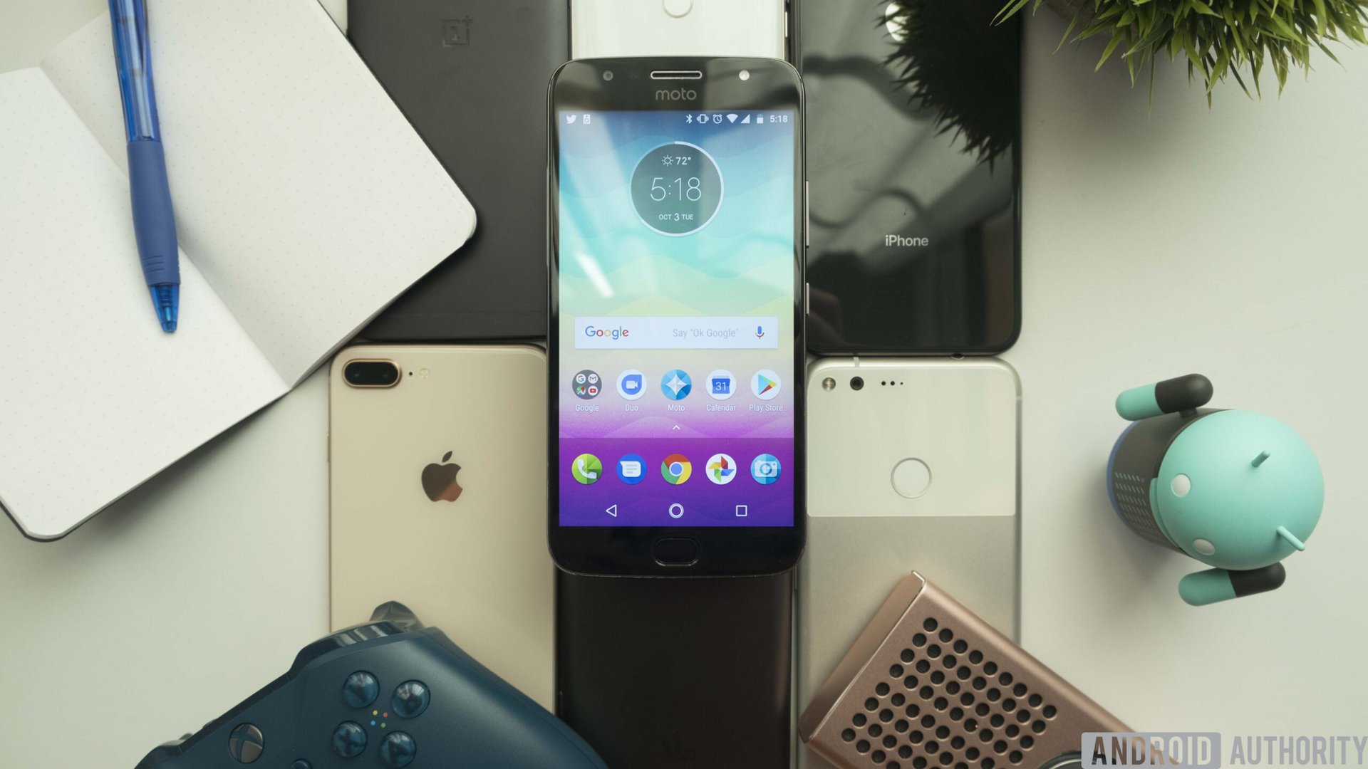
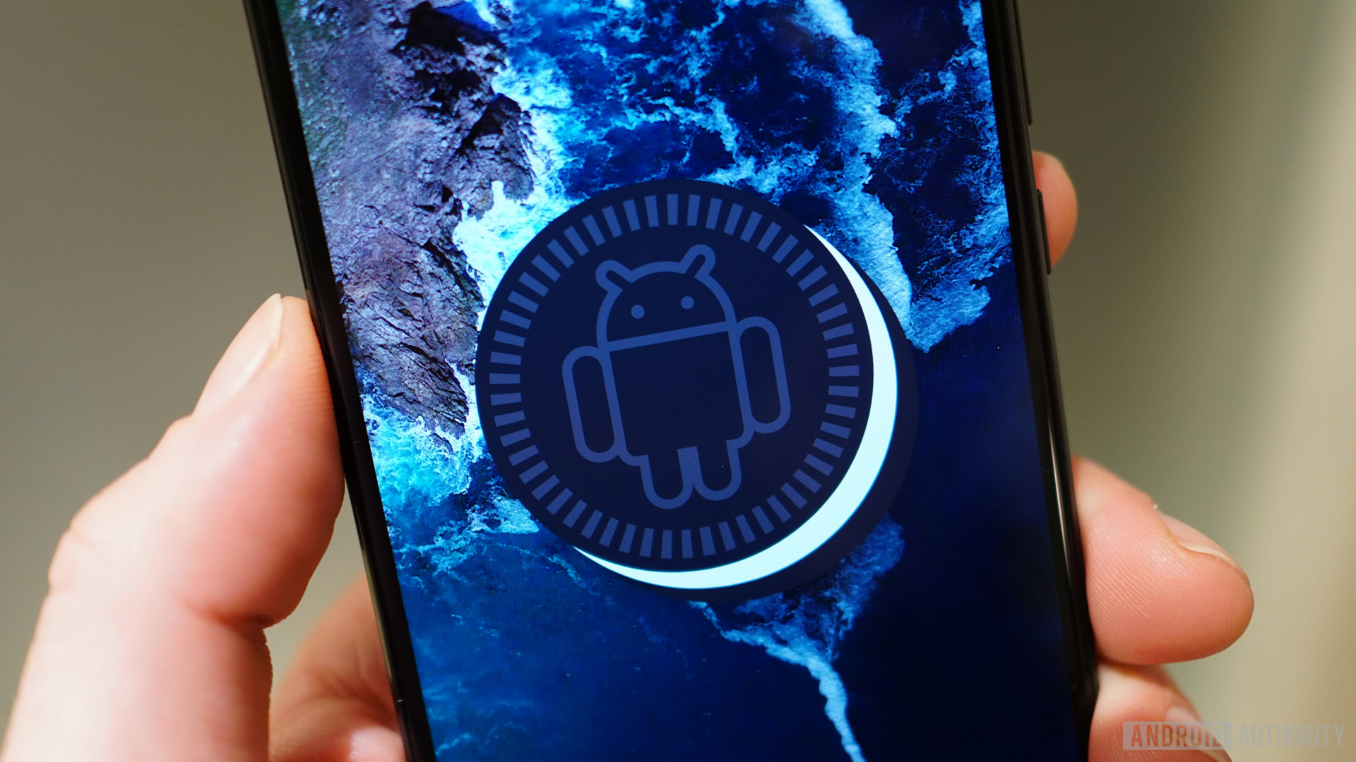
Navigating Motorola’s lightly skinned version of Android is a breeze on this device. It’s running Android 7.1 Nougat, and the company has even promised that owners will see Android Oreo in the coming months.
Motorola didn’t load this device with any bloatware (unless you consider Google apps bloatware ?♂️) except for an app simply called Moto. While I find most manufacturer gimmicks annoying and cumbersome, Motorola is the one company whose added functionality I always appreciate.
There are two subsections of the Moto app: Moto Actions and Moto Display. These offer a wide variety of gestures and actions that will make your Android experience a lot simpler to use. You’re also able to toggle features on and off as you please.
Moto Actions
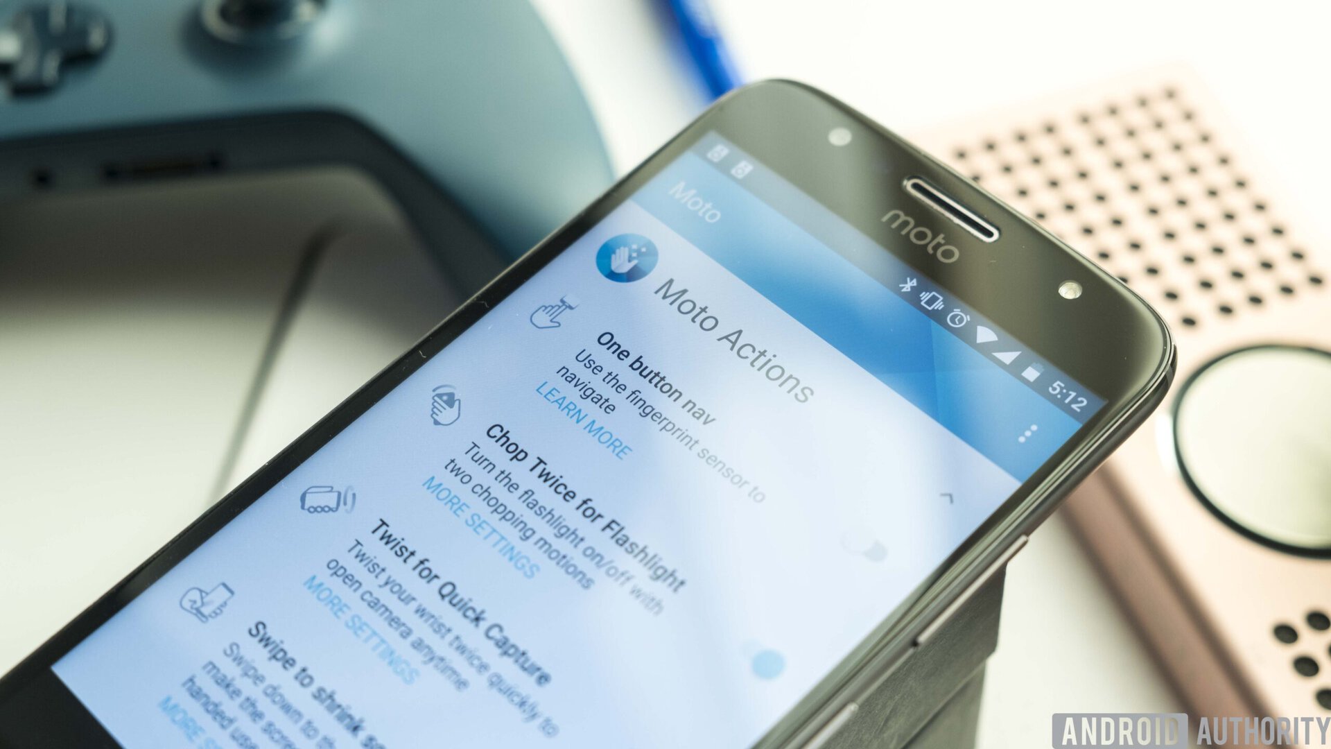
One button nav: Uses the fingerprint sensor as a home, sleep, back, and multitasking button, depending on the gesture.
Chop twice for flashlight: Allows you to toggle the flashlight on and off by making a “double chop” motion with the device.
Twist for quick capture: Allows you to quickly launch the camera by twisting your wrist in a rapid motion.
Swipe to shrink screen: Makes the screen smaller for easier one-handed use.
Pick up to stop ringing: Switches to vibrate when you lift the phone while it’s ringing.
Flip for Do Not Disturb: Allows you to silence all notifications and calls by placing the phone on its face.
Moto Display

Night Display: Reduces blue light during a set period to help you sleep better after using your device just before bed.
Moto Display: Displays actionable notifications for you to quickly launch and interact with while the phone is locked.
Nearly all of these features were immensely helpful, and some (like Moto Display) have even become baked into Android over the years.
There aren’t any other bloatware apps present on this device. FM Radio makes an appearance, but that is more of a bonus than a detriment, especially when most flagship devices on the market today have removed this functionality.
Specs
| Moto G5S Plus | |
|---|---|
Display | 5.5-inch IPS LCD 1920 x 1080 resolution 401ppi Gorilla Glass 3 |
Processor | 2.0 GHz octa-core Qualcomm Snapdragon 625 |
GPU | Adreno 506 |
RAM | 3/4 GB |
Storage | 32/64 GB microSD expansion up to 256 GB |
Cameras | Rear: Dual 13 MP sensors with an f/2 aperture Front: 8 MP sensor with an f/2 aperture |
Battery | 3,000 mAh Non-removable |
Connectivity | Wi-Fi 802.11n dual-band Bluetooth 4.2 MicroUSB 3.5mm headphone jack GPS+GLONASS NFC (not in the US) |
Software | Android 7.1 Nougat (Planned 8.0 update) |
Dimensions and weight | 153.5 x 76.2 x 8.0 mm 168 grams |
Gallery
Pricing & final thoughts
The Moto G5S Plus is an incredibly compelling piece of hardware. We crowned its younger sibling the Moto G5 Plus the king of budget back in April of this year, and this newer ‘S’ variant improves upon this model in every way.
For $229 you’re getting a modern day exterior, a lightning fast fingerprint reader, simplistic and compelling software with a guaranteed update to Google’s latest version, and even dual cameras (though we’ve seen much better). Qualcomm’s Snapdragon 625 performs admirably accompanied by the 3/4 GB RAM options, and storage shouldn’t be an issue due to the option for micro-SD expansion.
Coming in at just $10 more expensive than the G5 Plus, there really isn’t any reason not to pick up the G5S Plus. It looks and feels better in every way, and though the specs are very similar, you’re still getting more RAM and dual cameras with an improved body in the latter. What’s not to love?
The Moto G5S Plus might not be the most premium device in the world, but it is a pretty damn good phone. For the price, it’s hard to ask for much more.