Affiliate links on Android Authority may earn us a commission. Learn more.
Moto Z3 Play review: The value is still in the Moto Mods
Published onJuly 16, 2018
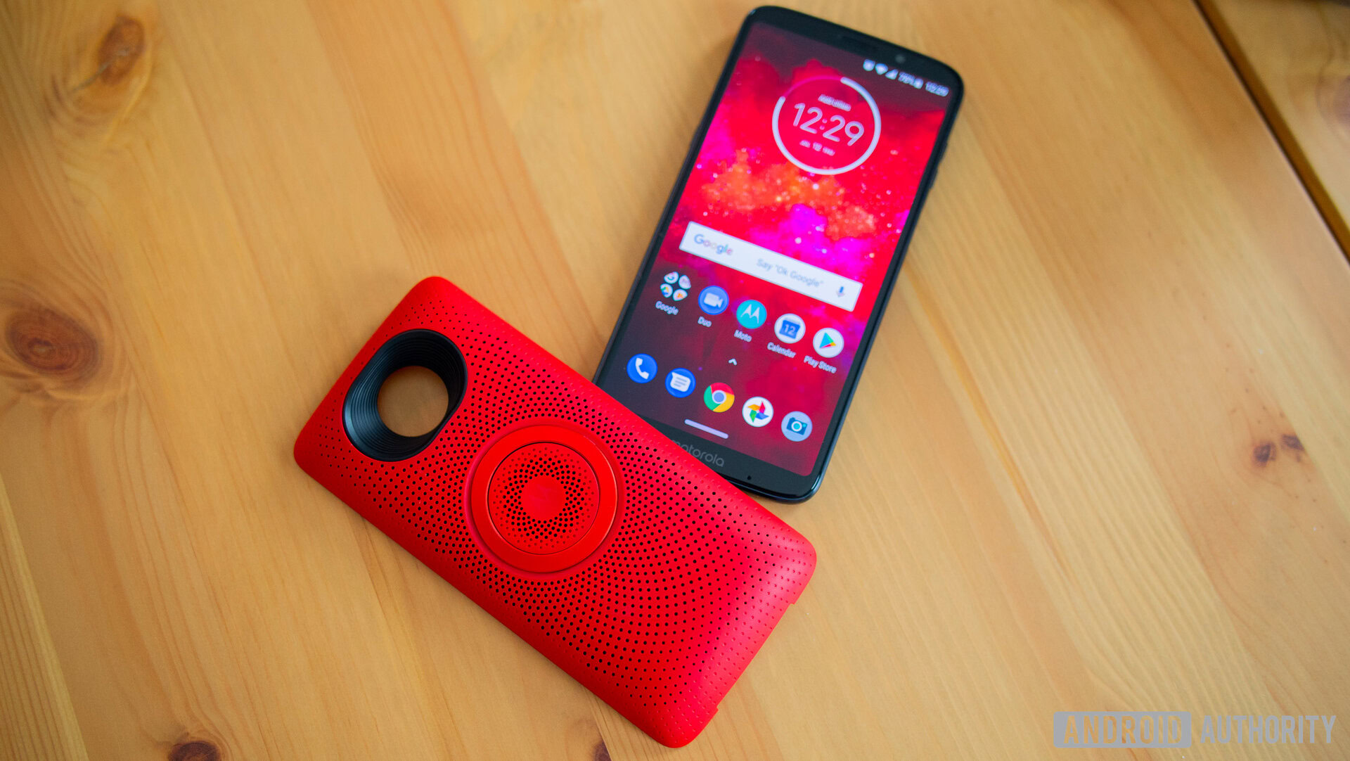
Motorola’s Moto Z Play series has always brought a great balance of modern features and specifications to an affordable price point. The brand new Moto Z3 Play is no exception, and brings some of the most significant changes to the Play line yet. Is it a worthy upgrade to last year’s model? Find out in our Moto Z3 Play review.
Read Next: Moto E5 Play and Moto E5 Plus review: All good things come to an end
| Pros: | Cons: |
|
|
Design

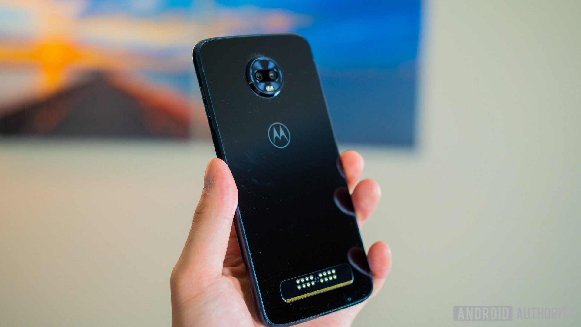
The Moto Z3 Play’s design shouldn’t be too surprising to anyone. It retains the same overall shape and footprint as the previous Moto Z devices, which is necessary to maintain compatibility with the Moto Mods.
The Moto Z3 Play works with all 14 current Moto Mods, and all Moto Z3 Play’s will come bundled with a free Moto Mod.
The Z3 Play’s main design differences come down to its new, mostly glass body and sleeker profile. As with most smartphones nowadays, the Z3 Play has a glass front and back, with a metal frame wrapping around the sides. The construction is sturdy and feels great, but it doesn’t stand out much.
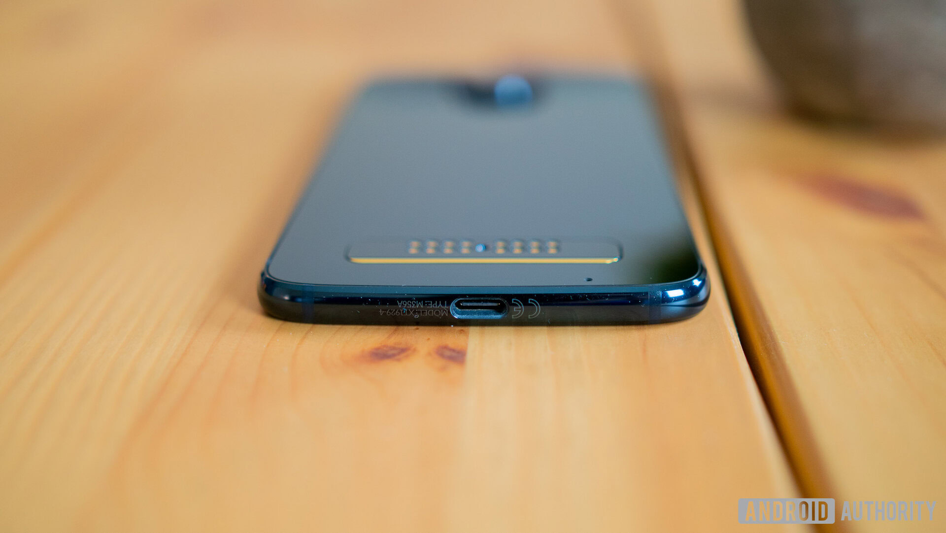
The Z3 Play is also thinner than its predecessor, but comes at the expense of the headphone jack. This may not be a surprising move anymore, but the headphone jack was a big part of the appeal of the Z Play series, considering the Z flagships didn’t have it. Motorola included a 3.5mm-to-USB-C adapter in the box, but it’s still an unfortunate loss.
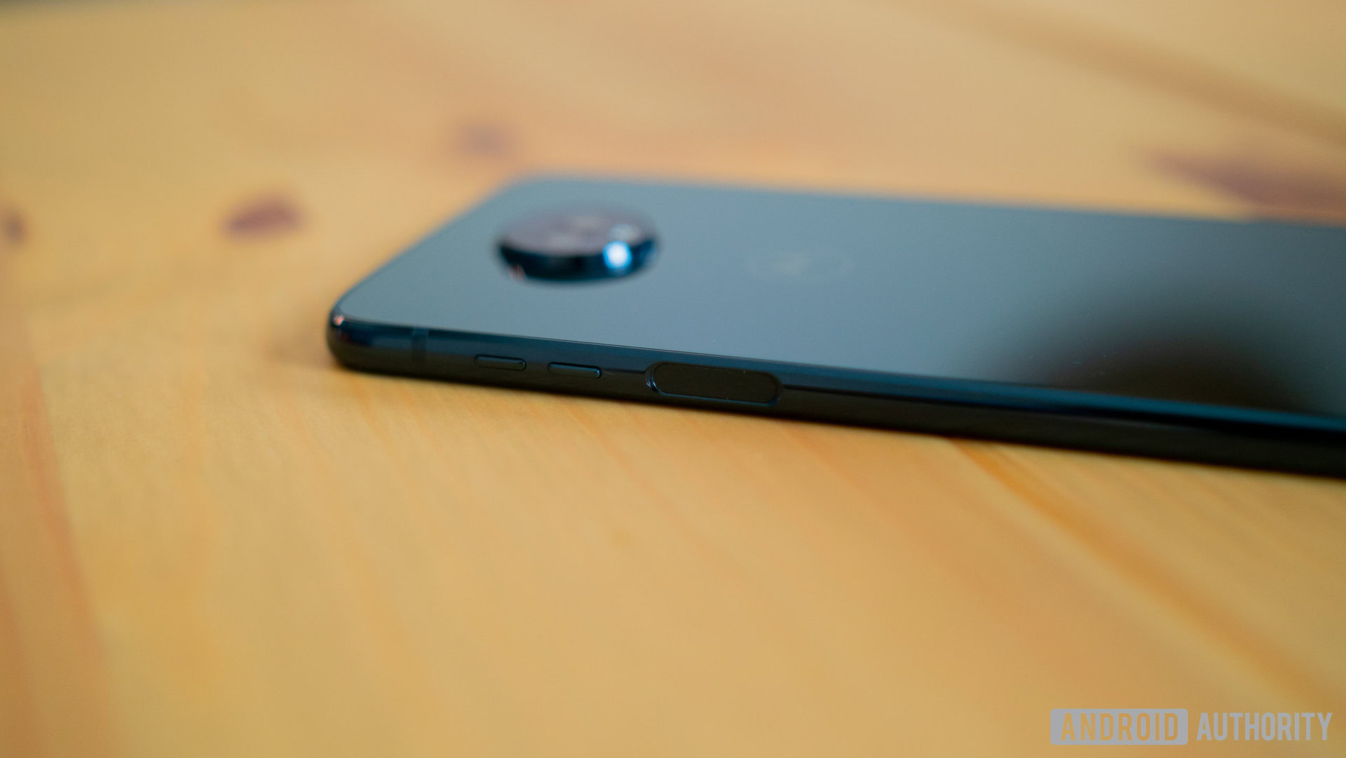
Side-mounted fingerprint sensors aren't very common but they definitely should be.
Another major change to the Z3 Play is the relocation of the fingerprint sensor. On previous models, this was on the bottom chin, but it sits on the right side of the Z3 Play, similar to where Sony used to put them. The power button sits on the left side, mirroring the fingerprint sensor. Side mounted fingerprint sensors aren’t very common, but they definitely should be.
Read Next: Motorola Moto Z3 vs the competition
This one’s comfortable and easy to reach with your thumb. I haven’t noticed any issues with accuracy or speed.
Display
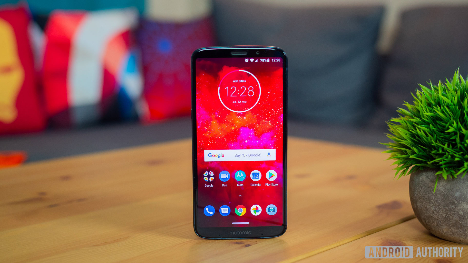
The Z3 Play now has a more modern display. It’s got an 18:9 aspect ratio and much smaller bezels on all sides than its predecessors. The 6.01-inch screen uses Super AMOLED technology with FHD+ resolution. The AMOLED display is vibrant and colorful, with excellent viewing angles and brightness. Contrast is also excellent, with the deep dark blacks typical of an AMOLED display. The FHD+ resolution may seem a little low, but I had no complaints. It’s plenty sharp for comfortably browsing the web and enjoying media.
Performance
The Moto Z3 Play is powered by a mid-range Qualcomm Snapdragon 636 processor with 4GB of RAM and 64GB of storage on the U.S. variant. Globally, there is an additional variant with 6GB of RAM and 128GB of storage. I’ve been testing the U.S. version and have run into no issues with performance.
The Z3 Play was quick to launch applications, quick to multitask with, and handled any game I threw at it with smooth frame rates. Swiping through the UI and browsing the web is also very fast and responsive. It may not have the most impressive spec sheet, but it was powerful enough to perform well with all of my daily demands.
Battery life performance, unfortunately, isn’t quite as good. While the Snapdragon 636 is a very efficient processor, the 3,000mAh battery could only get me through a light or moderate day. Screen-on time consistently reached the four-hour mark, but never more. It’s pretty average by current standards.
Most consumers will find it sufficient, but this phone just can’t last through a full day with heavy amounts of gaming and video watching.
Camera
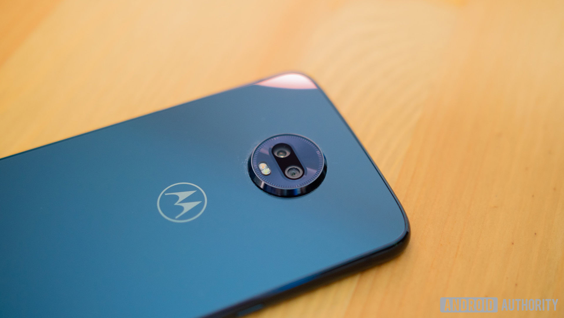
The Z3 Play is the first Moto Play phone to feature dual rear cameras. The main sensor is 12MP with an f/1.7 aperture, and it’s the only sensor designed for capturing photos. The secondary 5MP sensor is meant purely for capturing depth information for portrait mode or background blurring effects. The front-facing camera now has an 8MP sensor and a portrait mode, but it isn’t quite as advanced or feature-rich due to the lack of a second sensor.
The camera app now has built-in Google Lens support, making it very easy to do your virtual searches directly from the camera. Another new feature to the camera is cinemagraphs, which let you capture a picture with motion, where you can select which parts of the photo move and which parts stay still. It’s a ton of fun to use and really creative. The images save as a standard GIF which makes it very easy to share with your friends and family on social media or text messages.
In daylight or well-lit conditions, the camera produces acceptable results but colors lack vibrancy and details don't appear sharp.
Picture quality from the Z3 Play’s camera is average at best. I couldn’t help but feel underwhelmed by the results. In daylight or well-lit conditions, the camera performed acceptably, but colors lacked vibrancy and details weren’t sharp. The drop-off in quality is very significant in low light. Noise is very visible, colors are washed out, and highlights are severely overexposed. The camera also struggles to focus in dark conditions, which makes it difficult to get the shot you want sometimes.
Software
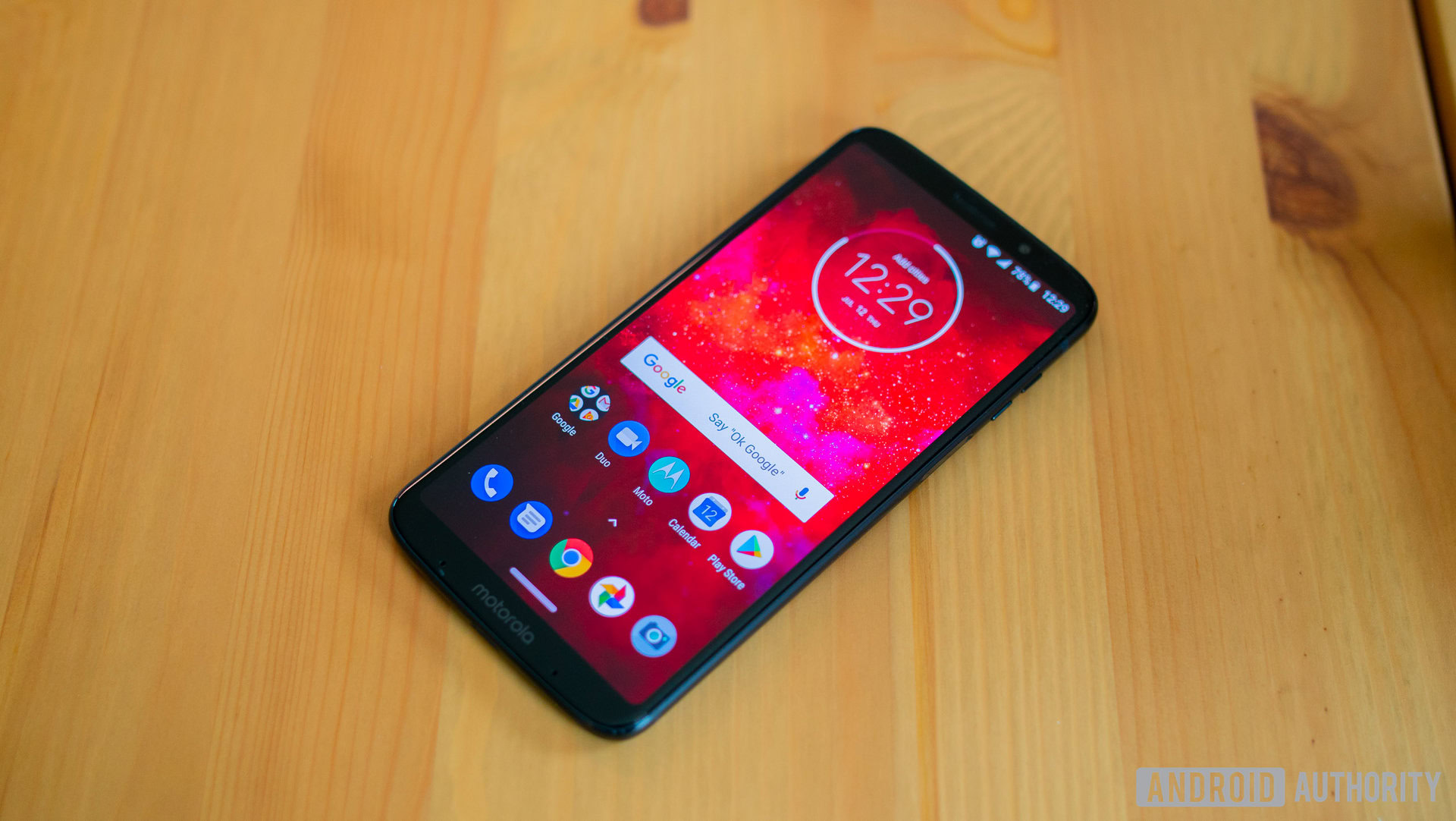
One of my favorite things about Moto devices has always been the software. Motorola keeps the experience on the Moto Z3 Play very close to stock Android. It’s one of the few experiences on the market similar to Google’s Pixel phones. Android 8.1 comes out of the box and Motorola says it will support two OS upgrades during the Z3 Play’s life cycle. Motorola’s usual suite of software features, such as Moto Display, the flashlight double chop, and a twist of the wrist for launching the camera, all remain intact.
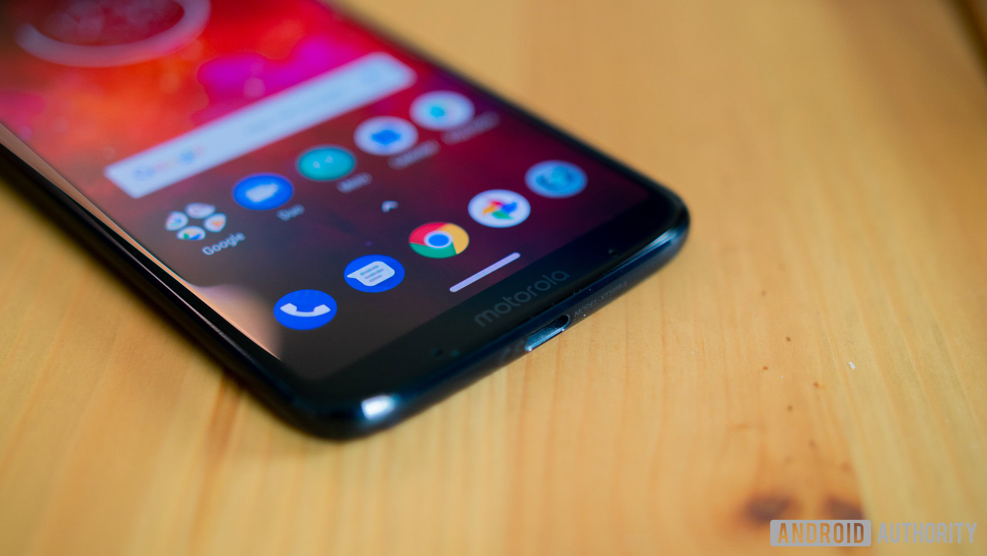
The newest software addition is the ability to navigate the UI using swipe gestures via the on-screen bar at the bottom of the display. This replaces the gesture controls that were previously achieved by swiping on the front facing home button. The gestures are similar to Android Pie’s swipe gestures and work in place of the standard on-screen navigation keys if you want them. They’re simple and very easy to figure out. Swiping left goes back, swiping right opens recent apps, tapping takes you home and holding down the virtual bar launches Google Assistant. After a few days of use, I much preferred using the gestures over the standard onscreen buttons.
Specifications
| Motorola Moto Z3 Play | |
|---|---|
Display | 6-inch AMOLED 2,160 x 1,080 resolution 18:9 screen ratio |
SoC | Qualcomm Snapdragon 636 Octa-core Kryo 260 at 1.8GHz |
GPU | Adreno 509 |
RAM | 4/6GB |
Storage | 64/128GB MicroSD up to 2TB |
Cameras | Rear cameras Main: 12MP with 1.4 micron pixels, f/1.7 aperture Secondary: 5MP Front camera 8MP sensor with 1.12-micron pixels, f/2.0 aperture |
Audio | Front-facing speaker USB Type-C No 3.5mm jack 24-bit audio at 94kHz |
Battery | 3,000mAh battery Non-removable TurboCharging |
IP rating | Water-repellent coating No IP rating |
Network | LTE Cat. 12 |
Software | Android 8.1 Oreo |
Dimensions and weight | 156.5 x 70.5 x 6.75mm 156g |
Colors | deep indigo |
Motorola Moto Z3 Play Pricing & Final Thoughts
The Moto Z3 Play was priced at $499 unlocked in the U.S. when it first launched, but is now available for $329, which is more in line with what you’d expect from a mid-range smartphone. When judging the phone on its own merits the Z3 Play is a great midrange offering, but unless you highly value Moto Mods and Motorola’s software suite it’s probably not worth the money.
Related:
- Best Motorola phones
- Spec showdown: Moto G6, G6 Plus, G6 Play vs Moto G5 series
- Moto G6 and Moto G6 Play review: The best cheap Android phones you can buy
- Moto X4 Android One review: return of the X
- Moto Z2 Force review: A force to be reckoned with?
- Moto G5S Plus review: this is a budget phone?
- Moto Z3 review: Is the promise of 5G enough?