Affiliate links on Android Authority may earn us a commission. Learn more.
My UX guide: Everything you need to know about Motorola's Android skin
Published onAugust 5, 2022
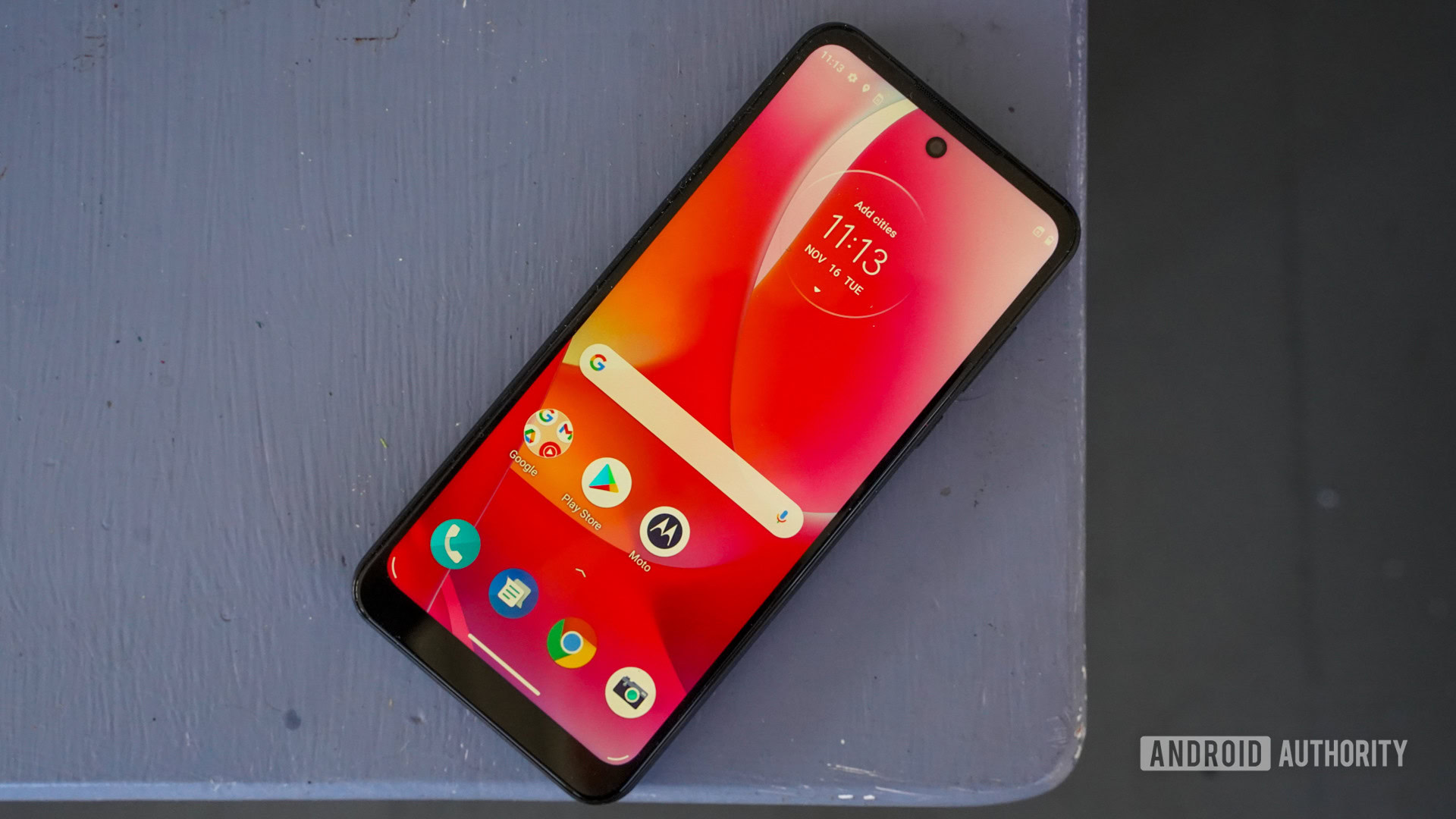
At one point, Motorola was owned by Google. With that in mind, it’s probably not surprising to learn that Motorola’s Android skin known as My UX is very similar to Google’s own Pixel UI skin. However, Motorola primarily makes budget and mid-range phones, and certainly makes a lot more of them than Google.
If you have one of these Motorola devices, you might be wondering how My UX works. How can you check for updates? What makes it special? How did it used to look? We’re going to tell you all this and more, in this full guide to the skin.
Editor’s note: This article is updated as of August 2022. We will add/remove content as Motorola reveals more information about My UX.
My UX at a glance
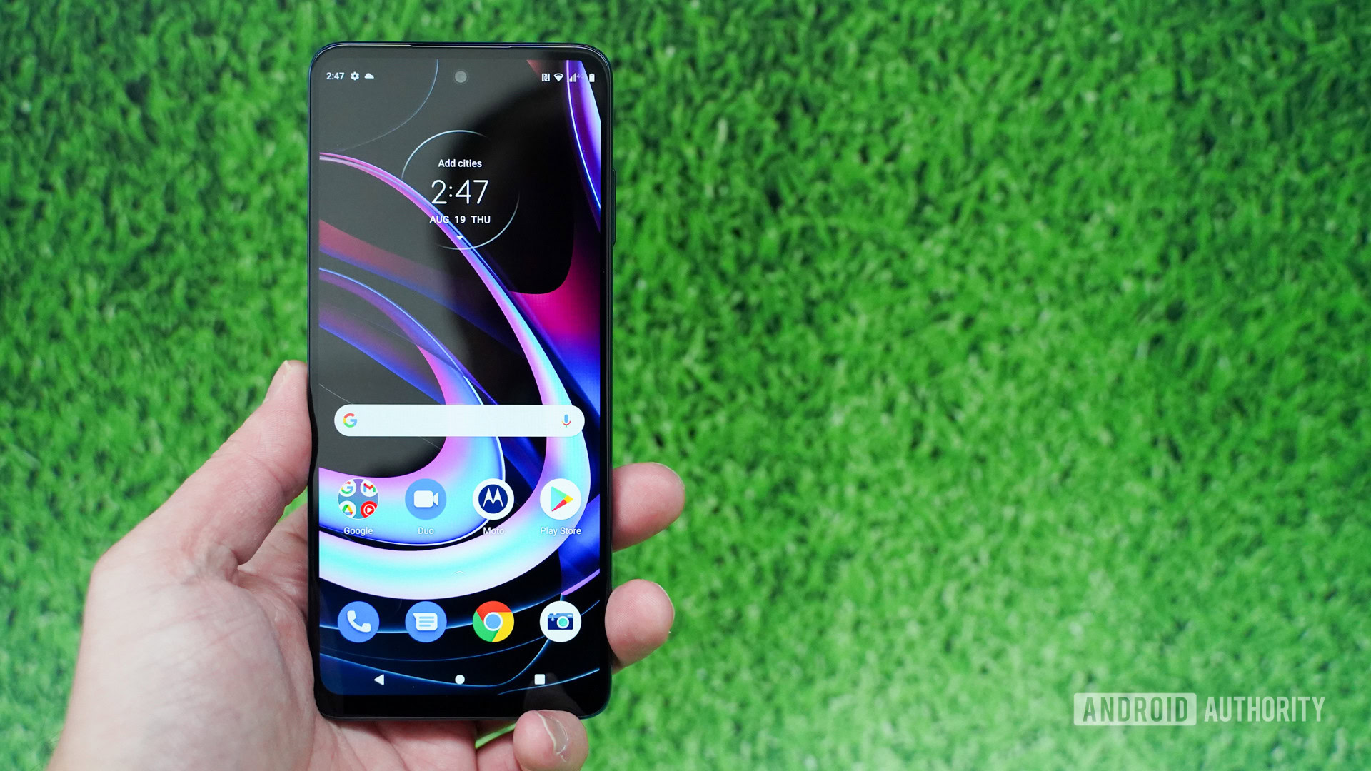
As mentioned, My UX doesn’t deviate too far from the look and feel of stock Android. Motorola does put its own stamp on things, but people who have used Pixel devices, Sony phones, or just enjoy the stock Android experience will find a lot to love here.
In general, My UX is very user-friendly. It’s colorful, welcoming, and simple. Its simplicity also keeps it light and smooth. Everything has a nice sheen over it that makes it appealing to the widest audience possible. Considering Motorola mostly makes mid-range devices — which could be used by children, adults, and the elderly alike — this makes a lot of sense.
See also: What is Android?
Unfortunately, Motorola has a bad reputation when it comes to keeping its phones updated. The company has been caught trying to pass off one major Android upgrade for even its most expensive phones — a stark contrast with Samsung and Google, which offer four or three upgrades for nearly all their phones. Motorola also doesn’t deliver security patches in a timely manner for a lot of its devices.
Regardless, if updates aren’t super important to you, you’ll likely be pleased with My UX.
The latest version of My UX
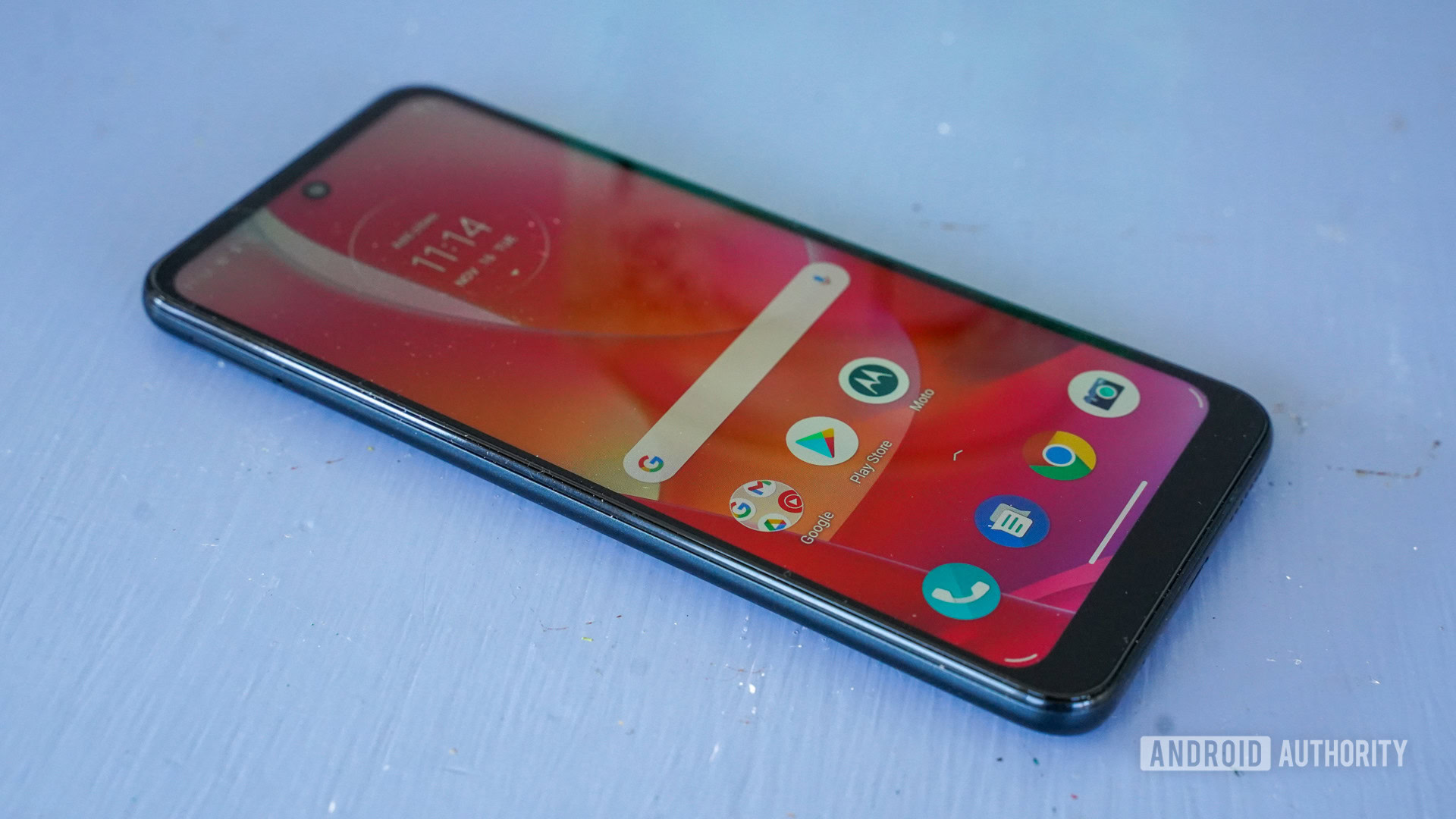
As mentioned in the previous section, Motorola doesn’t do a great job of keeping its software maintained. Generally, it takes months before its current phones see the latest version of Android. It was the same story with Android 12, with Motorola shipping out the first update four months after the OS was announced. For reference, Samsung did it in less than a month.
The most recent stable version of My UX is based on Android 12.
The latest version of My UX is based on Android 12 and is available on most of Motorola’s new phones. Lots of older ones are still on Android 11, although Motorola has already updated a few to the latest version of Android.
We have steps on how to check your version number in the next section.
How to check your version and for updates using My UX
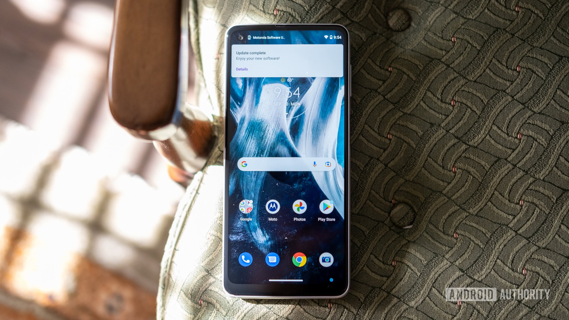
If you don’t know which version of My UX is on your Motorola device, you can easily check.
- Head to Android Settings by finding the shortcut in your app drawer or notification shade.
- Scroll towards the bottom of the list and tap on the System Updates section.
- Now, tap on Check For Updates.
- Assuming you’re up to date, you’ll see your Current Software Version, which is your My UX version.
If you’re running an older version of My UX, an update could be waiting for you in this section. If there is, it will install in the background and then prompt you to restart your phone. Depending on how behind you are on updates, you might need to repeat these steps several times.
If your software is up-to-date but you don’t have the latest version of My UX, that means your phone hasn’t received the update yet. It’s also possible your phone is too old to get new updates. Thankfully, Motorola has a website dedicated to giving you the information you need on the most recent versions of its software.
A brief history of My UX
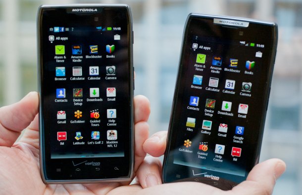
Motorola basically pioneered the Android world with its line of Droid phones in the late 2000s and early 2010s. Motorola phones during that time came with an Android skin called Motoblur. This skin was not well-received. It was bloated, ugly, and required you to create a Motoblur account before you could even access the phone’s home screen.
The consumer response to Motoblur was so bad that Motorola stopped referring to the skin with that name in 2011. It still kept the design but eventually phased out the requirement of creating a Motorola account before being able to use the phone.
See also: A look at the major Android skins
Unbelievably, from 2011 to 2020, Motorola didn’t have an official name for its software skin. Most people still referred to it as Motoblur until April 2020, when the company officially announced My UX as the new name. This was launched along with the Motorola Edge and Edge Plus.
Between 2011 and 2020, Motorola subtly and slowly altered its Android skin to be closer to stock. At this point, My UX is almost as close to stock Android as Google’s Pixel UI, which is saying quite a lot when you look back on Motoblur.
What My UX looks like
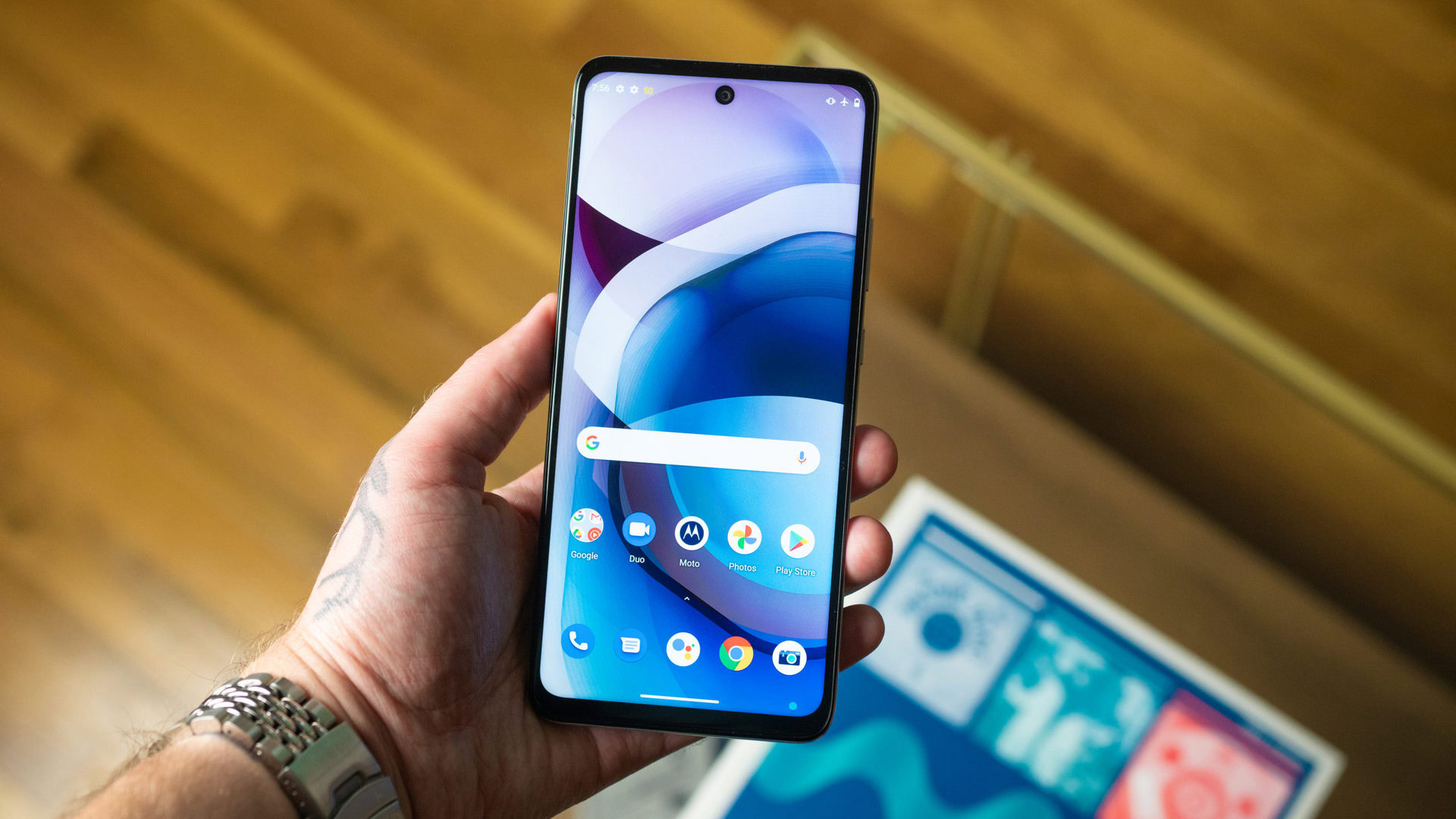
Here’s a gallery of screenshots that should give you an idea of what to expect from My UX.
Best unique features of My UX
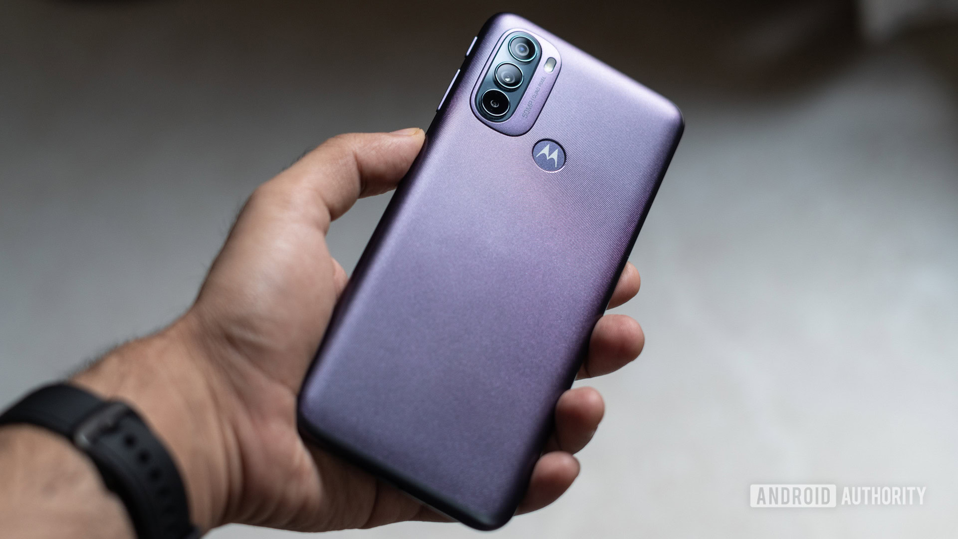
Every Android skin out there puts its own stamp on the software. Here are a few things My UX can do that most other skins can’t.
Gestures
Let’s say you want to turn on your phone’s flashlight feature. Most people would need to unlock their phone and then tap on an app to get the flashlight on. Motorola users though can simply make a chopping motion with their hand and the flashlight turns on. Another two chops and it’s off.
There are all sorts of gesture shortcuts like this available in My UX, including ways to quickly open the camera, take a screenshot, put the phone into Do Not Disturb mode, and more.
Attentive Display
If you read on your phone a lot, you might face the problem of the screen dimming after a few minutes. To prevent this, you either need to extend the time in which your screen stays on (which drains the battery) or repeatedly tap the screen every few minutes (which is annoying).
Attentive Display solves this problem by keeping the screen on while you’re looking at it. This requires a scan of your face, which some folks might not be comfortable with, but it works pretty well when you get it all set up.
Styles
Some people really prize the ability to make their phone look the way they want it to look. Most of the time, this involves downloading a third-party launcher or another app. With My UX, you can make some basic changes right from the home screen. This includes changing the font, changing the accent color, configuring the shapes of icons, and more.
It’s not as robust as the theming options within Samsung’s One UI or Oppo’s Color OS, but it’s better than nothing.
The Moto app
With some Android skins, it can be difficult to find their unique features. They are sometimes buried in Android Settings and you can’t easily tell if they’re a part of Android proper or something else. With Motorola’s My UX, you get a Moto app that helpfully aggregates all the best features into one spot.
The app basically exists as a shortcut to all the different features, relieving you of the burden of needing to go find them. This is incredibly helpful, and we wish more companies did this.
That’s everything you need to know about Motorola’s My UX. Be sure to bookmark this page, as we’ll update it as Motorola changes the Android skin.