Affiliate links on Android Authority may earn us a commission. Learn more.
Motorola shows us what every flagship is doing wrong this year
2016 has been full of its share of hits and misses, as far as smartphones are concerned. In recent months, Samsung in particular has ran into quite a bit of quality control issues with its Note 7 fiasco. In 2016 LG adopted modular design with the G5, only to give it up with the LG V20 shortly after. Meanwhile, the new Moto Z Force gives you an alternative with a sizable 5.5-inch display that’s shatterproof, and a modular design that actually works well and has a growing number of compatible accessories.
With all that in mind, let’s jump in and take a closer look at the Moto Z Force, as well as its brother, the Moto Z.
Further reading:
Design
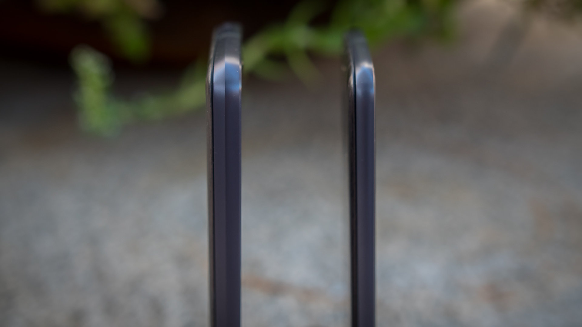
The Moto Z Force is the larger of the two devices, with a couple of more millimeters of thickness and a significant increase in heft. While it packs a little bit more in its body as a result, credit goes to Motorola for making one of the thinnest devices out there in the Moto Z proper, with it being only about 5 mm thick, and weighing less than plenty of devices that have similarly sized screens.
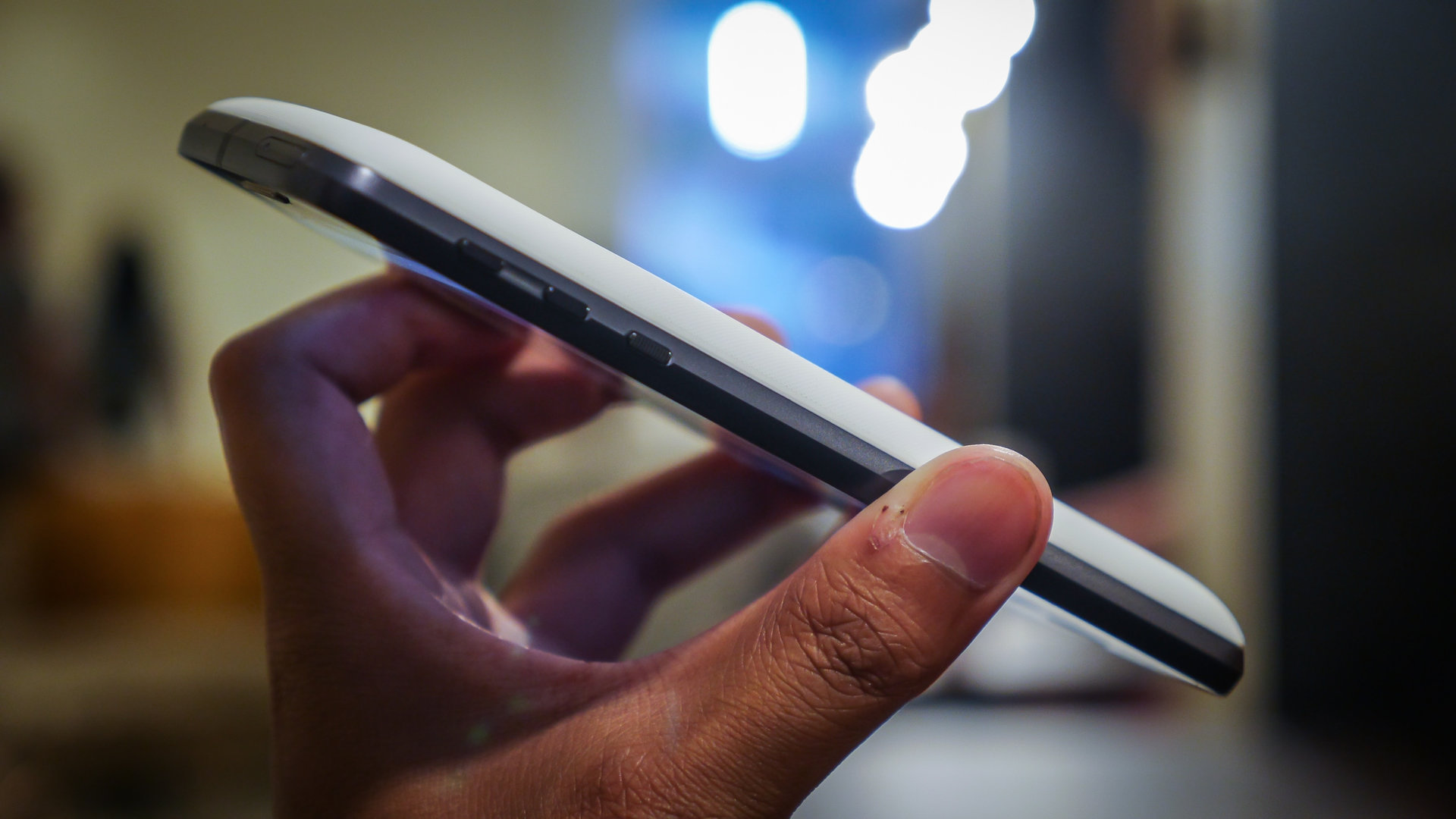
A textured power button is easy to find, and is low enough on the phone for easy access. Though the flatter Moto Z is smoother all around the sides, the extra heft adds a chamfer on the Z Force. You may also notice that there is only one port on the phone, the USB-C type connector that sits alone, without there being a headphone jack.

Overall, there’s something very Lenovo-esque about these new Motos, which isn’t all that surprising, but is definitely noticeable. The all metal bodies have a distinct shine that is both eye-catching, and magnets for fingerprints. Also, the silver-lined camera package really sticks out, something that is once again eye-catching, but not particularly ideal, we think. While some might like these less subtle changes to the Moto formula, others will probably prefer to employ the included remedy.
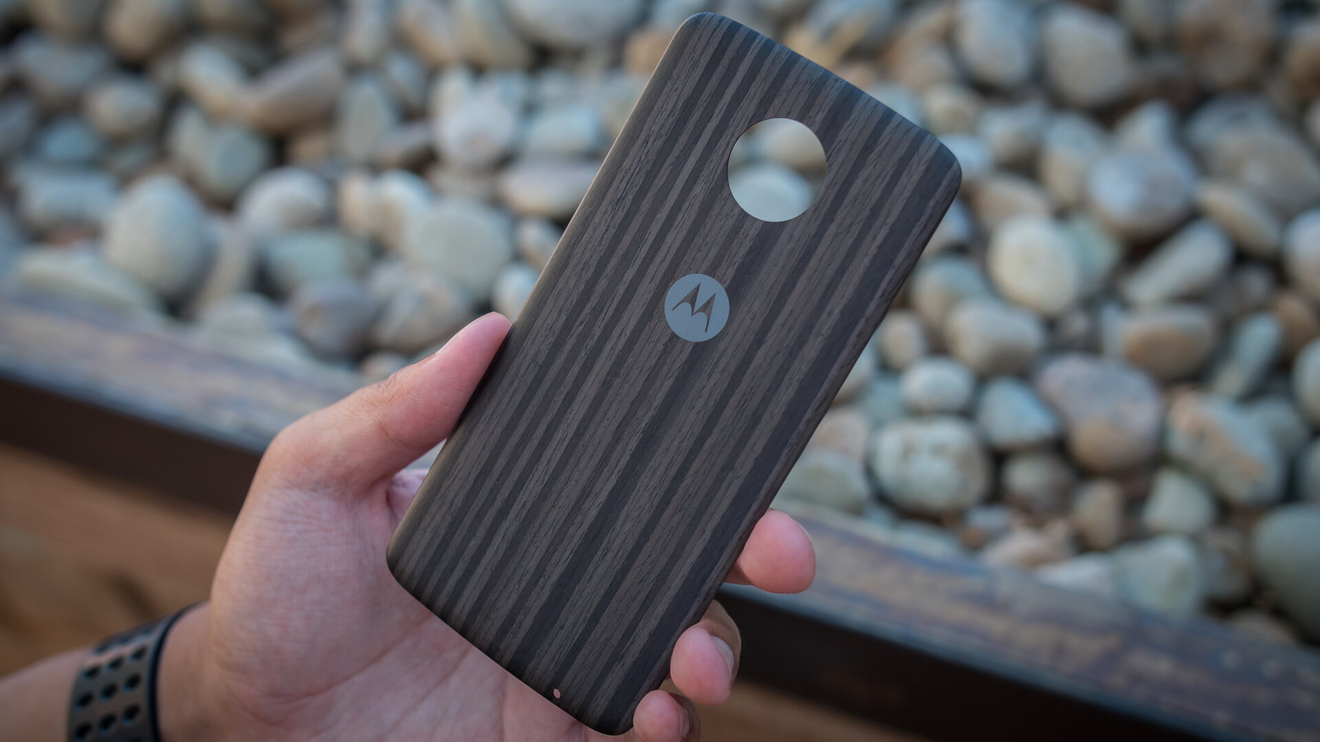
Magnets at the top and lower thirds of the backing are accompanied by connector pins, and the Moto Mods use these to attach and connect. From a purely design-focused perspective, this is how Moto Covers can be slapped onto the back of the phones. There are also, of course, the Moto Mods, but we’ll get to them later. A dark wooden Cover came with our devices, but plenty will be made available to add further customization. It covers up the fingerprint-heavy backing, covers up the connectors, and makes the camera flush. We wouldn’t be surprised if users put their Cover on and said, “that’s more like it.”
The covers add about 30 grams of weight to these devices, making the Moto Z feel more conventional, and the Moto Z Force feel like a brick. There are a couple advantages to having the Moto Z Force however, like the larger battery, and the mere fact that when a phone is that heavy, it feels more secure in the hand. Overall handling with these 5.5-inch screens is about where one would expect, though a large bezel at the top and bottom portions of the phones can make reaching up and down a bit tough.
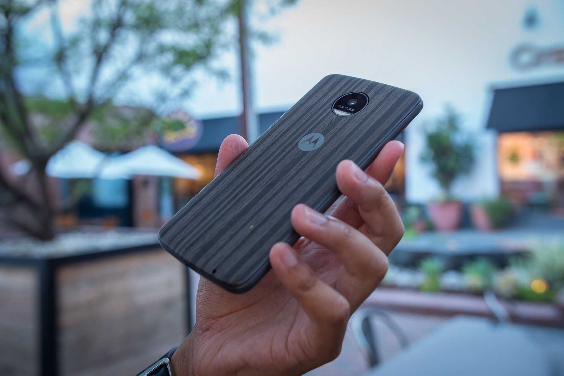
As you may learn in this review, there are a lot of ideas and a lot of roving parts to the Moto Z packages. They do seem more like Lenovo devices than before, but with that canvas comes a lot of room for possibilities.
Display

Both phones come with a 5.5-inch AMOLED display with a Quad HD resolution, resulting in a pixel density of 535 ppi. As far as displays go, there is little to complain about here, especially considering the higher saturation that AMOLED provides. Colors all look good, but can be toned down for users who find it a little too much. Text is easy to read and media consumption is enjoyable across the board, especially in our time playing games like Final Fantasy 7 and Pokemon Go.
The Moto Z Force, however, does come with the Moto ShatterShield, which keeps the display safe from cracks and shattering due to accidental drops. It is a multi-layer system that adds that little bit of protection, and so, even if this phone isn’t all that rugged, it will withstand a bit more than your average phone.
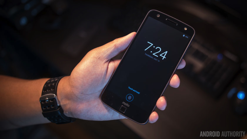
One returning feature from previous Moto devices is the Moto Display, which is an ambient display that allows for quick looks at notifications, and certain actions to be performed upon them. A sensor at the top of the device brings up the information, at which time users can tap and hold on the circles in the middle, and either swipe up to wake the phone in the app or swipe down to dismiss it. It’s still a useful Moto feature that benefits from the AMOLED screen.
Performance
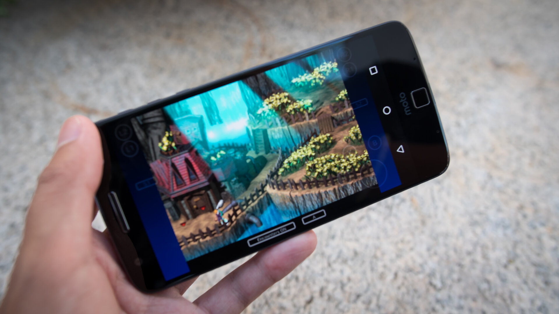
The Qualcomm Snapdragon 820 processor and the Adreno 530 GPU are at the helm of either device, providing the kind of performance any flagship should have. Even with the Verizon bloatware, the phone hasn’t skipped a beat and provides a smooth, snappy experience. Credit can also be given to the iteration of Android here, which is closer to stock Marshmallow than most other phone skins. For all accounts, apps performed without any drops and few stutters even when multitasking, which is helped along by the 4 GB of RAM.
Hardware
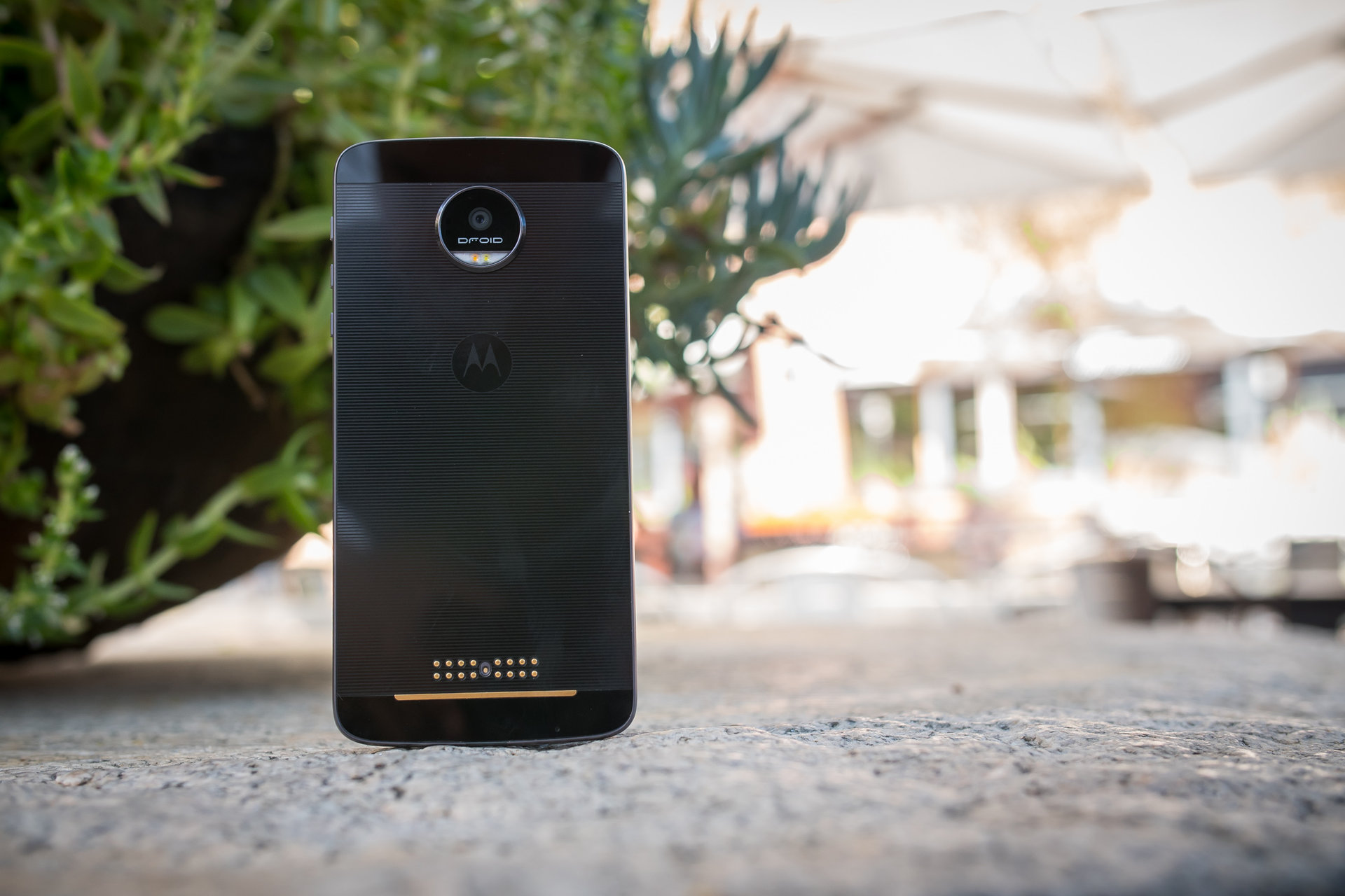
Before we get into the Moto Mods, let’s focus on what the phones already possess without any of those additions. Connections across the board are included, and both phones benefit from Verizon’s network. Though these phones might only be available on the CDMA Verizon network, at least for now, it is pretty well known that Verizon is one of the fastest and most reliable networks. That doesn’t much help the pain of waiting for GSM capable versions of these phones coming to the US, however.
32 GB or 64 GB are the on-board storage options that are available, but microSD cards, allowing for up to an additional 256 GB, can help make sure that you never run out of space.
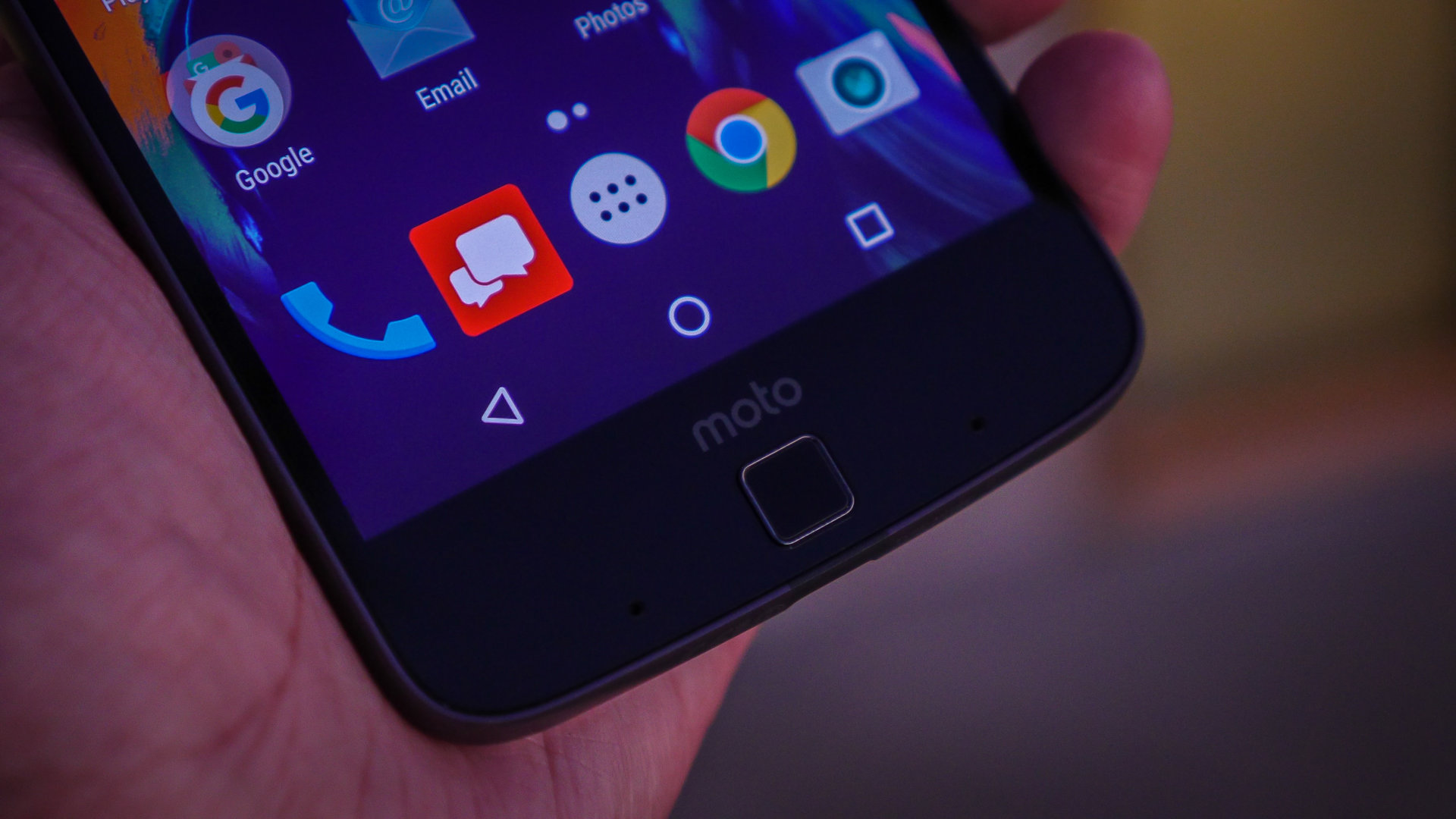
The fingerprint reader found below the display is a great performer. It is easy to set up, and responds in no time. It’s an easy way of waking and unlocking the device, as always, but there is an extra function programmed into it as well. By holding down on that area while in the phone, the phone will lock. This is a nice touch, no pun intended. It took some time for us to stop pressing the sensor because it seems like a home button, but it is hard not to when the on-screen navigation keys slide out of view in certain full screen situations.
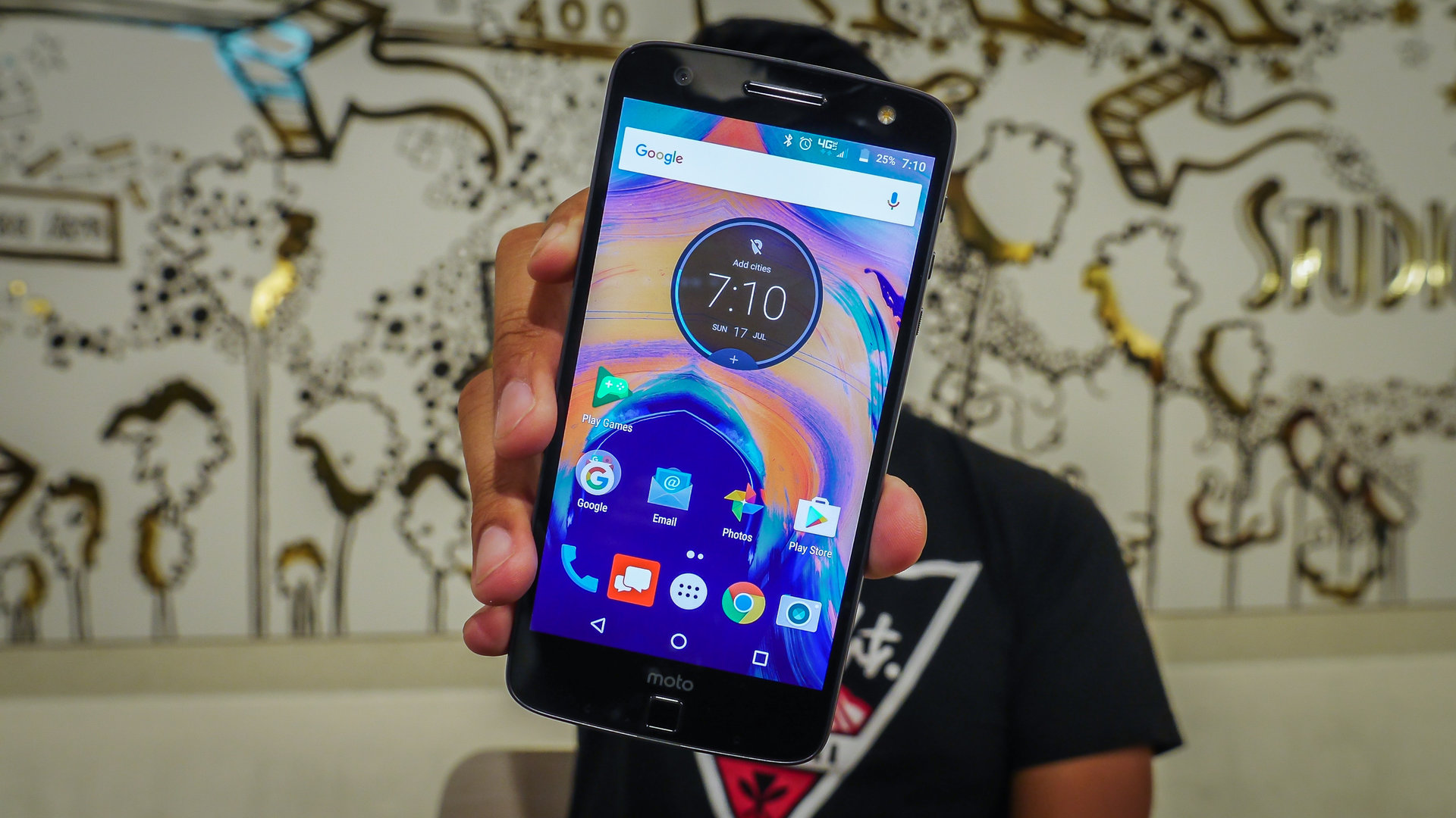
Audio is a bit of a mixed bag with the Motos, but it starts off on a good note during calls. There are 4 microphones strewn about the device, and all of them help not only with the Moto Voice activations, but outbound audio on calls end up sounding really clear. Inbound sound is also good, though the speaker on these phones is found in the earpiece, anyway. That said, the speaker benefits from being front facing, but there isn’t a particularly loud or rich sound coming out of it.
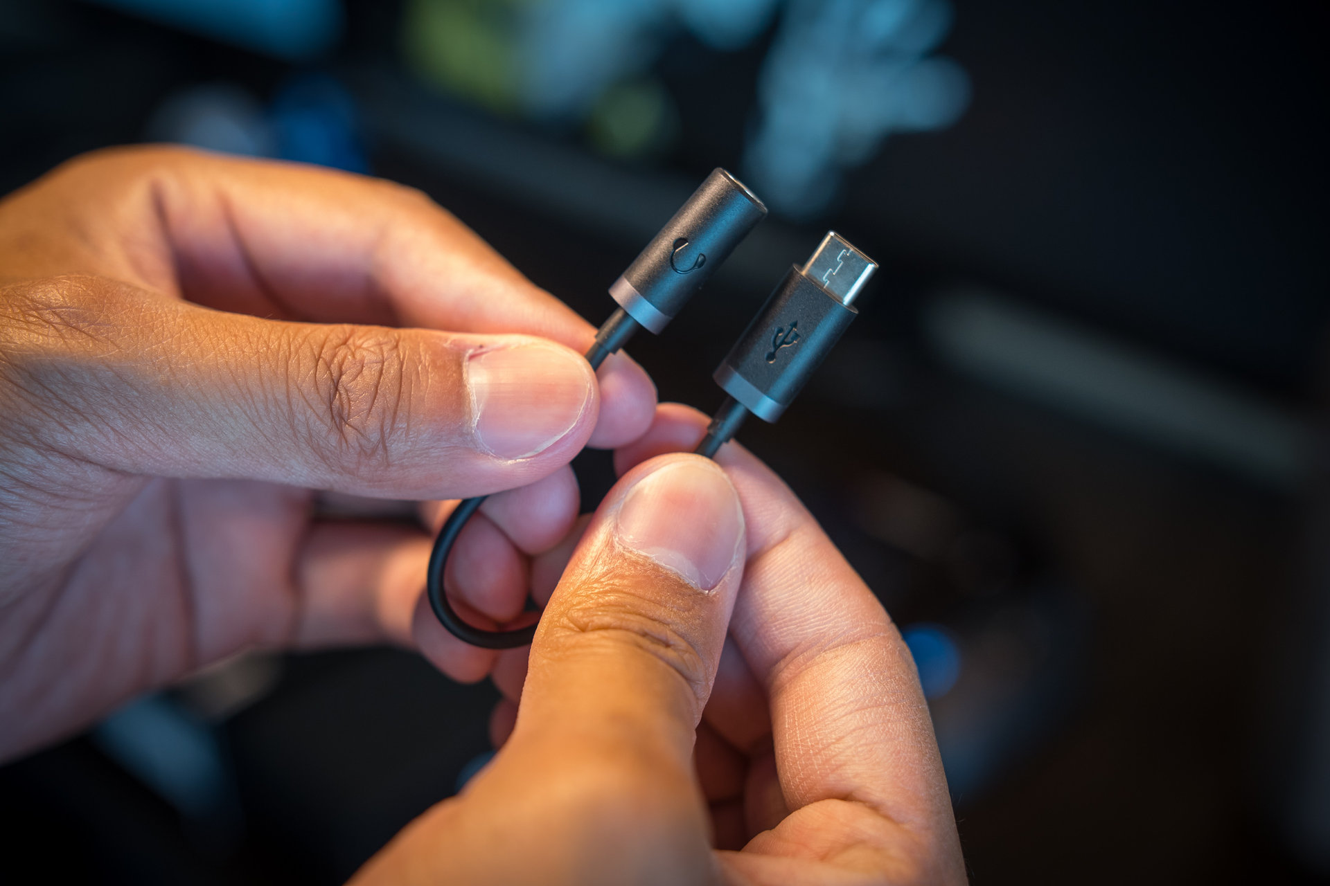
Which brings us to what has already been a polarizing detail in this new line of Motos, the lack of a headphone jack, which might end up being a hard adjustment to make for some. As prevalent as Bluetooth may be, it isn’t everyone’s ideal solution for audio playback. An adapter from USB-C to headphone jack is included in the box to help this transition, but even then it is another piece of kit that could easily be lost in a bag, or just lost in general. It might be easier to just keep the adapter connected to the headphones at all times. Even then, what if one wants to listen to content and charge the phone at the same time? That all said, the listening experience is still fairly standard, and is not any better or worse than most other phones. It’s good that there is a way to still use existing headphones, but this is a change that will take some time to normalize.
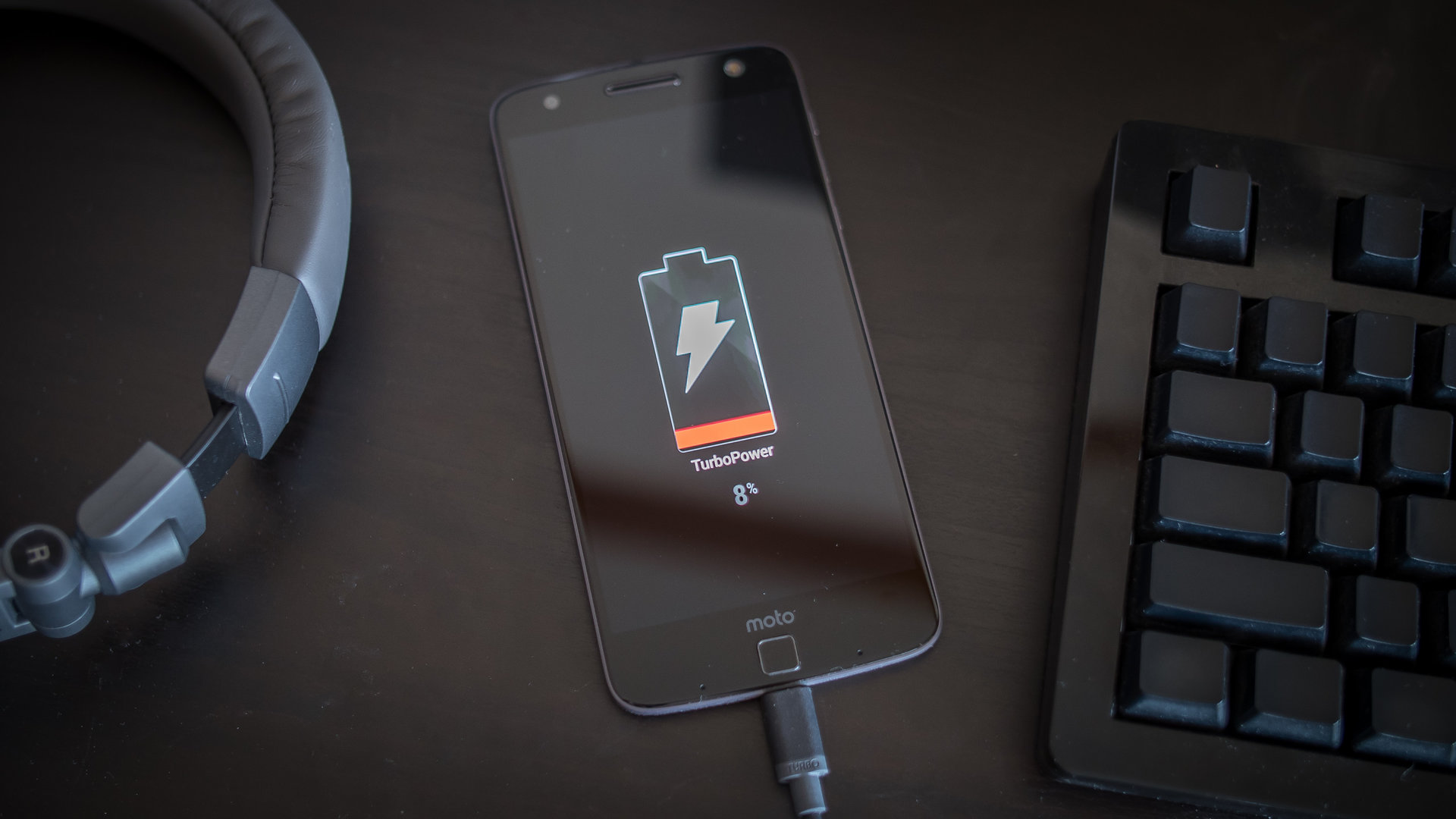
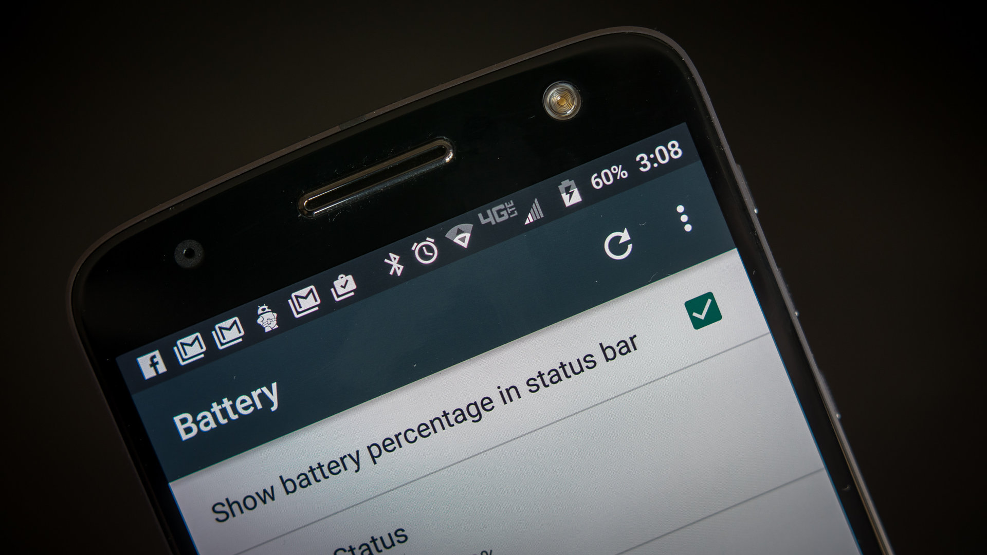
The Moto Z Force has the larger battery at 3,500 mAh, while the thinner Moto Z fits a 2,600 mAh unit. Battery life has been, for the most part, pretty decent. With pretty heavy usage days that included camera usage, YouTube viewing, and gaming, the Moto Z was able to give me about 3 and a half hours of screen on time while the Z Force managed close to 5 hours. The Z Force was able to go a full day without making me feel antsy, but the Moto Z would just barely make it after the power saving mode kicked in at 15%.
Thankfully, powering up doesn’t take much time at all. There is a trade-off between both of these phones, in that the Moto Z comes with a 15 W charger, while the Z Force has a more powerful 30 W charger. Both are USB-C chargers that are tethered to the bricks, meaning that one has to use them in order to achieve the very fast charging times that Motorola claim. They are indeed fast, as I was able to get to 50% of battery in half an hour, using the correct chargers for either phone.
Further, if you are really hurting for battery, the Moto Mods will help. These are Moto’s move into the future of smartphones, and while this is not quite modularity, it is easy to throw that term around with these phones. Instead, we will keep to just calling them mods, easily connected to the back of the phone via the magnets.
A more in-depth look at the three Moto Mods currently available can be found here, but for now it should be fairly obvious that the most useful of the bunch is the Incipio OffGrid Power Mod. This 2,200 mAh capacity battery slaps right on, and essentially makes the Moto Z a 4,800 mAh phone, and the Moto Z Force a 5,700 mAh device. Power is drained either regularly to keep the phone as charged as possible, or in an Efficiency Mode, that does enough to keep the phone at 80%. In terms of screen on time, these batteries got me about another hour, to and hour and a half, when slapped onto the phone at single digit percentages.
The other two Moto Mods are the Insta-Share projector add-on and the JBL SoundBoost speaker. In a nutshell, they are definitely convenient, and make the Moto Z family quite fun to use, but are still lesser performers than standalone solutions, like a Bluetooth speaker or a separate Pico projector. Also, they are quite expensive, especially the projector.
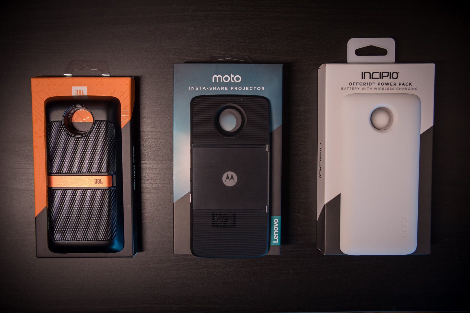
If modularity, and in this case, mods, are the future of smartphone experiences, then Motorola have done a great job in showing us a functional, accessible, and most of all fun way of doing it. They require no changes in the hardware or software of the device, and are quite literally the definition of plug and play, or rather, attach and play. The battery case is the most practical of them all, but we hope to see even more good ideas become reality in the world of Moto Mods.
Camera
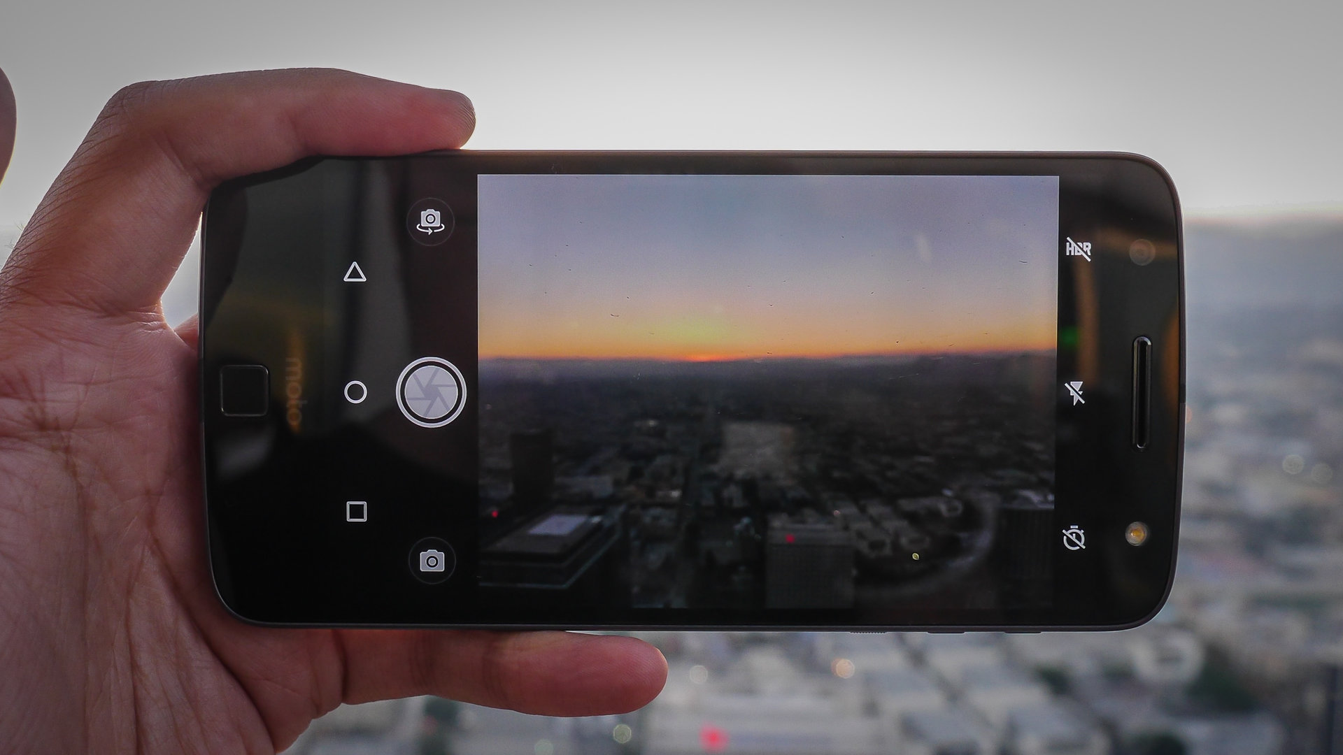
Differences between the Moto Z and Moto Z Force start with the battery and essentially end with the cameras. The Z Force has the more powerful camera, with a 21 MP shooter, while the Moto Z proper utilizes a 13 MP sensor. Pretty much everything else remains the same, including the f/1.8 apertures, the inclusions of OIS and laser autofocus, and secondary cameras that are 5 MP, with wide angles of view and f/2.2 apertures.
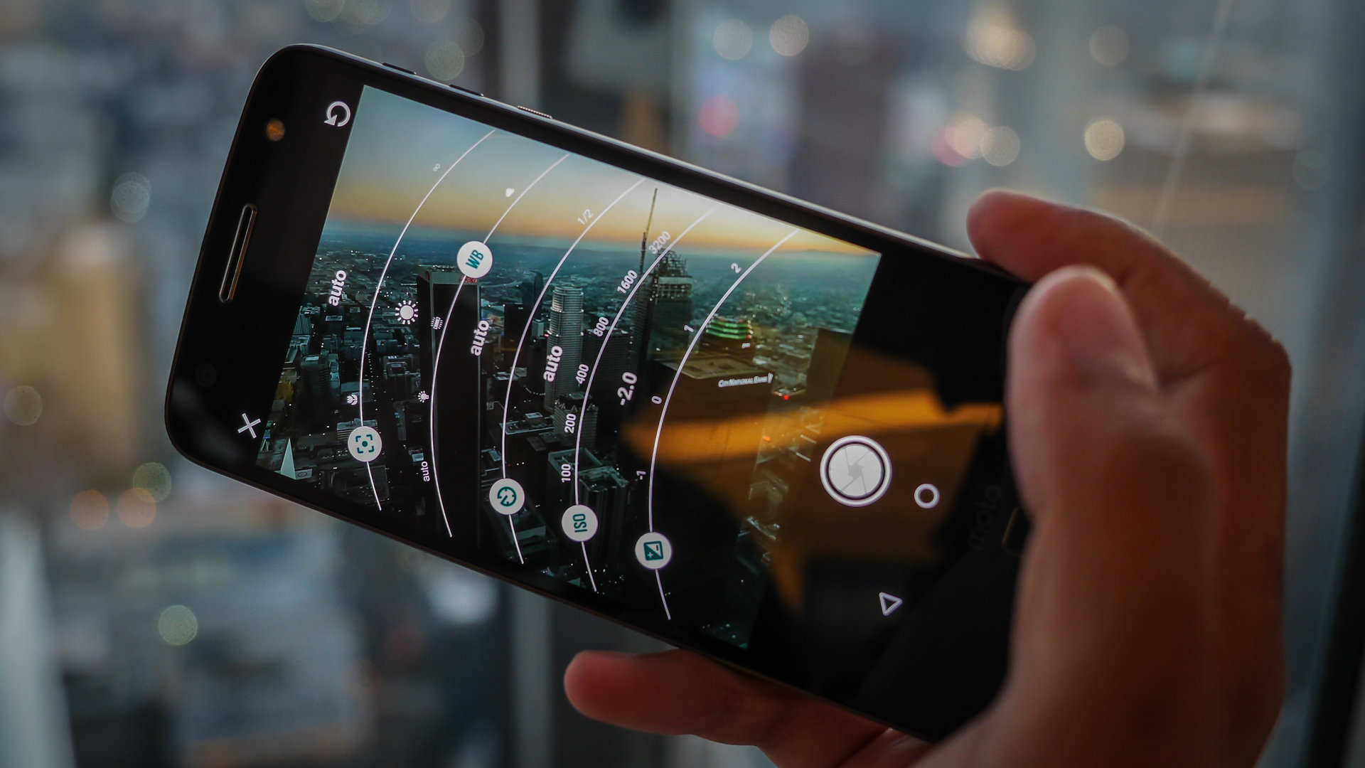
The apps are fairly simple to use and don’t get too much in the way of the user, unless you get into the Professional Mode, where toggles and sliders can get a little out of hand pretty quickly. When in the regular modes, it is simply a matter of tapping on a subject to put it in focus, shifting the exposure slider accordingly, and snapping. The conjunctive team of contrast, phase detection, and laser autofocus, ensure that focusing on subjects is quick and easy. A very small delay will occur if HDR is being used, but even then, the camera app is snappy and responsive.
Before we get into the analysis, we should mention that the different megapixel counts basically mean that the Moto Z Force captures more detail overall. As you can see in the pictures, cropping into the same areas simply means that there is more data in the 21 MP photos, which isn’t a surprise. Thankfully, shooting modes, video modes, and general processing all remain the same, so the cameras aren’t so different that the gap of choice between them turns out huge.
We start off with self portraits, which include a Beautification mode, which is a first for Moto, but not a first for Lenovo at large. It mainly enhances clarity and colors while smoothing out lines on the face, to varying degrees of success. A front-facing flash makes a welcome return, and proves useful for darker situations or when you need to lighten up your face in front of a bright backdrop.

Modes on the main cameras include 4K video recording, which benefits from the optical image stabilization and some software stabilization, that results in somewhat unnatural looking movements. It seems like the video mode supports the panorama mode too, as the viewfinder seems to go into a similar mode, so the user simply has to sweep across the landscape. Panorama on the Moto Z phones, then, is actually really easy to do, but suffers in lower light situations due to the required slow shutter speeds used to provide adequate exposure.
HDR can be on auto when shooting in the normal photo mode, and it does a good job of enhancing the photo. The effect is pretty noticeable in the heightened shadows, the higher clarity, and the punched up colors. Especially when used in the right situations, HDR here is a viable tool.
Overall, pictures look pretty good with accurate colors, meaning that the saturation is not really overdone. The majority of pictures keep from looking too dull, but if a bit more punch is needed, throwing on the HDR mode is always an option. We notice a bit of noise reduction happening, making the finer lines of a photo look quite smudged out, especially in low light situations. However, taken as they are ,and especially in bright situations, the pictures that come out of the Moto Z and Z Force are pretty pleasing to the eye. In dark situations, it can be rather difficult to get a sharp picture, because the night shooting mode requires a very steady hand with the shutter being open for longer periods of time.
Moto Z Force camera samples
A steady hand will go a long way to making low light shots better, but in all other situations, the Moto Z line does a good job at being a pocket photography companion
Software
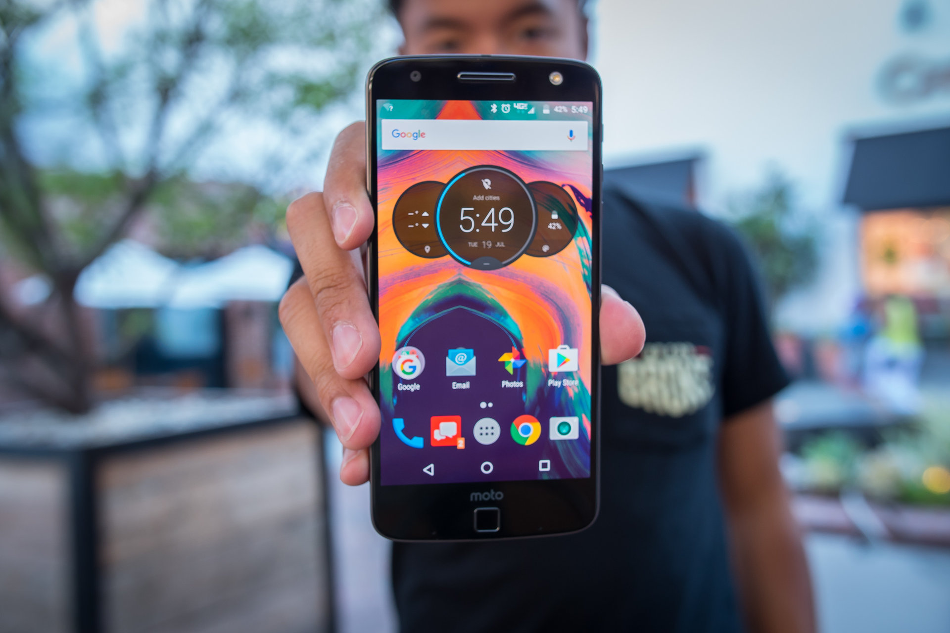
On the software side of things, we have Android 6.0 Marshmallow powering this version of Android, and thankfully, Moto keeps their version pretty close to stock. That basically means that all of the basics are there, with any Moto extras found when you dig deep enough. Contrary to how some other OEM skins tend to be, the additions in this version of Android are really useful.
Moto features are found in the app drawer, under an app called Moto. This is where users can toggle and customize the Moto Actions, Display, and Voice. There are a number of different gestures that can be used, including a double chop to easily activate the flashlight, and a double twist motion that opens the camera app. There is also a gesture to make the entire display easier to navigate with one hand.
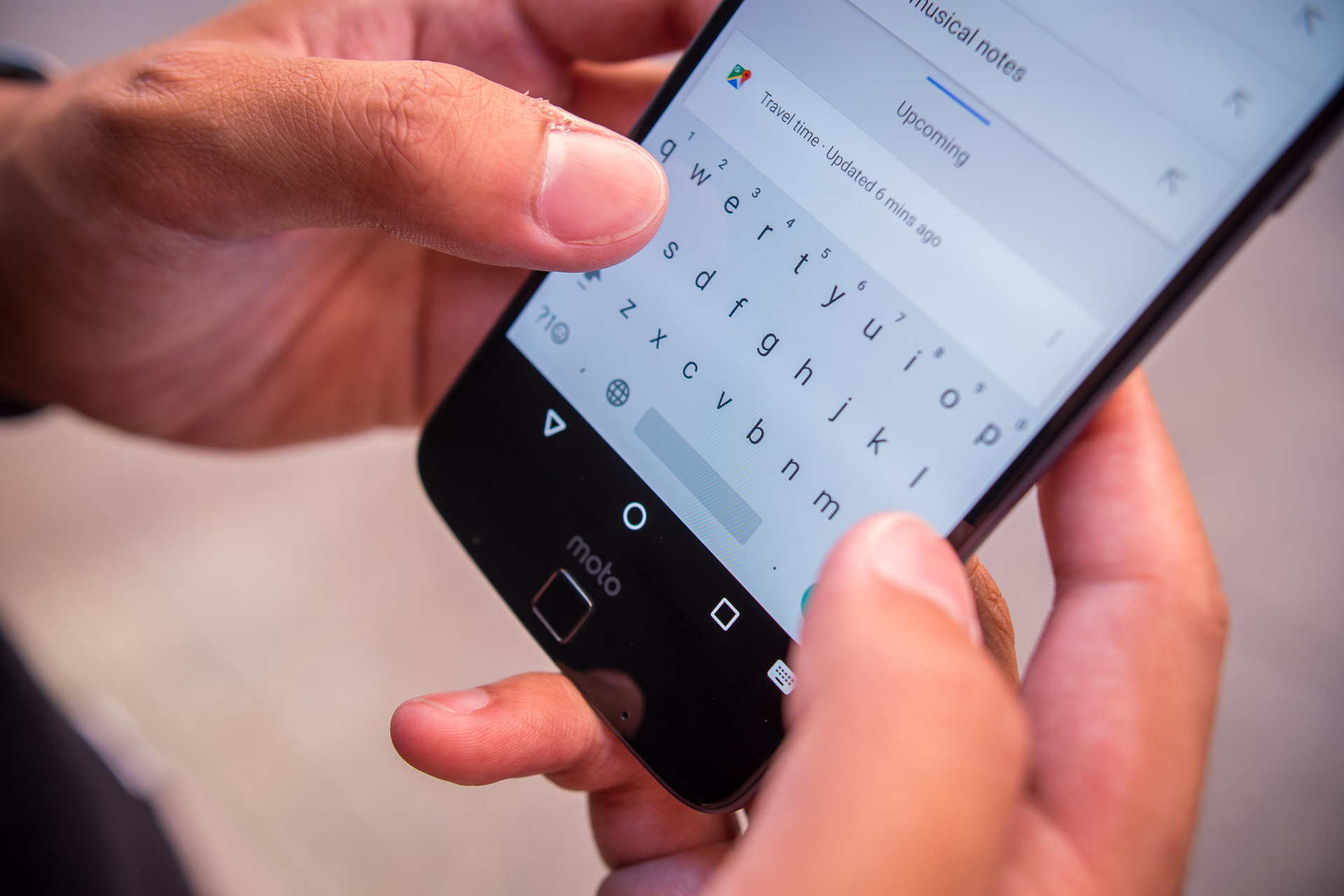
We already mentioned Moto Display, where a minimal ambient display will show notifications and music controls that can be utilized even when the phone is locked. Users can also add dark hours to the Moto Display, typically to when there is no need for it.
Finally, there is the Moto Voice, the customizable way of getting the phone to unlock and go straight into a Google Voice Search. Setting it up requires a quiet room and a few repetitions of the recorded phrase, but in the end it is a great way to get a search done on the phone from start to finish, just using one’s voice. More syllables mean that typical speech patterns won’t accidentally trigger Moto Voice. You might remember that I used the phrase “X, activate” on my Moto X. Well, with the Moto Z, I use the phrase “Zero, help me out.”
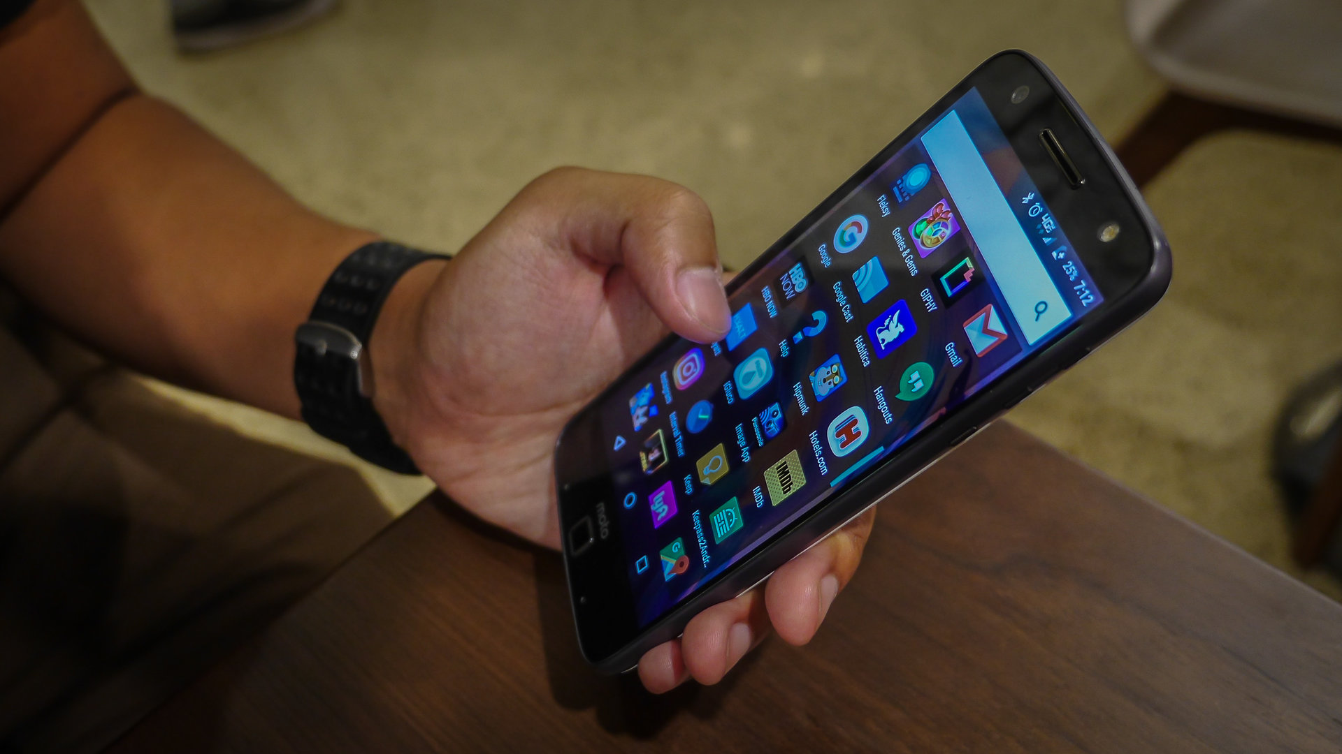
Moto manages to keep the good times rolling in their version of Android that will undoubtedly satisfy Android purists, but will also please those who need a little more from their operating systems. This is because the Moto additions are useful but generally are out of the way.
Specifications
| Moto Z | Moto Z Force | |
|---|---|---|
Display | Moto Z 5.5-inch AMOLED display Quad HD resolution, 535 ppi | Moto Z Force 5.5-inch AMOLED display Quad HD resolution, 535 ppi |
Processor | Moto Z 2.15 GHz Qualcomm Snapdragon 820 Adreno 530 GPU | Moto Z Force 2.15 GHz Qualcomm Snapdragon 820 Adreno 530 GPU |
RAM | Moto Z 4 GB | Moto Z Force 4 GB |
Storage | Moto Z 32/64 GB expandable via microSD up to 256 GB | Moto Z Force 32/64 GB expandable via microSD up to 256 GB |
Camera | Moto Z 13 MP rear camera, f/1.8 aperture, OIS, dual LED flash 5 MP front-facing camera | Moto Z Force 21 MP rear camera, f/1.8 aperture, OIS, dual LED flash 5 MP front-facing camera |
Connectivity | Moto Z Wi-Fi 802.11 a/b/g/n/ac Bluetooth 4.1 GPS + GLONASS NFC USB Type-C 1.0 | Moto Z Force Wi-Fi 802.11 a/b/g/n/ac Bluetooth 4.1 GPS + GLONASS NFC USB Type-C 1.0 |
Battery | Moto Z 2,600 mAh | Moto Z Force 3,500 mAh |
Software | Moto Z Android 6.0 Marshmallow | Moto Z Force Android 6.0 Marshmallow |
Dimensions | Moto Z 153.3 x 75.3 x 5.2 mm 136 grams | Moto Z Force 155.9 x 75.8 x 7 mm 163 grams |
Gallery
Pricing and final thoughts
Overall, the Moto Z Force and the Moto Z make for one of the best flagship experiences of 2016, offering great performance, a solid camera, and everything you’d want in a flagship. And adding the Moto Mods brings further versatility to the picture. While LG was slow to bring out its modular attachments and hasn’t done much to push them forward, Moto has been moving much faster and offering much better support.
While both handsets are wonderful, the Moto Z Force is absolutely worth picking up if you want the extra peace of mind that comes from the durability of a shatterproof display. Combining the shatterproof display with all the great specs found within, it’s really hard to find a phone that even begins to compare.