Affiliate links on Android Authority may earn us a commission. Learn more.
New Android Firefox browser might make a good Chrome alternative... eventually
Published onJuly 2, 2019
Mozilla introduced an experimental new Android browser last week called Firefox Preview. This in-development browser is the foundation on which the mainline Firefox for Android browser will be reinvented. Mozilla plans to relaunch the Android Firefox browser later in 2019.
Firefox Preview, as the name suggests, is a work-in-progress, but it already presents some appealing prospects. Mozilla claims the browser is up to two times as fast as its previous Android browsers. It also comes with an unconventional interface and automatic tracking protection.
I’ve been playing around with it for a few days to see if it delivers any of what Mozilla promises — below, you’ll find my early impressions.

How fast is Firefox Preview?
So far, it seems to be faster than the existing Firefox for Android, and about on par with Chrome for Android, or slightly slower. Still, it’s nippy — I suspect as fast or faster than many of its competitors. Chrome still seems to have the edge but I may be subconsciously biased towards Chrome, which I’ve used forever and is my everything.
For the most part, Firefox Preview is quick in page loading and general navigation, but perhaps not in a way that you would notice if you weren’t specifically looking at it. Users may, however, find the workflow faster thanks to the browser’s unique interface. What’s that like?
Interface highs and lows
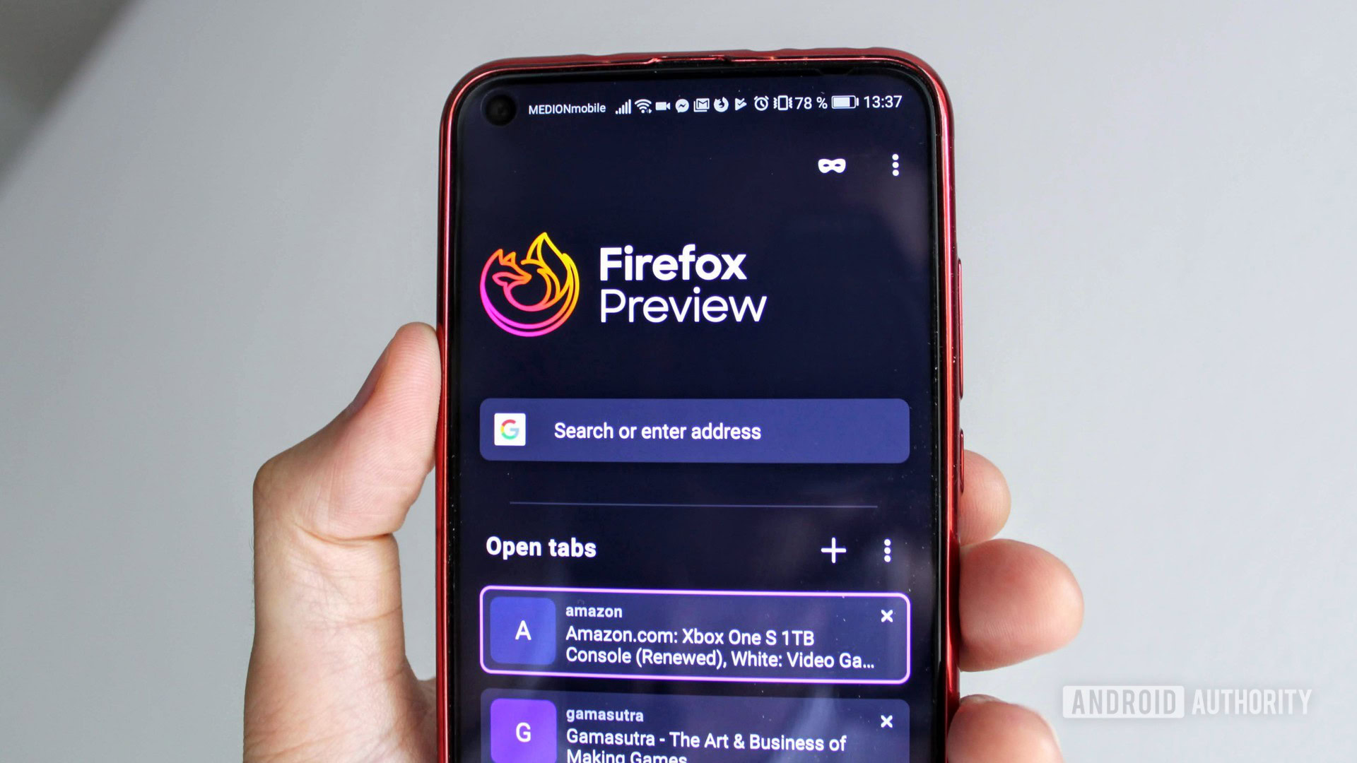
The Firefox Preview’s interface has some clear strengths. Its landing page, or general home area, is where you’ll find your search bar, open tabs, incognito mode toggle, and some other options.
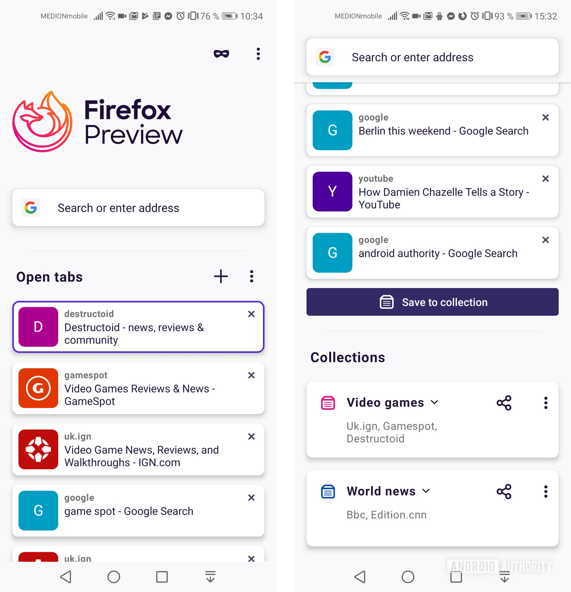
This area gives you a view of your open tabs — something those who regularly have dozens of open tabs will appreciate — and the information here is well laid out.
I prefer this to Chrome’s carousel tab view because you can read see more of them at a glance, but if there’s an improvement to be made it’s in the overall clarity. Where Chrome lets you see a snapshot of the page in the carousel tab view, here you only see the website, page names, and website icon if you’re lucky.
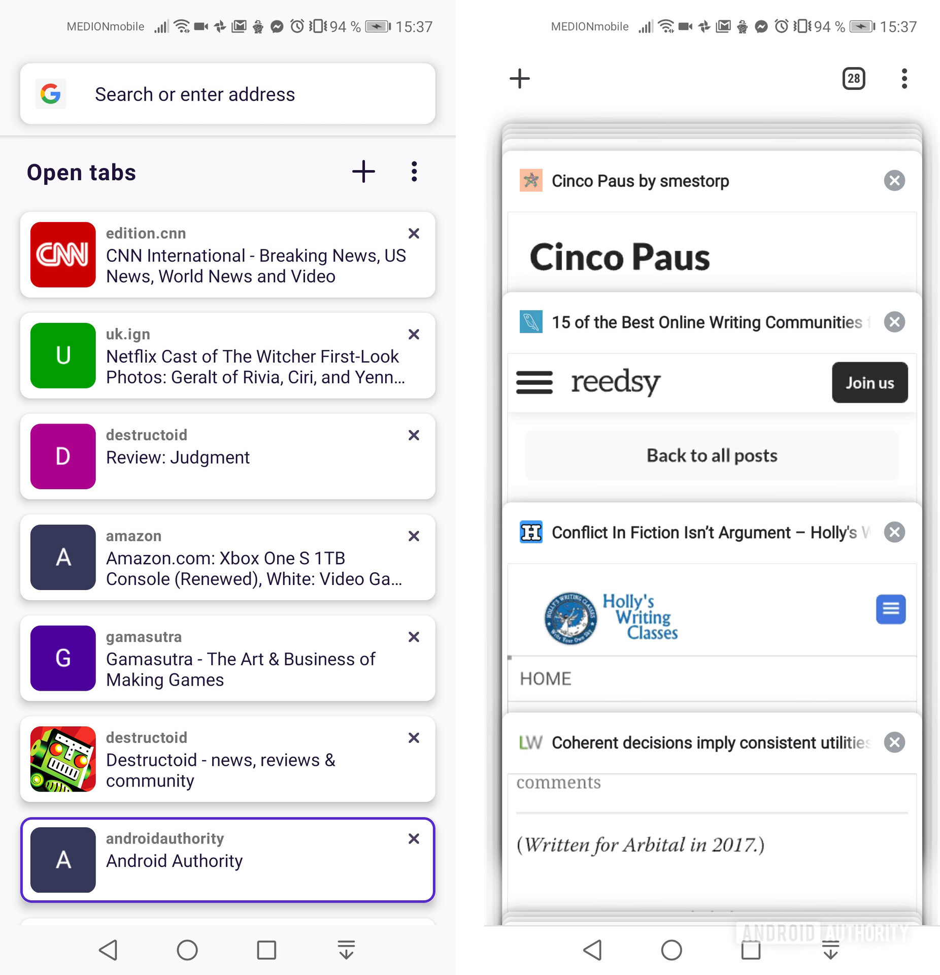
The incognito toggle and search box areas are easily accessible at the top of this area, but if you’re the kind of person who has 99 tabs open, the Collections are at the bottom is going to get buried. I’ll talk more about Collections in a moment but the good news is that they may reduce the need for dozens of open tabs in the first place.
As for how web pages are set up, Firefox Preview includes an address bar, tab counter, and an options menu on the page — as many browsers do. However, this toolbar is set apart from its competitors with one key significant difference: it’s placed at the bottom of the screen rather than at the top.
This doesn’t work for me.
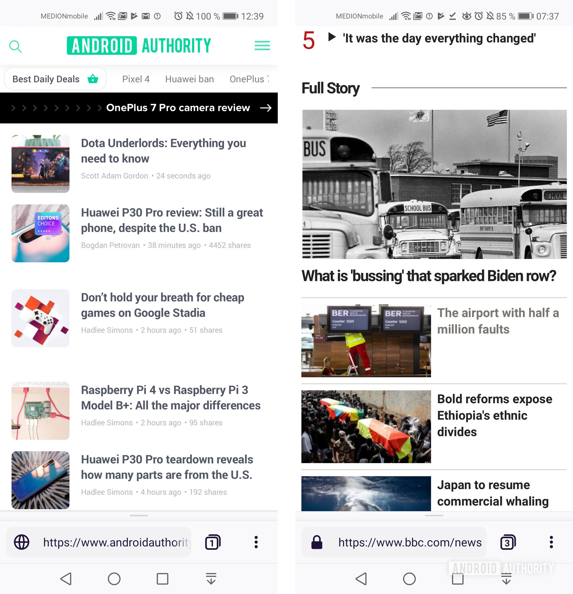
One the one hand, websites tend to place the most important information at the top of a web page, so de-cluttering this space at the browser level seems reasonable. But a browser like Chrome hides the URL bar when you scroll down anyway, so it doesn’t take up any unnecessary space (don’t worry, I think that’s the end of my Chrome fanboying for this article).
Firefox Preview’s approach does make this bar easier to access with one hand when using a big phone, which probably reflects most people’s situation. The trouble is, while at the bottom, it’s easy to mistakenly press a navigation button instead of the bar. It’s a small issue but an issue all the same.
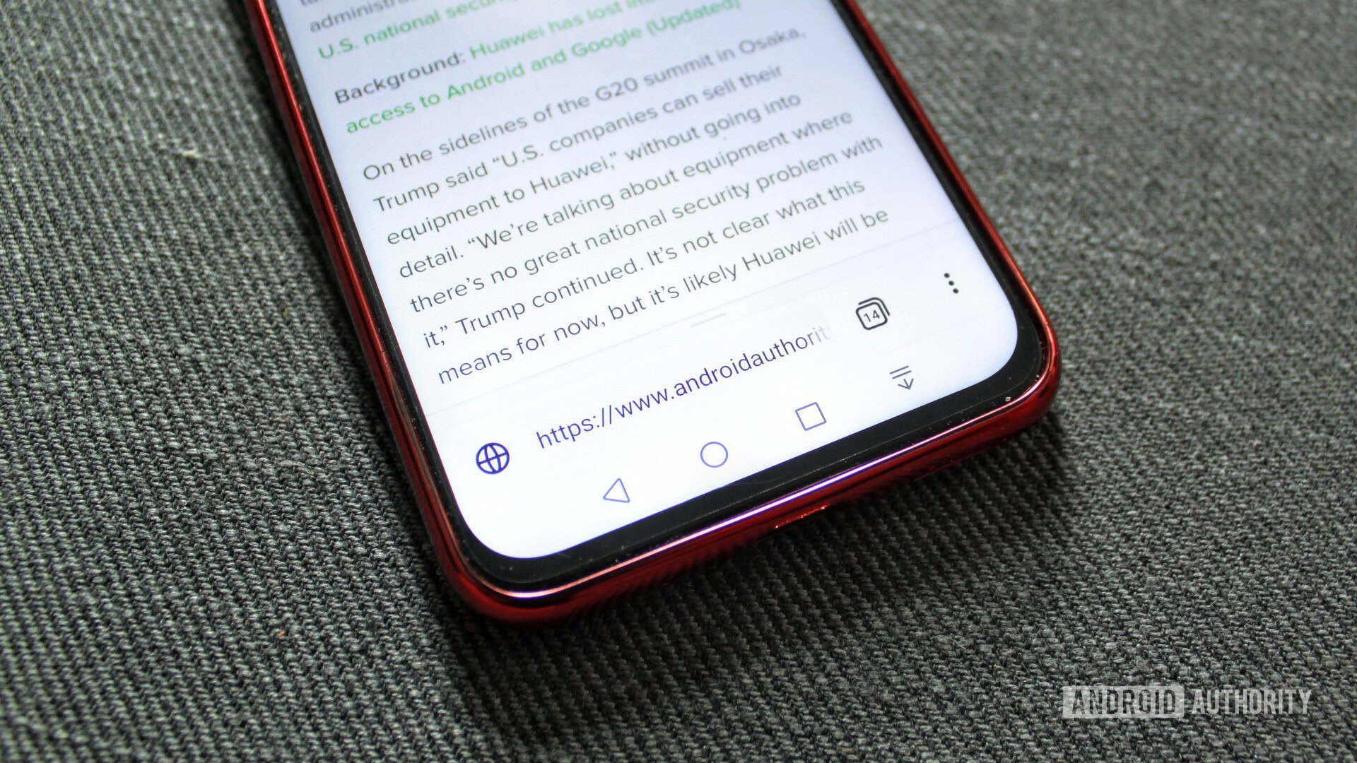
On a more positive note, a slide upwards from this bar reveals easily accessible share and bookmark buttons which I quite like, but I just can’t believe Mozilla hasn’t put an “add to Collections” button there.
What’s this about Firefox Collections?
Firefox Preview’s Collections are basically like bookmarks folders. You can name and add websites to collections for a convenient place to find and access groups of web links. For example, you might have a collection called “Travel,” where you save all of your favorite travel websites.
You can find your collections below your tabs in the landing area. Tapping on one will open it up for you to view the hyperlinks saved there. Tap a link and you’ll be taken the corresponding website.
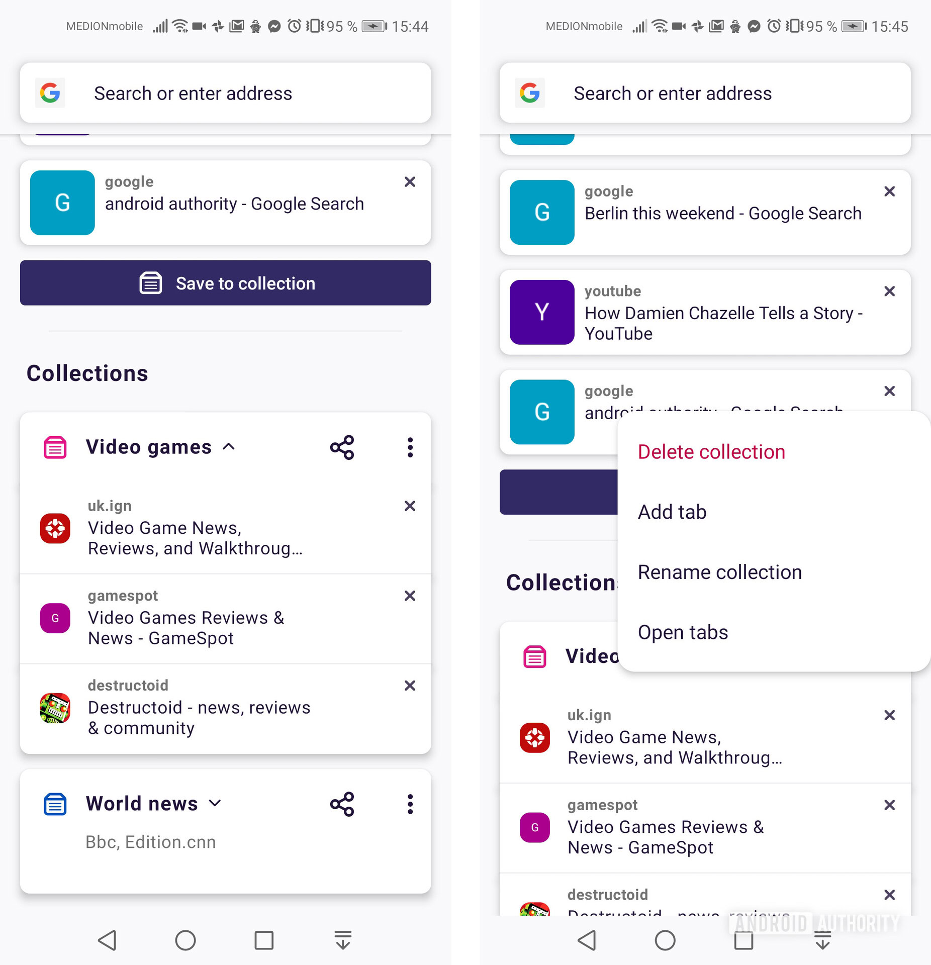
So, yeah, they’re bookmark folders, only they’re slightly fancier bookmark folders with a couple of benefits — one of which is saving the state of a particular site (h/t Lifehacker for that info nugget). If you’ve added an item to a shopping cart on a particular page, for example, it should remain there while the link is saved in the collection.
You can also share these collections, and Mozilla places a bit of emphasis on this (you can’t miss the share buttons). But how often does a person want to share collections of websites these days? I don’t think it will grow to be a particularly worthwhile or interesting feature.
Since Collections seem superior to bookmarks and are more easily accessed — bookmarks are tucked away behind options > your library > bookmarks while Collections are there at the tap of the tabs button — I feel like using collections will become the more popular way to save Firefox links in the future. For now, since Firefox Preview can sync up a previous Firefox user’s bookmarks, I can understand why they have been kept around.
What else does Firefox Preview offer?
Reader view
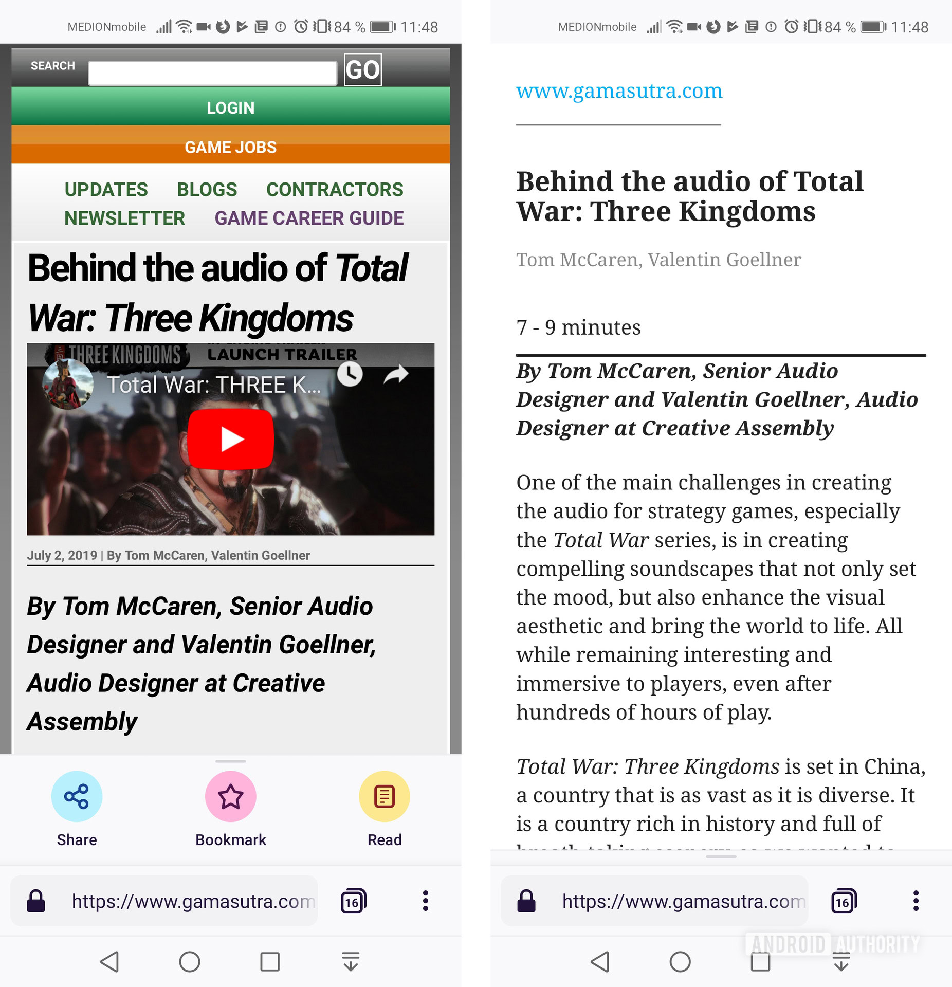
Firefox’s excellent Reader View has gotten its own color and text to go with its icon in the slide-up menu (alongside Share and Bookmark) on compatible pages. I have yet to decide if this is a more sensible placement; at least if you stumble your way there, the button’s function is clearer than it was.
Tracking Protection
Firefox Preview comes with tracking protection, which blocks content that would track you and is activated by default. Most people probably don’t want to be tracked, so making it opt-out rather than opt-in seems like a smart move. I can’t yet speak to its effectiveness, though.
Aesthetics
The overall look of Firefox Preview is subtle, yet strong. The animations seem to borrow from existing Google animations in some places, but they’re slick. The transition from normal browsing to private browsing is particularly sexy.
Preview’s Dark Mode also looks great, and you can set the Light or Dark modes to automatically reflect your device theme.
Firefox Preview’s “signature” features — the speed, the tracking blocking, the bottom-mounted address bar and buttons — aren’t necessarily world-beating right now. But I still recommend the Firefox Preview browser.
It’s free for starters, so, you know, why not just give it a try? But it also feels like the beginning of something interesting. I appreciate why some of these early moves have been made, even if I don’t agree they were all necessary. Preview should only get better as the months roll on.
Mozilla said Preview would be improved based on user feedback, so if you’re keen, you can email them at firefox-preview-feedback@mozilla.com. For anybody that’s already taken a look, tell me what you like or don’t like about it in the comments. Your tips and tricks are also appreciated!