Affiliate links on Android Authority may earn us a commission. Learn more.
This is the new Android Auto
Published onJuly 30, 2019
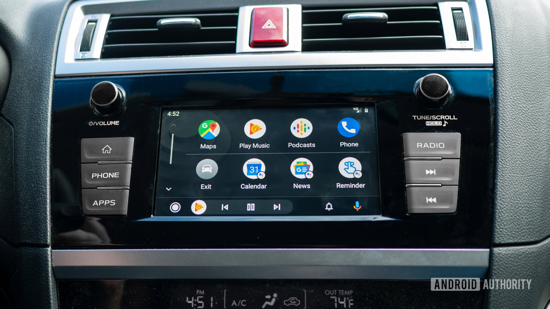
Android Auto launched five years ago, and it’s been a driving force behind new car purchases ever since. Infotainment systems are important to people when choosing a new vehicle, which is why Google is giving Android Auto a huge overhaul in an attempt to make it best in class.
Get going faster
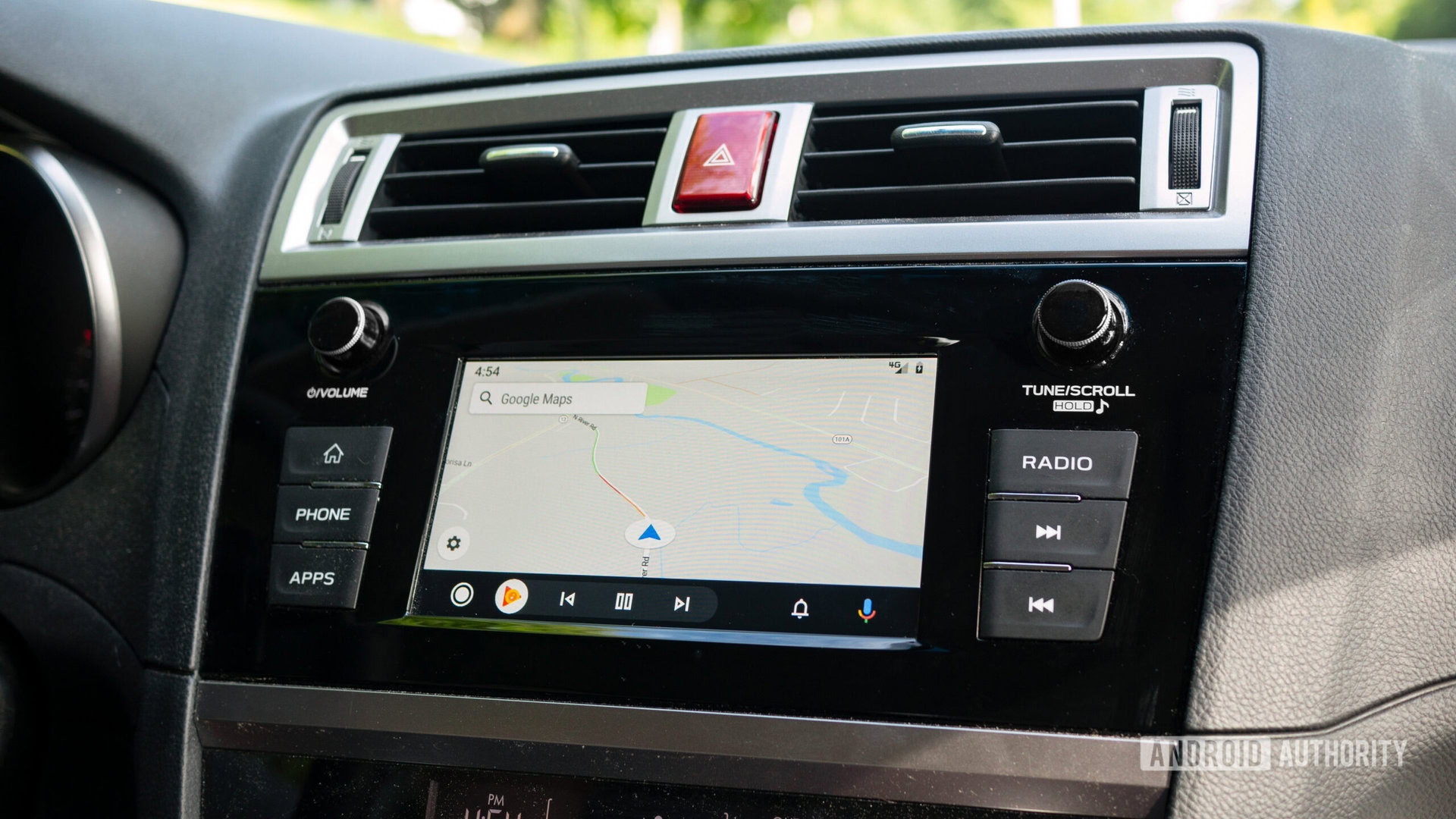
With the new update, Android Auto will show your preferred navigation app as soon as you start your car, so you’ll no longer need to start from the home screen. It will also give you suggested navigation locations based on your history. If you need to go somewhere new, you can always use the “Hey Google” keyphrase and ask for new directions.
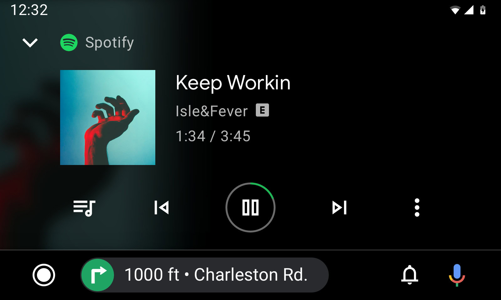
A new navigation bar will dynamically display media to accent what you’re currently doing. If you’re navigating, the navbar will show media and phone controls. If you’ve got the podcast launcher open for a larger view, the navbar will show basic turns and directions. This new navigation bar should help you navigate safer and more effectively.
New app launcher, better assistance
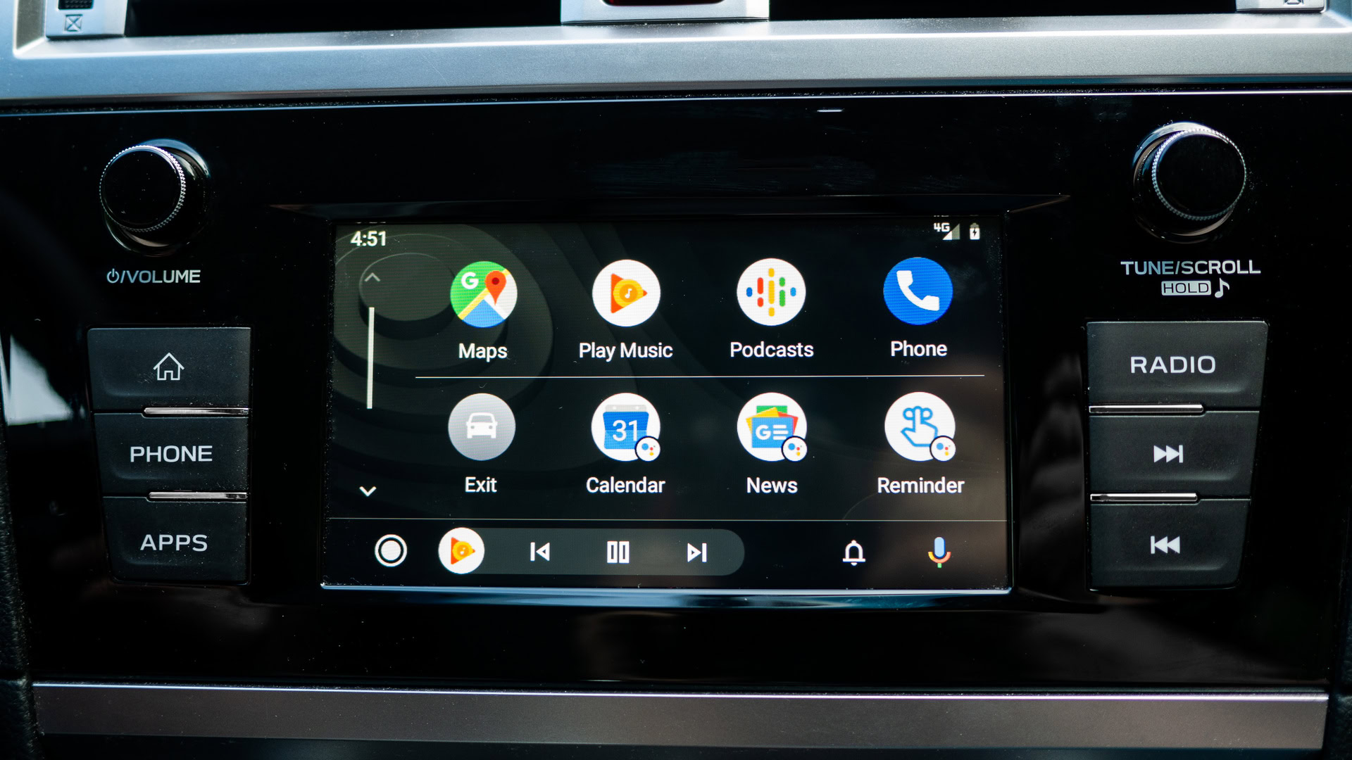
In this version of Android Auto, there’s a new app launcher to more easily switch between compatible apps. You can access things like maps, podcasts, calendar, and news from the heads-up display (HUD). This menu will be organized based on the apps you use most frequently while driving.
Multitasking is a lot easier, and safer, in the new Android Auto
Some of these apps will have a small Google Assistant badge embedded in their icon. When you tap the badge, the Assistant will give you more details relating to that app, like helping you understand your calendar agenda, making a phone call, or sending a text. You can still use your voice with the “Hey Google” keyphrase to perform these actions.
The new Android Auto also includes a notification bar that allows you to manage notifications at your own pace. The bar will show recent calls, texts, and alerts, and allows you to respond to them when you can.
Dark theme and better space utilization
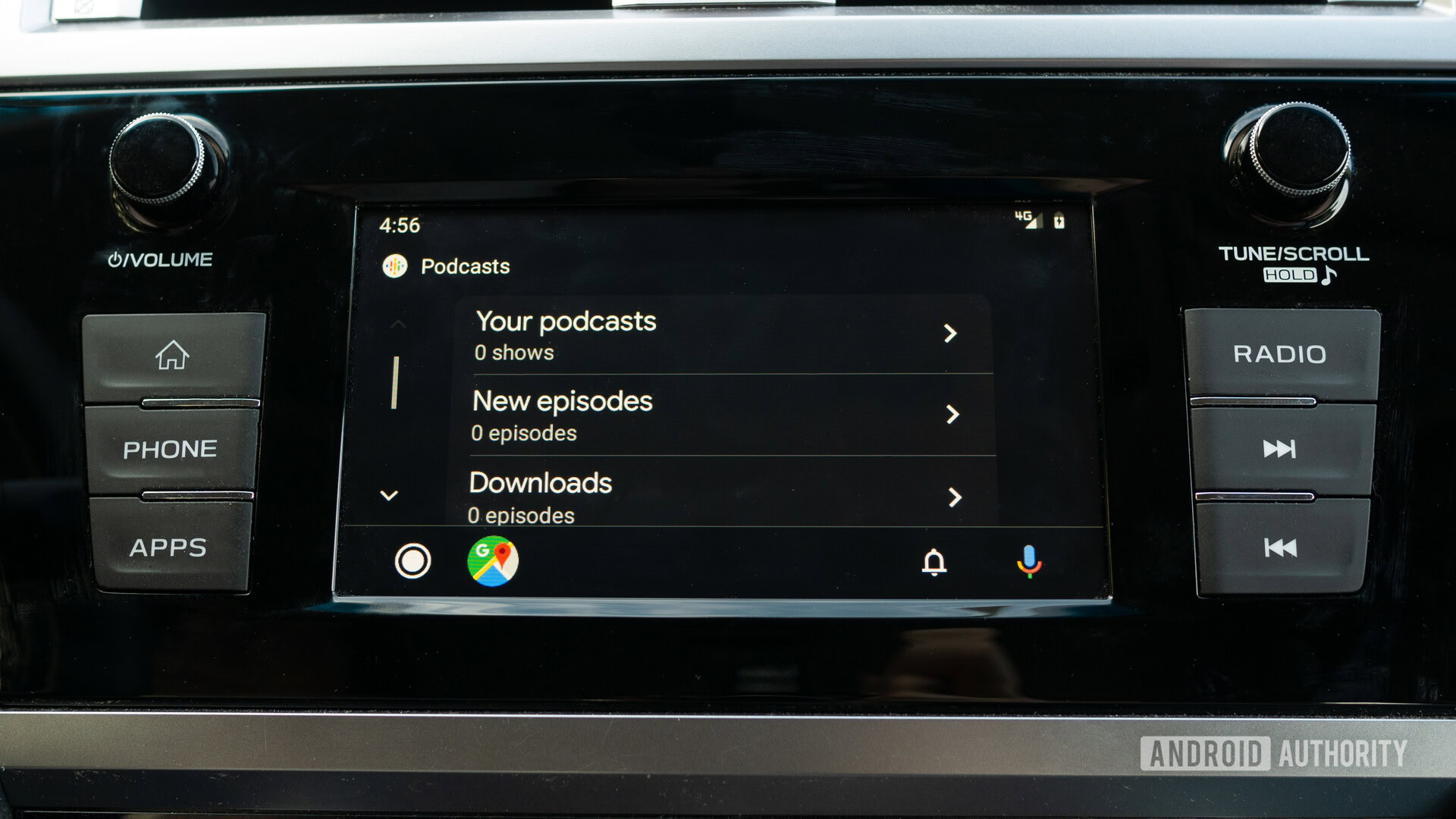
Google has also included a new dark theme, along with other colored accents and new fonts. This helps Android Auto feel new, while also being easier on your eyes. Google has been slowly adding dark mode to most of the apps in their ecosystem, so it’s nice to see Android Auto getting some love as well.
If you have a car with a wider-screen HUD, Android Auto will take advantage of the extra space by showing more information. This can show things like your next turn, ongoing call information, and playback controls.
Users have been asking for a lot of these features for a while now, so the update is nice to see. If you want to try the new version yourself, it should start rolling out to everyone in the coming weeks.