Affiliate links on Android Authority may earn us a commission. Learn more.
The new Android Auto UI is rolling out as a public beta now, finally
Published onNovember 11, 2022

- The new Android Auto user interface is rolling out to public beta testers now.
- It features a whole new look, easier controls, and a better split-screen.
- Unfortunately, the public beta roster is full, so you can’t see it unless you’ve already joined.
At Google I/O in May, Google showed off a teaser of an update to Android Auto. The infotainment system was going to get a new look and new features. At the time, the company promised it would land by the end of the summer.
Unfortunately, the summer came and went with no word on the new Android Auto. Today, though, Google is finally dropping the update — sort of. For now, only public beta testers will have access to the redesign. If you head to the Android Auto listing on the Google Play Store, you’ll notice that the public beta roster is full. That means if you haven’t already signed up for the beta, you won’t be able to give this a shot quite yet.
Google didn’t give any indications as to when we can expect the full rollout of this update to begin. However, it did give us a better look at what we can expect.
New Android Auto look
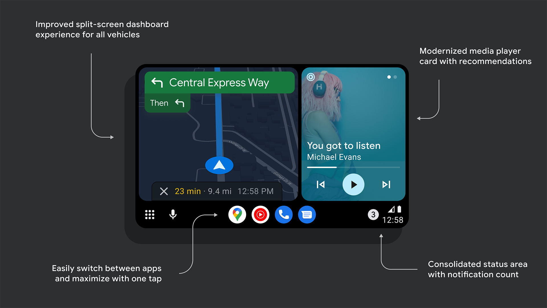
Overall, the new UI for Android Auto is cleaner, more organized, and better displays pertinent information. Split-screening is more effective, too. Here are the big changes Google is highlighting:
- Your map will now be closer to the driver in the new dashboard with improved size/reachability.
- The dashboard media card has a completely new look and now grows and shrinks dynamically.
- You can now make the map fill the entire Android Auto area, giving users more choices to pick layouts on large screens.
- There’s a new app dock in the rail to make it easy to switch between recent apps with one tap.
- More parts of the system have been updated to adopt Material You and modernized UI components and layouts.
- Music and media recommendations from Google Assistant can now be accessed with one swipe of the dashboard media card.
- The old status icons and notification center bell has been merged into one easy-to-parse, tappable area on the rail that includes the number of unread messages.