Affiliate links on Android Authority may earn us a commission. Learn more.
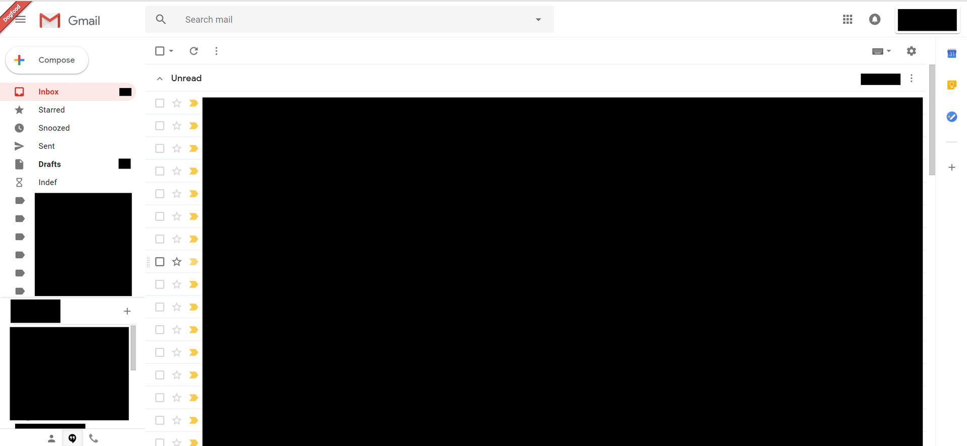
This is what the new Gmail interface will look like
Published onApril 11, 2018

This update is said to include new features currently present in Inbox, such as smart replies and the ability to snooze emails. The update will also bring Gmail up to date with Google’s rapidly changing design languages, and will incorporate aspects of material design as well as Google’s new bubble design.

Features
After we posted that report, a trusted source offered to let us see the Google redesign early. The new design we received supports the claims of features like smart replies and email snoozing, and enables a sidebar of plugins that give you easy access to different Google apps like Calendar and Keep.
Tasks redesign
What’s more interesting, is that Google looks to be completely refreshing Tasks for the masses. This is essentially a To-Do list which can be built directly into your Gmail window to help keep you on track with your goals for the day. Tasks was previously built into Gmail already, but the UI hadn’t been updated since the dark ages, so this total revamp is a welcome change.
These plugins are huge from a productivity standpoint, and make even more sense for things like Chromebooks. If I could get all my work done on a single webpage I would never leave my inbox again, and that is likely what Google is aiming for with this update.
Layouts
The new Gmail will give you three different layouts to choose from:
- Default will show you what kind of attachment is included in an email, including things like images, slides, documents or spreadsheets, right from your inbox
- Comfortable removes these icons and instead shows the familiar paperclip to signify an attachment
- Compact is similar to Comfortable but decreases the vertical whitespace
It’s unclear exactly when this new version will launch, but we have heard that Google will be letting users in through a beta channel in the coming months. If that doesn’t happen in the next couple of weeks, it’s likely we’ll hear more at Google I/O in May.
What are your thoughts on the new design? Do you like the new plugins?
Let us know your thoughts in the comments section below.
Full coverage of the new gmail look and features:
- New Gmail look for Android and PC explained
- The new Gmail is here, update rolling out now
- All the new Gmail features explained (Updated with video)
- Don’t like the new Gmail? You likely won’t have a choice come October
- The new Gmail vs Inbox — differences explained
- 5 common Gmail issues and how to fix them
- Gmail’s new Smart Compose is easy to use: Here’s how to do it
- You can now snooze your emails in the Gmail app on Android