Affiliate links on Android Authority may earn us a commission. Learn more.
I really like the new Google Pixel camera UI, except for one infuriating change
Published onOctober 4, 2023

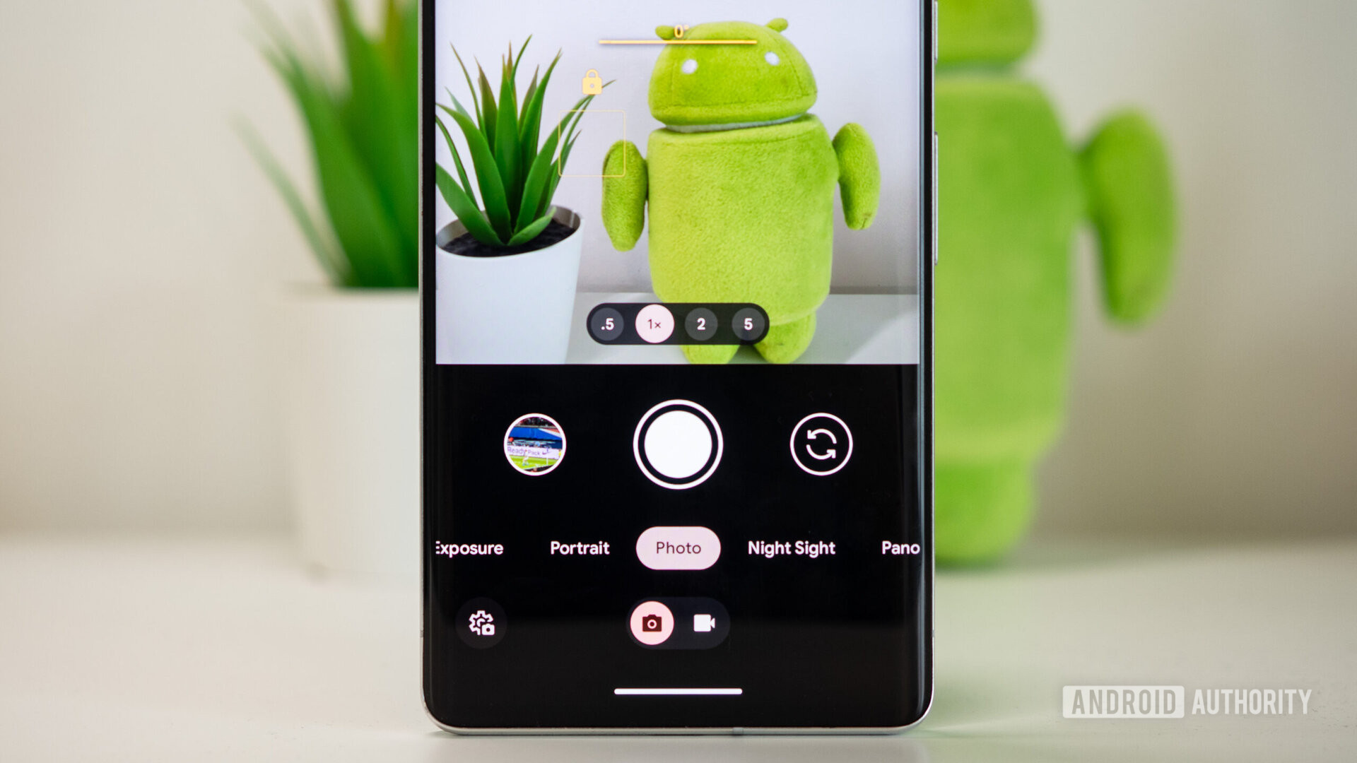
Google has been rolling out an update to its Pixel camera app with a revamped interface centered around usability. The change, which we initially thought was a Pixel 8 exclusive, is available on older units too, including my Pixel 7 Pro. And since I love taking photos with my phone, I’ve had to use this new app UI for about a week now. The verdict? I love everything about it, except for one very annoying change.
This new camera app is much easier to use
The Pixel camera app has been part of the Pixel’s exclusive feature list for a while now. And while the existing interface served its purpose when the app’s capabilities were limited (photo, video, portrait, night mode), it has certainly become more cumbersome with the addition of extra features like the various video modes, long exposure, and action pan photos. The Pixel 8 series is supposed to add even more unique camera options, so a revamp was due.
Google’s update for the camera interface couldn’t have come at a better time. The app now separates photos and videos into two main sections, which are easier to understand. This is especially beneficial for video, where multiple modes (Slow Motion, Timelapse, and Cinematic Blur) are no longer stacked a layer deep next to each other. It also moves the stabilization into the overlay settings and graduates the Pan mode to a standalone tab.
I love that the new camera interface is easier to understand and lets me access Night Sight faster.
For photography, it also means that Long Exposure and Action Pan are now separate instead of being bundled under the Motion mode; while the Panorama and Photo Sphere modes get promoted to the top picker too. I don’t use any of those a lot, but I appreciate faster access to them for the few times when I need them.
Personally, though, my favorite change is the very simple move of Night Sight so it’s next to the main Photo mode. I take enough low-light photos, outdoors and indoors, and use this all the time, so I definitely like not having to swipe three tabs away to find it.
Room for improvement and one dealbreaker

Ever since my Pixel 7 Pro’s camera app has been updated, my muscle memory has been messing up with me because of one change. And it’s a borderline dealbreaker to be honest.
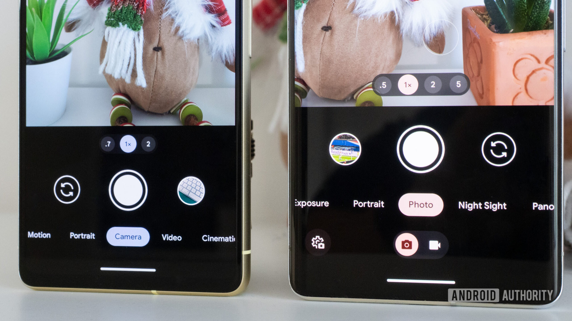
Google flipped the camera switch (selfie) and camera roll (preview) buttons’ placement. I hate that change. For the past several years, my brain and thumb have been trained to tap to the right of the shutter button after capturing a photo or video to see how well the result turned out to be. It’s not that I doubt the Pixel’s camera, but I doubt my own framing and alignment, as well as my ability to get the right shot at the right moment. On busy days, I might tap that preview button dozens of times. And now, because the functions have been inverted, I find myself inadvertently switching to the selfie mode instead. *insert audible grunt*
Instead of breaking years of muscle memory, couldn't Google just offer a setting to choose where the selfie camera and preview buttons go?
I understand that, for most people, the selfie camera has become just as, if not more important than the cameras on the back of a phone. I also understand why Google thought that easier access to that camera flip button for right-handed users would benefit more people than the preview button. But really, instead of breaking years of muscle memory with no warning, couldn’t we just have a setting? Pick which button you want on each side, easy peasy. Right- and left-handed people could choose which button to privilege according to their own usage.
Where do you prefer the camera preview (or camera roll) button in the Pixel camera app?
There’s also a list of other improvements I’d love to see Google bring to the Pixel Camera app. Chief among them is a simple button for 10x zoom. The Pixel 7 Pro has excellent zoom and can squeeze out some great stills and videos from the 10x range, even though its telephoto is physically capped at 5x. Google even sang the praises of the 10x zoom when it launched the phone. But since there’s no button for 10x, you have to manually try to hit that, which is clumsy and time-consuming. Having a button next to the 5x zoom would be great.
A better interface for macro mode and zoom options while shooting panoramas would also be welcome. Plus, we’ll have to wait until the Pixel 8 Pro is announced to see how Google is adding support for the rumored manual mode.