Affiliate links on Android Authority may earn us a commission. Learn more.
Everything you need to know about the new Google Play Store


New features
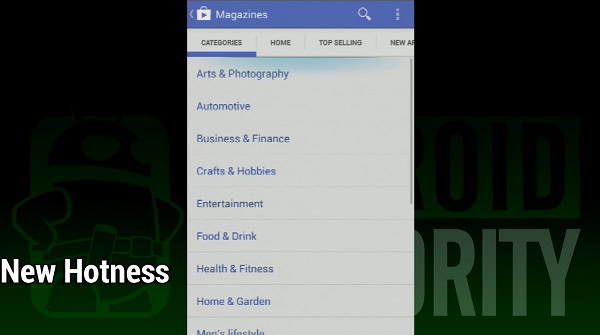
First let’s take a look at the new features. Despite the looks receiving a mammoth overhaul, the Google Play Store actually received a surprisingly little amount of new features. Pretty much all the core functionality is still there. You can search for apps via categories. There are still top new paid, top new free, and trending lists to choose new stuff from. If you were to open up top new free apps, the list would be identical in the new one as it is in the old one. So the experience is still very much the same.
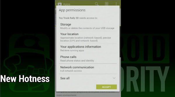
There are a couple of small features that we’d like to mention, though. That annoying Keep Shopping page is now gone. When you download an app, a window pops up showing you the app permissions. Click the download button and you just go back to the app screen. That’s one less step in downloading applications. For people who download a lot of applications, this can be a huge time saver. Good riddance, we say, because that Keep Shopping page wasn’t overly helpful at all.
The other feature is each app listing now has a 3-dots button. This isn’t anything big but you can now download apps without being required to actually visit the app page. It’s a nifty little feature if you’re looking to download something really quickly. Most people probably won’t notice it and that’s their loss. It can make downloading a long list of apps a really easy task.

New design
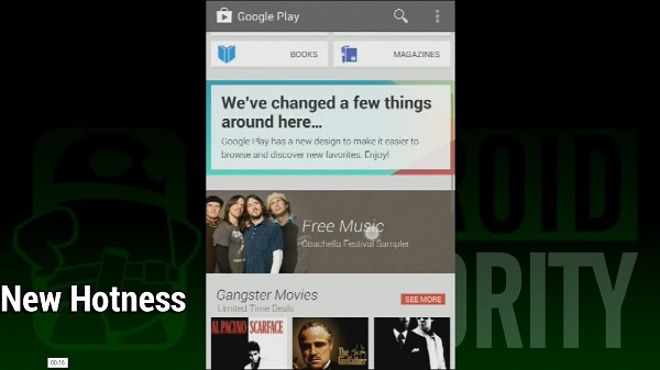
The biggest change over the old Google Play Store is the new design. The front page is no longer a garbled mess, the dark theme has been replaced by a light theme, and the whole store looks more organized. Gone are the days where everything is cluttered together in a glob of content. One would think that adding a little space wouldn’t matter so much, but it really does. Everything is much easier on the eyes and much easier to focus on. Things like day to day sales and promotions are easier to absorb since it isn’t being huddled together with everything else.
The other really big design change is the switch from tile views to card views. Most lists are now in card format like you see in Google apps as of late. There still some tiled views but even they seem retain the card format. All the app listings are now larger too. So you won’t see a couple dozen app listings on the screen anymore but more like four to six or so. This is also great for easier digestion of content because gazing over a few apps and then scrolling is easier on the eyes than squinting at a bunch of apps then scrolling.

The new Google Play Store wrap up
If you were coming into this article hoping for some major changes, you’ll be both happy and disappointed. The new design is a lot easier on the eyes and what few features the new Google Play Store brings to the table are welcome. However, when you get right down to it, you won’t be using the Google Play Store any differently than you were before the change. The same apps adorn the tops of each list. Even the categories like music, movies, apps, books, etc keep the same color scheme. Books are still blue, Music is still orange, and Movies are still red. The front page still holds all the deals of the day. In the day to day operation of the Google Play Store, very little has actually changed.
The design overhaul is a welcome change, though. The dark themed, cluttered Google Play Store is gone, replaced by something a little more colorful, elegant, and easier to use. That, in and of itself, could be considered a feature. The new card views for apps is a welcome change as it’s easier to take in information. All that extra space is also welcome for the very same reasons. People can now go into the Play Store and actually see what’s going on. No more dark themed, cluttered magazine views.
Overall, we really like the design change. While Google didn’t really change the experience, the new design changes how we experience it. Instead of being eye blasted by cluttered content, we’re now treated to the same deals but in a more readable format. Instead of having a tiled list full of apps, we’re given lists four to six apps at a time for easier consumption. This should help people go into the Play Store and actually want to check back for new content.
If you haven’t gotten it yet, just be patient. It seems to be randomly rolling out to devices so yours should update on its own naturally. If you absolutely can’t wait, there are a multitude of places online with the APK that you can download and install manually.