Affiliate links on Android Authority may earn us a commission. Learn more.
Let's take a look at the new YouTube Music (hands-on)
Published onMay 26, 2018
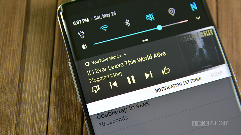
The new YouTube Music is out. We’ve heard about this a ton over the last year. It’s going to eventually replace Google Play Music in Google’s lineup and, unlike its predecessor, it links directly to YouTube in a ton of ways. It’s one of Google’s more ambitious releases over the last year or so as it hopes to compete with the likes of music streaming juggernauts like Spotify, Apple Music, TIDAL, and others. Could this be the one that breaks the mold? Silly, required rhetorical questions aside, let’s take a look at the new YouTube Music and see what it’s really about.
YouTube Music’s UI
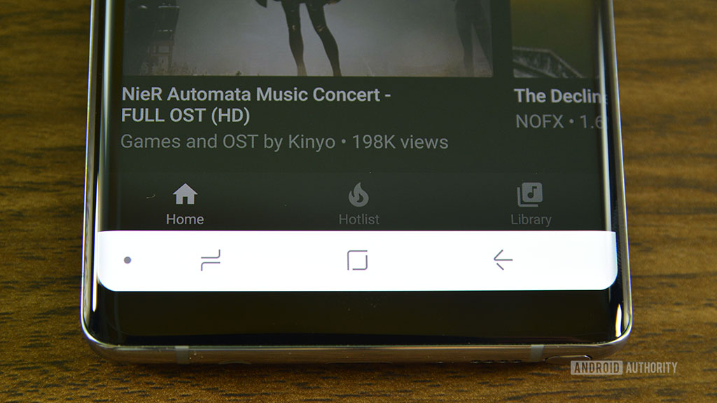
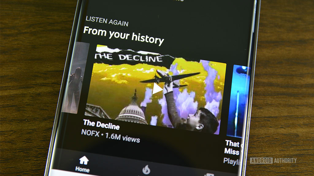
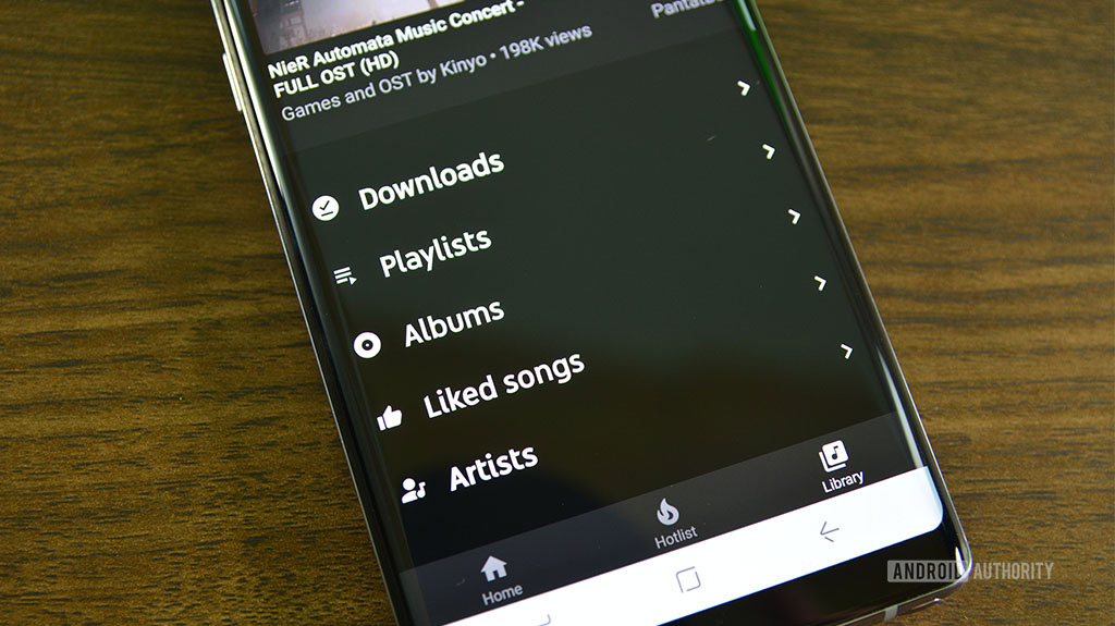
To be perfectly honest, YouTube Music’s UI is delightful. It’s a little bland and minimal. However, you can also get to just about everywhere in the app within two taps. The app consists of three main screens: the home screen, the Hotlist, and the library. The home page shows recommendations for things like new releases, various playlists, music videos, and stuff like that. The Hotlist is basically just the most popular and most trending music videos. The library shows your playlists, saved artists, saved albums, downloaded content, and your liked songs.
You can tap the profile picture in the top right to see more stuff. That includes settings, downloads, viewing/listening history, the switch account action, and the help/feedback section. The settings are fairly bare-bones with most settings dealing with network usage, notifications, and a restrictive mode that blocks things like offensive language. The actual music player UI is fairly standard fair. There aren’t any surprises here. Swipe up for playlists and hit the three-dot menu for additional options.
That’s it for the UI, really. It’s simple, effective, and quick to navigate. It shouldn’t take long to get it down. We really hope they keep that core simplicity as they continue to add features to the app. We can definitively say that this is vastly easier than Google Play Music ever was, even if there isn’t much here yet.
Content
YouTube Music’s content is a little bit of a mystery. It offers all of the music videos from YouTube. That gives it a list of songs greater than any streaming service. There is also a separate selection of stream-only songs without video. Searching for content shows both along with other people’s playlists and albums. Thus, it solves the age-old problem of not finding a song on your streaming service and then opening YouTube to find it there. This app searches for both in the same spot. Subscribers have unmitigated access to both video and audio-only content.
We’re not sure how many on-demand, non-video songs YouTube Music supports. We imagine it’s in the tens of millions much like Google Play Music and other comparable services. The app still gives access to every music video on YouTube, though, and that really helps fill in the blanks left my most other streaming services.
The integration between on-demand music streaming and music videos is present in every function of the app and that’s where things get awesome. You can create playlists with both music videos and on-demand music in the same place, giving YouTube Music the most powerful playlist creation tool this side of the Internet.
Additionally, all videos have a toggle that turns off the video for an “audio-only” mode (an older feature from before the big update), essentially turning all music videos into on-demand music streams. Thus, in practice, you can’t really tell the difference between a music video from YouTube or an on-demand song from YouTube Music. Integrating the two together was a stroke of genius. In terms of content, even in its current form, it has more music than whatever you’re using.
Additional features
There aren’t a ton of additional features aside from the usual array of music streaming mainstays like playlists, music on-demand, and other such things. The app is fairly bare-bones right now, but we expect that to change as the app and service both mature. There are a few extra things, though. The previously mentioned restrictive mode makes the app more friendly for younger folks or those that flat don’t like swearing. The app also has Chromecast support (of course).
This is an early access beta, though, so there aren’t a ton of extra features to write home about yet. It should get a bunch of features from Google Play Music as they integrate the two over the course of the next several months. We’re sure there are other plans for this app as well that we don’t know about yet. In short, there aren’t a ton of additional features yet, but there is more than enough evidence of new features coming to the app sooner rather than later.
What we didn’t like
Nothing is perfect and that includes the new YouTube Music. We did see a few flaws that we’ll talk about briefly in hopes that they get fixed before too long.
- For some reason, the app doesn’t show song lengths in search results. This is odd because YouTube shows length in its search results. Considering that bands like Dire Straits have live versions of Sultans of Swing that are both five minutes long and 11 minutes long, we would’ve liked to have seen track lengths so we know what we’re dealing with.
- Everything you do in YouTube Music is reflected somewhere in the main YouTube app for better or for worse. Any playlists you make in YouTube are visible in YouTube Music and vice versa. Every song on YouTube Music is also a video on YouTube. This may reflect in your recommendations on the standard YouTube app as well eventually.
- You can choose video quality on YouTube, but not audio quality. The same goes for YouTube Music. You get whatever audio came with the video and that’s it. It’s usually fairly middle-of-the-road stuff. It’s not terrible by any stretch, but we’re definitely not dealing with high quality MP3s either. Most people likely won’t notice or care and that’s fine. However, those who enjoy higher quality audio might be disappointed.
- Finally, there are a swath of popular videos that are basically entire concerts in a single video. YouTube viewers rely on comments and video descriptions for time stamps so they know where the songs start and end. YouTube Music doesn’t show comments or video descriptions. You can see why that might be a problem. Longer concert-style videos are still better on the main YouTube app.
- Quite frankly, other than changes to the UI, we’re having trouble discerning the difference between the new YouTube Music and the old one.
Most of these issues are nitpicks, but they are issues we would like to see fixed sooner rather than later. There are also some UI elements that seem a little under-cooked. However, this is an early release, so we kind of expected those.
Wrap up
YouTube Music is a very interesting product. Its massive library of content already eclipses everything else on the market, even SoundCloud and its absurd number of tracks. The integration between YouTube and YouTube Music is neat and the promised inclusion of the best parts of Google Play Music should make almost any music fan giddy with excitement. This one has a lot of potential.
However, like we said a moment ago, there really isn’t much of a difference between the new YouTube Music and the old one. There are no audio quality settings, everything you listen to is a video that is available on YouTube anyway. Aside from a scaled back UI, a larger focus on music, and removing non-music content, you’d be hard pressed to find features in YouTube Music that aren’t also available in the main YouTube app.
For now, we recommend that you don’t cancel your Spotify subscription yet. YouTube Music is in early access beta and it has a long way to go. There is definitely promise, the app works well, and some of the ideas here are utterly fantastic. However, until it starts acting more like its own product and less like an off-shoot of another product, it’s difficult to recommend that people spend money on it. Of course, we want to hear your thoughts as well! Tell us what you think in the comments below.
