Affiliate links on Android Authority may earn us a commission. Learn more.
Nitpicking the Nexus 5X: Gosh the grievances!
Published onNovember 10, 2015
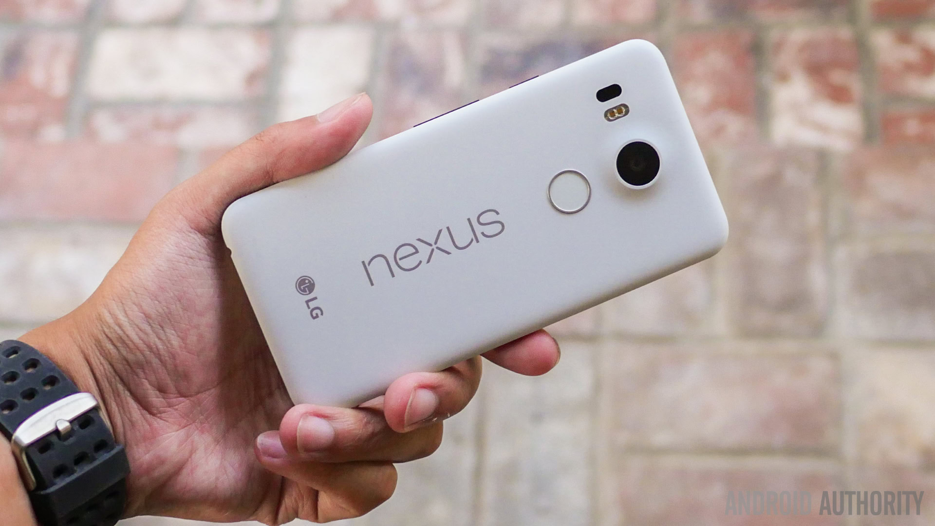
Now that the LG Nexus 5X has hit the hands of some of the more hardcore haves, I thought it would be a good time to sound off on some of the sour spots. Make no mistake, the device is a fantastic product and a worthy upgrade from the original Nexus 5. Still, I tend to test out a lot of phones for evaluative purposes and suffice to say there have been a number of issues I’ve had with the 5X in the days I’ve spent with it so far. Some of these are device-specific, some are OS-related, however, given that the two are one-and-the-same, both will be addressed in this piece.
Also, I feel it pertinent to mention that this is not intended to be a thorough review of the hardware by any means. Those interested in a more objective, in-depth look at the device and all it has to offer should check out our official review here. With that said, let’s get this train started.
The “Misunderstandings”
Call it strange, but unless I’m specifically required to know relevant information for purposes of a post or debate, I tend to shy away from full-disclosure when it comes to IT products. Basic specs are fine, but I want to know the ins and outs for myself, kind of a pseudo sense of discovery. With that said – and especially regarding the 5X as opposed to the 6P – my prior knowledge of the spec sheet was limited so as to be potentially surprised. Indeed I was, but in both good – and bad – ways.
To this end, the first formal section will address those “darling discoveries” I have encountered:
Sour about the speaker
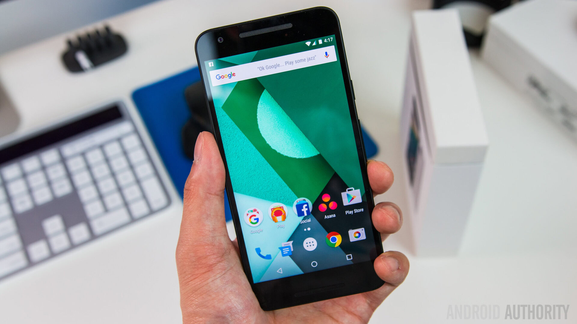
Before I had my hands on a 5X, I was under the impression the prominently visible dual “grill” setup along the top and bottom bezels were for stereo speakers. Nope. Sound comes only from the bottom vent, and the sound quality is really lacking for 2015, especially with companies like ZTE making it a sound priority.
YouTube videos for example, are harder to enjoy due to this problem, and I really wish LG could have put a better sound system in the hardware. At the very least, at this point in time if companies are going to make it look like there are front-facing stereo speakers, they ought to actually do it.
This is not to say the Nexus 5X is horrible, but in all honesty I’ve heard better sound coming from rear facing speakers than the one pointed flat at my face on this device. Oh well, that’s what headphones are for perhaps.
Bravo about the build
Some of the other aspects of the 5X are, in my humble opinion, fantastic. I happen to love the design, even the camera protrusion on the back. It hearkens back to the days of the HTCOne X, of which I have fond recollection. At least on a personal level, I feel the 5X looks more modern than the original Nexus 5.
Additionally the screen is excellent. Shortly before the 5X arrived I stared in total disbelief at the spec: it’s “TFT”. And yet, the screen is – as far as non-AMOLED goes – bright, vibrant, and colorful. It is perhaps a testament to LG’s own display prowess.
…but those buttons…

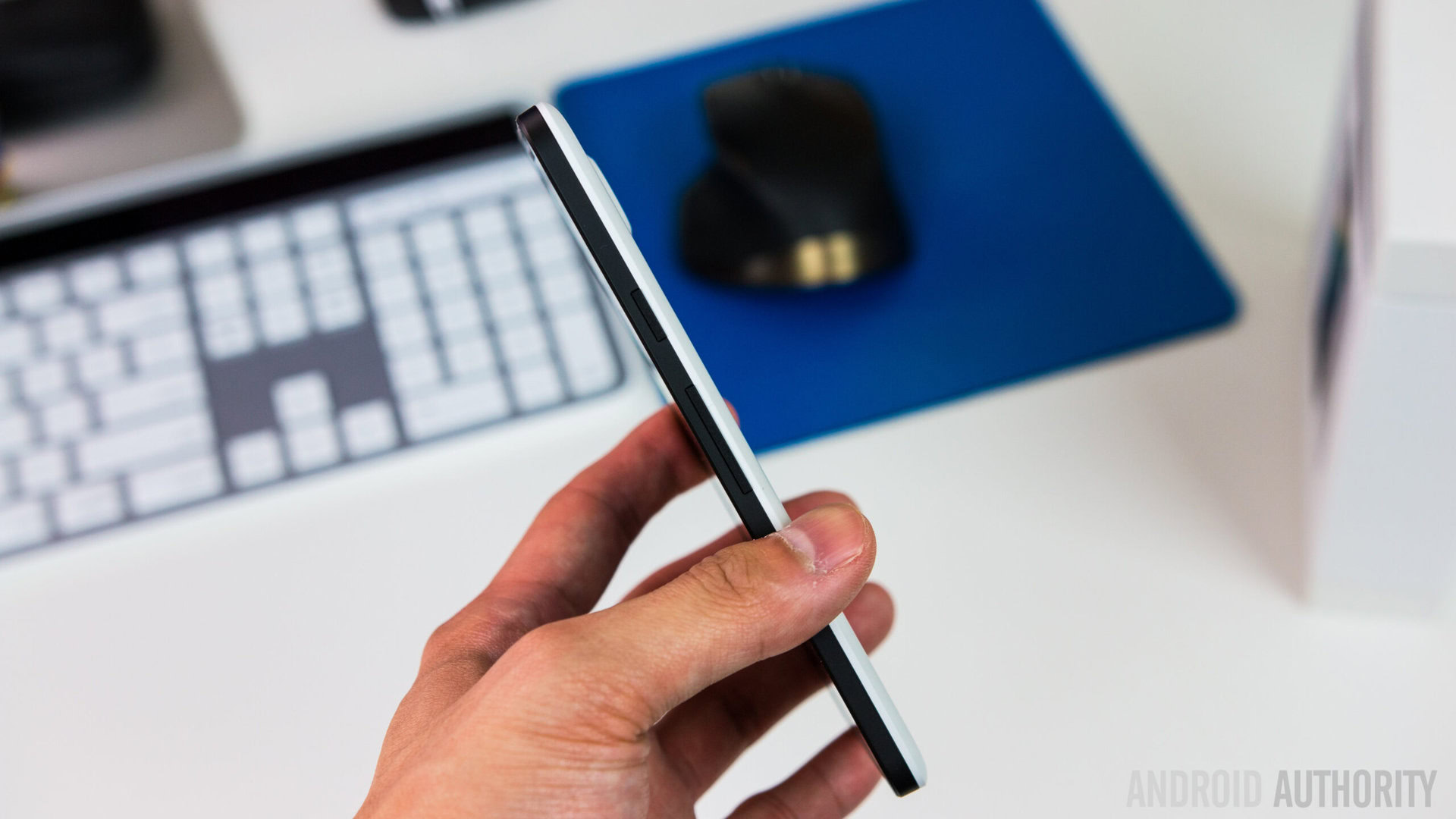
On the other hand, I have nothing positive to say about the flimsy power and volume buttons along the right side of the phone. They are every bit as bad as those on last year’s Nexus 9. In the case of said tablet, the issue was gradually resolved with later builds, and seemed to be better – on the whole – with the white variant.
LG still makes some internally produced hardware with buttons along the side, one of which I used just last month, released in Japan as the LG Spray. This device had the same tactile, responsive buttons that LG used to make on all their phones, thus I begin to wonder if this is something Google-related given the HTC Nexus 9.
Could LG fix this with later production runs, as it did with the Nexus 4’s sliding siding? Sure. But it’s not going to do diddly squat for me, or the potentially hundreds of thousands of early adopters who potentially are less than pleased with the issue. Sure the Nexus Imprint negates the need to use the power button, but that’s hardly justification. Speaking of which…
I can’t quite place my finger on it…
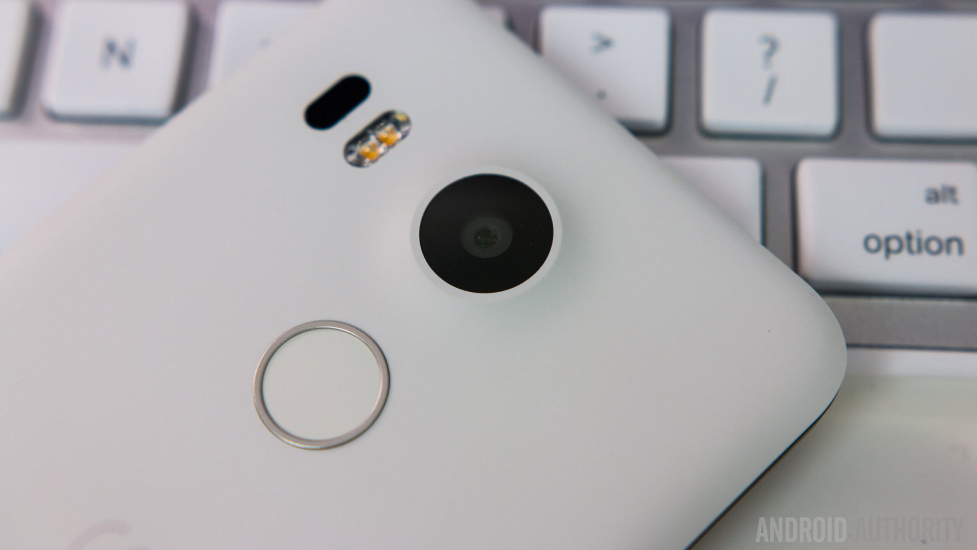
The Nexus Imprint sensor is cool, without a doubt. Rather than requiring a prior press to turn on 5X’s screen (or a pressurized push), a single print does double duty and will both power on the device and immediately unlock it.
This works wonders, especially given the aforementioned build quality blues regarding the power button. You simply place, and presto.
The problem is that…any time the device is turned off and something presses against Imprint, the sensor will try to read it. Wrong. It makes handling the device somewhat troublesome because of the two quick haptic feedback responses that occur for bad scans.
At least for me, it’s like I’m always accidentally touching the Imprint sensor by “accident” and constantly get the vibratory feedback error. Likewise depending on the finger(s) registered, you may inadvertently turn wake up and unlock the display simply by mistake.
It kind of makes me wish the sensor was on the front of the device, a la Samsung, though obviously nothing can be done about this now.
The force returns in full

Related to this is the problem of the 5X’s forceful feedback. In all my years and experience, I don’t think I’ve ever encountered a device with haptic feedback this strong. Indeed many have said that the actual audible vibration from the part itself is stronger than the sensation itself.
And it is loud. Even on a semi-crowded Tokyo subway with people talking next to me, I could still hear the mechanical “noise” emitted by the build as I typed this very sentence.
This brings up two specific issues for concern:
1. If haptic feedback is this strong, will the internals wear out over time due to too much use?
2. Why isn’t there a way to manually adjust the haptic feedback intensity in the Usability settings option? Given that high intensity might be best for people who have certain disabilities, it seems fundamentally relevant.
Mushy Marshmallows
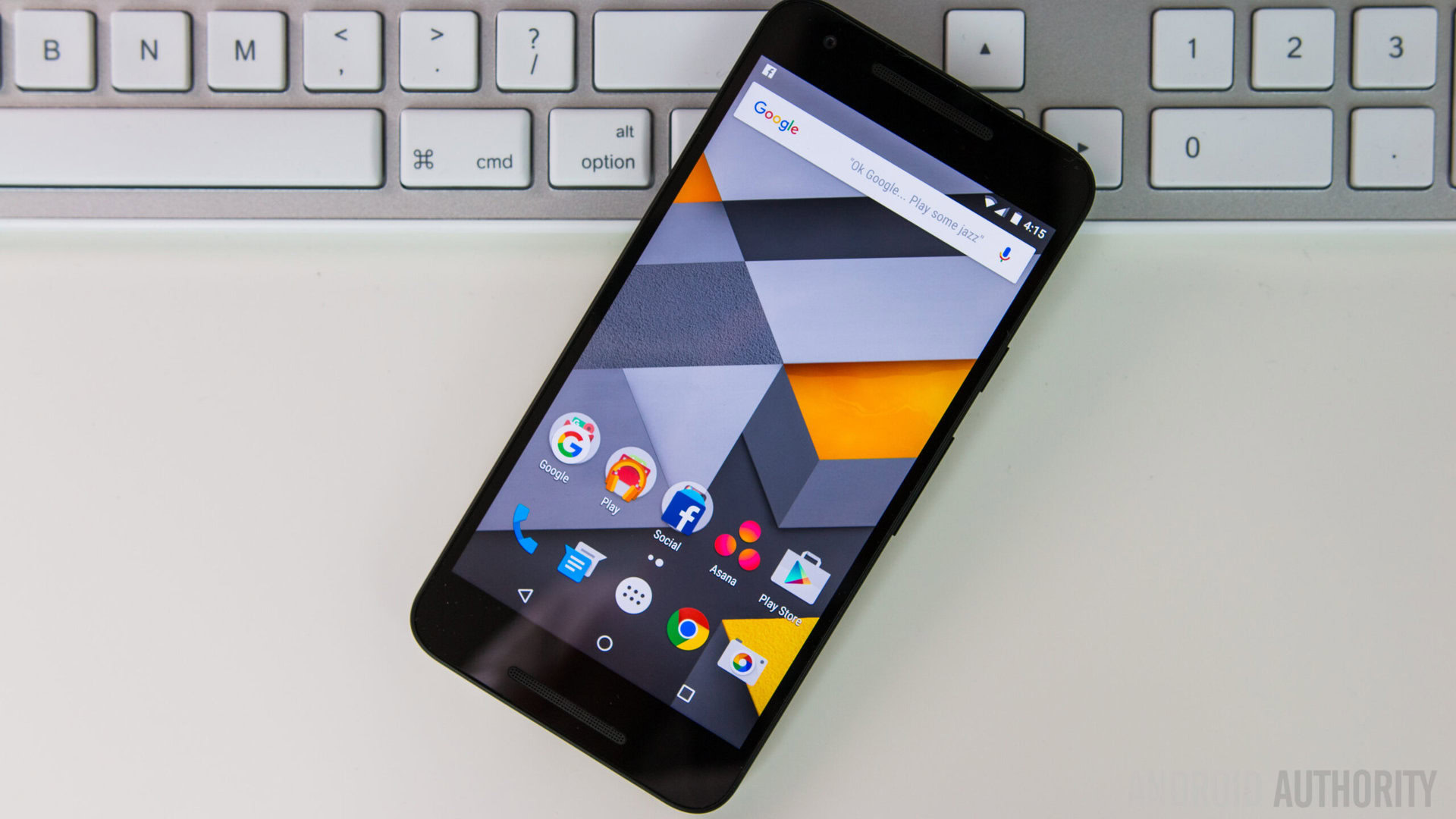
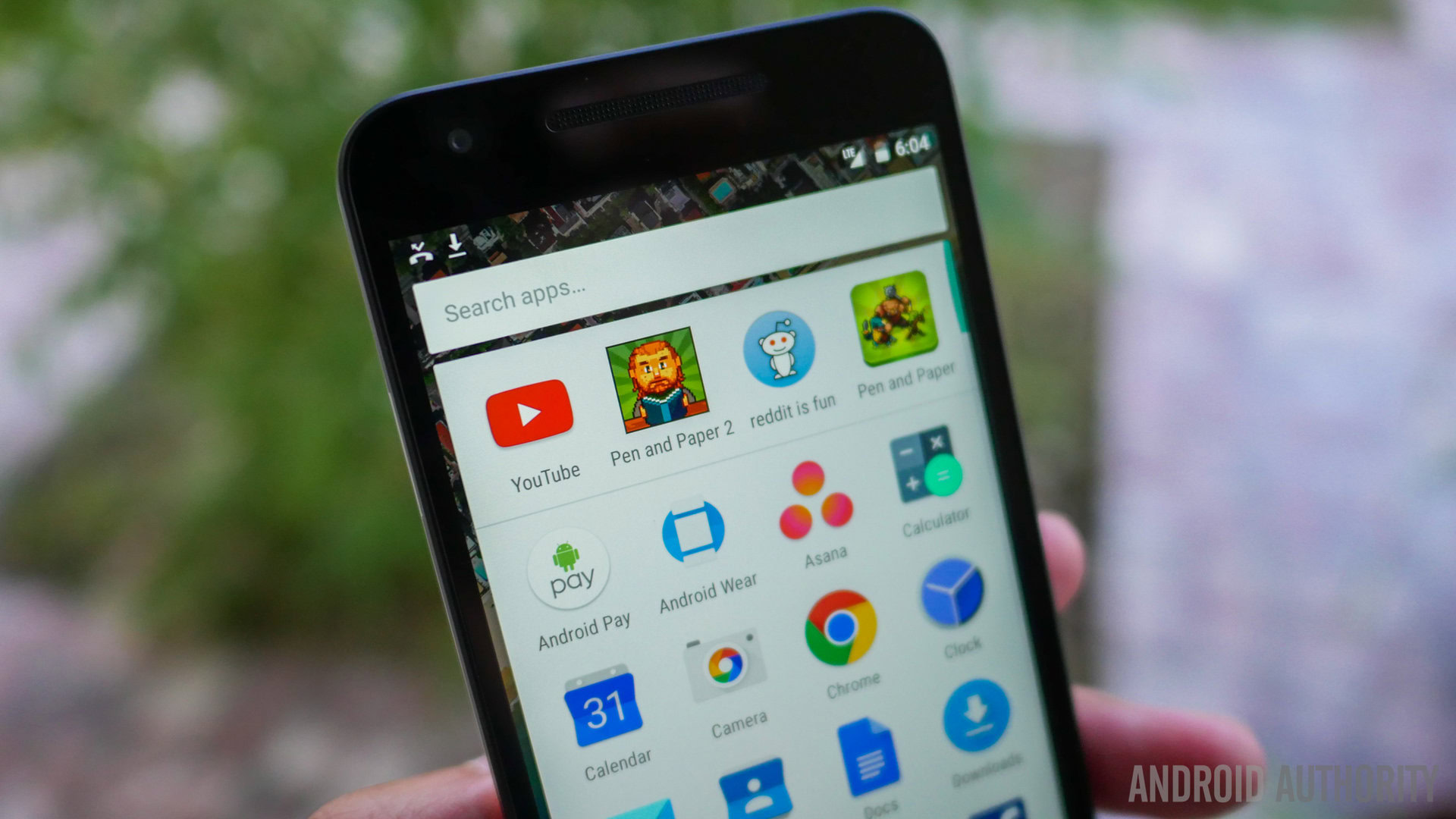
Concluding this list, I am also not particularly happy with the fact that the home screen now has 5 columns instead of just 4. The icons seem almost too small, despite the fact that their text labels are permanently enlarged. This is a stark contrast to the Google Now Launcher’s typical presentation wherein it usually has gigantic icons.
I am also somewhat surprised that the font size on the 5X is so small. Even when set to Large, it looks small. Extra Large, which is usually comically gigantic, is basically what I’d consider to be just “large” standard.
And on a final note, I’m not too keen on the new font. What was wrong with Roboto…
Wrap up
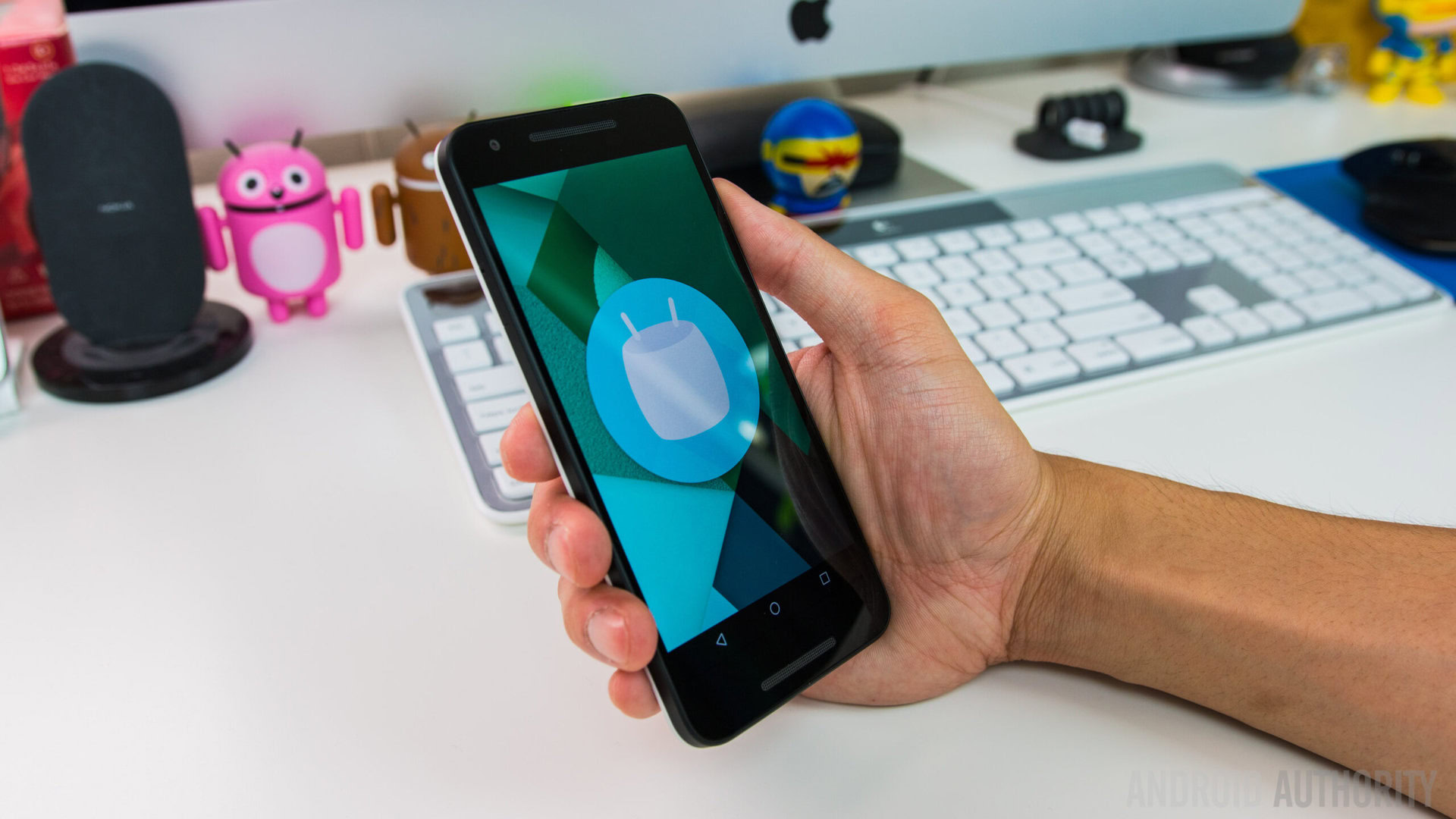
And there you have it, my general grievances about the Nexus 5X. Is it a good phone? Yes. Is it a worthy sequel to its predecessor? Definitely. Is it the best product it could be? No, not really. Given that rumors persist that the 5X had 3GB of RAM until the last minute, I am inclined to lean towards the belief that it was once much more, but stripped of its superiority due to possible competition with the 6P.
Still, assuming you want a Nexus, one must be happy with what they have, as that’s all we’re going to get, this year at least. With that said, I’d like to ask for your thoughts. Are any of you sporting the Nexus 5X? Do you have similar feelings or is everything perfect as far as you’re concerned? Leave a comment below, or yell at me on Google Plus!