Affiliate links on Android Authority may earn us a commission. Learn more.
Nexus 6 unboxing and first impressions
Published onNovember 2, 2014

While leaks and rumors of the “Motorola Shamu” gave us a pretty good idea of what to expect with the Google Nexus 6, what took everyone by surprise was the massive upgrade from its predecessor in every aspect, including the price point. The Nexus 6 offers the best of the best currently available, is certainly far more in line with its flagship counterparts than previous iterations were, in terms of specifications, design, but unfortunately, price. Before diving into a full review, we take a quick look at the unboxing, and give you our first impressions about the Google Nexus 6!
Unboxing
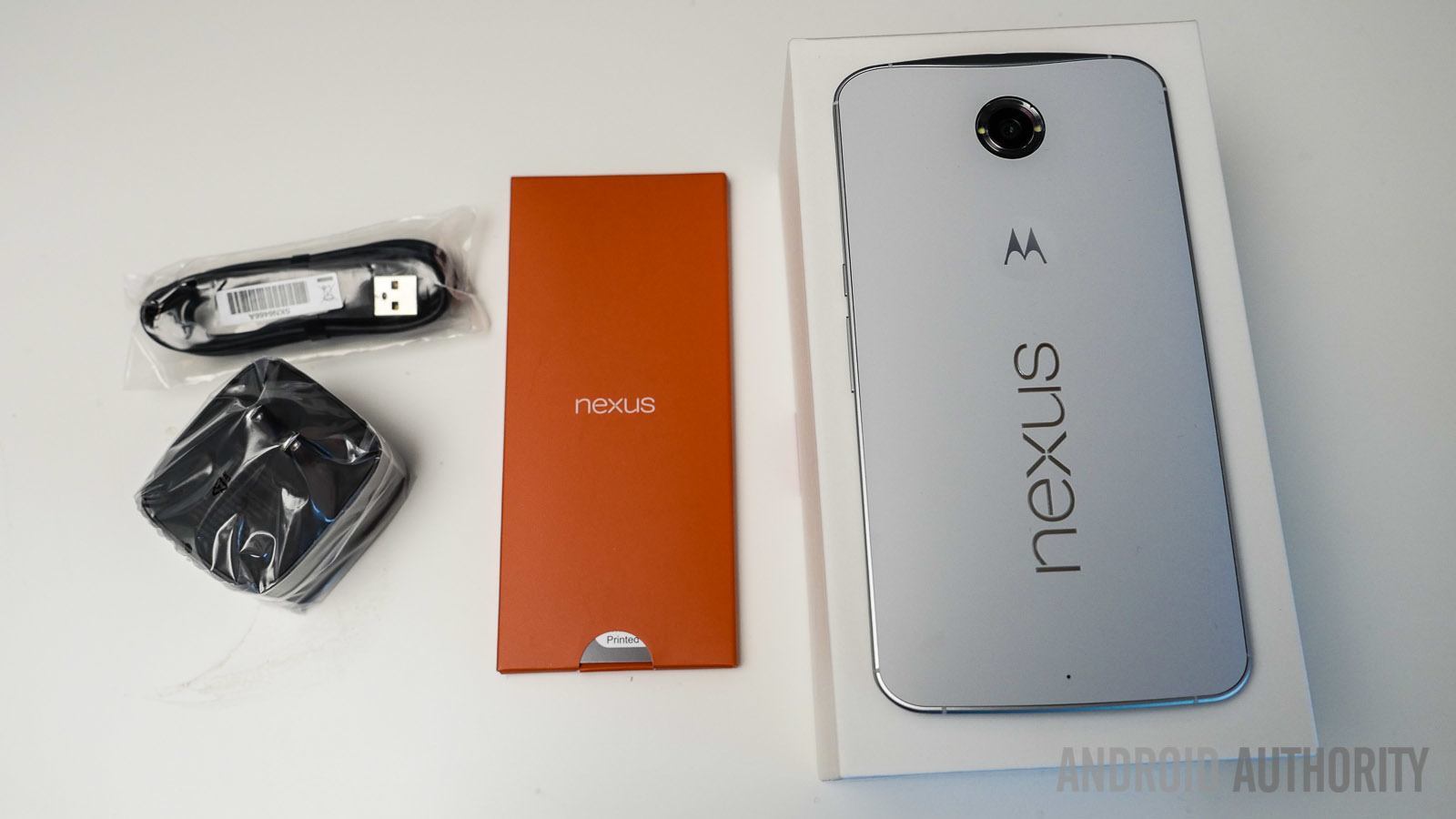
The box itself doesn’t have anything to it apart from a large 6 at the top, but the final retail packaging may be a little different. Opening the large white box shows you the Nexus 6 in all its glory, and you don’t have to pick it up to see that it’s a big phone. Apart from the phone, inside the box is some documentation, including a start guide and warranty information, and a SIM tray unlock tool all inside a colorful orange packaging.
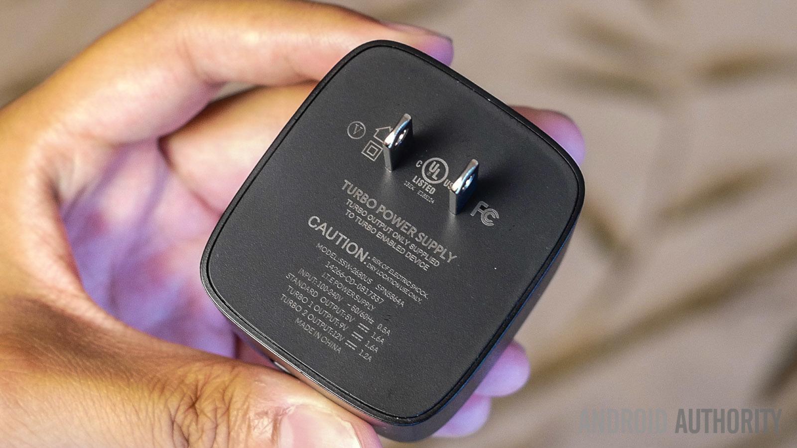
Also in the box are the microUSB cable and the AC wall charging adapter. What will certainly be very appreciated is the fact that the charger is the Motorola Turbo Charger that was introduced along with the Moto X (2014) with a price point of $34.99. With the Moto X, you get up to 8 hours of use after a charge of just 15 minutes, and it’ll be very interesting to see what kind of boost the battery life gets in the case of the Nexus 6.
First Impressions
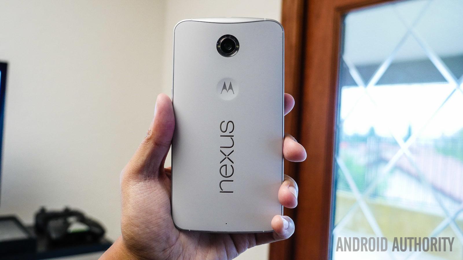
When it comes to the design, the Nexus 6 is basically a blown up version of the Moto X (2014), including the metal frame, the significant curve on the back, the dual LED ring flash around the camera optics, and the front-facing speaker setup. Apart from the size, the only small differences that can be found are with the Motorola logo, that isn’t as prominent as is the case with its counterpart, and is in fact, similar to the logo indentation that was found with the original Moto X. And of course, there is a large Nexus logo on the back as well.
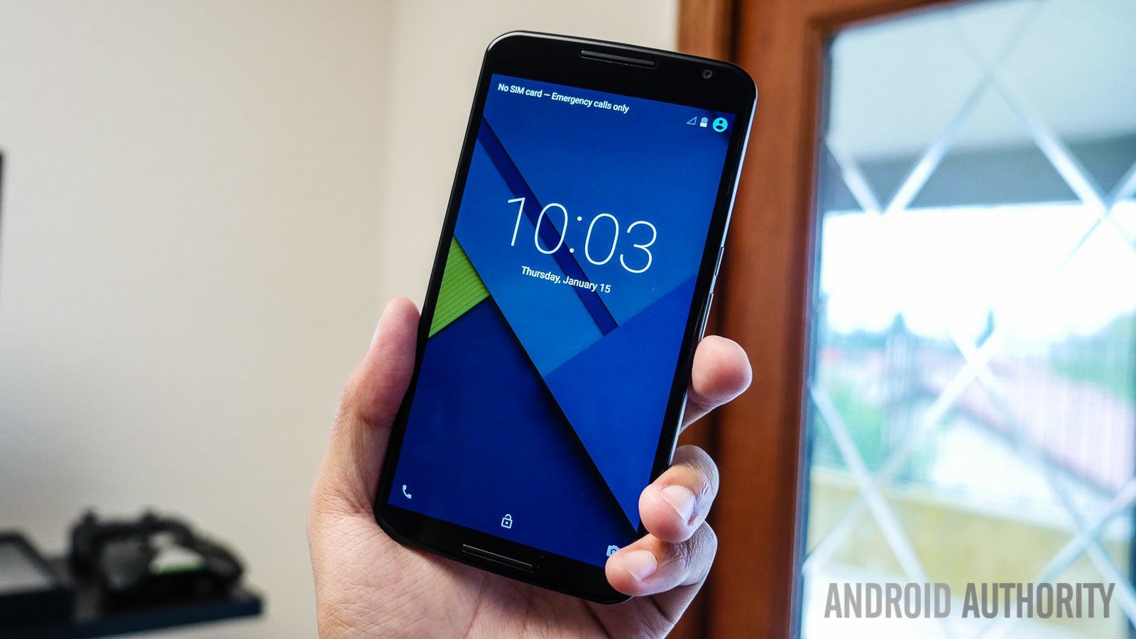
With its 5.96-inch display, there’s no denying that the Nexus 6 is a very large device, and the handling could take some getting used to, especially if phones of this size haven’t been your daily driver in the past. Anyone familiar with the Galaxy Note line and other phablets will feel right at home with the girth of the Nexus 6, but for others, including those planning to upgrade from the Nexus 5, are looking at a bit of a learning curve.
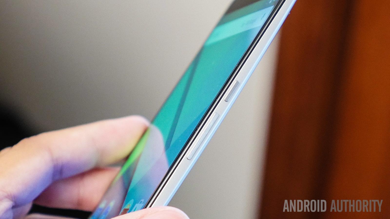
That said, the handling experience isn’t that bad. Motorola has always shown a lot of prowess when it comes to the ergonomics of their devices, and that continues with the Nexus 6. The curve on the back allows for the phone to comfortably nestle into your palm, and the thin metallic sides make it easy to grip the device. The volume rocker is found below the power the button on the right side, and doesn’t require any hand gymnastics to reach.
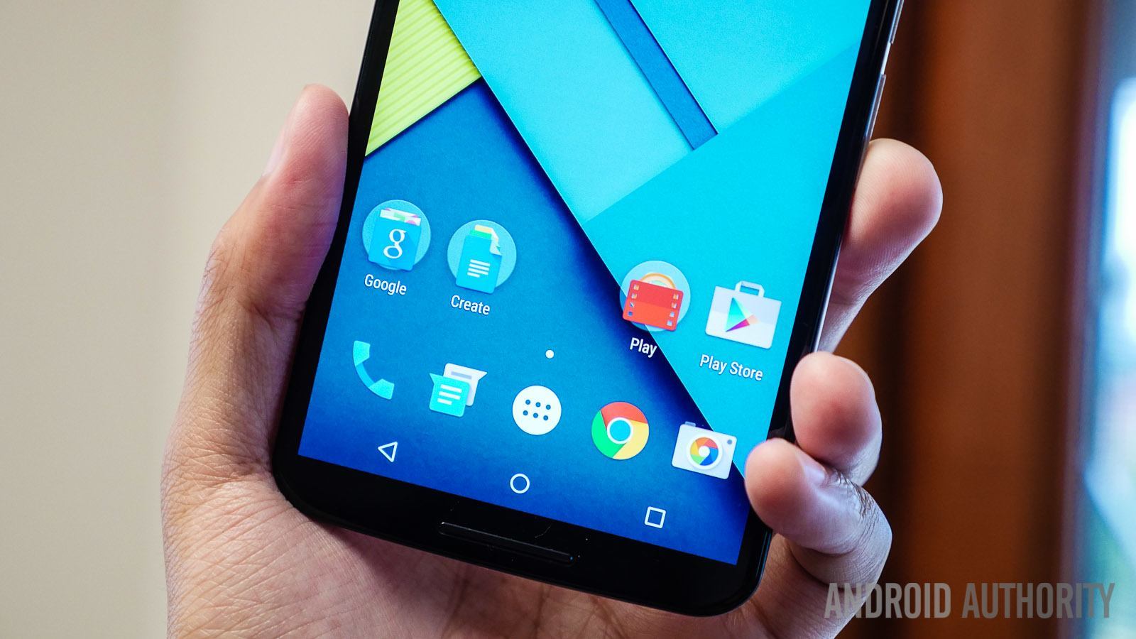
Under the hood are all the latest and greatest specifications you can find, currently matched only by the Samsung Galaxy Note 4. Up front is a screen that has not only received a massive upgrade in size, but also in resolution, with the Nexus 6 featuring a 5.96-inch Quad HD AMOLED display with a pixel density of 493 ppi. We will further explore the display and other hardware aspects in detail in the upcoming comprehensive review.
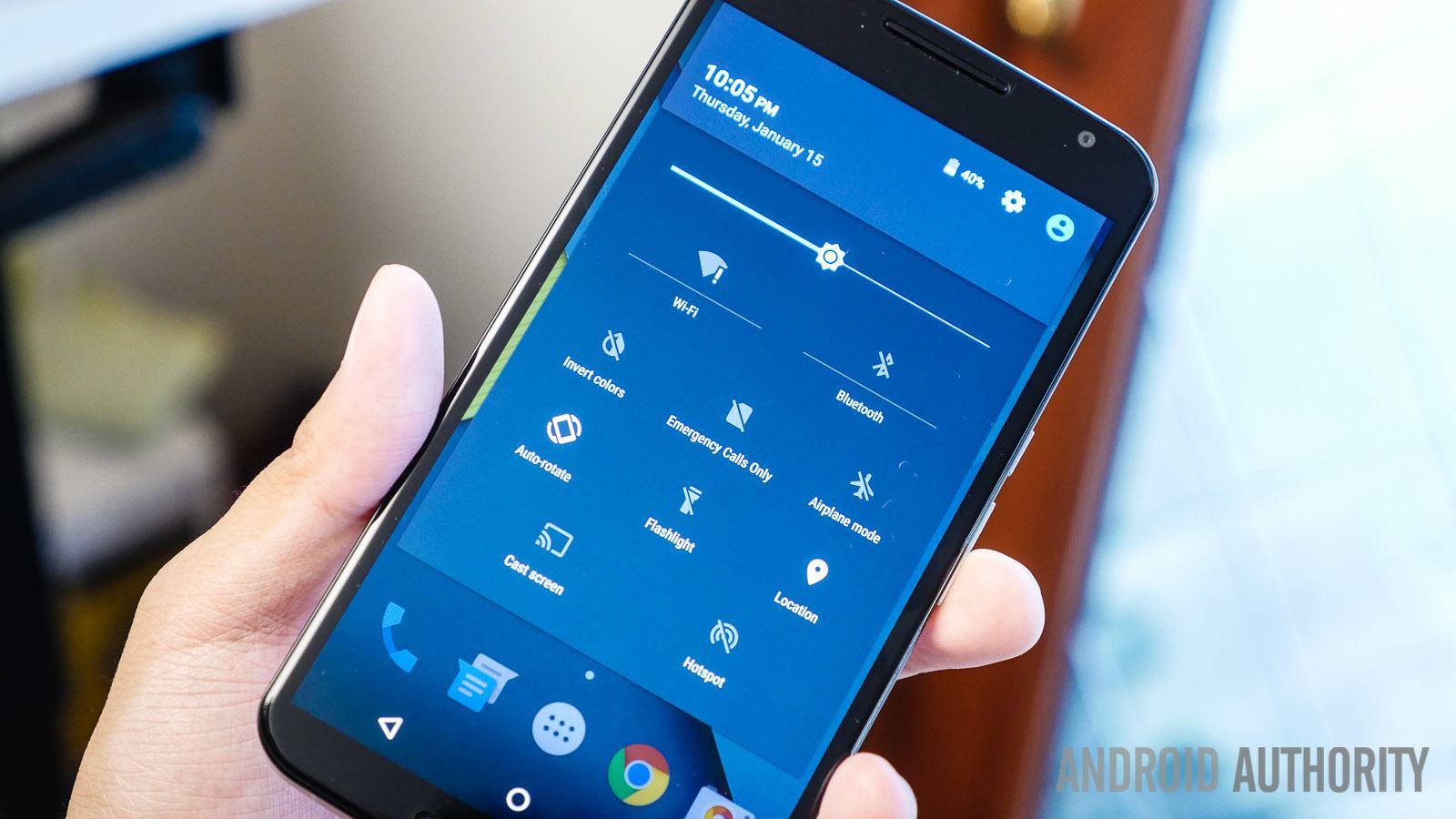
The other big story with the Nexus 6 is, of course, with regards to the software. The Nexus 6 is the first smartphone to feature Android 5.0 Lollipop, and all the Material Design goodness that it entails. The differences are evident right from the start, even while going through the initial setup process. Every transition, while jumping in and out of apps, opening the app drawer, accessing the Recent Apps screen, and more are as smooth as ever and the more colorful elements make this one of the brightest iterations of stock Android yet. The notification dropdown has seen some changes as well, now taking on a translucent shade, with another swipe down opening up the Quick Settings menu.
So there you have it – a quick look at the unboxing, and our first impressions about the Nexus 6! We are certainly very excited to see how this large version of the Nexus stacks up against the rest of the competition. As mentioned, we will be diving in deeper into the various hardware and software aspects of this device, so stay tuned for the full comprehensive review that will be coming up shortly.