Affiliate links on Android Authority may earn us a commission. Learn more.
Nexus 6 vs iPhone 6 Plus
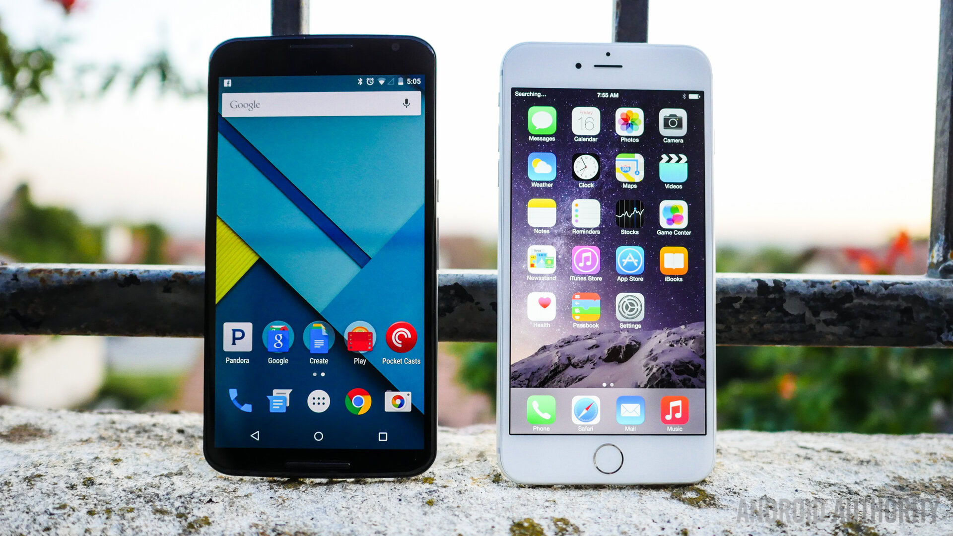
The change to the Nexus line came as a big surprise to many, not only in terms of the jump in size, but also with regards to its more premium design, and matching price tag. On the other hand, it was an inevitable move on the part of Apple to finally introduce a larger form factor with their flagship iPhone, with the two versions available bringing the fight, at least in terms of size, closer to their Android counterparts. So how do the so-called 6th iteration of both lines fare against each other? We find out, in this comprehensive look at the Nexus 6 vs iPhone 6 Plus!
The most significant change with both these smartphones is clearly the size. The Nexus 6 is dramatically larger than the Nexus 5, and in the case of the iPhone 6 Plus, the jump is even more impressive when compared to the much smaller iPhone 5 family.
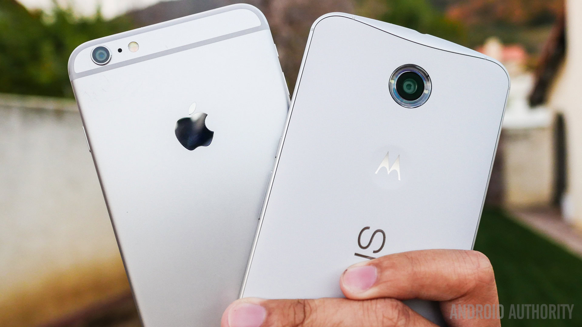
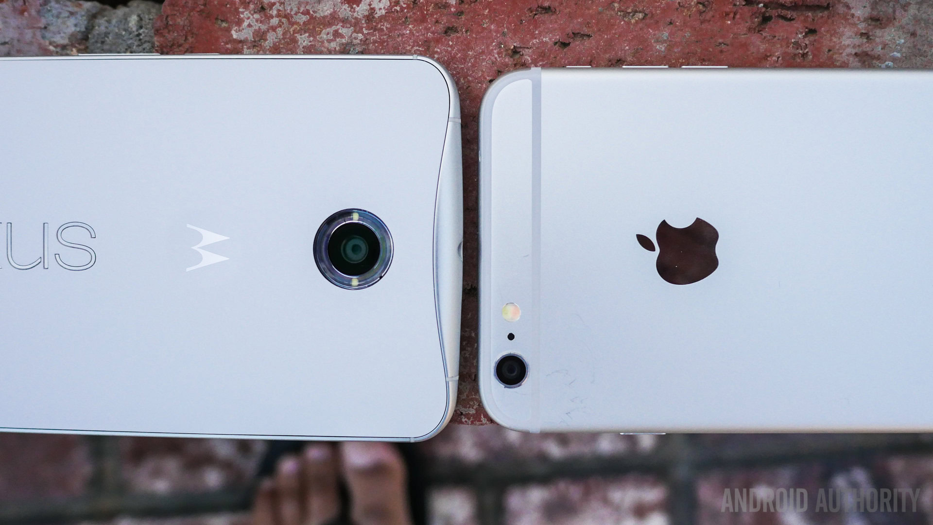
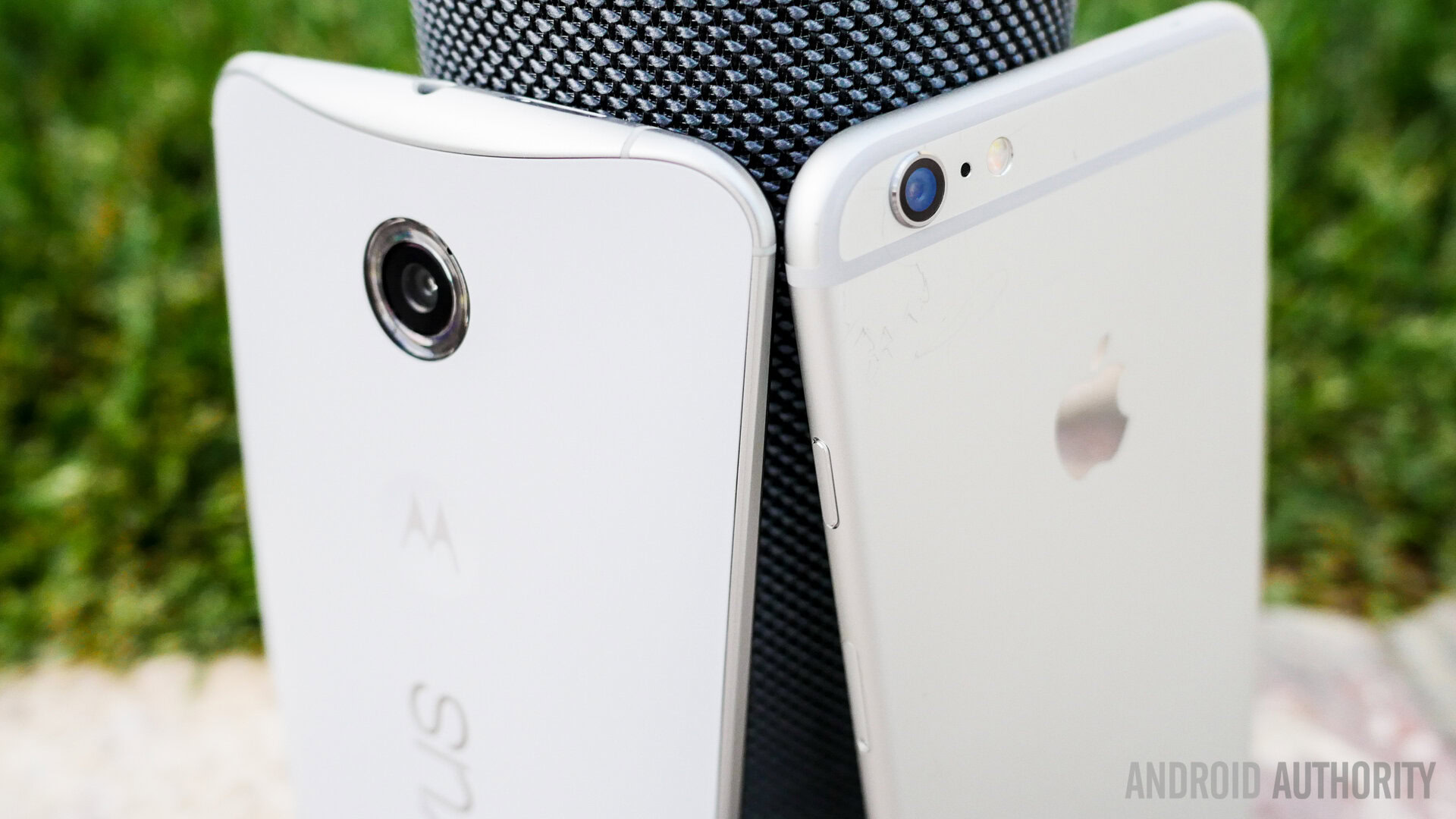
The iPhone 6 introduced a rounded look to its design language, with the larger Plus edition an identical counterpart, only with a screen bumped up to 5.5-inches. The result, as always, is an attractive phone featuring Apple’s typical design cues, only made a little bit harder to handle because of its size. Typical buttons include the volume rocker on the left side with the silence toggle, and the power button, which has been brought to the right side from its usual position up top for better access. A lone tactile home button up front also includes a fingerprint scanner underneath, and it lies somewhat concave to the front panel, with the 2.5D glass adding to the rounded look. The metallic construction automatically increases this phone’s attraction, with lines denoting where the separations are in the part. The Apple logo on the back is under the camera optics in the top corner.
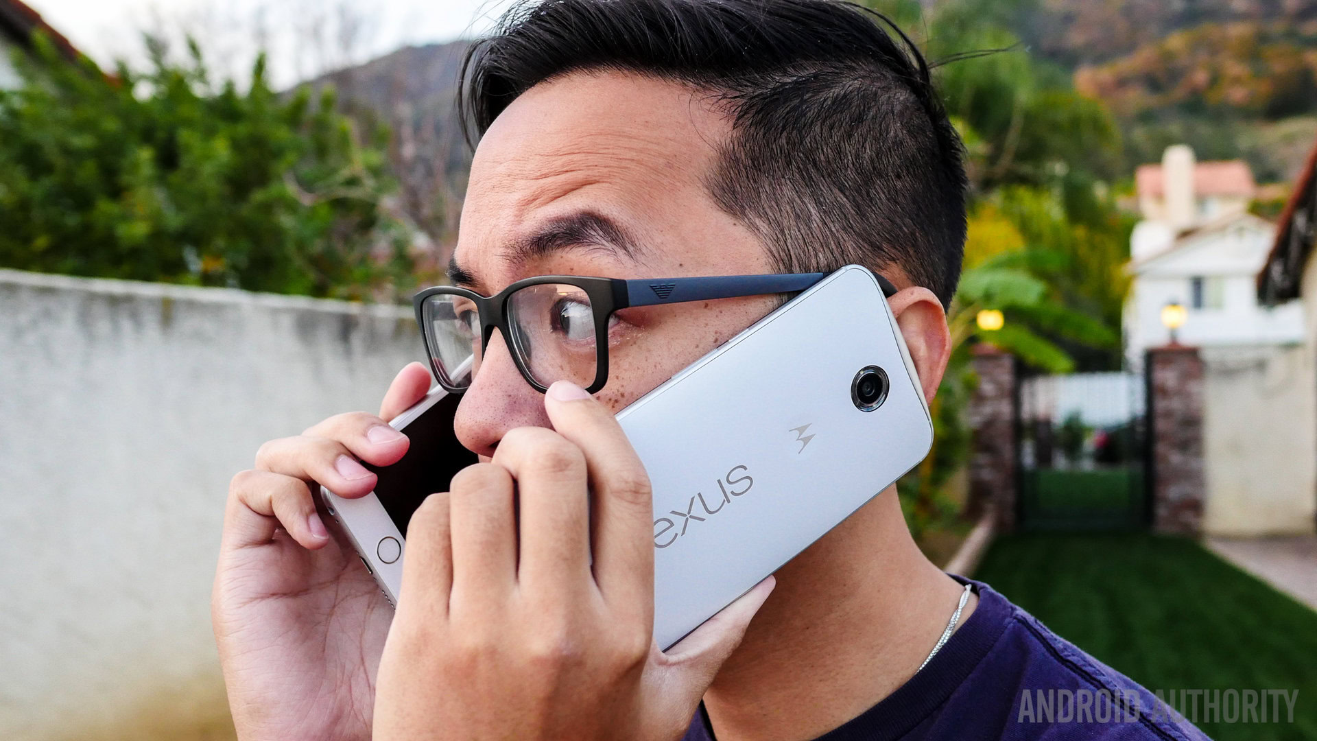
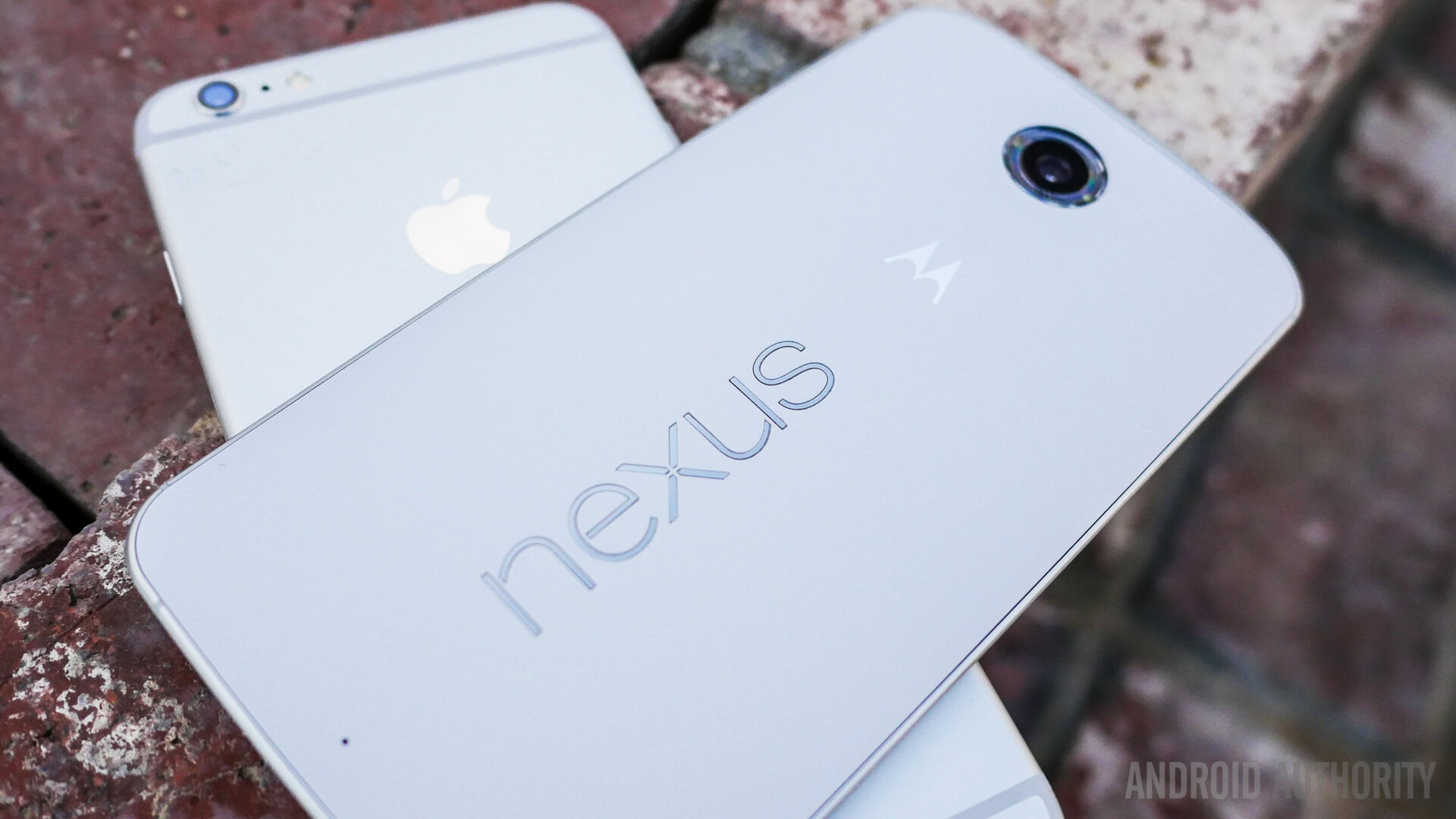
In the case of the Nexus 6, Motorola’s design language takes center stage here, as the phone looks like a large Moto X (2014), albeit without the numerous customization options available. No buttons on the front mean that the inputs are made with software keys. One of the big concerns with the Nexus 6 was in terms of the handling, but the curve on the back does help with the phone’s feel in the hand. The camera optics are up top on the back of this white edition, with the now iconic Motorola dimple underneath, along with the Nexus logo in landscape. A metallic frame also helps the Nexus 6, adding to what is one of the most exquisite Nexus devices yet.
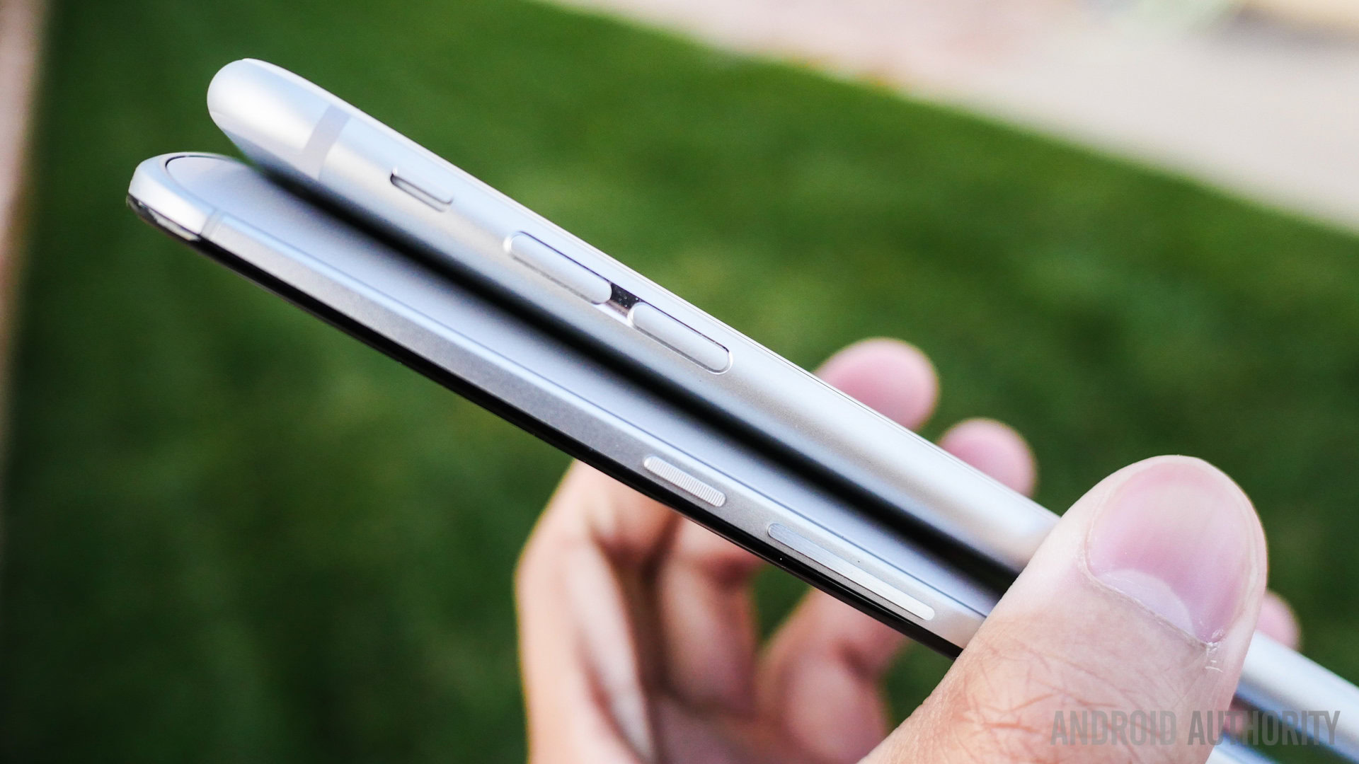
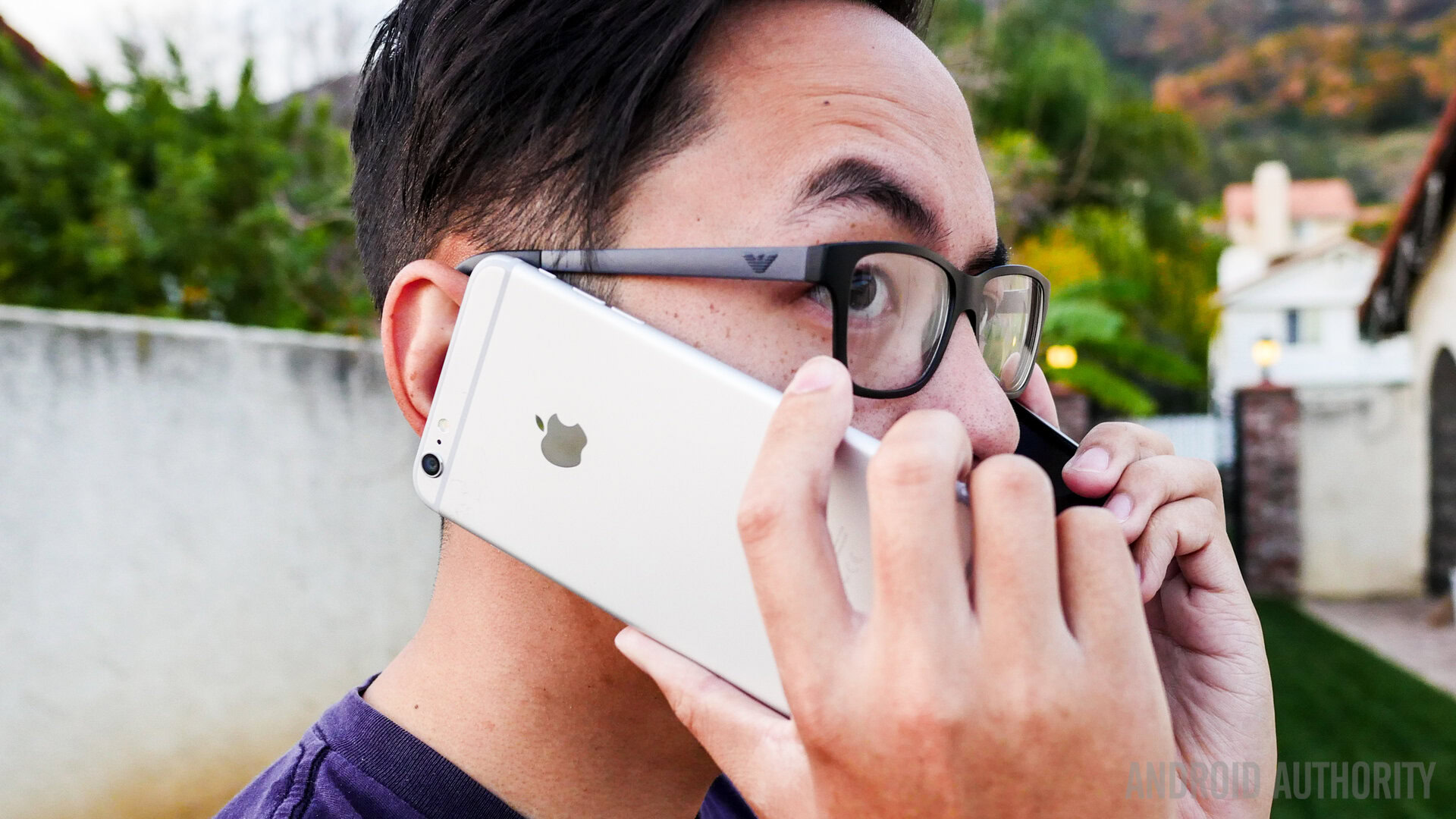
Design aesthetics remains a matter of opinion, but the main story in the case of either smartphone is with regards to their respective handling experiences. The iPhone 6 Plus is thinner, and its rounded sides do make it a bit more comfortable to grip, but the larger bezels on the Apple phone actually make it similar in size to the Nexus 6. It’s thickness makes the Nexus 6 a little harder to handle in one hand, though its curve does what it can to help.
Related: Best Nexus 6 Cases.
In either case, you’re always going to have to perform some form of hand gymnastics to go from side to side or to reach the top, and while both are not the easiest to handle, they certainly do manage to be really easy on the eyes.
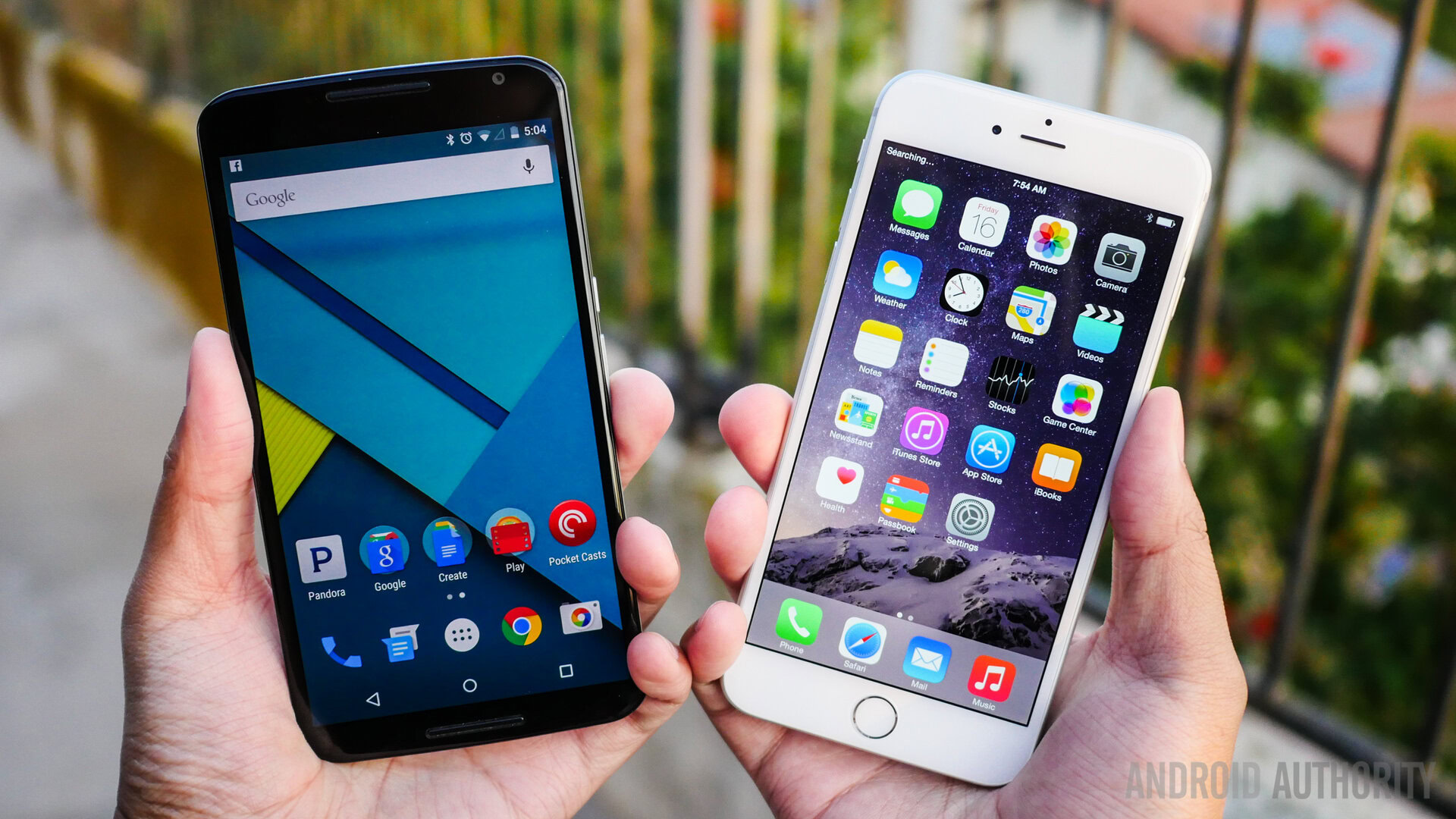
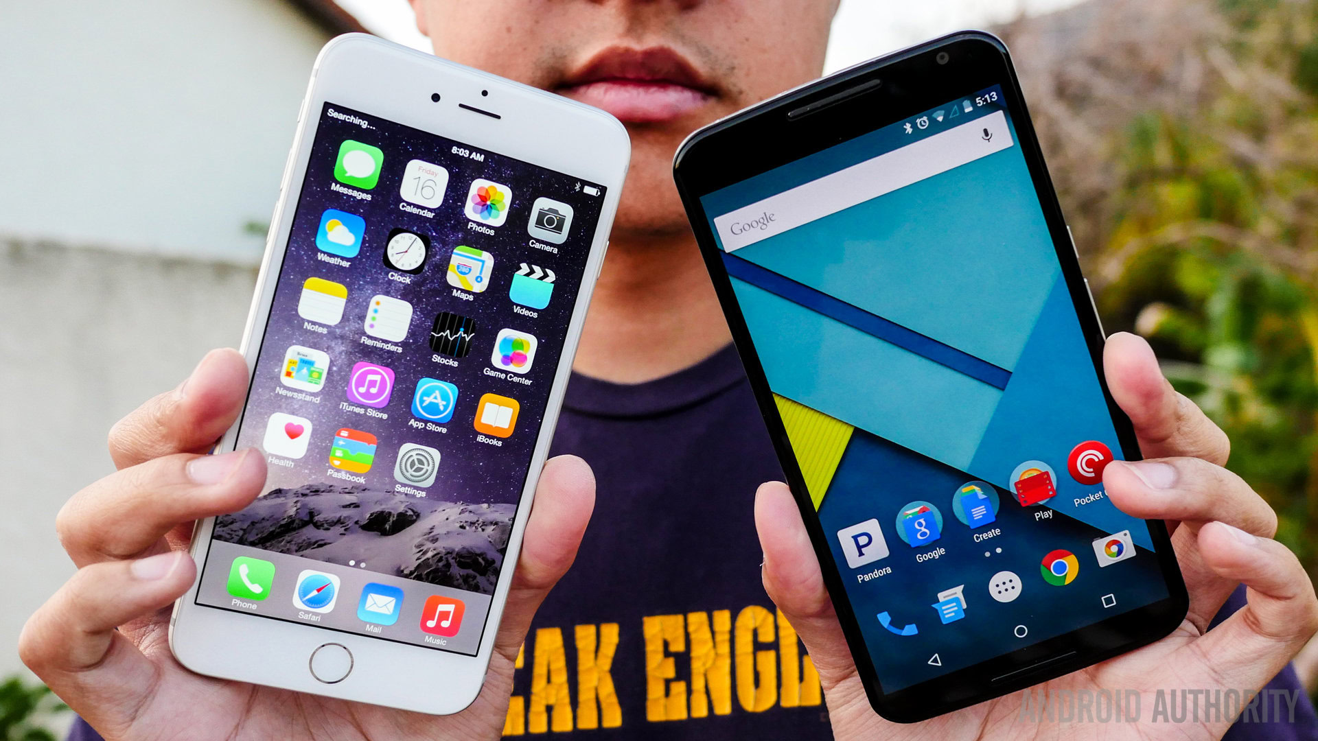
Large displays are par for the course here as the trend continues to pick up steam, but in the case of the Nexus 6, an extra half inch and a higher resolution might be enough to make you choose the Android phone over its Apple competitor.
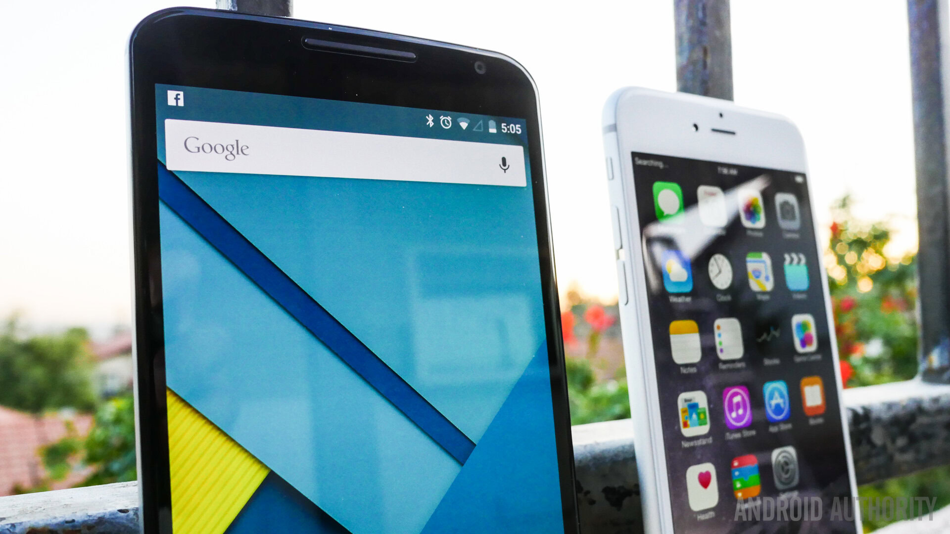
Apple’s display technology gets a bump up to 5.5-inches and offers Full HD resolution, which results in in a pixel density of 401 ppi. An IPS construction makes this screen pretty easy to view in daylight, and text is easier to view on this larger display, compared to previous smaller iterations of the iPhone. What I always notice on the iPhone screens, however, is that its color output is a little more subdued, for example, when compared to the AMOLED displays commonly found on Android devices.

That is exactly what the Nexus 6 sports, an AMOLED screen at just under 6-inches with Google and Motorola deciding to meet the trend of Quad HD, resulting in a pixel density of 493 ppi. The result is a display that is outputting some intense power, and for work and play, you will be able to read sharp text and enjoy any media in a large fashion. There have been some issues with screen burn-in reported, but on my particular unit, it hasn’t been an issue at all.
The colors on the iPhone 6 Plus are not bad at all, but they seem to pop out a little more on the Nexus 6. This can also be owed to the highly colorful motif of Android 5.0 Lollipop, though. Nonetheless, we have an evolution in both of these devices, and is surely a welcome change for veterans in either camp. If you do want a higher resolution to eke out that much more enjoyment from your smartphone usage though, the larger and more powerful screen of the Nexus 6 is the obvious choice.
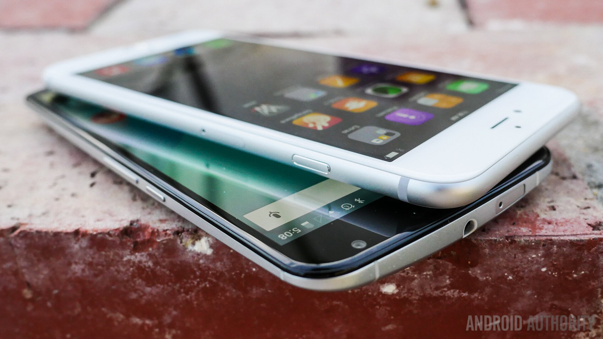
Talking about performance in a comparison like this is always a bit of an odd situation, because what we’re pitting against each other are two completely different architectures, catering to equally different ecosystems.
Under the hood, the Nexus 6 packs a quad-core Qualcomm Snapdragon 805 processor, clocked at 2.7 GHz, backed by the Adreno 420 GPU, and 3 GB of RAM. The device boasts the kind of high-performance processing package you’d expect to find with a flagship Nexus smartphone, and can handle anything you throw at it with ease. Opening, closing, and switching between applications is a breeze, and gaming is also extremely smooth and enjoyable. While I might have seen a few hiccups here and there, it has more to do with the occasional bug in Android 5.0 Lollipop, which are sure to be fixed in updated versions.
Apple likes to put together their own processing packages, and any iOS user can tell you that their architecture works well for their needs. The A8 is the processor of choice for the iPhone 6 Plus, and its dual-core 1.4GHz Cyclone chip is backed by quad-core graphics in the PowerVR GX6450. iOS has gradually become more about flashiness in its interface, but overall, the simplicity of the operating system can be felt. Moving among applications is pretty seamless, and even the 1 GB of RAM is able to keep a good number of apps running simultaneously. Gaming is also a standard affair, with games moving along well without much incident.
Comparing Android and iOS on different processing architectures is really tough, but what I can tell you is that users in both camps have reported very good experiences nonetheless. Ultimately, iOS performs the way it should on the iPhone 6 Plus; and Lollipop, despite the need for just a little more polishing, performs really well on the Nexus 6.
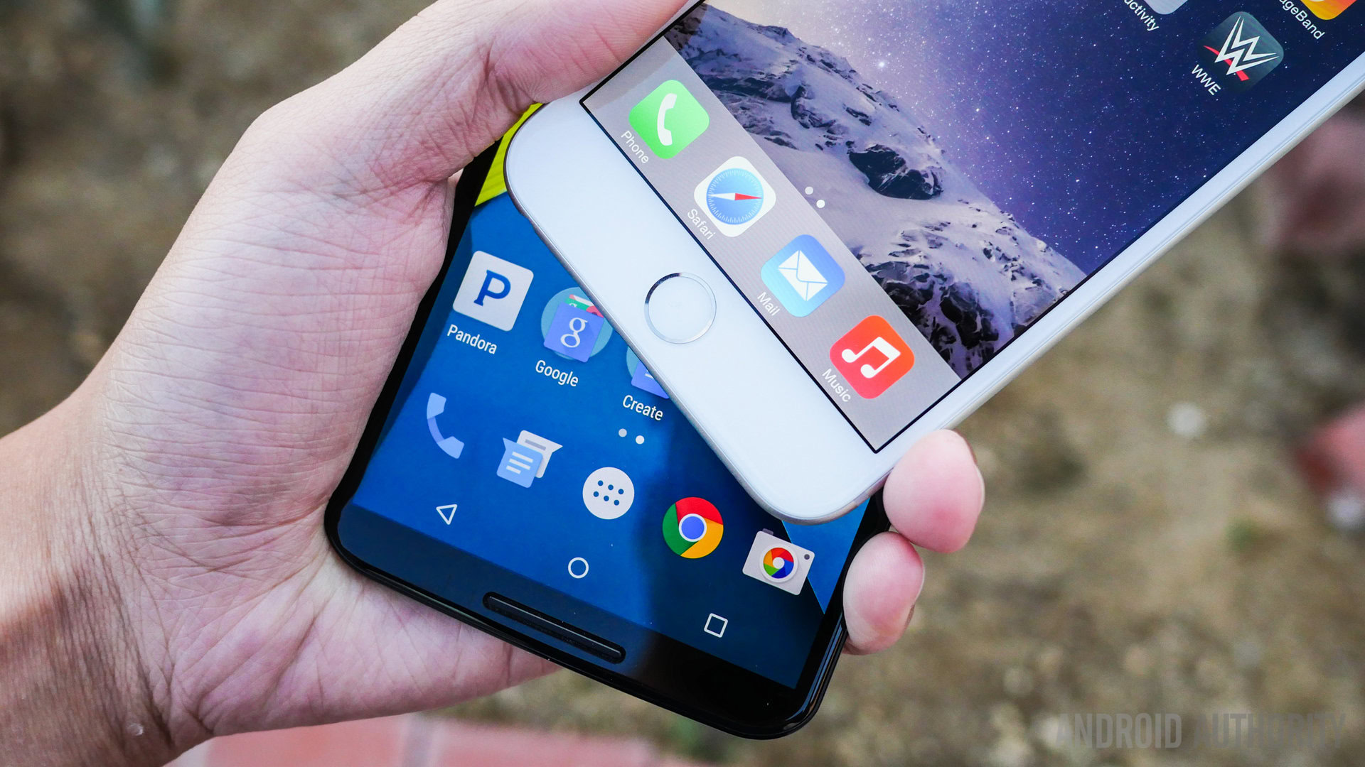
Hardware offerings on either of these phones are mostly typical fare, with the iPhone 6 Plus boasting one specific addition over the Nexus 6.
The fingerprint reader on the iPhone is a press version, meaning you can easily unlock the phone by pressing and holding the home button. The reader can also be used for some other functions like unlocking payments. Aside from that, however, you get the standard fare with various connectivity options and even NFC, though it is restricted to Apple Pay for the time being. With versions of the phone available across all networks, mobile internet is never an issue. The bottom mounted speaker performs as expected, offering a pretty good soundstage. On the storage front, the iPhone 6 Plus does come in a 128 GB flavor, but you’re going to have to put down a pretty penny to get that much storage.
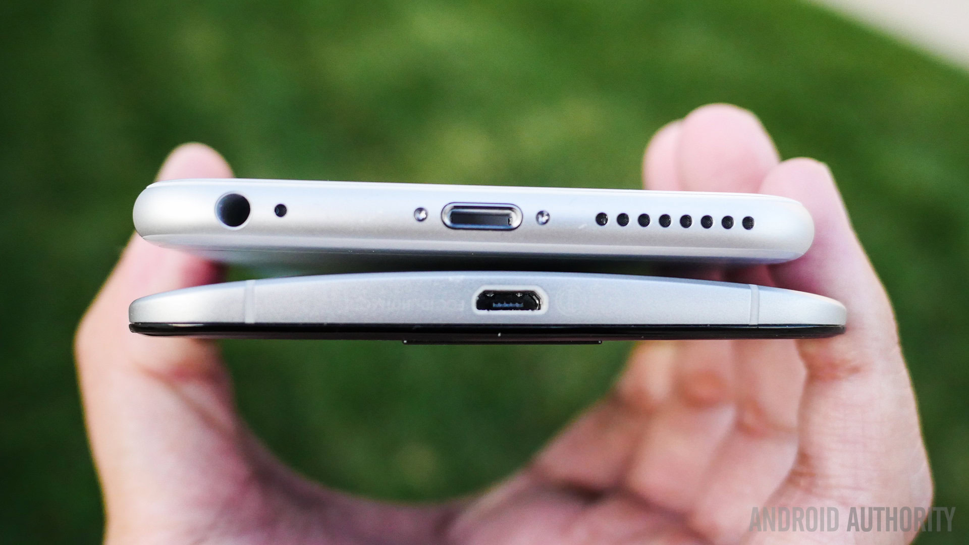
A 2,915 mAh battery powers the iPhone 6 Plus, bringing a fair amount of battery life, though with enough power usage, it will struggle to get past the one day mark. Previous versions of the iPhone did have problems with longevity, and the larger and higher resolution screen on this edition does bring the bigger battery back down to size a bit.
On the Nexus 6, the lack of a fingerprint reader is made up for with its media consumption features. The main enhancement on the Nexus 6 is right on the front, with its dual front-facing speakers, whose placement simply trump the bottom mounted unit on the iPhone 6 Plus. NFC on the Nexus 6 is also wide open, and not left to just a payment platform. As far as connectivity goes, the Nexus 6 is the first of the line to get access across the board, with versions on AT&T, T-Mobile, Sprint, UScellular and one possibly coming to Verizon soon.

In battery life, the Nexus 6 actually suffers from the same issues as the iPhone 6 Plus. A much larger display and a big bump in resolution means that the 3,220 mAh is just about what is necessary to make this phone get close to the day and a half mark, but never really going past it.
Unless you want a fingerprint scanner to unlock your phone, the dual front-facing speakers are a compelling notch in the Nexus 6’s belt, boosting media consumption along with the gorgeous screen.
The camera situation in this comparison is influenced by the ecosystem history. While the iPhone has a pedigree with good performing cameras, things have been a bit uneven in the case of the Nexus line.
The app on the iPhone 6 Plus is about as simple as you can get. Swiping on the viewfinder changes the various modes, and the different options for your pictures are accessed via buttons on the side. You get modes for regular photos, for video, for slo-mo video, and even a square interface that makes Instagramming easy. Panorama and time-lapse modes are also available for anyone that wants to get fancy with their smartphone photography.
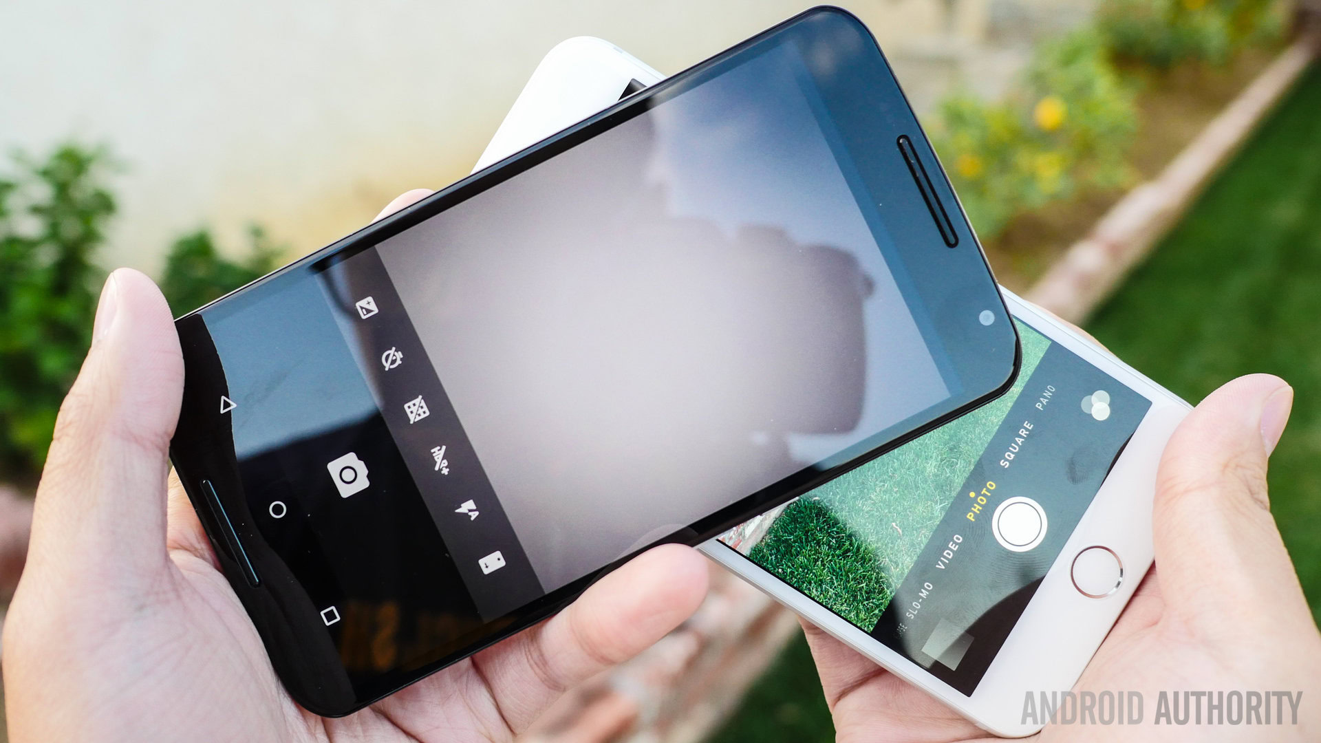
When it comes to the Nexus 6, the interface of the Google Camera has gotten simpler over time. Swiping from the left side of the viewfinder brings up the photo and video modes, but adds Photo Sphere and Lens blur, the latter of which is more usable due to its stylish defocusing. Accessing HDR+ is done via the small button on the opposite corner, which also allows for switching to the front facing camera and adding a few elements to the viewfinder.
Picture quality here, perhaps more so than in any other comparison between Android and iOS, shows that the evolution in either system has gone in the right direction. I’m quite familiar with the good quality of the iPhone cameras, so the way the pictures turned out were no surprise. The Nexus 6, on the other hand, has really stepped up its game with pictures that have a higher color saturation and good detail in the 13 megapixel photos.
Nexus 6 Camera Samples
What I did notice is that the metering systems in both phones are a bit different. In cases when the Nexus 6 would get a good exposure, the iPhone would underexpose, and the other way around at times. Where the iPhone does get a step ahead is in low light performance. Details are simply better captured in it than the grainier results from the Nexus 6.
iPhone 6 Plus Camera Samples
HDR modes on both of these cameras are at their best when used in the right spots. While the iPhone opts to have an HDR Auto mode, the Nexus 6 requires a little thought put into the shot, so that you’re taking advantage of how the scene can benefit from it. Video modes also fall under a similarly even scope, because both cameras benefit from optical image stabilization. The Nexus 6, however, can record in 4k resolution, putting it over the Full HD capabilities of what is already a good performer in the video space.
If this were last year’s competition, the iPhone 5S would have trumped the Nexus 5, and it did. This year though, we have a more even playing field, because Google and Motorola stepped its game up in the Nexus 6. The iPhone pushes ahead a little bit especially with its low light capabilities, but the Nexus 6 isn’t that far behind, and that’s saying something.
Finally, we get to the age old question of Android vs iOS, and truth be told, if this was a comparison being made a couple years ago, there would be a far gap between the ecosystems. This situation has drastically reduced over time. iOS was a pioneer in app development, getting many now-essential applications far before Android did, but now, Android has matured, and even with a few niche holes here and there, the difference has become mostly negligible.
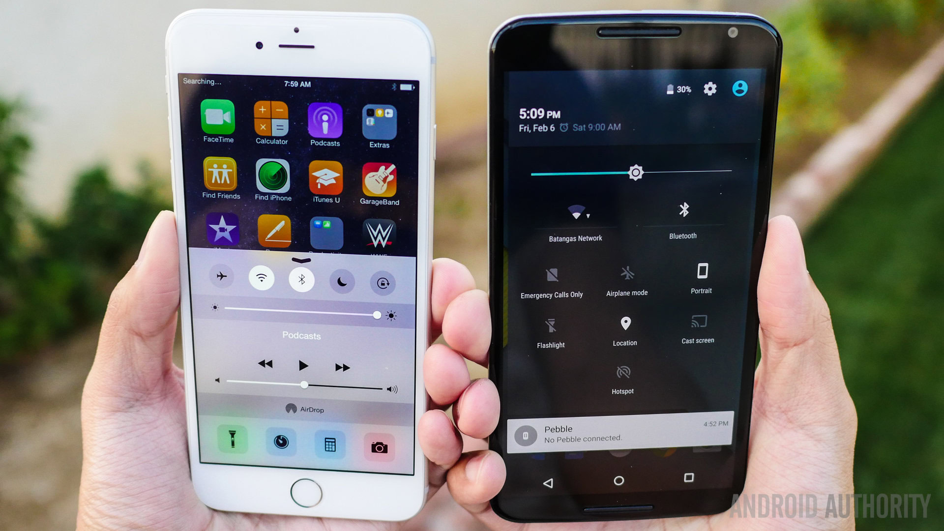
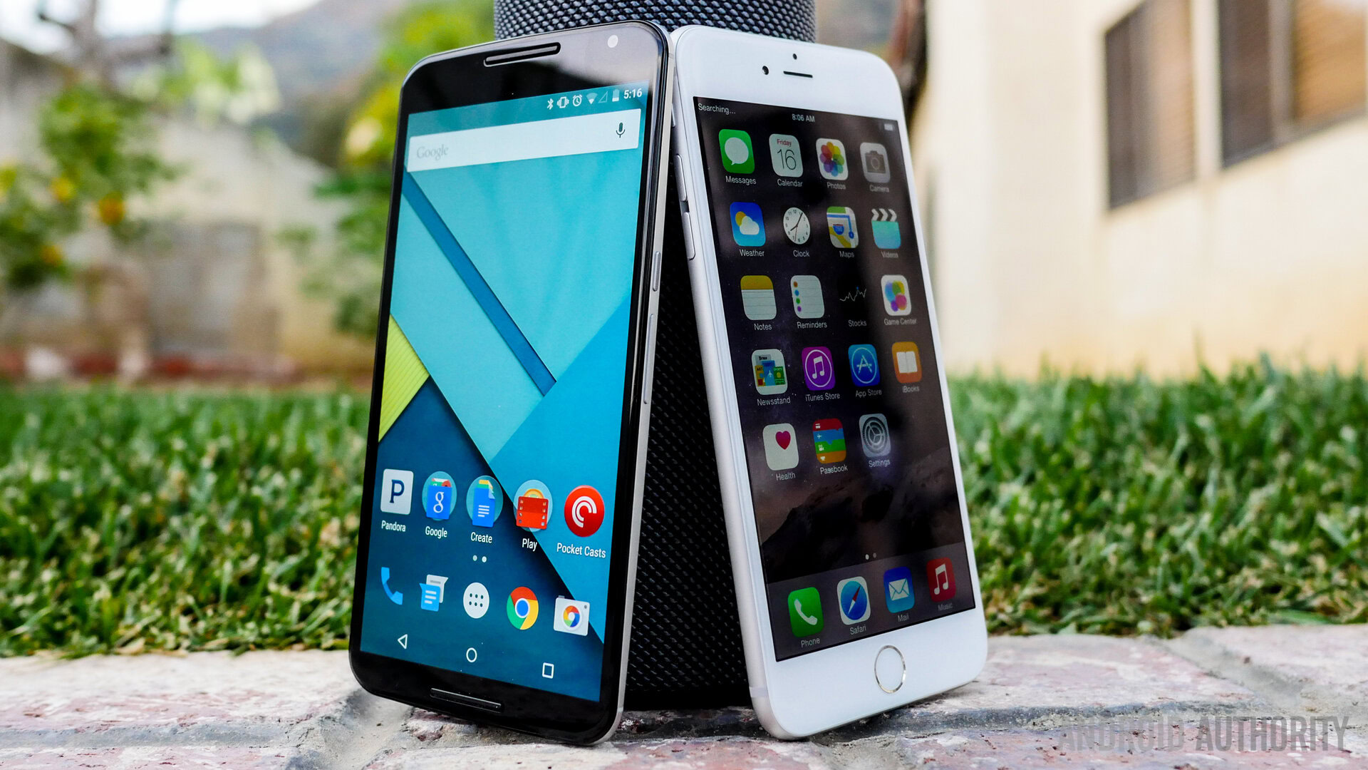
In the newest version of the operating system, iOS has been able to bring a number of features that Android pioneered, like the notification dropdown, a quick settings panel called “Control Center,” and a Holo-like design that has refreshed its look quite well. However, functionally, iOS remains about the same. No app drawer means organization requires folders, and despite the additions of the notification dropdown and Control Center, much of what veteran Apple users call home remains as such. That being said, there are still few limits on what you can do on iOS, and choosing is purely based on how you feel about its aesthetic, perhaps more than any thing else.
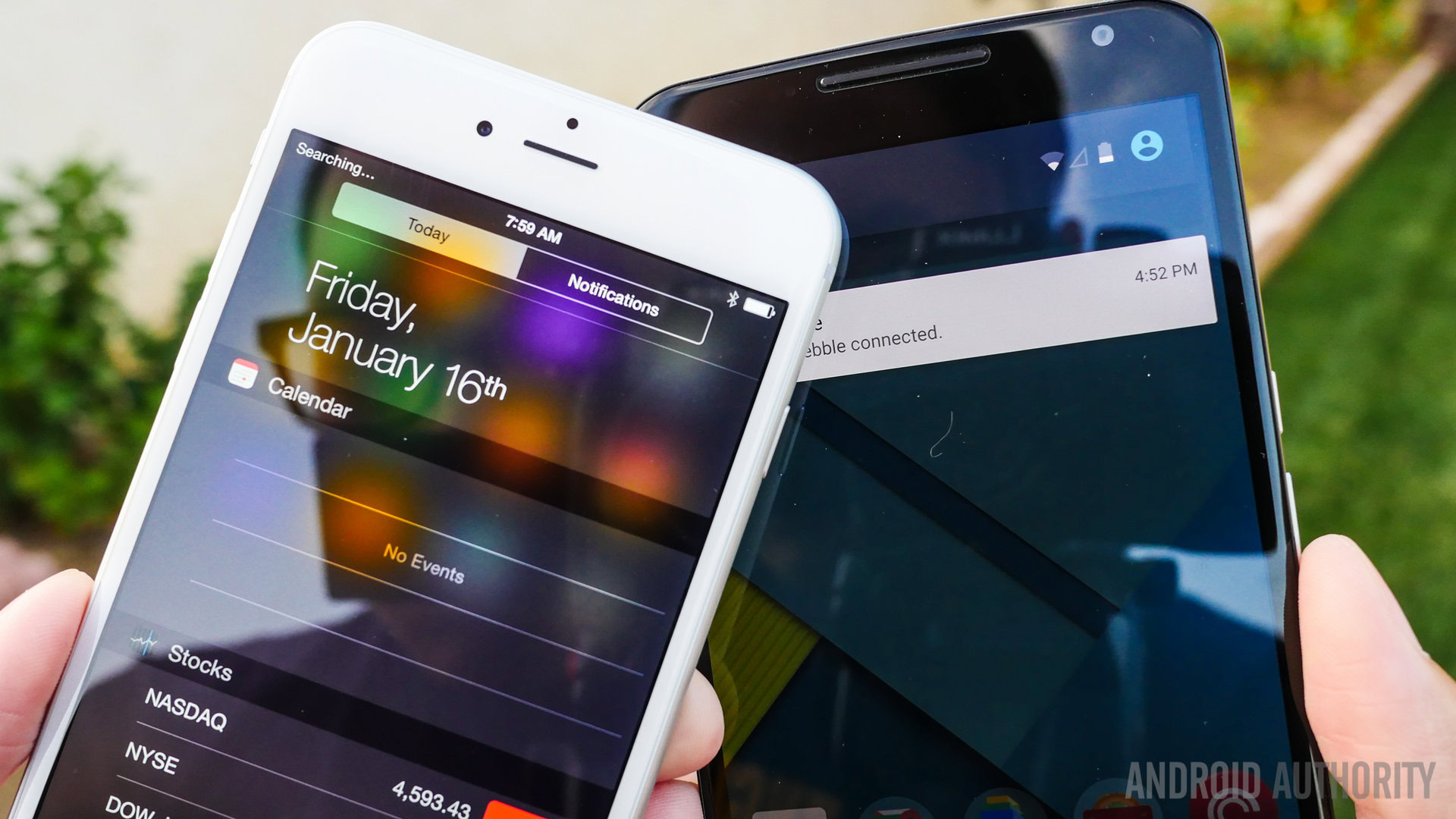
Android, on the other hand, has become rather ubiquitous outside of the Apple space, and its limits are just as far and few between now. The newest version of Android, Lollipop, brought with it a much starker aesthetic change, taking what already worked before, and finding ways of presenting them in even better fashion. Google Now is now a launcher that comes with a second homescreen for quick news and contextual cues from your Google history, and the notification dropdown has been made easier on the eyes, hiding an equally attractive quick settings panel.
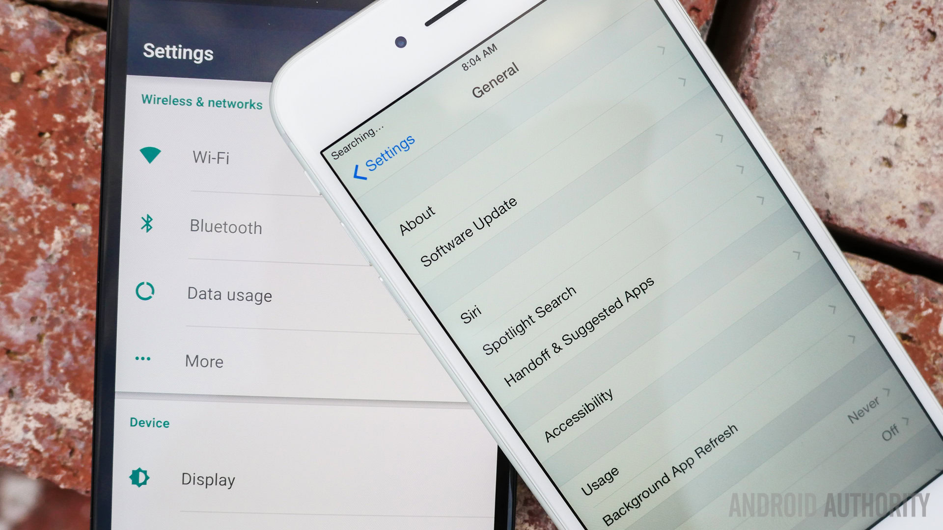
The only real hole that I’ve ever seen in the Lollipop changes is in the recent apps screen – it is a nice rolodex-style way of going through apps, but putting all Chrome tabs there makes the list a little unwieldy. Thankfully, you can turn this function off in Chrome to clean things up a bit. Despite a few bugs here and there with this early version of Lollipop, it is a step forward for Android, whose forward movement over the last number of years has been readily apparent.
Will you find many applications that work on one but not the other? I bet not. So, choosing between these two depends on the interface you want to look at on the daily to access the ecosystem you support.
| Nexus 6 | iPhone 6 Plus | |
|---|---|---|
Price | Nexus 6 $649 | iPhone 6 Plus $749 - $949 |
Display | Nexus 6 5.96" AMOLED | iPhone 6 Plus 5.5" IPS LCD |
Resolution | Nexus 6 1440 x 2560 (493 ppi) | iPhone 6 Plus 1080 x 1920 (401 ppi) |
SoC | Nexus 6 Snapdragon 805 | iPhone 6 Plus Apple A8 |
CPU | Nexus 6 4x 2.7GHz Krait 450 | iPhone 6 Plus 2x 1.4GHz (ARMv8 based) |
GPU | Nexus 6 Adreno 420 | iPhone 6 Plus PowerVR GX6450 |
RAM | Nexus 6 3GB | iPhone 6 Plus 1GB |
Memory | Nexus 6 32GB / 64 GB | iPhone 6 Plus 16/64/128 GB |
MicroSD | Nexus 6 No | iPhone 6 Plus No |
Battery | Nexus 6 3220mAh | iPhone 6 Plus 2915mAh |
