Affiliate links on Android Authority may earn us a commission. Learn more.
Nothing teases OS 3.0 changes: 'the OS we always wanted to make'
September 24, 2024
- Nothing OS 3.0 will enter beta testing in October, ahead of a planned December release.
- The clean, productivity-focused interface has been optimized in areas users engage with most.
- Look for changes to Quick Settings, widgets, the lock screen, gallery, and a whole lot more.
We still may have a bit of a wait in store for us before the Nothing Phone 3 arrives, but as we think about what 2025 will hold for the company’s hardware, our attention’s shifted to the next big thing from its software. We’ve already had the opportunity to check out some early looks at Nothing OS 3.0, and it was shaping up to be a major overhaul of the company’s vision for its phones and their interface. Hot on the heels of today’s Nothing Ear Open launch, the company is giving us our best preview yet of OS 3.0, and sharing its plans for the software’s release.
Carl Pei sits down with product lead Yuri Levin to talk about all the changes the company’s been working on for Nothing OS 3.0, starting at around the 5:50 mark in the video above. Levin is clear that this release represents a real accomplishment for his team, who worked hard to bring this software to a place that does its best to realize the company’s aspirations for how a smartphone platform should look and feel.
OS 3.0 is pretty much the OS we always wanted to make.
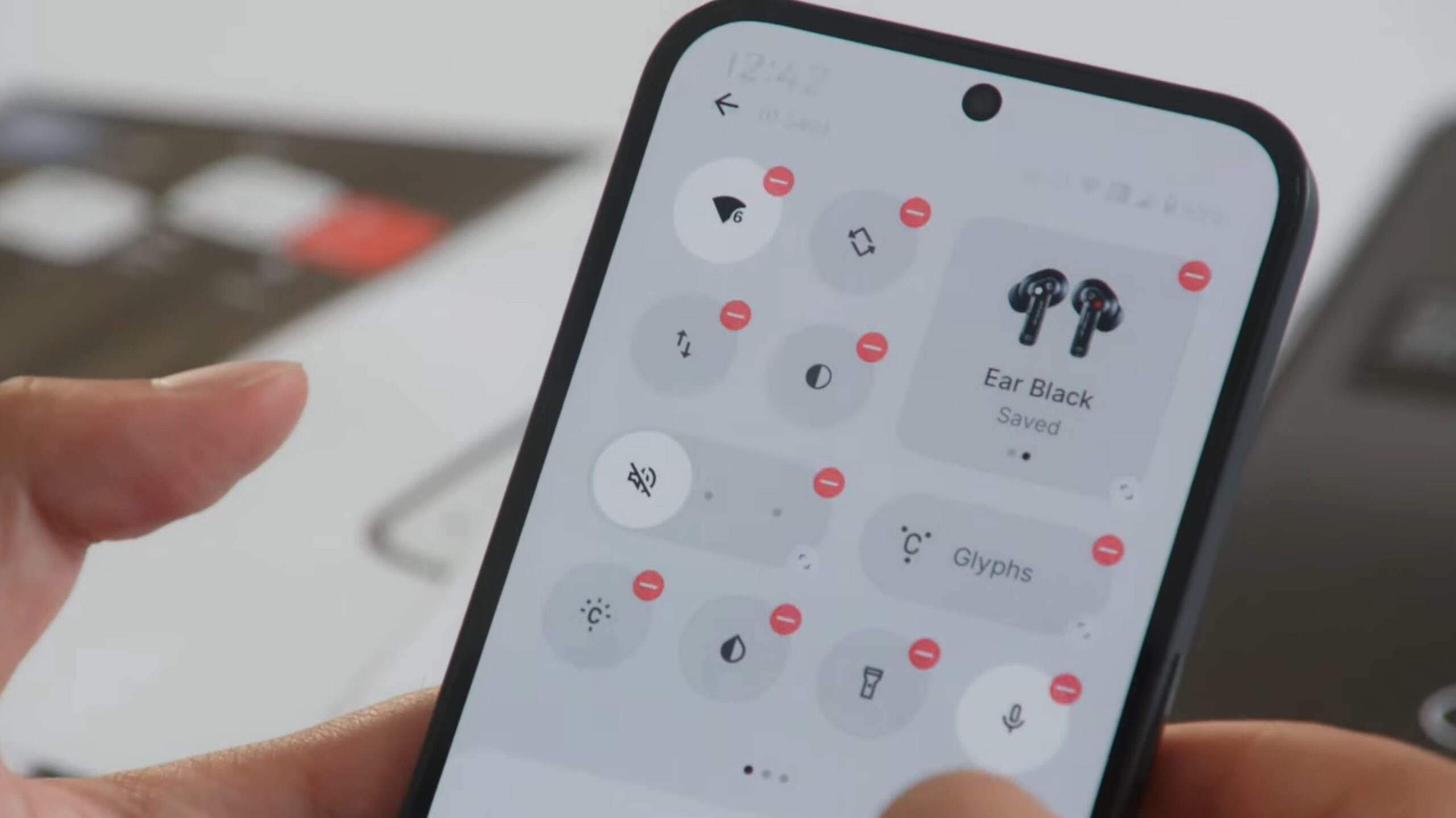
That means focusing on usability for the parts of the platform that people interact with the most, like Quick Settings and the lock screen. The former picks up new customization options and finally adds an easy auto-brightness toggle, while the latter offers new clock faces, a larger space for widgets, and more customization features of its own.
The lock screen is also where you might notice some fallout from a system-wide tweak that changes up the platform’s approach to fonts. Nothing’s going for readability and clean layout above all else, so the classic dot font takes a back seat. But while the font itself isn’t so prominent, Nothing is trying to keep its spirit alive by using dots to dress up the interface all over the place — like you’ll see when going to scan your fingerprint, or in the weather app:
Like everything else in 2024, the app drawer is leaning into AI to help categorize programs and highlight the ones you’ll find most useful. And if AI’s not pulling its weight, you can just manually pin your favorites up top.
Nothing Gallery promises to be your best friend if you’re constantly re-evaluating photos and going back for re-shoots, making it super quick to jump between the camera interface and gallery. Widget fans should also have a lot to look forward to in Nothing OS 3.0, with the addition of a countdown widget for tracking upcoming events and some fun new shared widgets that let you sync up stats with your friends.
So when can you get your hands on this new software? Nothing shares that its public beta program is set to get underway sometime in October, so look out for sign-up details if you’re interested in an early look. For everyone else, expect the final release of Nothing OS 3.0 this December.
Thank you for being part of our community. Read our Comment Policy before posting.

