Affiliate links on Android Authority may earn us a commission. Learn more.
Nothing OS 3.0 hands-on: Dot matrix re-reloaded
Published onOctober 9, 2024
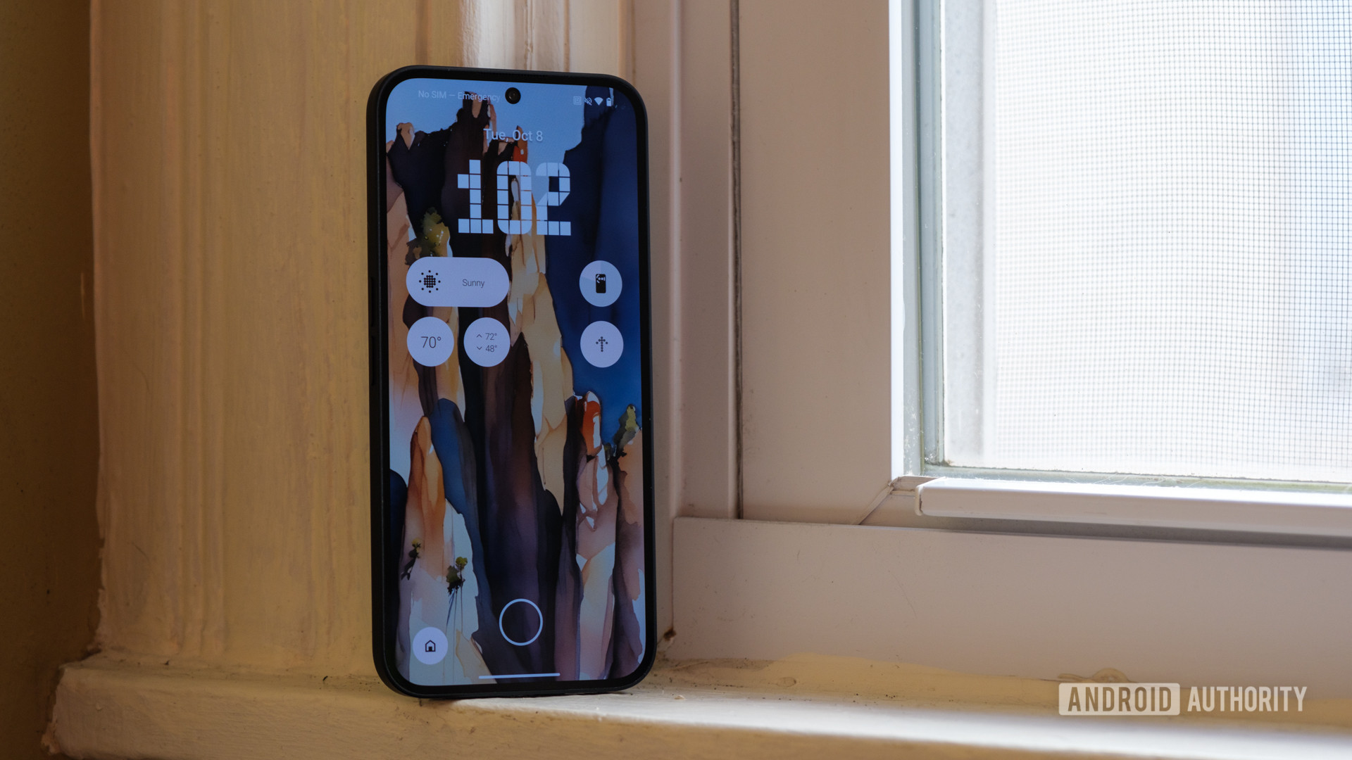
Nothing is well-known among Android fans. Its combination of transparent hardware design and dot-based software zigs every time the larger Android ecosystem would prefer to zag. Sometimes, the ambition works, like in the case of the fun, unique Glyph Interface. Other times, it simply confuses me, like the ringtones and notification chimes that sound like nails on a chalkboard. But, as time passes, it’s clear that Nothing is learning. It’s getting closer to what I think Carl Pei wanted when he spun off from OnePlus, and it all starts with Nothing’s approach to Android 15. I’ve spent a little time with the Nothing OS 3.0 beta and like what I’ve seen so far.
Dots, dots, and more dots
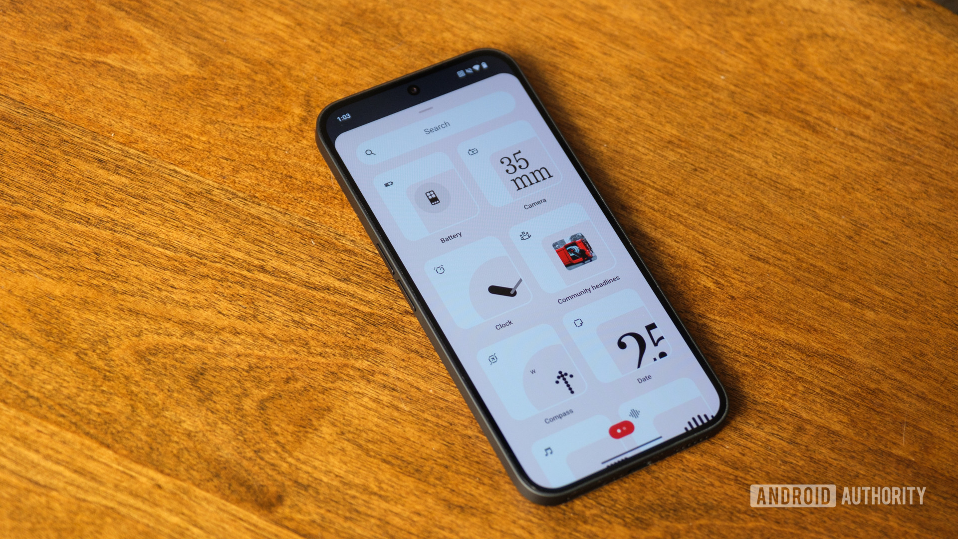
Leading up to the Nothing OS 3.0 beta launch, I saw one thing repeated more than any other on Nothing’s community site: Please don’t ditch the dots. After all, the unique dot-based widgets and dot font were what drew many people to the small Android brand in the first place. Now, I’m happy to report that the dots have indeed stuck around — well, for the most part.
I wouldn’t say that Nothing OS 3.0 uses the classic dot font quite as much as its predecessors did, but it makes up for it by adding extra dots elsewhere. It rolled out a new unlock animation, rippling dots outward from the optical fingerprint sensor whenever you open your phone. Nothing is working on a revamped weather app, too, which will replace the current one-size dots with dots of several sizes, making the sun, rain, and clouds look more natural and less like they’ve escaped a Tamagotchi. It’ll be a welcome update to what is already one of the better weather apps, thanks to Nothing’s convenient widgets for air quality, humidity, and more — I just wish you could reorganize them like you can on Google’s Pixel Weather app.
Come for the dots, stay for the Nothing OS glow-up.
Many of Nothing’s other widgets remain safely dot-based, too. The pedometer still shows a stick man slowly making his way across a dotted line, while the screen time widget shows a smiling, dotted outline of a phone to remind me that I don’t always need my screen on. Even the quick camera launcher widget is a good reminder that less is more, combining a crystal-clear serif font to show me my camera’s focal length while using the dot font below it to remind me that a 35mm lens is best for road trips and not portraits.
By the time Nothing OS 3.0 breaks free from its beta label at the end of 2024, I think it will probably have the right level of dot-based design. I’ll admit that the dots aren’t always the easiest to read or the most refined, but shuffling around the sizing should open up a new level of flexibility to explore.
More freedom to customize
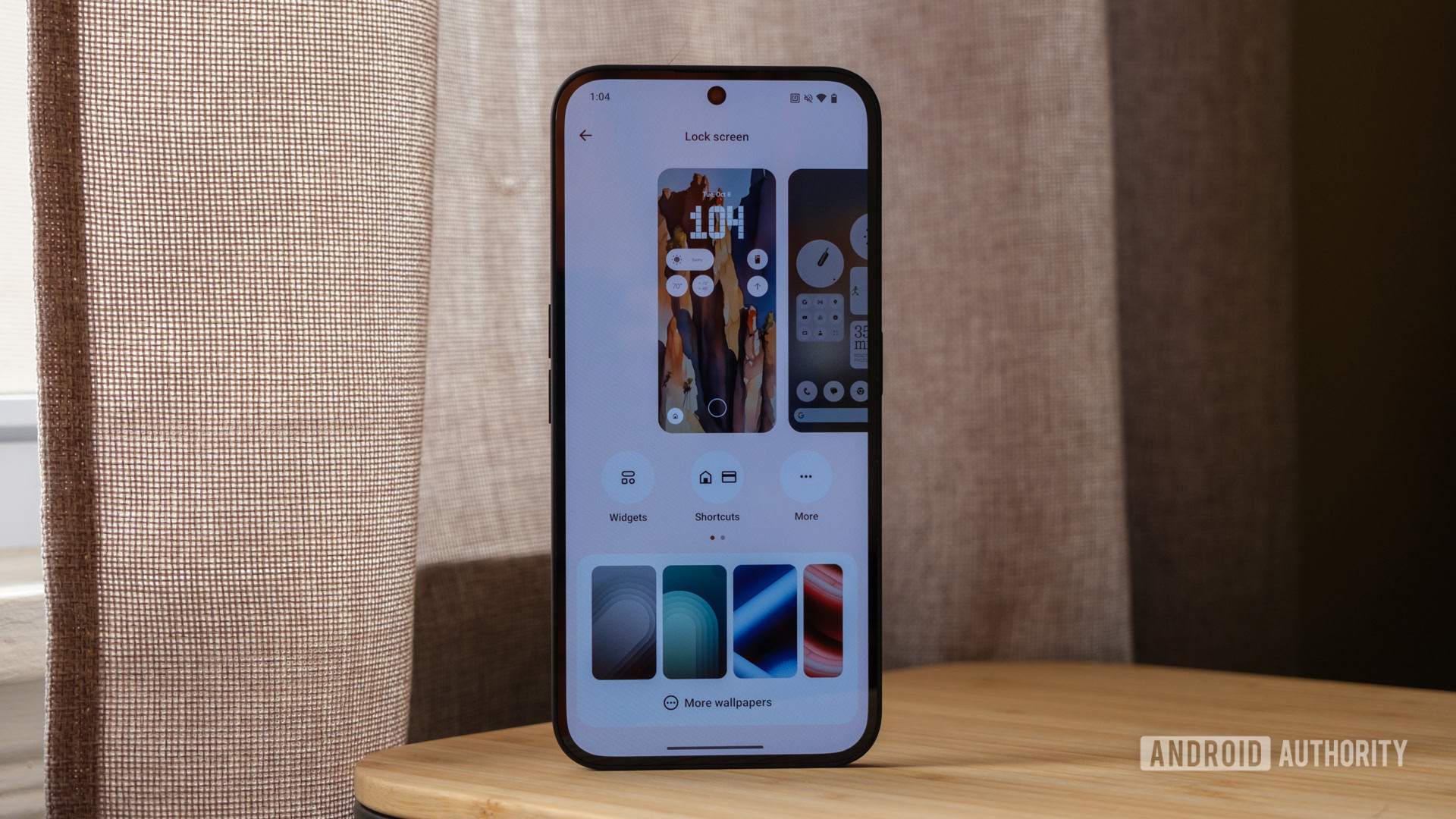
Speaking of flexibility, much of the Nothing OS 3.0 beta is centered around having greater control over your user interface. From the lock screen to the quick settings, it’s much easier to make your phone feel a little more unique. I started my customization adventure with the lock screen, figuring I may as well make the layout that I see all day on my always-on display feel a little bit more interesting. I quickly jumped from the simple default clock style to one of Nothing’s new layouts, a digital clock based on the classic London Underground font. Below that, I set up a small grid of widgets (most of which are the same as I had on Nothing OS 2.5), listing the weather, my remaining battery, and a compass — more for its additional dot-based detailing than for a constant reminder of which way is North.
I love a custom lock screen, but Nothing might have to refine its widgets a little further.
However, as much as I like my new lock screen, I think it relies on some of the same issues I mentioned in the previous section. Yes, I like the dots, but the default weather widget only shows a simplified sun without any extra information — something I could figure out just as easily by looking out the window. I’ve since swapped it for a more detailed weather widget, which feels like the one that Nothing should have used from the start. Nothing’s battery indicator is only visible when your screen is darkened, making it less useful when the Phone 2a already shows your remaining battery percentage at the bottom of the display.
Once you set your lock screen up the way you like it, it’s time to dive into the quick settings and app drawer to make them feel a little more personal. This time, though, I can’t shake a sense of deja vu while exploring some of Nothing’s new options. It rolled out a new quick settings layout and transformed the app drawer into a usage-based Smart Drawer, both of which feel just a little too much like Apple’s iOS 18. I’m not saying that familiarity is a bad thing. I generally like iOS 18, but it’s just similar enough that I picked up on it within a minute or two of updating to Nothing OS 3.0.
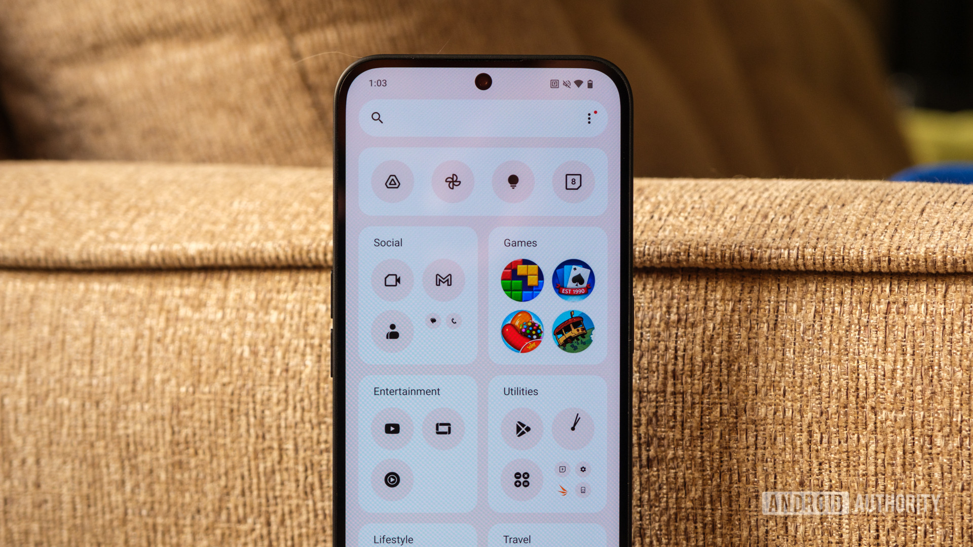
Actually, I quite like the similarity in the quick settings, as controls are easier to reach and resize. Nothing moved its brightness slider to the bottom of the dropdown, which seems like it should be a no-brainer, yet so few Android skins do the same. However, I can’t help but feel a little lost with the Smart Drawer. Like Apple, Nothing decided to sort my apps into several smaller folders based on usage, but the divisions feel half-baked at best. It accurately separated the games I have on my Phone 2a, but then dumped Gmail into the social folder and Chrome into the utilities folder while reserving a productivity folder for Drive, Keep Notes, and Google One. And yes, I can understand why it put each of those apps into that folder, but it results in an app drawer that takes up more space than the classic design because I have several folders with just one app in them.
Nothing OS 3.0: Starting to feel like something
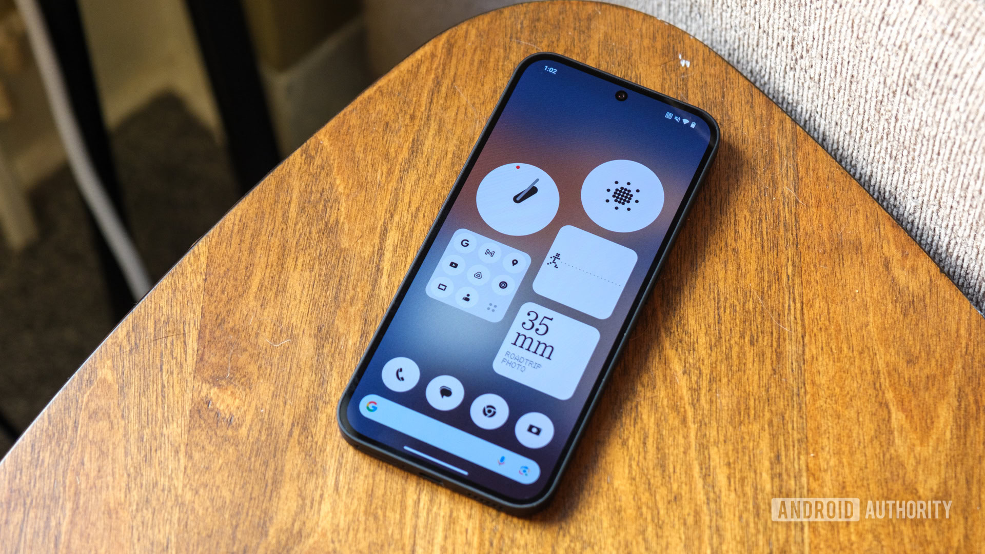
I’ve only spent a few hours exploring Nothing OS 3.0, but one thing is clear — this is the software that Nothing wanted to make from the start. It’s not finished yet — I’m still waiting on the Nothing Gallery and the updated weather interface — but the broad strokes of Android 15 feel nice and smooth. Nothing has teased a few AI-powered features that are coming as part of Android 15, but they’re not ready yet, either. Key pieces of Nothing’s user interface are still there, like the dot-based design, black, white, and red color scheme, and heavy reliance on widgets, but it feels like the overall skin is maturing and becoming cohesive rather than trying to look cool and edgy.
I like (or am looking forward to) almost all parts of Android 15 on the Nothing Phone 2a. I think people will jump all over the new quick settings and have plenty of fun mixing and matching the widgets on their lock screens. Longtime Nothing fans will appreciate the continuity of the dots throughout the interface. At the same time, new converts won’t feel overwhelmed by how different the overall skin looks compared to One UI or Pixel UI. In fact, that’s what I like best: Nothing is still zigging, but it feels more intentional and less like it’s trying to be the opposite of mainstream Android. And yet, it still zags just a bit too far sometimes. I’m already ready to revert to the old app drawer layout, and I’m counting on the updated dot-based design to make the widgets more useful.
Nothing might have one of the best Android 15 skins, so long as it extends its update commitment.
Of course, I have to remember that this is still the first beta version of Nothing OS 3.0. I know that there are still several features that have yet to roll out, like the ability to share widgets between friends with Nothing devices. One day, you’ll be able to send pedometer counts back and forth, pushing each other to be more active, but right now, you have to trust that Nothing is working on it. It’ll still be a few months before Nothing lifts that beta label, but when it does, I’m starting to think it’ll climb even higher on our ranking of Android skins — at least as long as Nothing improves its update commitment, too.
If you’re ready to jump into Nothing’s public beta, you can do so on the Phone 2a right now. If you have the Nothing Phone 2, you’ll have to wait for November 2024, and Nothing Phone 1 and Phone 2a Plus users will have to wait until December for their crack at Android 15.

Amazing display
Fast wired charging
