Affiliate links on Android Authority may earn us a commission. Learn more.
Nothing OS 3.0 leak offers first look at new animations and big changes
Published onSeptember 4, 2024

- A leak has revealed the many changes coming to Nothing Phones with Nothing OS 3.0.
- The update redesigns the Control Center and introduces resizeable toggles.
- Nothing has removed the dot matrix font from several areas of the UI.
With Android 15 nearly ready for its stable launch, Android phone manufacturers are preparing for their updated Android skins to follow suit. If you have a Nothing Phone, that means you’re waiting on Nothing OS 3.0. While you wait for the update, check out this leak that reveals all the new goodies in the upcoming version of Nothing OS.
The folks over at Smartprix have managed to install a preliminary release of Nothing OS 3.0 on a Nothing Phone 2a. Just for reference, this build is built on top of the Android 15 Beta update. Since this is a preliminary release, the final version could differ some.
First things first, we have the changelog below that lists what’s new, enhancements that have been made, and improvements to the experience.
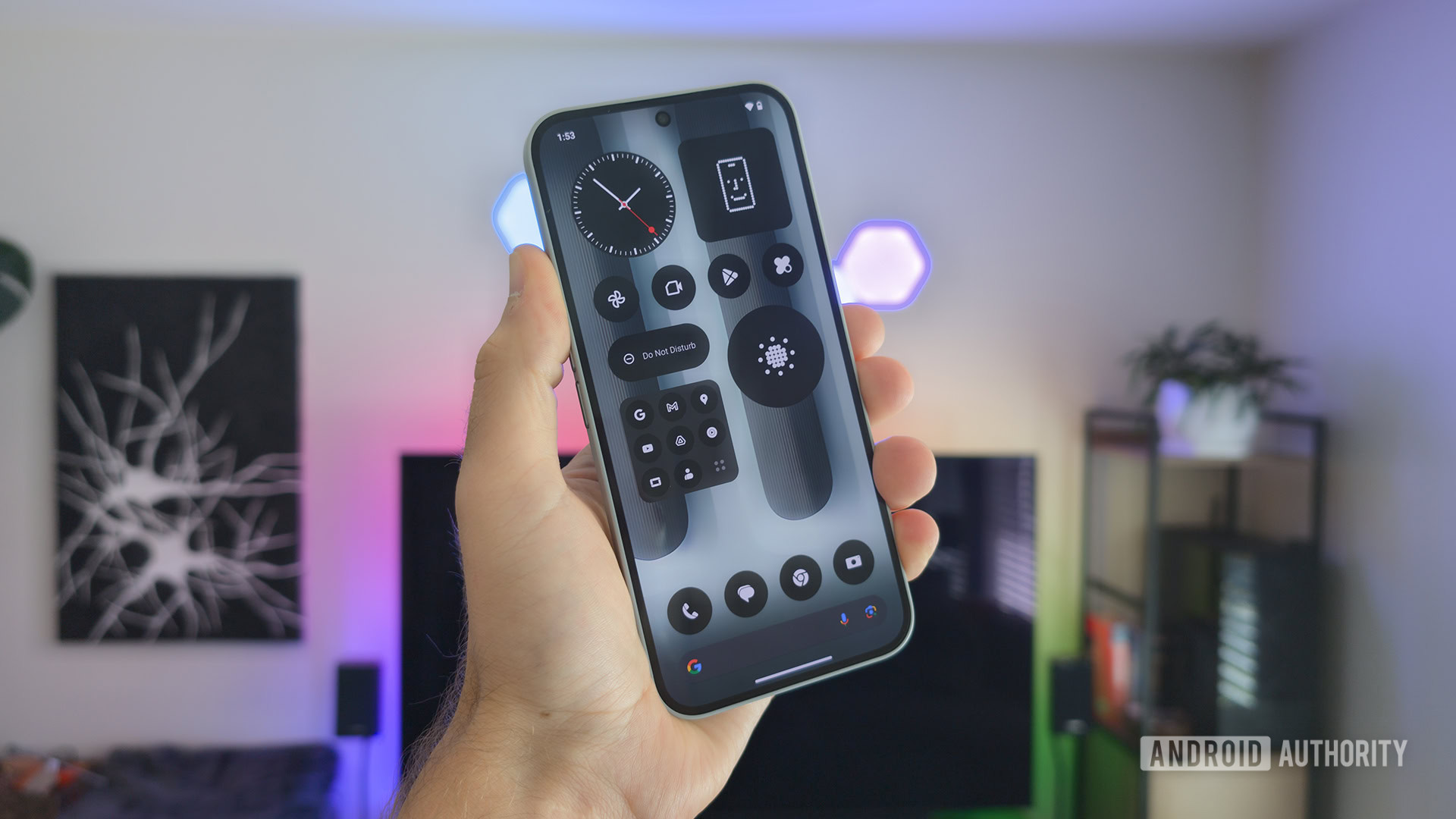
It seems that users can expect quite a few big changes in this new update. One particularly big change that the outlet noted is that the dot matrix font is less prevalent than it once was, being removed from several areas of the UI. In places like the Setting headers and the lock screen clock, you’ll see the text and numbers in a stylized font instead of the dot matrix. It’s possible this was done to help improve readability.
However, don’t expect the dot matrix to disappear completely. In fact, it appears to have been added in a few new areas. For example, when you turn your phone on, you’ll still see the Nothing logo in dot matrix font, but now it will transition into a dot matrix circle that expands outward. Additionally, the lock screen fingerprint sensor also has a new dot matrix animation when unlocking.
Another big change you’ll notice is a redesigned Control Center with resizeable toggles. Swiping down from the top of the screen will show you the Wi-Fi, Mobile Data, and Bluetooth toggles as seen in the left image above. However, if you swipe down again, you’ll be greeted by additional toggles. Swiping to the left will show you even more toggles.
All of these toggles can now be resized with the Expand Toggle button, which appears on the bottom right of the icon. The sizes you are allowed to choose from include 1×1, 1×2, or 2×2.
Finally, the brightness slider reportedly has an auto-brightness toggle baked in. There’s also a reset button to put everything back to the way it was. And Control Center said to adapt to light mode.
Other notable changes include:
- Lock screen customization shortcut: Takes you directly to lock screen customization settings.
- Dynamic Clock: Double-lined clock has been renamed to Dynamic Clock.
- Home screen reset: You can now reset the home screen to Nothing’s original layout.
- New font option: A new font called “Inter” is now available as an alternative to “Roboto.”
- Redesigned Settings: In addition to removing the dot matrix font, the app layout is more organized and grouped into sections.
- Charging Assistant: This feature will notify you if your phone isn’t charging at the maximum speed or if a charging limit has been set.
- Battery health: The feature now offers “Smart Charging Mode” and “Custom Charging Mode.” Smart Charging juices up the phone steadily overnight. Custom Charging lets you set a charging limit between 70% – 90%.
- Predictive Back Gesture: This lets you preview content when navigating back.
- Close apps from Control Center: Apps with sensitive permissions, like the Camera, can be closed from Control Center.
- Partial screen recording: You can choose to record just a single app or the full screen.
- Device diagnostics: You can test the health of components or the health of another Nothing device.
- Component Health: You can test the display, touch functionality, battery status, and storage status.
- Evaluation Mode: You can test another Nothing device running on Nothing OS 3.0. It involves scanning a QR code.
- Fingerprint saved: You’ll be notified if your fingerprint was already saved.
- Auto archive: Unused apps can be archived automatically.
- Network Power Save Mode: Able to extend standby mode time.
Additionally, the outlet says that Dialer, Contacts, Gallery, and other system apps will be coming in the final version. All in all, Nothing OS 3.0 sounds like it’s a big improvement compared to the Nothing OS 2.5 update.