Affiliate links on Android Authority may earn us a commission. Learn more.
We asked, you told us: Most of you like the Nothing Phone 1 design
Published onJune 20, 2022
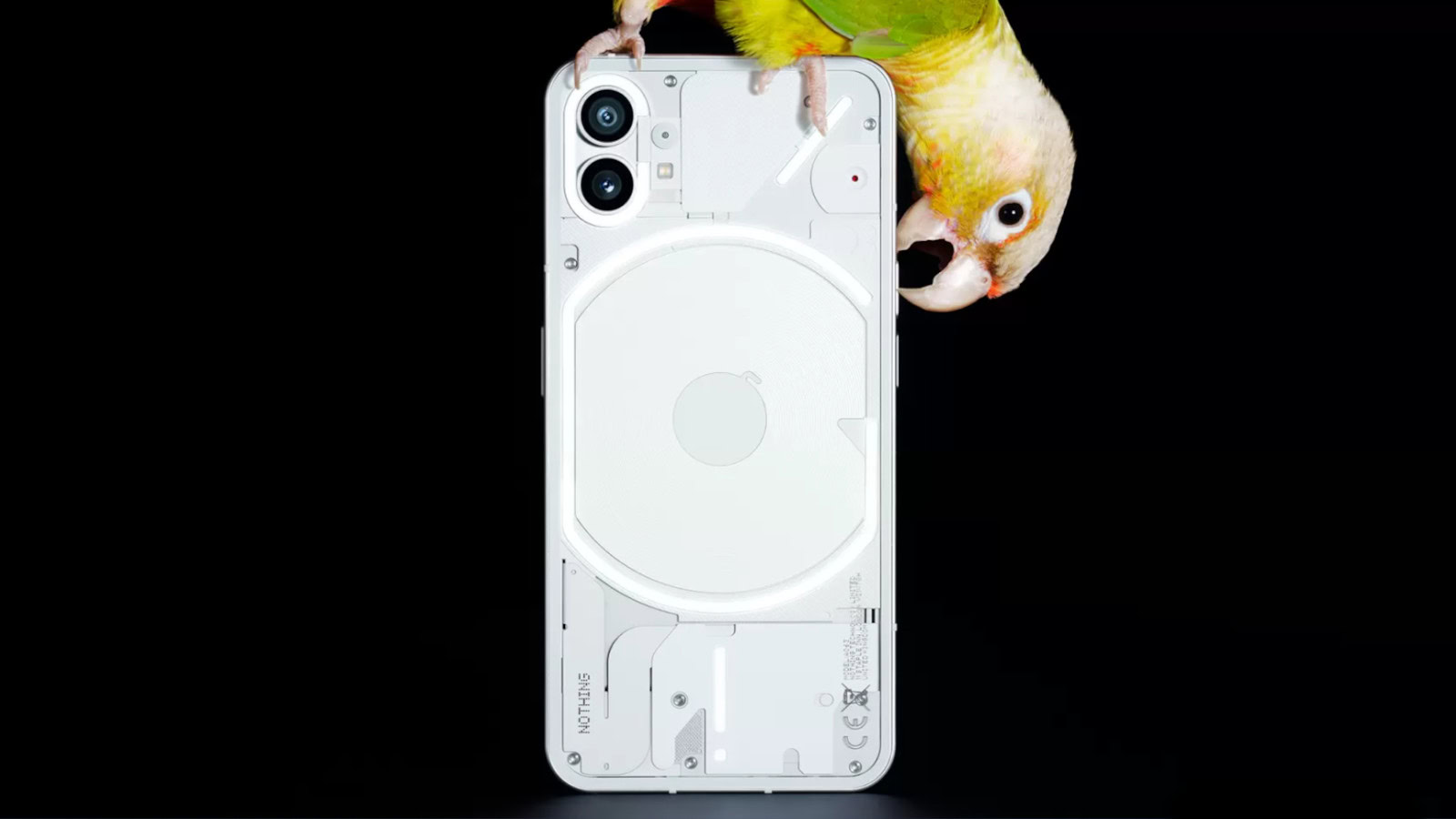
The Nothing Phone 1 is just under a month away from its July 12 release, and the company finally revealed the rear of the phone last week. The design is indeed transparent, while also showing off a wireless charging coil, Nothing logo in the center, and dual rear camera system.
What do Android Authority readers think of this design, though? Well, we posted a poll inside our news article, and the results are finally in.
What do you think of the Nothing Phone 1 design?
Results
Over 4,300 votes were counted as of writing, giving us a healthy sample size. It turns out that 73.06% of respondents say they like the Nothing Phone 1 design. We didn’t see many comments on this story at all, but we imagine that the transparent design appealed to many polled readers hoping for a change from the usual plastic and glass designs.
Meanwhile, 26.94% of polled readers said they hated the design. For what it’s worth, it seems like the handset takes more than a couple of cues from the iPhone. For example, the vertically stacked rear cameras and the position of the flash and secondary sensor seem similar to devices like the iPhone 12. We also get flat edges here, along with Apple-style antenna strips.
Nevertheless, it looks like most polled Android Authority readers are in favor of Nothing’s design. But we look forward to a full reveal, including the front, specs, pricing, and availability.
