Affiliate links on Android Authority may earn us a commission. Learn more.
NYTimes has revamped their app and here's our review!
Published onMay 8, 2015
What’s new?
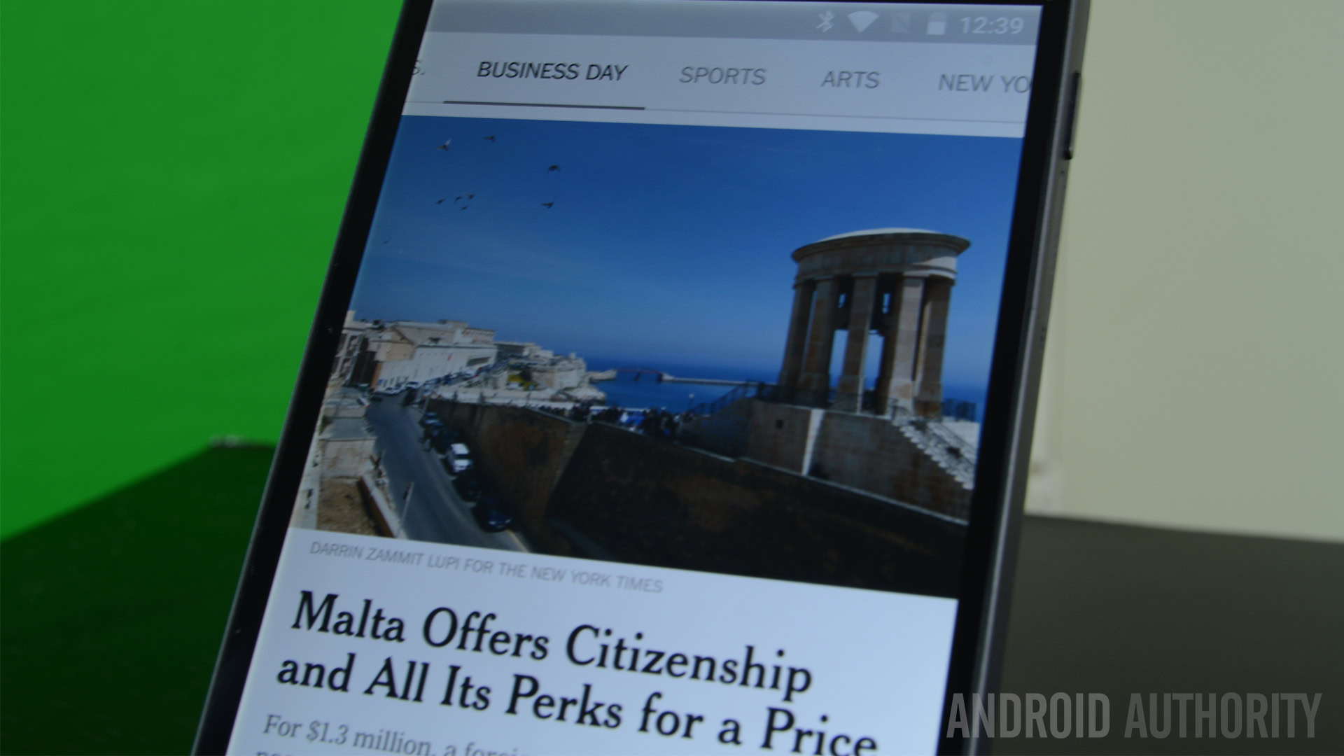
Perhaps the most prominent change in the NYTImes app is the user interface. They have abandoned their prior design almost entirely in favor of a much newer, far fresher interface that contains heaps of Android Holo with a pinch of Material Design thrown in for good measure. We can’t emphasize enough how quick and smooth the new interface is and it’s clear without resignation that a lot of work went into it.
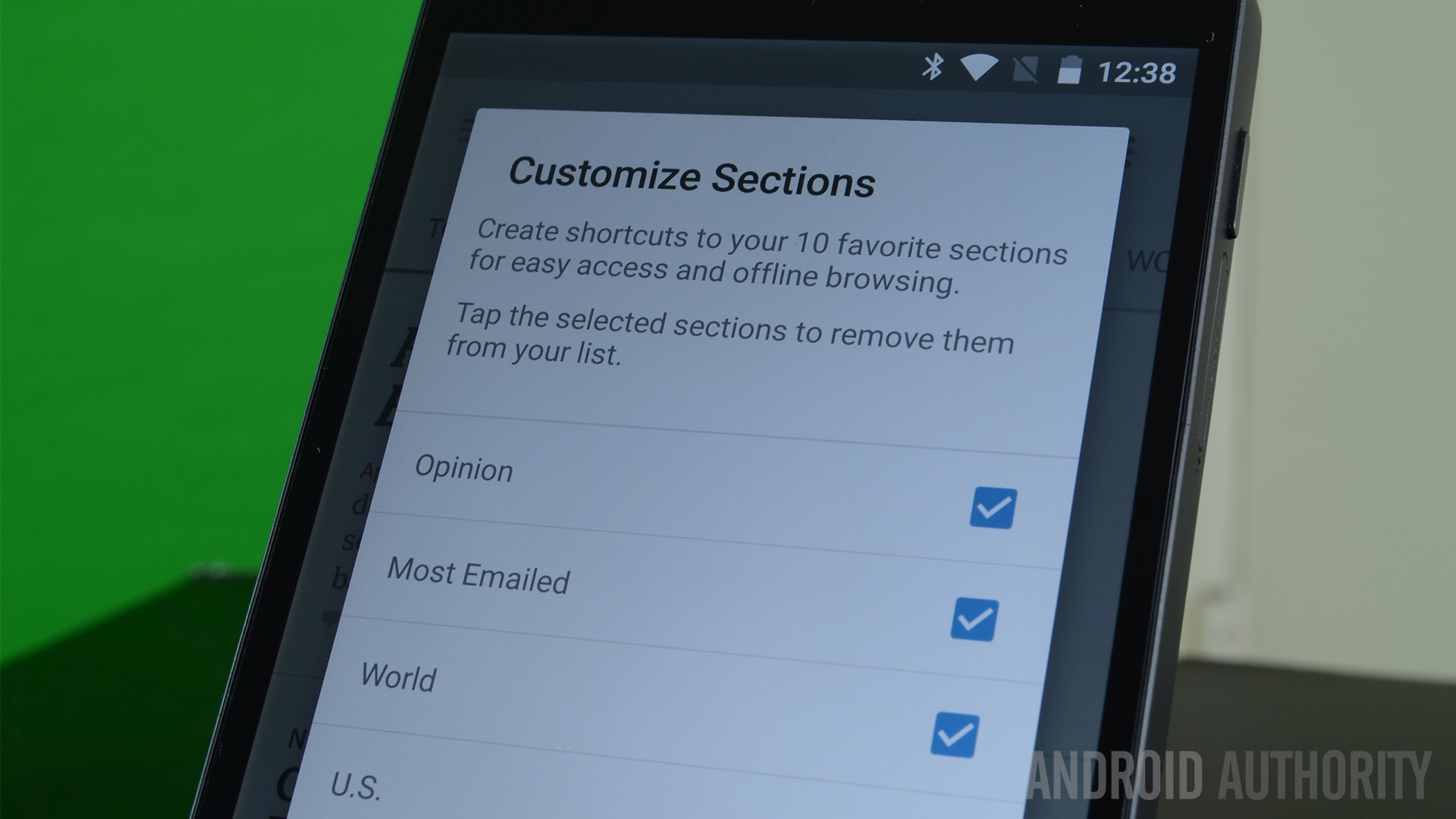
Upon starting the app, you’ll see categories lined up across the top of the screen. You can swipe left and right between them to browse the various sections of the NYTimes. In the overflow (3-dot) menu in the top right, you can customize which categories you see across the top of the screen. In the hamburger menu on the top left, you’ll also see your 10 favorite categories along with a list of all categories and NYTimes properties that you can engage with.
This new swiping functionality is consistently present across practically all screens. You can easily swipe to the next article (or back to the old one) and some articles even have a comment section that you can swipe around as well. At any point you can open the left menu by swiping in from the left side of your screen. There are also dedicated phone and tablet interfaces so you can enjoy content no matter the size of the screen.
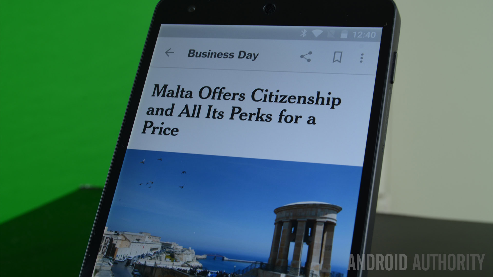
It is also worth mentioning that the articles themselves now follow a singular format with richer media than before and that makes them more enjoyable.
Functionality
The UI definitely takes center stage but the app does contain a number of other useful features. In the Settings menu, you can control things like notifications, categories, and your account settings if you decide to sign up for a NYTimes subscription. You can use the app for free although you are limited to 10 articles per month whereas subscribers generally get full access.
You can expect two kinds of notifications from this app. One is a breaking news notification that will pop up whenever big news is happening. During my testing, I received one when the NFL draft started and a few others. The second type of notification is called The Morning Brief that occurs every morning. This serves up the important news from overnight to get you caught up quickly.
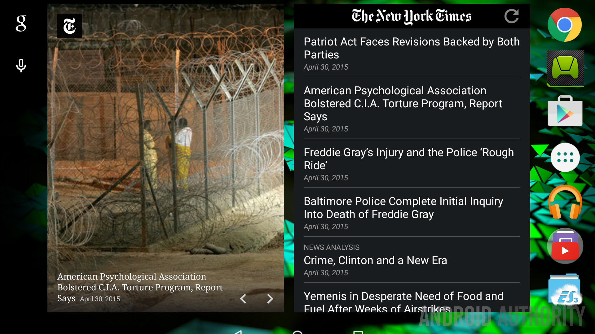
There are two kinds of widgets you can use as well. The first is a fairly standard widget that shows you the latest headlines. You can scroll through the widget and tap on stories to launch the app and read them. The second is a brand new widget that shows interesting photographs from the day. Tapping on the photographs will launch the relevant article.
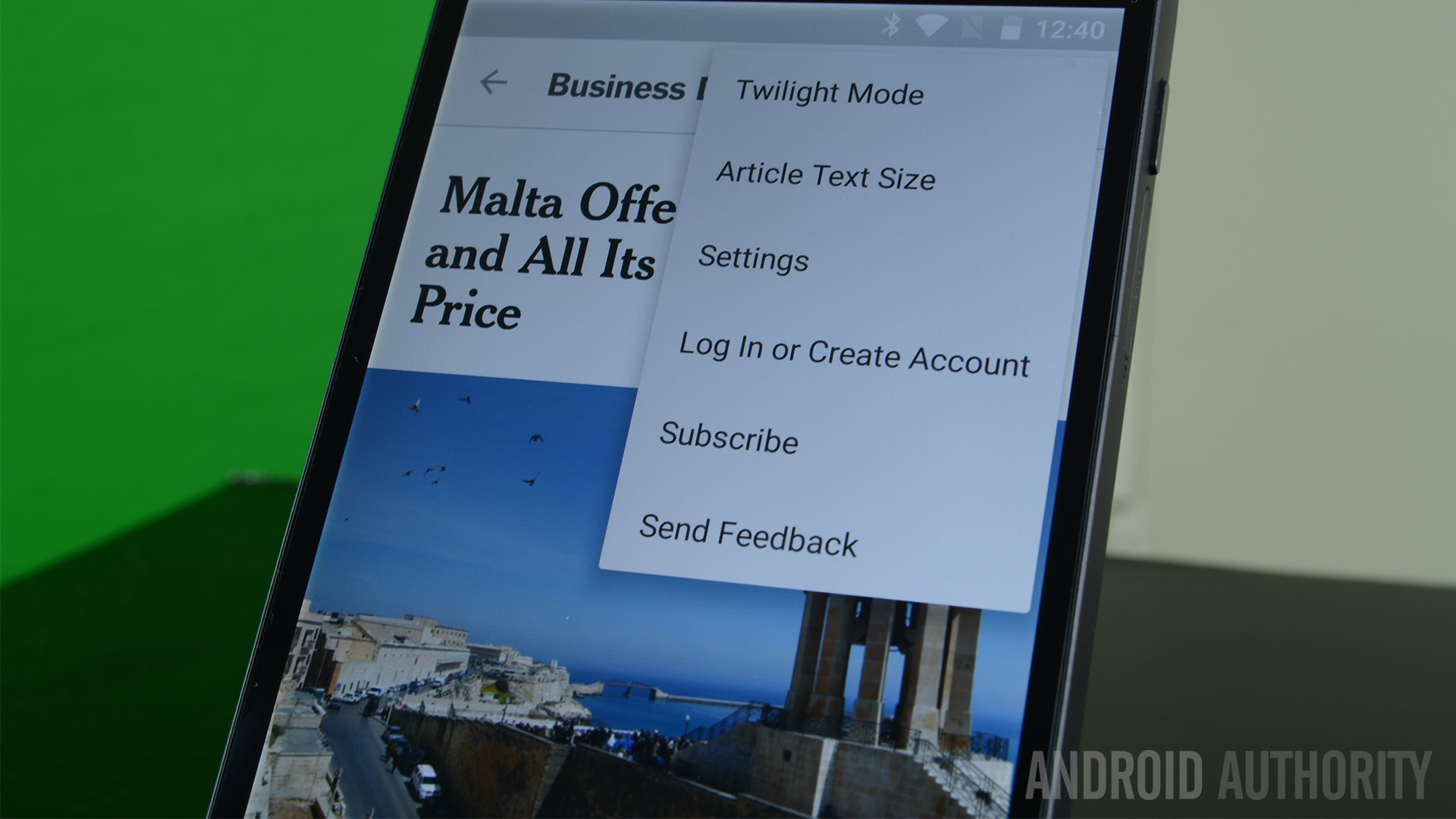
In addition, you also have a Twilight Mode to darken the screen for easier reading, the ability to switch between the U.S. and International editions of the NYTimes, and multiple links to send feedback about the app if you have comments, complaints, or suggestions.
The good
Here’s what we liked about the new NYTimes app:
- The new interface is simply stunning. We’ve seen few news apps embrace the Android design language and fewer still who have done it as well as the NYTimes has here. We especially enjoyed the consistent swipe controls on the main interface and articles as well as the grid layout on tablets.
- It is one of the best performing Android news apps that we’ve ever used. Articles load quickly (Internet connection permitting). Swiping between categories and articles has a satisfying smoothness that just screams high class when combined with the simplistic elegance of the new interface.
- The notifications are consistent enough to be useful but not so consistent that it becomes an annoyance. The Morning Brief is an excellent way to get caught up on what’s going on and we liked that both types of notifications can be configured in the Settings.
- You have the ability to save articles and read them across multiple devices (subscription permitting). This means you can start reading a story on your phone and continue reading it on your tablet or computer later or vice versa.
- The widgets included are simple but effective. They can be re-sized to an extent to fit your home screen needs.
- We’d like to talk for a moment about the subscriptions. The NYTimes offers more than a half a dozen subscription options and three of them are for their online content. Subscriptions are generally an all-or-nothing proposition and we appreciate the ability to go with a cheaper or more specialized options. For instance, if you don’t own a tablet, you can get a smartphone-only subscription.
The not so good
Here’s what wasn’t so great about the NYTimes app:
- The app is a total refresh. That means many features from the old app are now gone. This has irked some folks but the developers have been attentive in fixing issues and taking suggestions to re-integrate popular old features. You can expect the app to change a great deal over the coming months.
- When scrolling through the photo widget, we noticed that there were only about a half a dozen photos. We would’ve liked to have seen more photos. It does auto-update over the course of the day so this really is just a minor nitpick.
Wrap up
The NYTimes app developers clearly wanted to go in a new direction and they succeeded in their endeavor entirely. The emphasis on quick loading and buttery smooth performance meshes well with the high standards of the publication’s content and the two combined create one of the greatest news reading experiences available on Android today. That said, the app is in its infancy and we expect more features to be rolled out over time to make up for all the features lost in the transition.
Overall, it’s a fantastic application. You can read articles and test the app for free before committing to a subscription so there’s no actual harm in trying it out for yourself. Just click the button below to get started. Don’t forget to check out the gallery below!
