Affiliate links on Android Authority may earn us a commission. Learn more.
One UI 6 review: Samsung keeps it fresh with Android 14
Published onAugust 26, 2024
Samsung has been hard at work improving One UI, and releases like One UI 6 and One UI 6.1 are testimony to that. One UI 6 first began rolling out to the Galaxy S23 series before expanding to the rest of Samsung’s portfolio. Samsung has followed up with One UI 6.1 on the Galaxy S24 series, bringing plenty of AI features to Samsung’s lineup of One UI 6.1 eligible devices. But is One UI 6 a good update? Are there enough meaningful changes in One UI 6 to keep fans happy? And perhaps most importantly, should you update to One UI 6 on your Galaxy smartphone? I’ve been using One UI 6 for many months, and I can answer these questions for you.
One UI 6 brings plenty of visual changes if you look around
If you were hoping to see a massive, ground-up visual overhaul when upgrading from One UI 5.1 based on Android 13 to One UI 6 based on Android 14, you will be disappointed.
Most UX elements generally look the same, and in my opinion, that is actually good. Users have spent a lot of time familiarizing themselves with the UI and how all the visual elements work and interact with each other. It does not make sense to expect Samsung to go against the built-up muscle memory just for the sake of change.
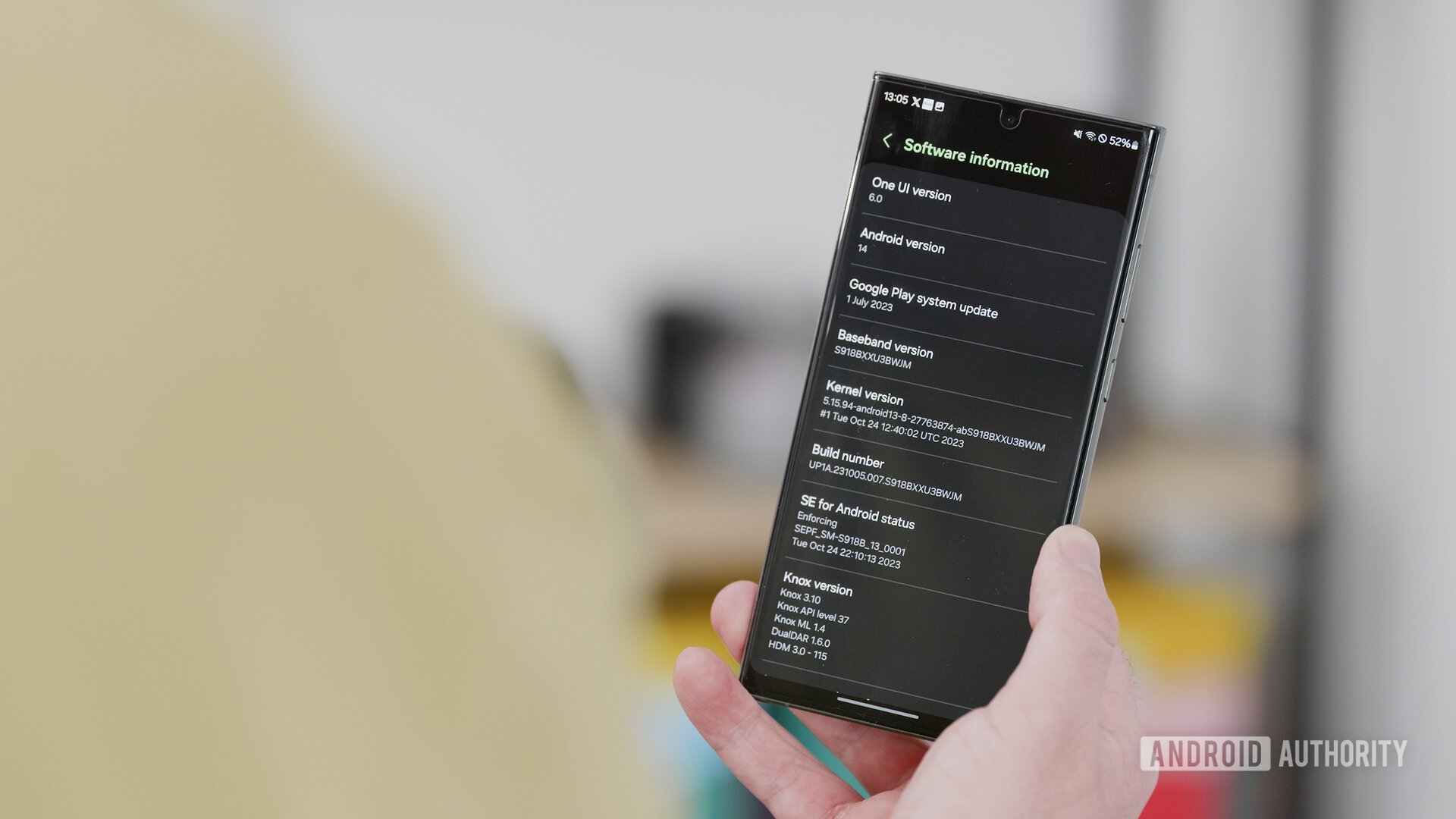
The most significant visual changes are present in the Quick Settings panel, the Lockscreen, and the Notification panel.
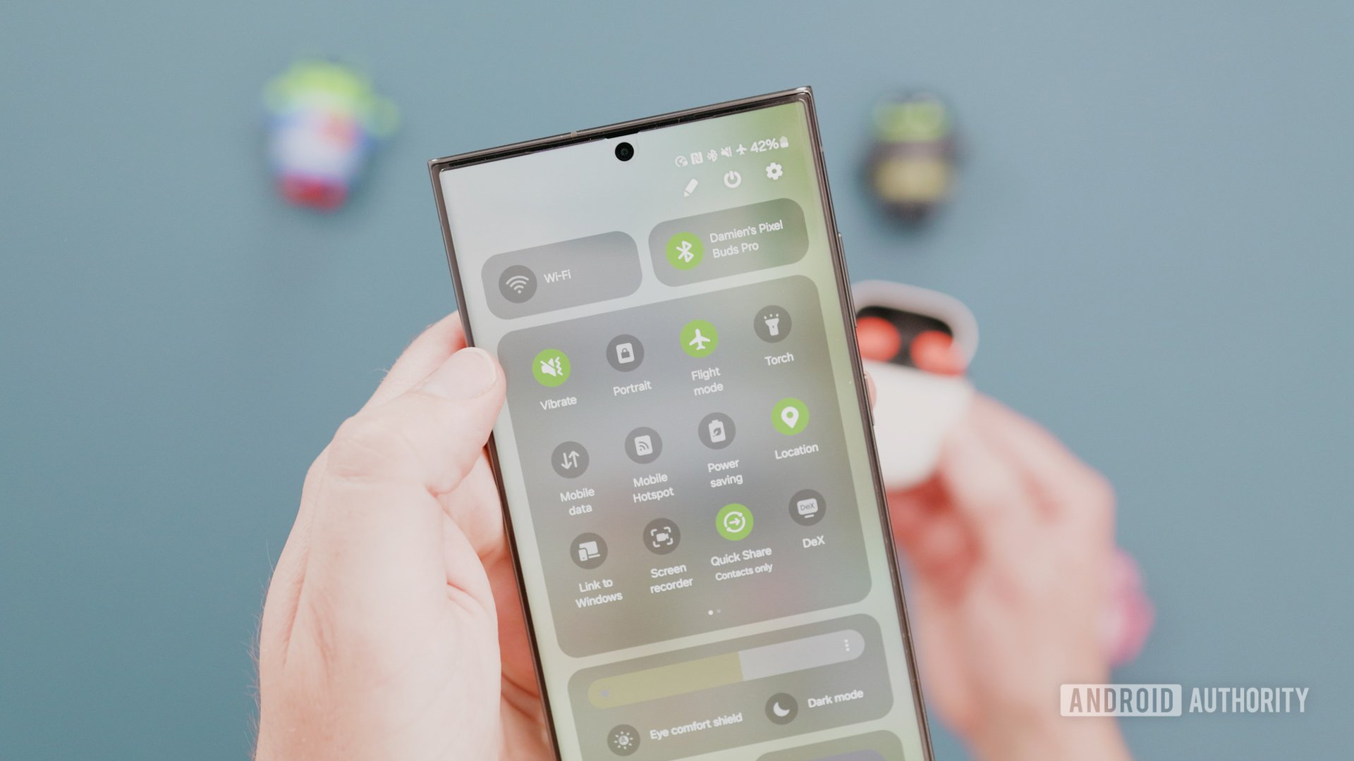
Samsung has played around with the colors, transparency, button positioning, and layout on the Quick Settings panel. A side effect of this change is that the panel does lose out on its previously awesome one-handed reach. The buttons for the most commonly used toggles, like Wi-Fi and Bluetooth, are quite high up, and they require more finger gymnastics to reach. You can’t reposition them to the bottom row of buttons either.
On the bright side, the toggles for Smart View and Device Control are now easier to reach. Samsung has also added a Quick Settings Instant Access setting, letting you swipe from the top right edge to access Quick Settings quickly. We’ve seen this behavior previously in custom ROMs and other skins like MIUI, and some people really like it.
The Notification panel now gets individual notifications as separate cards. This creates more space between notifications and gives them individuality, but it also takes up more screen space, and you end up needing a scroll or three if you have many unread notifications.
You can now also sort your notifications by time instead of priority for chronological sorting. There is still notification grouping, so if an app gets a new notification, the notification group will jump to the top with all of its older notifications.
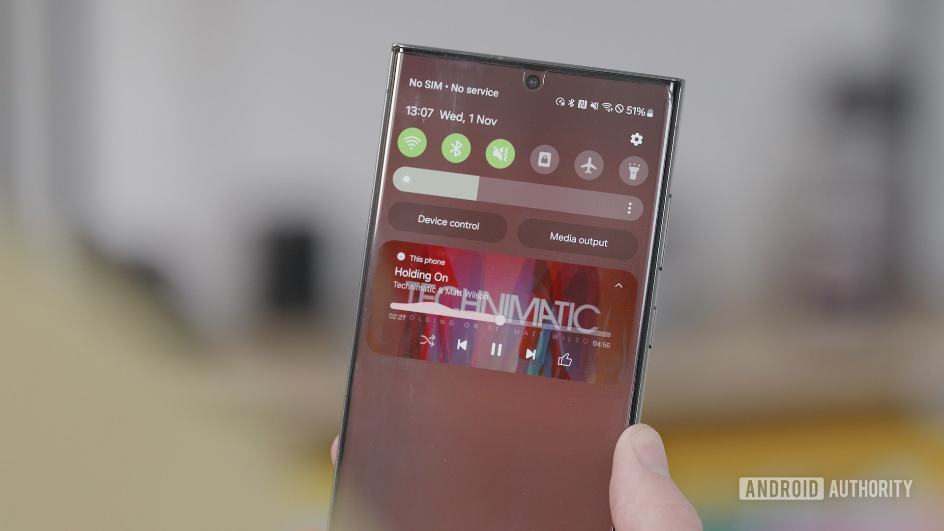
The music player has a very nice visual change. The album art now covers the entire background of the notification, and the progress bar leaves behind a visualizer trail. While it does look slightly out of place from its bland surroundings, it’s a nice touch that adds color and life to the boring notification panel.
For the Lockscreen, we now have a few customizations available. You can also place the lock screen clock widget more freely and adjust it around. But that’s not the significant change here.
The Lockscreen now gets tied to Modes, much like iOS’s Focus Modes, but it misses the mark
One UI 5 introduced Modes and Routines, while One UI 5.1 introduced the ability to set a different wallpaper based on your routine. With One UI 6, Samsung is looking to iOS 17 for inspiration.
You can now set uniquely different lock screens for each mode, just like you can on iOS 17. When you edit a lock screen when a mode is on, you edit that mode’s version of the lock screen. This can be helpful if you need to edit different parameters, like your shortcuts, depending on what you are doing. For instance, you can surface a shortcut to a workout app when your Exercise mode gets toggled, which in turn can be set to toggle automatically when you reach your gym location.
While it’s clear where Samsung is looking for inspiration, the entire experience with lock screens and modes is rather confusing.
For one, Samsung doesn’t do a good job advertising this as a feature. There is no immediate indication in the UX that you can edit the lock screen within a mode and have the edits stuck to that mode only. It does say “Change appearance” from within the mode setting, but most users are not going to realize the correlation between modes and lock screens until they reach this screen. On iOS, Apple makes it much more apparent that you can style your lock screen per Focus Mode.
On iOS, you can also toggle between Focus Modes by long-pressing the lock screen and swapping it into the next lock screen. This does trigger accidentally often, but it is also quite simple to start different Focus Modes when needed manually. But on One UI 6, you can’t change the mode from the lock screen.
One UI 6 gets a new ‘Studio’ video editor for Samsung’s video ambitions
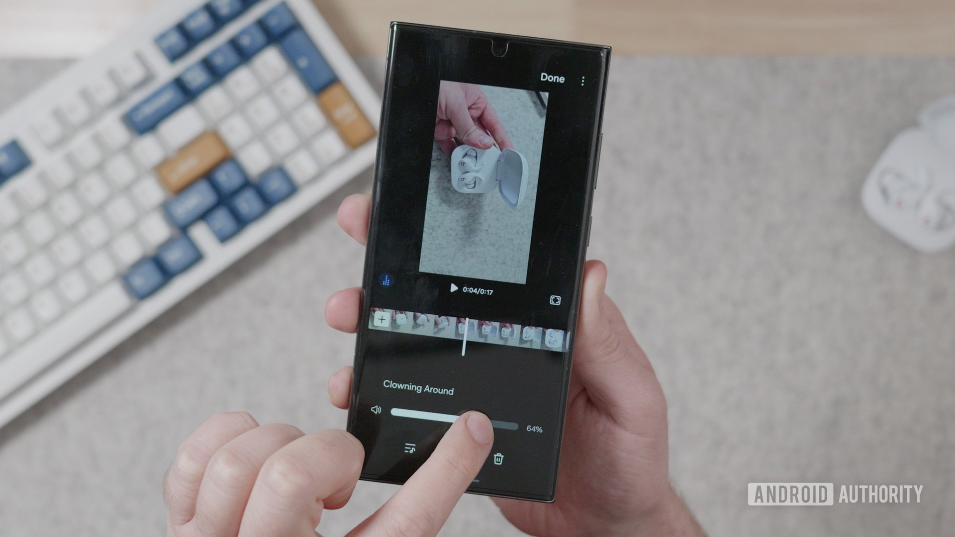
Speaking of bigger changes, One UI now has a dedicated video editor app. Previously, video edits were done within the default Gallery app. The new Studio video editor is first accessed when you click the three-line hamburger menu in the bottom right of the Gallery app, after which Samsung prompts you to add the app icon to the home screen.
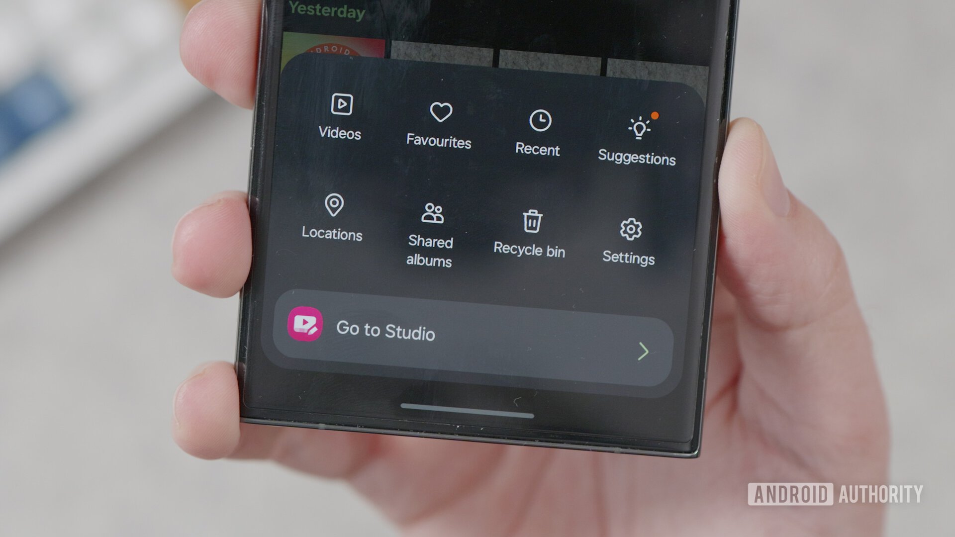
Why Samsung did not give Studio its own app icon by default is something that confuses me as much as it would you. Because of this perplexing decision, most users would not know that an amateur-friendly video editing app already exists on their phones.
What sets Studio apart from the default Gallery’s video editing experience is Samsung’s video ambitions. Past Galaxy S-flagships have focused a lot on video recording, but that’s only one part of what makes a good video. Tight editing is equally important, and that requires a video editing app that would let you work on projects, view multiple clips in timeline view, and then edit accordingly. Studio achieves this, though there’s a lot of room for improvement when compared to other established video editing apps on Android. For its first release, it’s a good start as it keeps things simple for enthusiastic beginners.
Auto Blocker ups your phone’s security
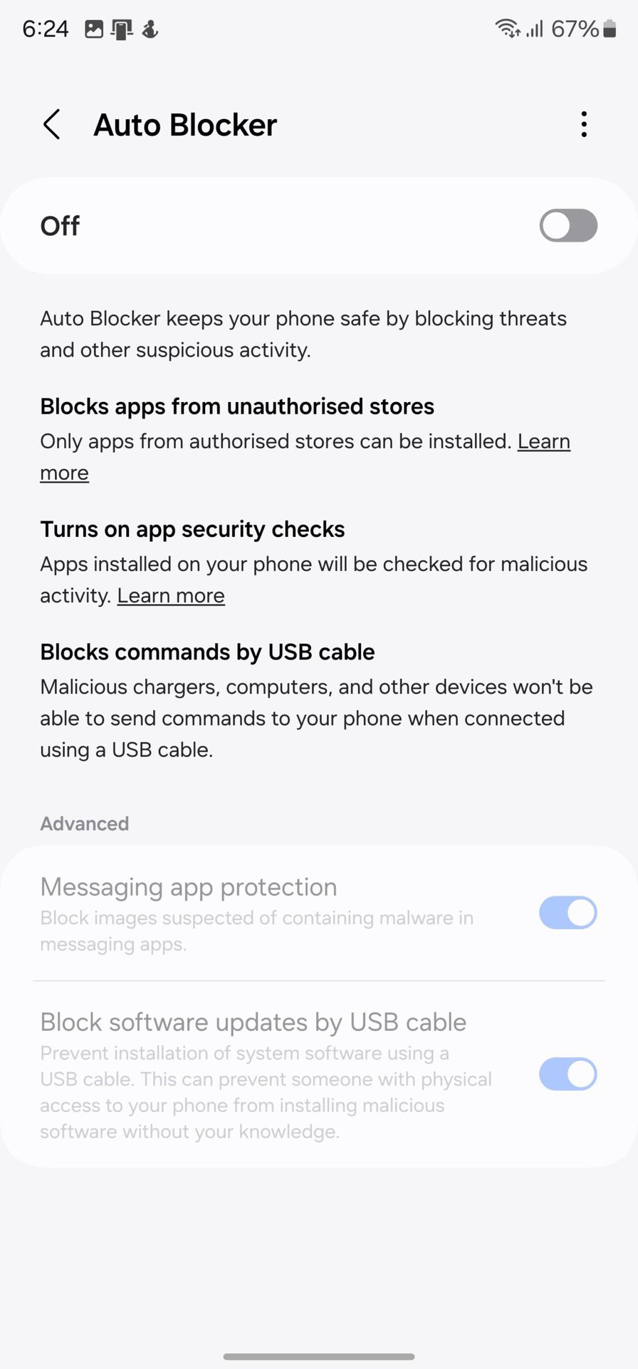
There is a new Auto Blocker feature present in Settings > Security and Privacy, but Samsung has left it disabled by default. When enabled, this feature blocks the installation of apps from unauthorized app stores. To most users, I would recommend turning this on, as your app needs will likely be met entirely with the Google Play Store and the Galaxy Store. It’s an excellent way to ensure that other apps can’t social-engineer their way into installing random apps on your phone.
Auto Blocker also turns on app security checks and blocks USB cables from sending commands to your phone for juice-jacking attempts. My gripe with these is that you can’t individually toggle them on. For example, if you do not mind app installations from third parties but would still like to be safe from potential juice-jacking attacks, there is no way to do that.
Thankfully, Samsung houses two advanced options under their own toggles. I’d recommend turning Auto Blocker on and turning on the other two options housed within the feature unless you have reason to keep these three off.
Samsung Internet gets background playback support
This isn’t a One UI 6 feature per se, but it is mentioned as part of the One UI 6 changelog. You can get it on other phones running the Samsung Internet app too.
With background play enabled, you can play any video in the background through the Samsung Internet app, including YouTube videos. You don’t need to subscribe to YouTube Premium or YouTube Music Premium for background playback functionality. This feature also turns any video into an audio podcast.
You can enable background playback on the Samsung Internet app by following these steps:
- Open Samsung Internet. On non-Samsung devices, you can download the app from the Google Play Store.
- Click on the menu button in the bottom right corner.
- Go to Settings > Useful features > Background play.
- You can toggle it to On or Only on headphones or external speakers.
Save clipped images as stickers
One UI 5.1 first added the ability to clip images to extract subjects and objects. You could primarily save the image as a PNG file with no background and then use it as a sticker elsewhere.
With One UI 6, Samsung now allows you to save the clipped image as a sticker for use within the Gallery and Studio Video Editor. Now, I don’t need another editing app to layer the primary photo with a clipped image. I can simply drop the saved clipped sticker onto another image and resize and reposition it as needed.
Then, there are the smaller changes
Everything else in One UI 6 can be called a more minor change. Most people will not notice them unless they are actively looking for them. But these changes cumulatively add up to a better One UI experience.
For instance, the Camera largely looks the same. But Samsung has moved the photo resolution switcher to the surface, making it easier to swap around resolutions as needed quickly.
Watermarks on images have also exploded in popularity, driven mainly by Chinese brands. While Samsung doesn’t have an iconic watermark, One UI 6 lets you customize the date and time watermark a little more.
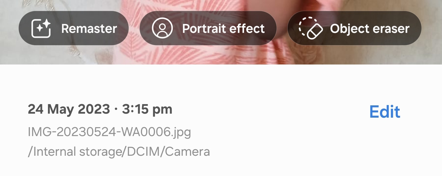
Similarly, the Gallery app looks and functions largely the same. But a new details button lets you not only pull up the details on the image but also touch it up with options like portrait effects, remaster, and object eraser.
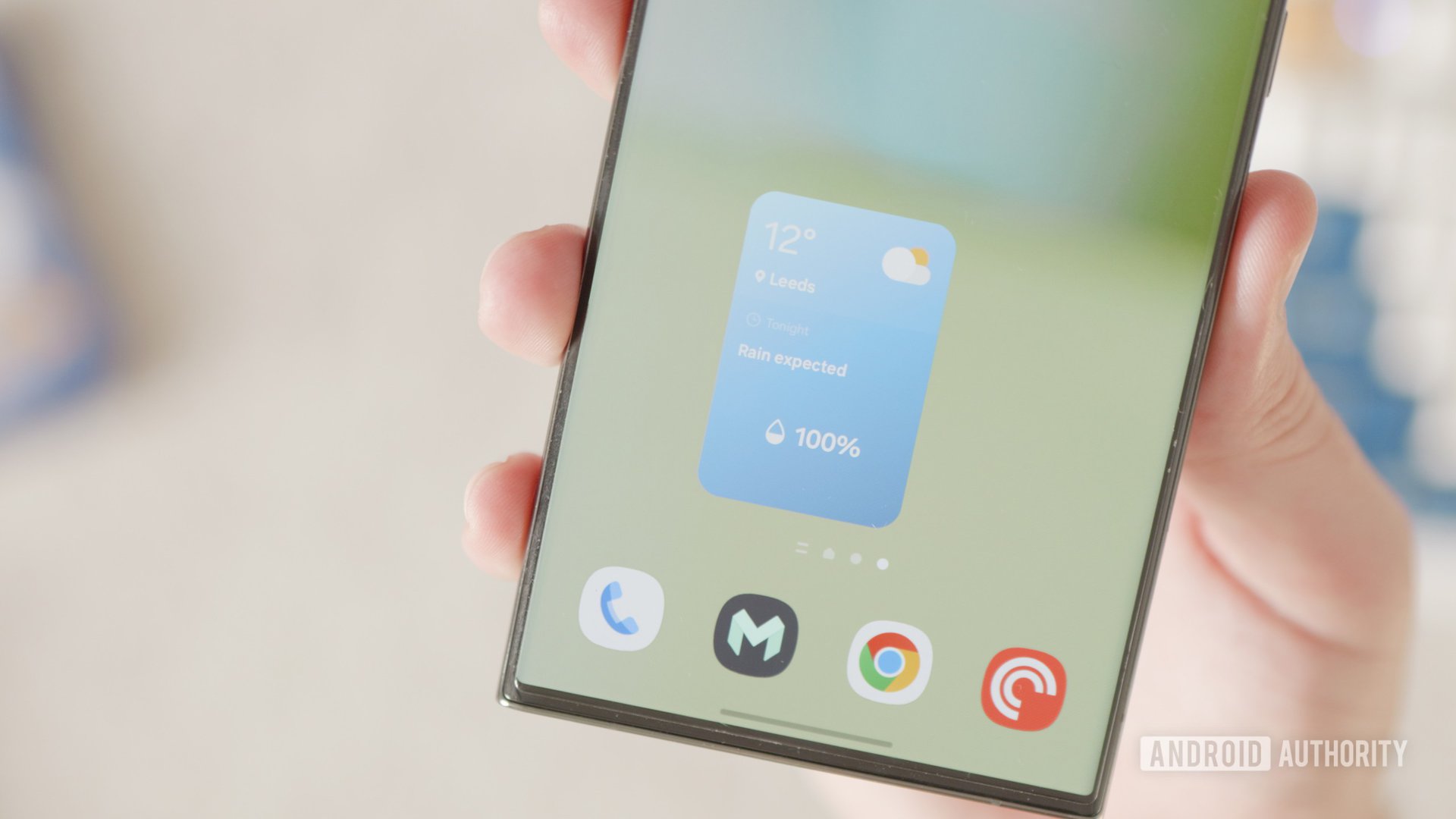
There are two new widgets, and I quite like both of them. The Weather Insights widget showcases the current weather and temperature at your location and also mentions the next weather event, like a forecast or an upcoming sunset.
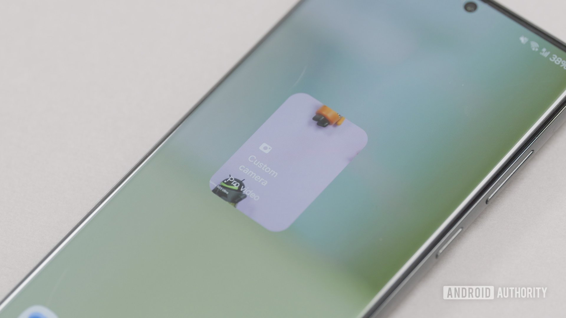
The camera widget is a shortcut that pulls you straight into a specific camera mode. For devices like the Galaxy S23 Ultra that can shoot a wide variety of content, a dedicated shortcut for a specific mode is a godsend.
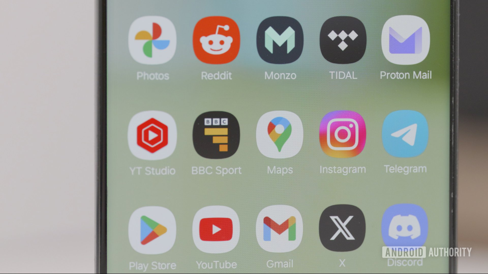
One UI 6 comes with a new default font that is quite similar to the outgoing. If you didn’t notice it right away, I won’t blame you. Samsung has also shortened the name of some of its apps, removing the word “Galaxy” from the app icon label. For example, the Galaxy Store is now just called “Store.” Combined, it’s a subtle way to achieve a cleaner look in the busy app drawer.
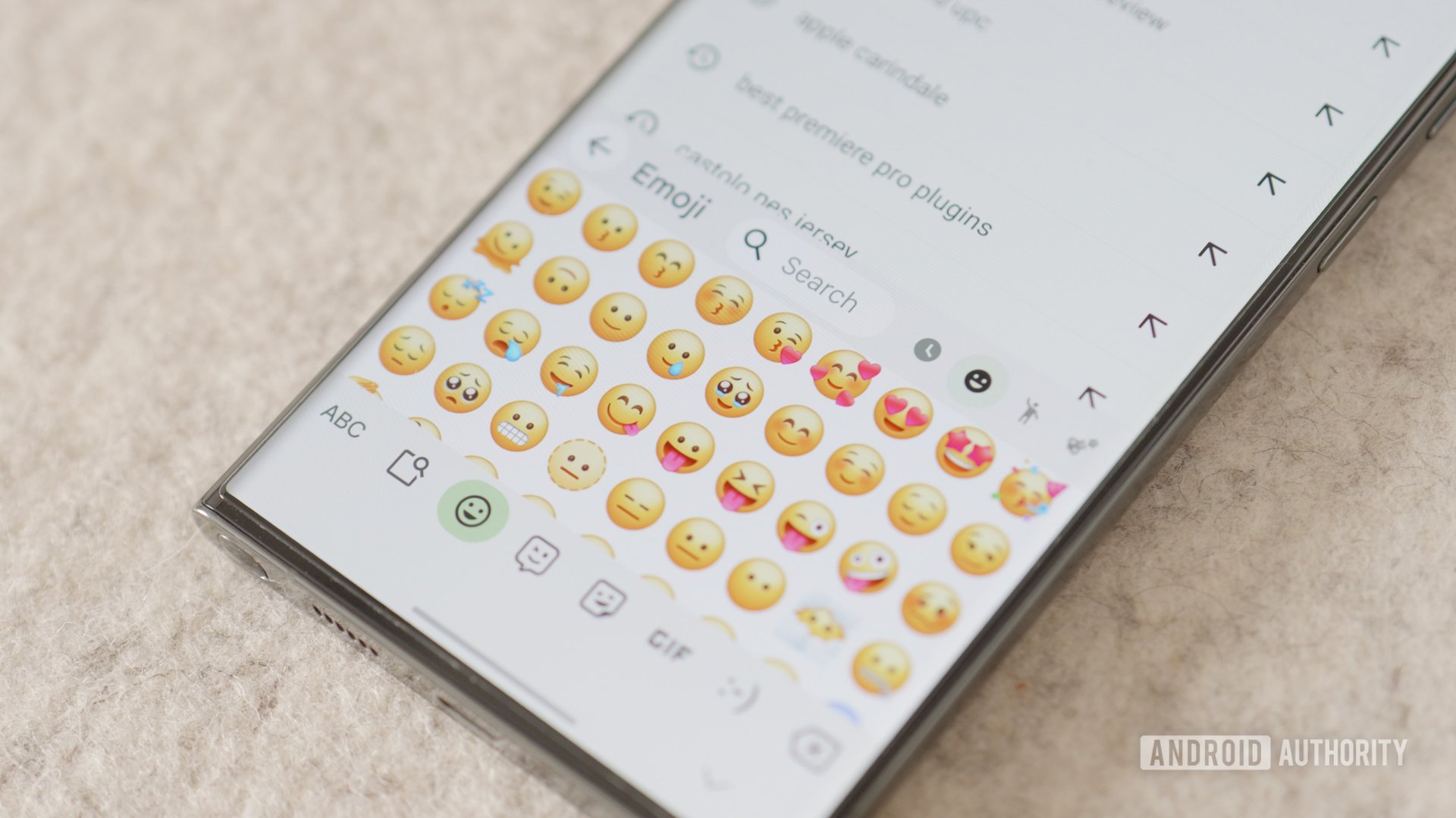
Emojis within Samsung Keyboard now have a new look. Subjectively, I dislike them, but your opinion on the same can rightfully vary.
Another small change that most people would miss is the fact that toggling the Airplane mode will now retain the Wi-Fi and Bluetooth states. This change was introduced in Android 13 QPR1, so Samsung has caught up with the platform.
Full One UI 6 Changelog
Samsung has a lot of other changes littered throughout One UI 6. You can read the complete changelog below:
Samsung fans will like One UI 6
One UI has been rightfully applauded for walking the tightrope between packing in many features and making the experience overwhelming. With One UI 6, Samsung maintains the balance and gets a lot of the little things right, and Samsung fans are bound to like this release overall.
In my time using the stable release, my only real complaint has been the slow move away from one-handed reachability that Samsung had focused on so strongly some years ago. A few questionable UX choices require juggling the large Galaxy S23 Ultra in my hand, and I preferred when Samsung obsessively kept everything within thumb reach. A bug I continue to face is Widevine L3 in Netflix and losing HDR playback, which isn’t very pleasant. Good Lock modules are also wonky on One UI 6, but I am confident this will get ironed out with updates.
My only real complaint with One UI 6 is one-hand reachability. Beyond that, I am pretty satisfied with One UI 6.
Beyond that, I am pretty satisfied. Performance has been excellent on my flagship Android phone, as expected. There haven’t been any larger-than-average battery drain for me, either. Bugs and hiccups were present in the beta releases, and thankfully, I haven’t faced any dealbreakers in the stable rollout. I’m glad Samsung took time with the betas and ironed out most bugs, and I hope the rest get quickly sorted out, too.
Overall, if you are a Samsung Galaxy smartphone user, you should be excited about One UI 6. When the update is released for your Galaxy smartphone, we recommend updating to it immediately. Give the update a few days to settle, and continue enjoying your smartphone.
At the same time, your phone may also have a One UI 6.1 update waiting for you. Samsung is also working on One UI 7 based on Android 15, which is likely to be released first for its most recent flagships before eventually trickling down to the rest of the lineup. So, you can enjoy stable One UI 6 and 6.1 until another update arrives.
How have you been liking the One UI 6 update so far? Let us know in the comments below!