Affiliate links on Android Authority may earn us a commission. Learn more.
I've seen an early version of One UI 7, and it has controversial changes
October 3, 2024
- Samsung quietly put phones running an early build of One UI 7 on the show floor at SDC 2024.
- There are some controversial design changes, including a split notifications/Quick Settings tiles pulldown and new icons.
- It’s possible some (or all) of these changes might not make it to the final release.
Samsung held its annual developers conference today, known as SDC. We expected the company to announce some news related to One UI 7, the Android 15-based skin that will land on Galaxy smartphones. Unfortunately, aside from some disappointing news about a 2025 release date, we didn’t learn much at all about the Android skin itself.
However, Samsung quietly left phones running an early build of the software hidden in plain sight at the show. Throughout the show floor, there were code stations where Samsung employees could help software engineers understand how to do certain things. There were probably 50+ stations at the show, but four of those stations had Samsung Galaxy S24 Ultras running One UI 7.
Jeff at SammyGuru first spotted and photographed these phones. We’ve mirrored those images here, but I checked out the phones for myself and can confirm the pics are legitimate.
Do note, though, that this is a very early look, and Samsung definitely did not intend for people outside of SDC to see them. Therefore, it is possible that some or even all of the changes we see here won’t make it to the final release in 2025. Still, it’s a good way to see what Samsung is working towards.
Let’s dive into what we learned!
A split between notifications and Quick Settings tiles
About a month ago, we told you that Google is almost certainly going to split Android’s notification dropdown menu at some point soon. This will mean notifications and Quick Settings tiles will be separated. By our reckoning, Google will likely bake this into Android 16.
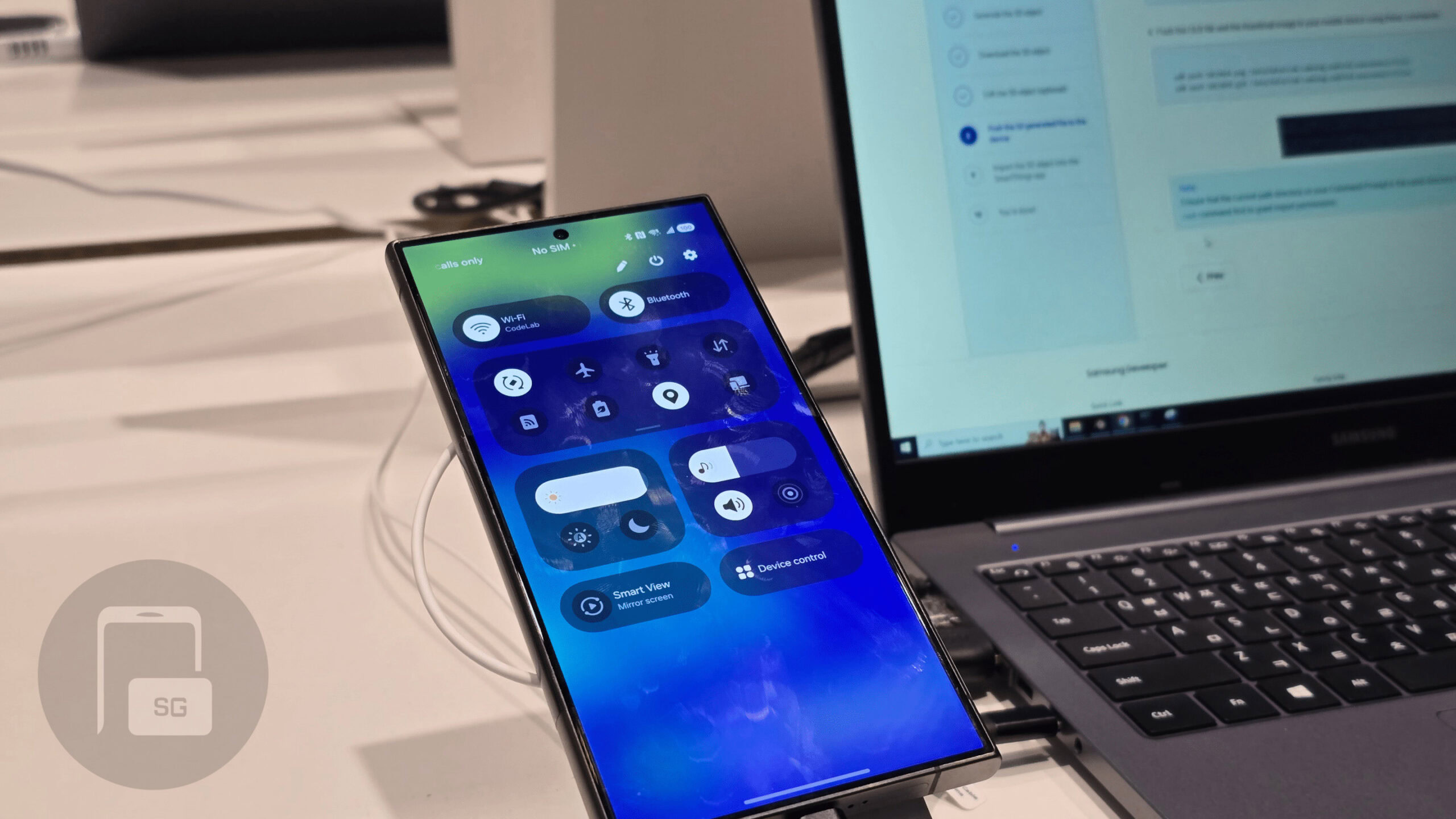
It seems Samsung isn’t going to wait that long, though. The leaked version of One UI 7 I briefly used today has notifications and Quick Settings tiles split. In the images above, you can see how this currently looks. According to SammyGuru, there is a way to revert back to having Quick Settings tiles and notifications on the same page, but I couldn’t test that for myself.
In One UI 7, notifications will be on one page and Quick Settings tiles will be on another.
Outside of the split, these two systems have some slight design changes. Notifications are much rounder, for one. The little arrow that appears on the right to expand the notification has also been shifted to be more centered.
Meanwhile, the Quick Settings tiles section has a smaller brightness slider and a new volume slider right next to it. Everything is also much rounder, making One UI 7 look a lot closer to Google’s Material You design, which we see both in Pixel UI and stock Android. It also doesn’t look too far off from iOS 18’s Control Center.
You’ll also notice the battery icon in the status bar has changed to something very similar to the one we leaked a while ago. Although what we leaked still looked like a battery, and this one is just an oval, the concept is pretty much the same.
New One UI 7 icons
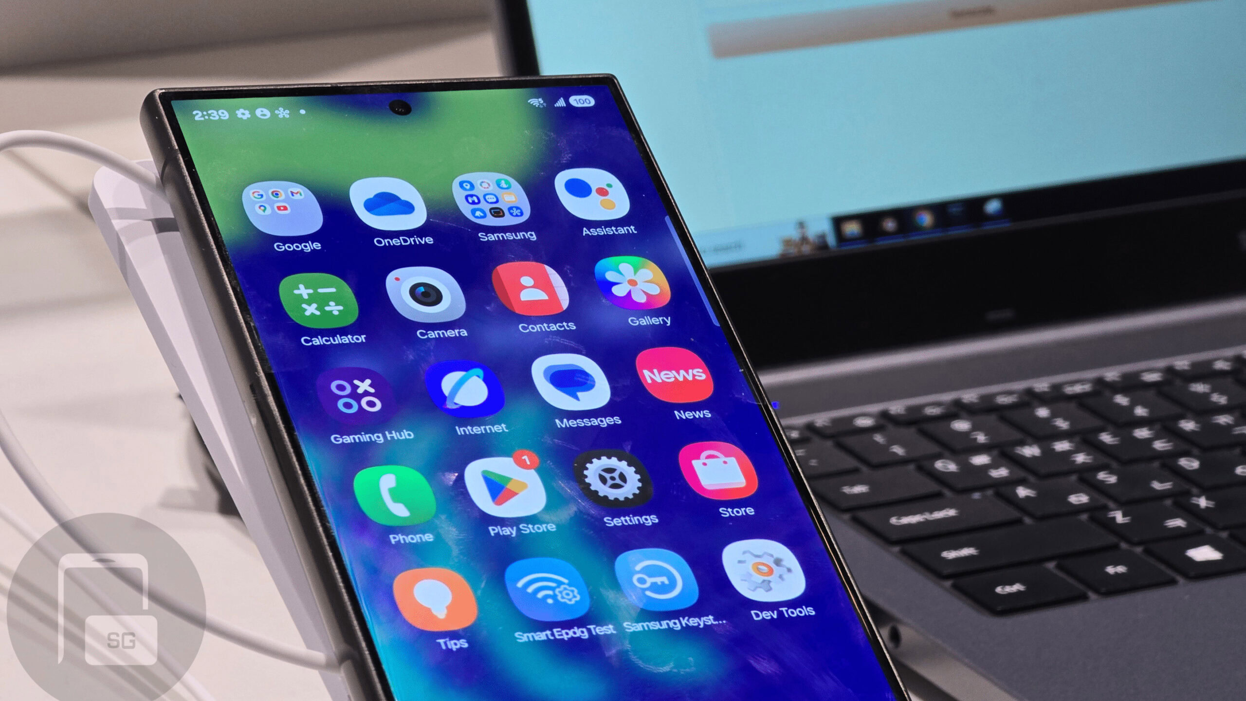
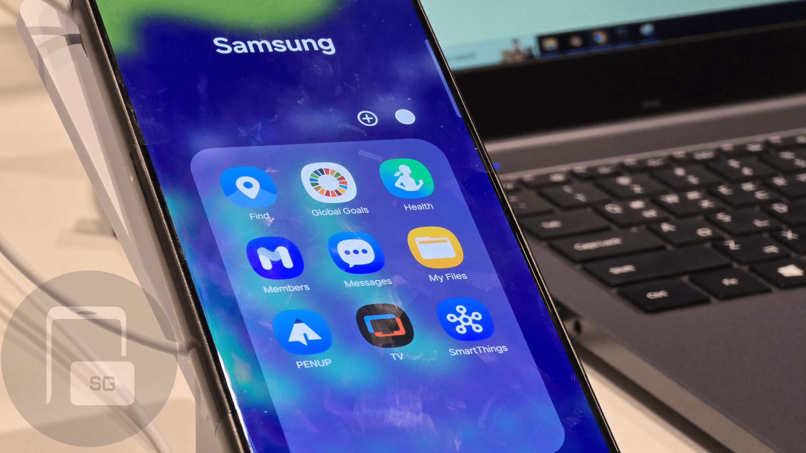
Samsung is also changing some of its icons. If Samsung doesn’t change its mind before 2025, this will be the first time we’ve seen significant icon changes in many years.
In the image above, you can see some of the most notable ones. The Gallery app is much more colorful, with a rainbow gradient behind the “flower” image. The center of the flower is orange instead of red, as we see on One UI 6.1. The Camera app also gets a wildly redesigned icon, making it look much more like a “real” camera than the flat, simplified image we see used today.
The Galaxy Store’s icon has also been redesigned. The “bag” image has a new look, making it look more like a tote bag and less like a purse. The color scheme seems a bit brighter, too. Contacts has been changed to make it look more like a book, complete with what looks to be a representation of lined paper on the right.
The Settings app also received a significant redesign, taking many cues from the one we see in iOS. In fact, many of these icon designs seem lifted or at least inspired by their iOS counterparts, which will no doubt disappoint many Samsung fans. Finally, the Phone app is subtly different, too, but not by much.
What do you think of the One UI 7 designs so far?
That’s all we’ve got for One UI 7 leaks at SDC 2024. However, there is a short video clip below recorded by Abhijeet Mishra from SamMobile. It doesn’t show anything we don’t see in the images above, but it’s another quick look at what we know so far. Before you go, be sure to vote in the poll above to let us know what you think about One UI 7 so far!
Thank you for being part of our community. Read our Comment Policy before posting.


