Affiliate links on Android Authority may earn us a commission. Learn more.
The OnePlus 5 design is a step backwards
Published onJune 15, 2017
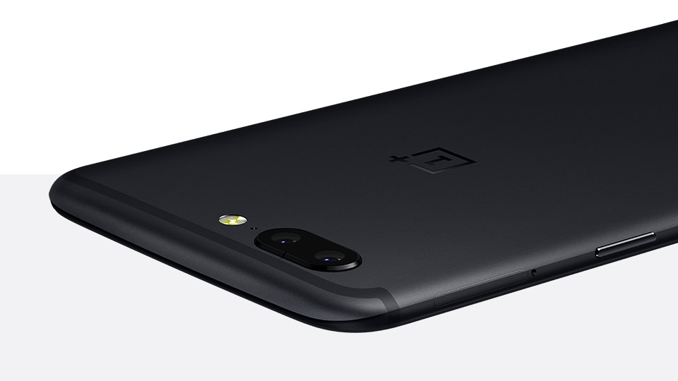
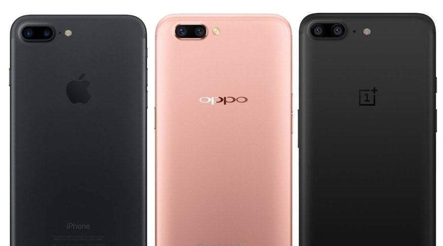
While OnePlus – and some others – would like to have you believe the OnePlus 5 design doesn’t look at all like the iPhone 7 Plus, it clearly does. But laboring that similarity misses a larger point: it’s not so much the iPhone 7 Plus connection that’s disappointing as it is the OPPO R11 connection. That OnePlus is once again falling back on a design borrowed from one of its sibling BBK companies demonstrates the company hasn’t matured quite as much as we otherwise might have thought.
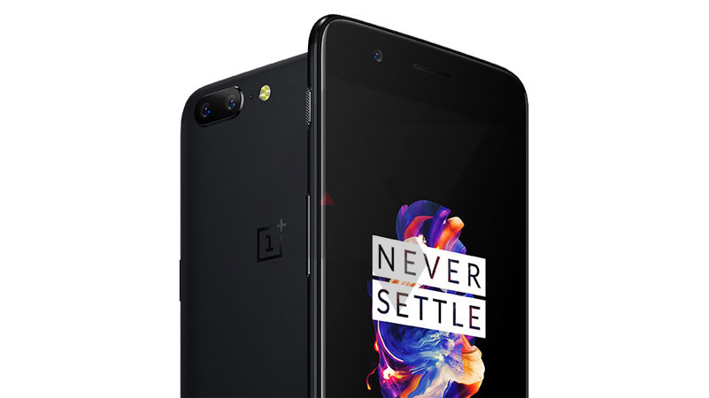
To give you the basic background, OnePlus, along with OPPO and vivo, exists under the broad umbrella of BBK Electronics. That means there’s naturally some shared supply chains, R&D, and in some cases, crossovers of smartphone design. The original OnePlus One was itself a fairly faithful borrowing of the OPPO Find 7 design and Pete Lau left a VP position at OPPO to co-found OnePlus. While both companies seem reticent to discuss the connections, they’re pretty plain to see.
While some stereotypes about Chinese companies shamelessly cloning iPhones are justified, what’s more interesting than what the OPPO R11 looks like is that OnePlus is still using a design blueprint from OPPO for its latest smartphone, three whole years after its first. This is an odd move for a company that has justifiably begun to outgrow its early growing pains and increasingly come to be seen as “all grown up”.
OnePlus finally did away with its awkward invite system with the launch of the OnePlus 3 last year. While that system may have been a necessary evil for managing supply and demand in the early days, it reeked of a fledgling company. OnePlus has since expanded dramatically to new regions and expanded its team by hundreds.
Software missteps with Cyanogen aside, the consolidation of its Oxygen and Hydrogen OS teams was also a move indicative of a company maturing – even if I’ve been critical of its success at times. Likewise, those tacky, clickbaity marketing attempts (remember the awful “Ladies First” campaign?) largely seem to have been relegated to OnePlus’ immature adolescent phase.
We've all watched OnePlus very publicly find its feet – and occasionally trip up – in the smartphone game.
The hubris OnePlus showed with the OnePlus 2 (especially regarding the messaging surrounding the absence of NFC) got them burnt fingers they vowed to learn from. Getting busted trying to game the benchmark game with the OnePlus 3 and 3T demonstrated that some sneaky tricks are better left untried too. What I’m getting at is that we’ve all watched OnePlus very publicly find its feet – and occasionally trip up – in the smartphone game.
Admittedly, the company still has a long way to go when it comes to update promises and customer service, but the difference in approach and attitude we’ve seen in recent years has been noticeable. Until the OnePlus 5 design, that is.
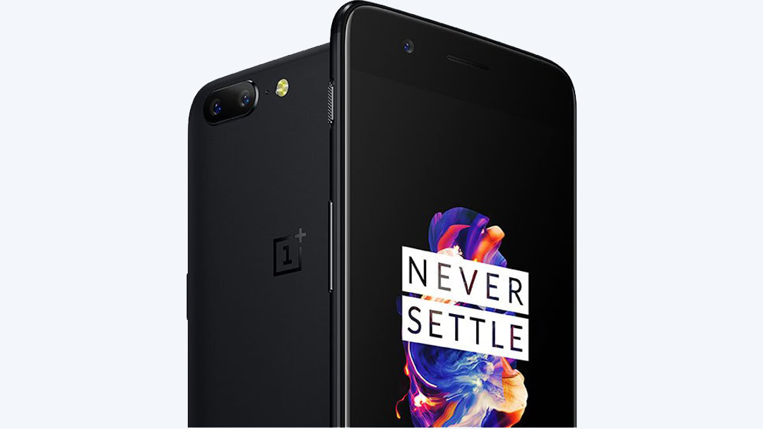
Recycling the OnePlus 3 design for the OnePlus 3T made sense and was completely understandable. Earlier changes in design represented the company finding its signature design language, culminating in the premium look and feel of the OnePlus 3. But the OnePlus 5 bucks those trends, transporting us back a few years to when the little startup that could needed all the help it could get from larger companies like OPPO.
But those days have passed. OnePlus looks a lot more like a “real” OEM than a scrappy startup these days and that means there are certain things we’ve come to expect, whether they’re reasonable to expect or not. Sure, OnePlus still makes gaffes and mistakes like any company, but they are fewer and farther between.
OnePlus looks a lot more like a real OEM these days, and that means we've come to expect certain things.
I think that’s why so many folks were disappointed when they saw the sixth OnePlus smartphone appear looking a lot like the most famous smartphone in the world. Even if that was largely due to the OPPO R11 borrowing from the iPhone 7 Plus design rather than OnePlus itself: it just felt like a step backwards, not forwards.
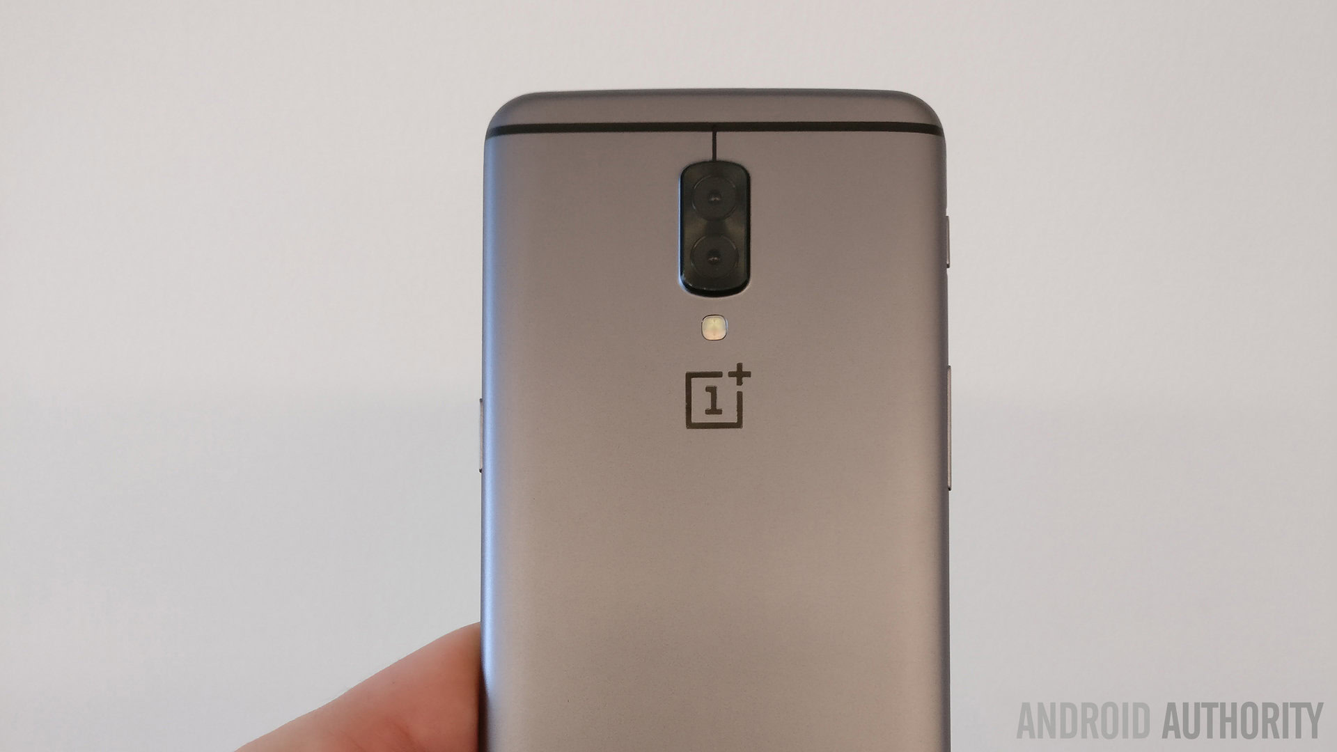
While the phone itself will no doubt be great and be adored by many, it’s just a shame that OnePlus hasn’t matured enough yet to never settle where its design language is concerned. Of course, there will certainly be plenty of differences between the OnePlus 5 and the iPhone 7 Plus for those that want to go looking for them, but we shouldn’t have to.
You’ll have to wait until the phone is out to draw your own conclusions (and decide whether it even matters to you). But considering the other potential designs we’ve seen leaked in recent weeks, we were kinda expecting something more original from the OnePlus 5. OnePlus can’t be upset with this reaction either, because the company itself has religiously fostered the hype surrounding its devices, so we can hardly be blamed for wanting more. Maybe next year.
What do you think of the OnePlus 5 design?