Affiliate links on Android Authority may earn us a commission. Learn more.
5 things I'd change about OnePlus' OxygenOS Android skin
Published onJanuary 21, 2020
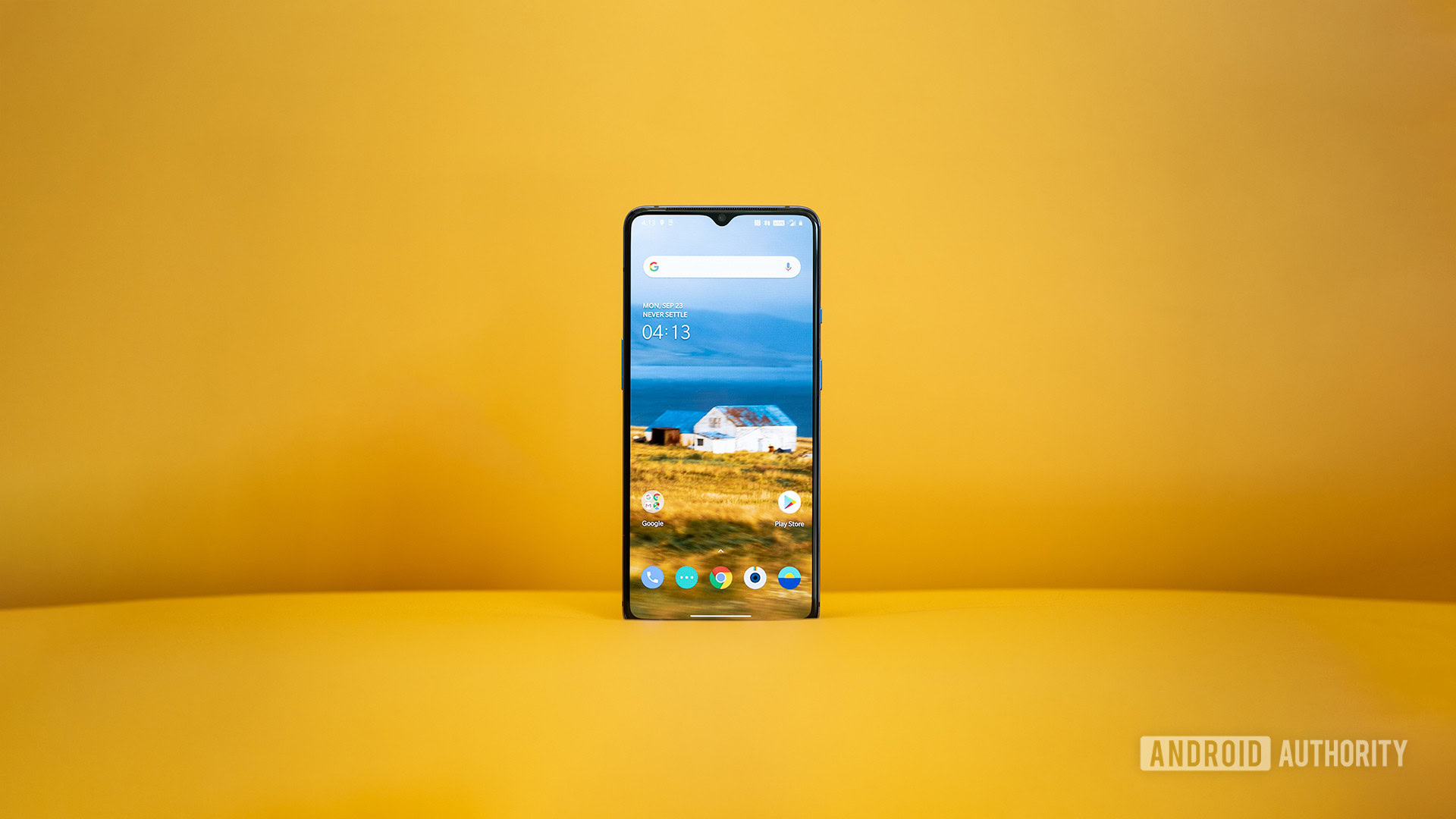
OxygenOS is one of the main reasons why I love OnePlus phones. But despite being the best Android skin out there, in my opinion, it is still far from perfect. The problem is that some of its features seem half-baked. The skin also lacks an important feature I think should be available on every high-end phone out there.
Read on to learn more about all the changes I’d like to see added in updates or future versions of OxygenOS.
Note: I’m currently using the OnePlus 7T running OxygenOS 10.0.7 based on Android 10. Please keep in mind that some of the features mentioned in this post are not available on all OnePlus devices.
Hide the notch but don’t waste space
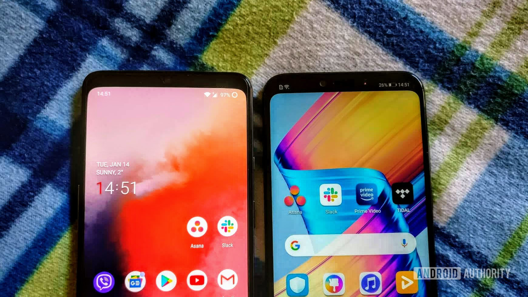
My OnePlus 7T comes with a waterdrop notch, and although I personally don’t mind it because of its relatively small size, it can be hidden with some software trickery. Like most phones sporting notches, tapping a button in the Settings will place a black bar across the upper part of the screen, effectively making the notch “invisible.” It’s a great feature for those who hate notches, but it lacks polish.
The problem is that, when the notch is hidden, the time, battery percentage, and the rest of the icons get pushed down instead of staying in the virtual black bar. It’s a waste of space, looks terrible, and doesn’t make sense. You can check out what this looks like on the OnePlus 7T in the image above, which is placed alongside the HONOR Play which runs on EMUI. As you can see, the latter takes advantage of the space on the sides of its notch (well done, HONOR!).
OnePlus’ approach eats away a bit of screen real estate. When the software pushes down the clock and the rest of the icons, all the content below gets pushed down as well. That means I see less info on the display when browsing the web, as well as when I open up the Settings menu and the app drawer. It’s not a huge difference, but it’s big enough for me to notice.
Hidden Space is too limited
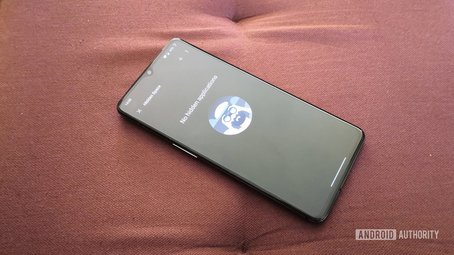
The Hidden Space feature on OxygenOS allows you to hide apps that are for your eyes only. To see the apps you’ve hidden, you have to launch Hidden Space by either swiping right in the app drawer or pinching out on the home screen and then using a PIN code or your fingerprint to gain access to it.
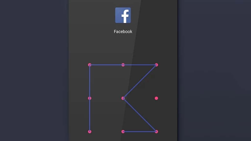
The problem I have with the feature is that it’s too barebones. I mean, why stop at apps? There are plenty of other files on my phone I’d like to hide to make sure any of my friends won’t see them if they play around with my phone. I’d like to see OnePlus expand the feature by adding support for videos, images, audio files, and documents. Essentially, the company should make the Hidden Space feature similar to Secure Folder, which is one of the best features found on Samsung phones.
The step counter needs work
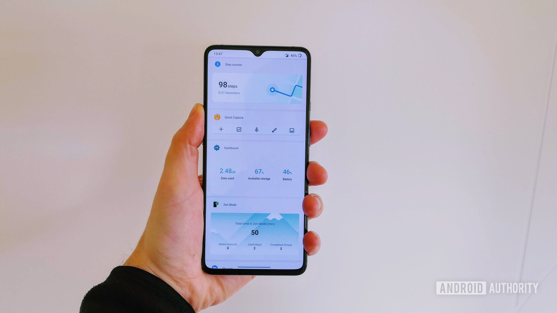
A handy feature on my OnePlus 7T is the step counter, which I can access by swiping right on the home screen to bring up Shelf. But like the Hidden Space feature mentioned above, it is half-baked.
The step counter in OxygenOS is just a simple widget. I need more!
It’s basically just a simple widget that shows the number of steps I’ve taken on a given day. I need more! I’d like to set up a daily goal and receive a notification when I reach it, so I don’t have to check the widget every five minutes. I’d also like to see how many steps I took yesterday, the day before, and last month, which I can’t do now.
Additionally, I’d love to see the option of showing the number of steps taken right on the lock screen as well as the Ambient Display. That way, I don’t need to unlock the phone to see how far away from my daily goal I am. This is something OnePlus can pull off, but third-party fitness apps like Google Fit can’t since they don’t have access to the lock screen or the Ambient Display. The company has an advantage over competing services here, and it’s a shame it’s not taking advantage of it.
App drawer tags need a manual mode
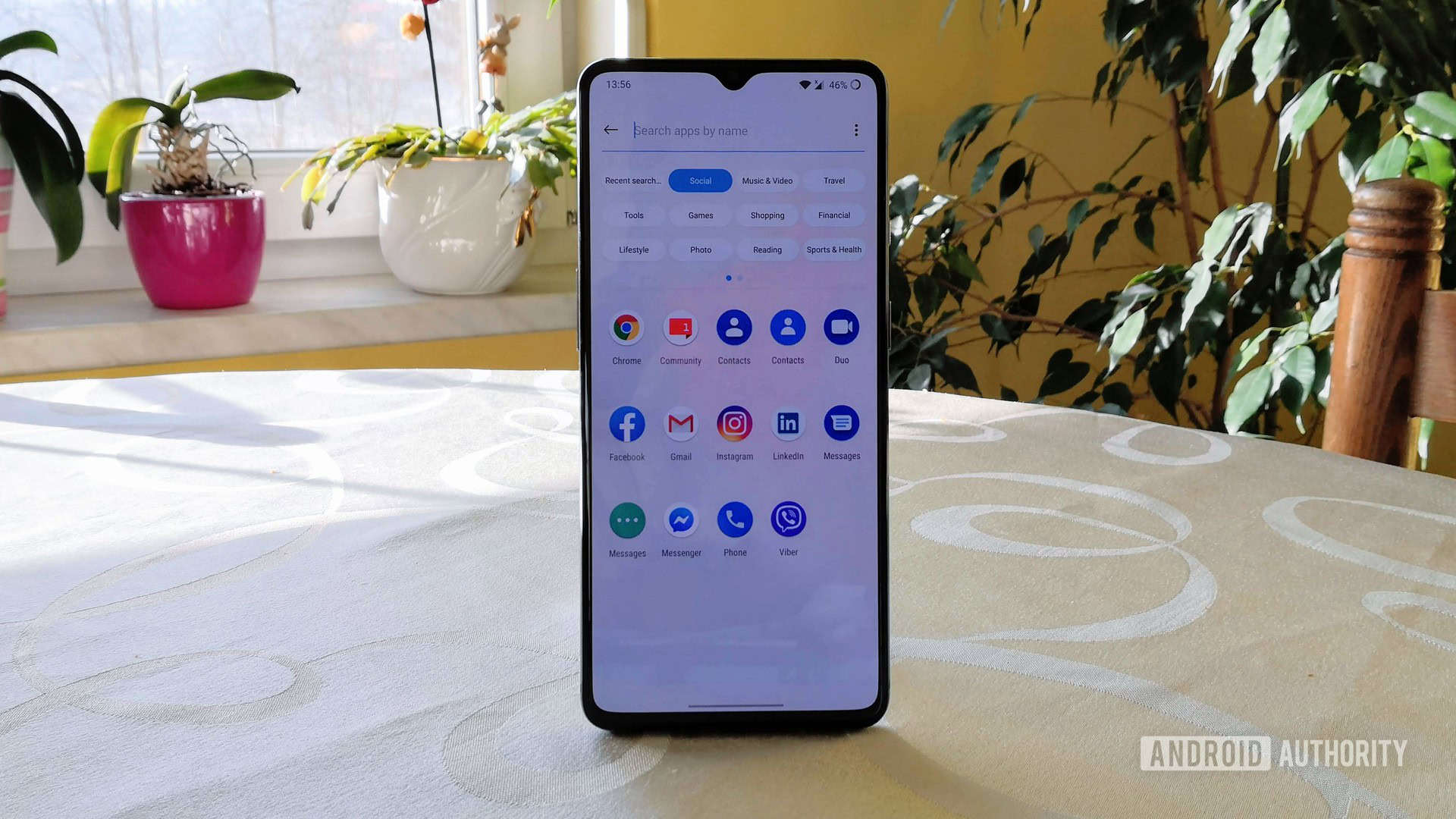
OnePlus’ OxygenOS has a solution for finding the app you’re looking for in the app drawer fast, without having to scroll down endlessly. Once you open the app drawer and tap the search bar up top, a bunch of tags appear including Social, Reading, and Travel — you can see what this looks like in the image above.
If I want to use the Calculator app, I just tap the Tools tag and it shows up, along with a few others. To use Facebook, I tap the Social tag and I can see the app right away. It’s a great feature, but the problem is that it doesn’t always work as advertised.
Each app is assigned a tag automatically and the problem is that the software doesn’t always get it right. For example, my banking app is located under Tools instead of Finance, while an app I use to sign documents digitally shows up under Games.
For that reason, I’d love to see the option of manually creating tags and assigning them to each app. That way, all the apps on my phone would be sorted correctly, allowing me to find them with ease.
Always-on Display is missing
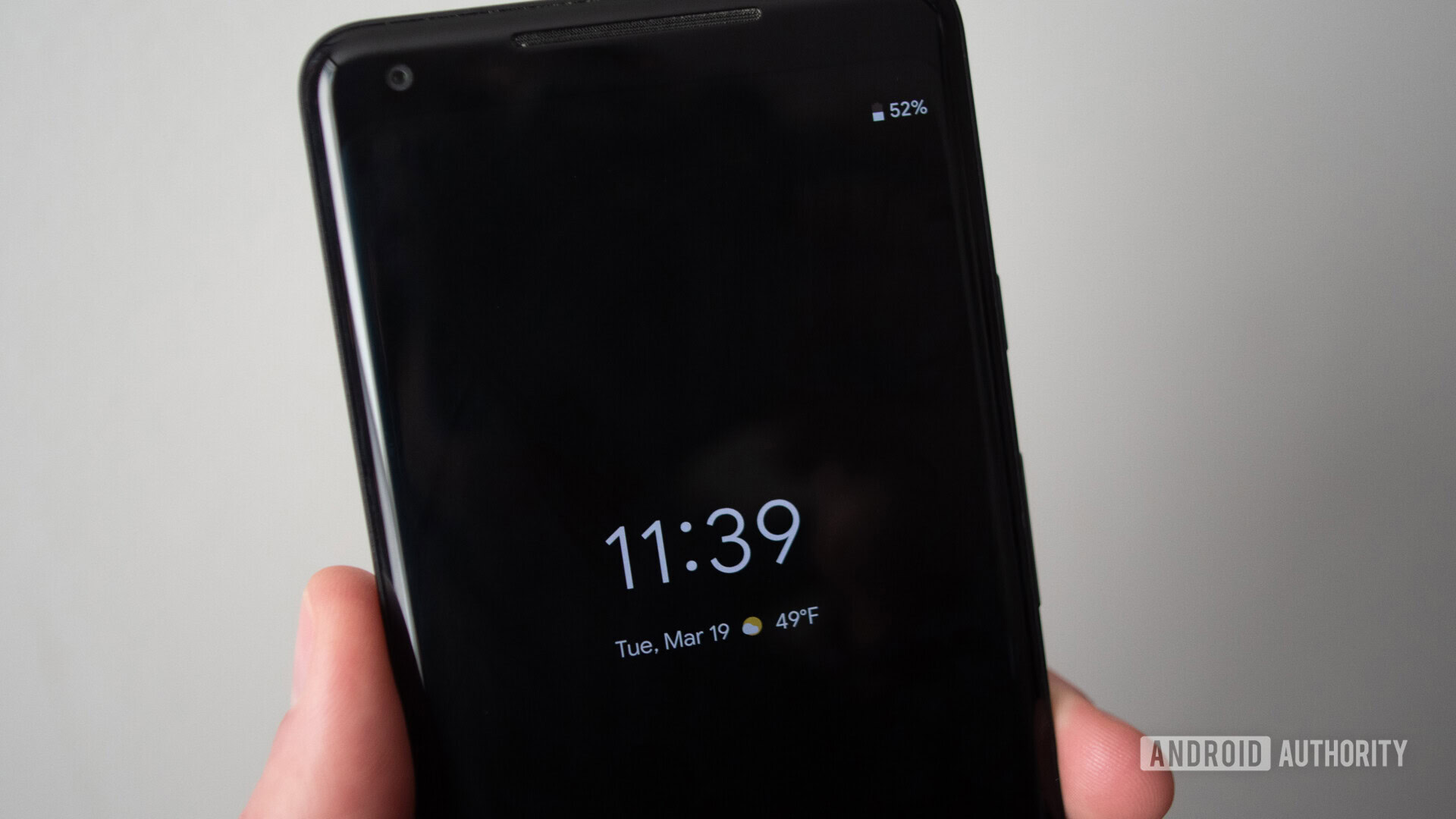
Despite sporting an AMOLED panel, my OnePlus 7T — and the rest of OnePlus’ lineup — doesn’t feature an always-on display (AOD). My old HUAWEI P20 Pro had this feature and I loved it, as it allowed me to see the time, date, as well as various notifications like missed calls without even touching the device. I want to see this feature make it to OxygenOS as well, especially since the latest OnePlus phones like my 7T don’t even have a notification light, so I always have to turn on the screen to see if I’ve missed an important email or call.
Always-on display is expected to come to OxygenOS soon.
OnePlus initially wanted to include the AOD feature on the OnePlus 6 but then decided against it at the last minute. The company said the reason for this was battery concerns, which doesn’t make a lot of sense to me. Sure, enabling the AOD will drain more battery, but the feature is not so power-hungry that you’ll notice a big difference in battery life in my experience. Flagships from Samsung, Huawei, and other manufacturers all support it and I’ve never heard similar claims from them.
Based on the fact AOD is one of the most requested features among OnePlus users, it looks like the company will bring it to OxygenOS eventually. The phone maker has hinted this in a forum post last year, so we hope to see it soon.
These are the top five things I’d like to change on OnePlus’ Android skin, although a few other minor ones come to mind as well. Instead of just showing the 10 most recent apps and contacts in Shelf, I’d like to edit those two boxes by adding in the apps and contacts of choice. That way I can just swipe right to get access to them, which comes in handy since I don’t want to clutter up my home screen.
I’d also love to see the ability to set a daily data limit — only a monthly limit is an option for now — that would disable my mobile internet connection once reached. The limit would be set automatically by the software every day by checking the amount of data I have left and then dividing it with the days left on my billing cycle. That way, I wouldn’t have to worry about using all of my data within the first week and then be left with nothing for the rest of the billing month.
I’ve shared my view on the topic, and now it’s time for you to share yours. Which OxygenOS features would you change and which ones would you add to the skin, if any? Let us know your thoughts in the comments.