Affiliate links on Android Authority may earn us a commission. Learn more.
Opera introduces new logo and brand
Published onSeptember 22, 2015

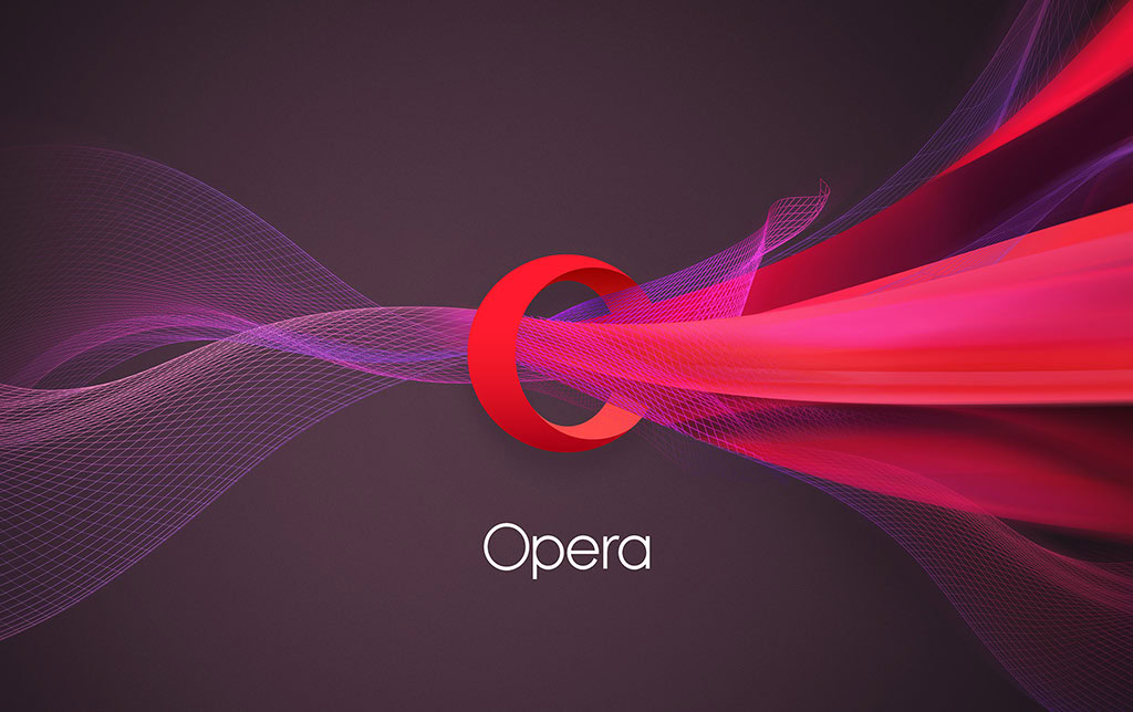
Opera is off to a fresh start with its new logo, which comes accompanied by a revamped brand philosophy that better aligns with the company’s current endeavors. As it goes with any re-design, the Opera definitely put a lot of effort into making all the right decisions, so let’s tell you a bit about what’s going on here.
It’s still an “O”, but it’s much more than that!
Opera didn’t want to go too far off its original branding. After all, they need people to recognize that familiar “O” we have all grown so accustomed to. What they did is make it more three-dimensional and added intricate designs going through it.
The idea was to have the “O” look more like a portal. Opera is no longer just a simple browser. They envision themselves as enablers who give you access to content, answers, communication, fun, data savings and other online experiences. This is why the “O” ressembles a portal or gateway, and there is a stream going through one end, then materializing through the other.
By the way, this is the same reason why they got rid of the word “Software” in their logo.
How it came to be
The new image of the company was not only put together by their in-house creative team. Opera also called in DixonBaxi and Anti. The former worked on the global brand and creative strategy, while Anti was in charge of the visual identity.
When will we see the new branding in products?
It will take a bit of time before Opera can spread its awesome new branding all over the web, but they are definitely working on it. The new icon will be coming to Opera Mini for iOS and Windows Phone today (wait… what?!). Their advertising medium, Opera Mediaworks, is also adopting the improved design right away.
The rest of Opera’s family of apps will get the same treatment in the “next few months”. They will start with Opera for Android, Opera Mini for Android and Opera for PC. Opera Max and Opera Coast will follow soon afterwards.
What do you guys think? Are you liking the new logo and branding? I think it looks pretty snazzy! Oh, and Opera wants to make sure those who don’t have access to the new branding get some love in the meanwhile. They have released a couple wallpapers for your PC or your smartphone. Enjoy!
