Affiliate links on Android Authority may earn us a commission. Learn more.
OPPO Find N vs Samsung Galaxy Z Fold 3: Which foldable is for you?
December 28, 2021
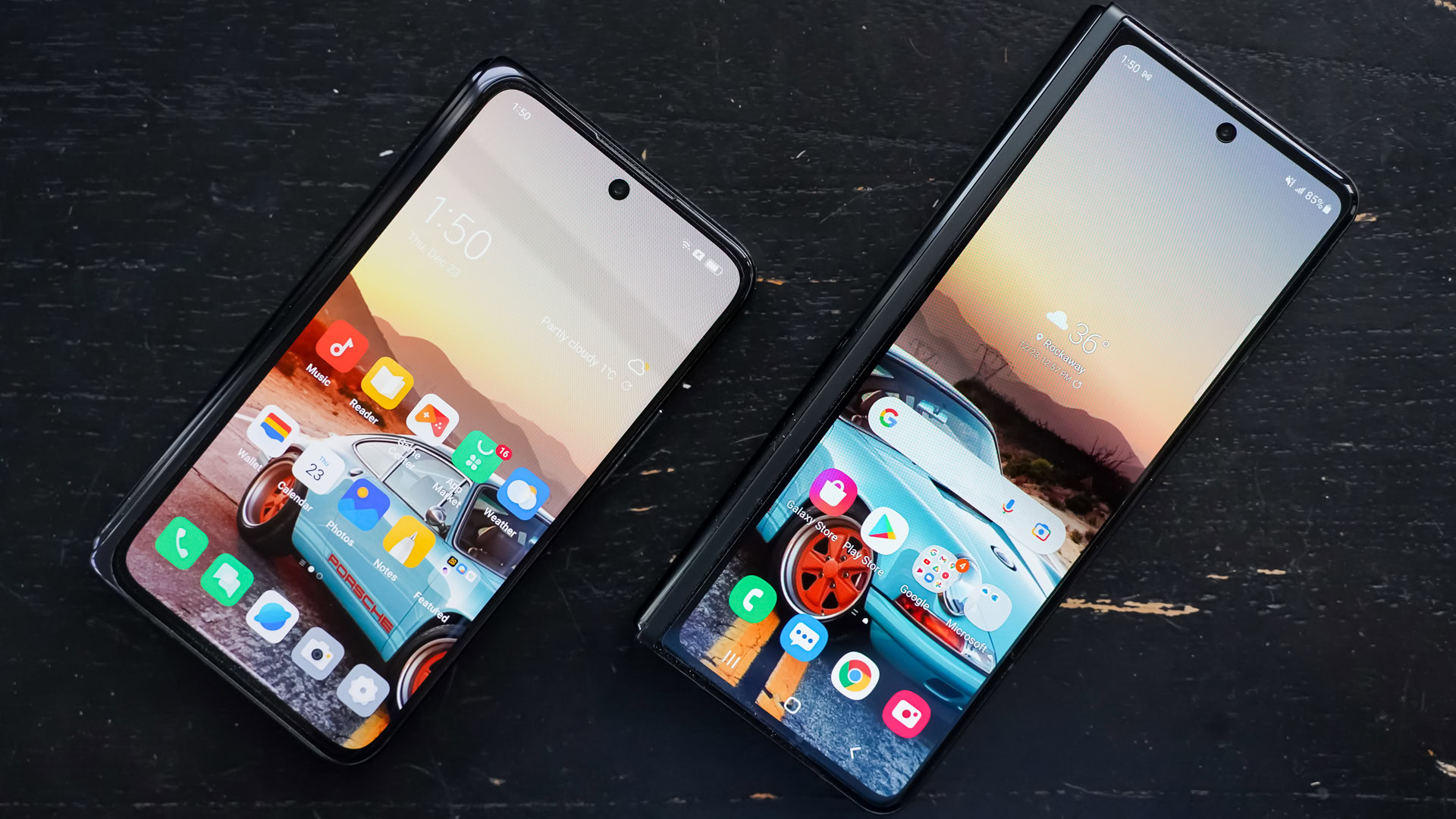
Foldable phones are still a rare breed. Samsung and HUAWEI have gripped most of the market with devices such as the Galaxy Z Fold 3 and Mate X2. Now, OPPO has thrown its hat into the ring. The company recently debuted the OPPO Find N, its first foldable phone. Though the device will only be available in China, it’s still a significant market entrant that will challenge Samsung and HUAWEI — and hopefully bring the foldable form factor to more people.
We’ve already given the device a once over in our hands-on article, but how does the Find N compare to the polished Samsung Galaxy Z Fold 3? We’ve had the chance to use the two phones alongside one another to see how the experiences are similar and how they differ. Here’s a look at the OPPO Find N vs Samsung Galaxy Z Fold 3.
OPPO Find N vs Samsung Galaxy Z Fold 3: Shaping experiences
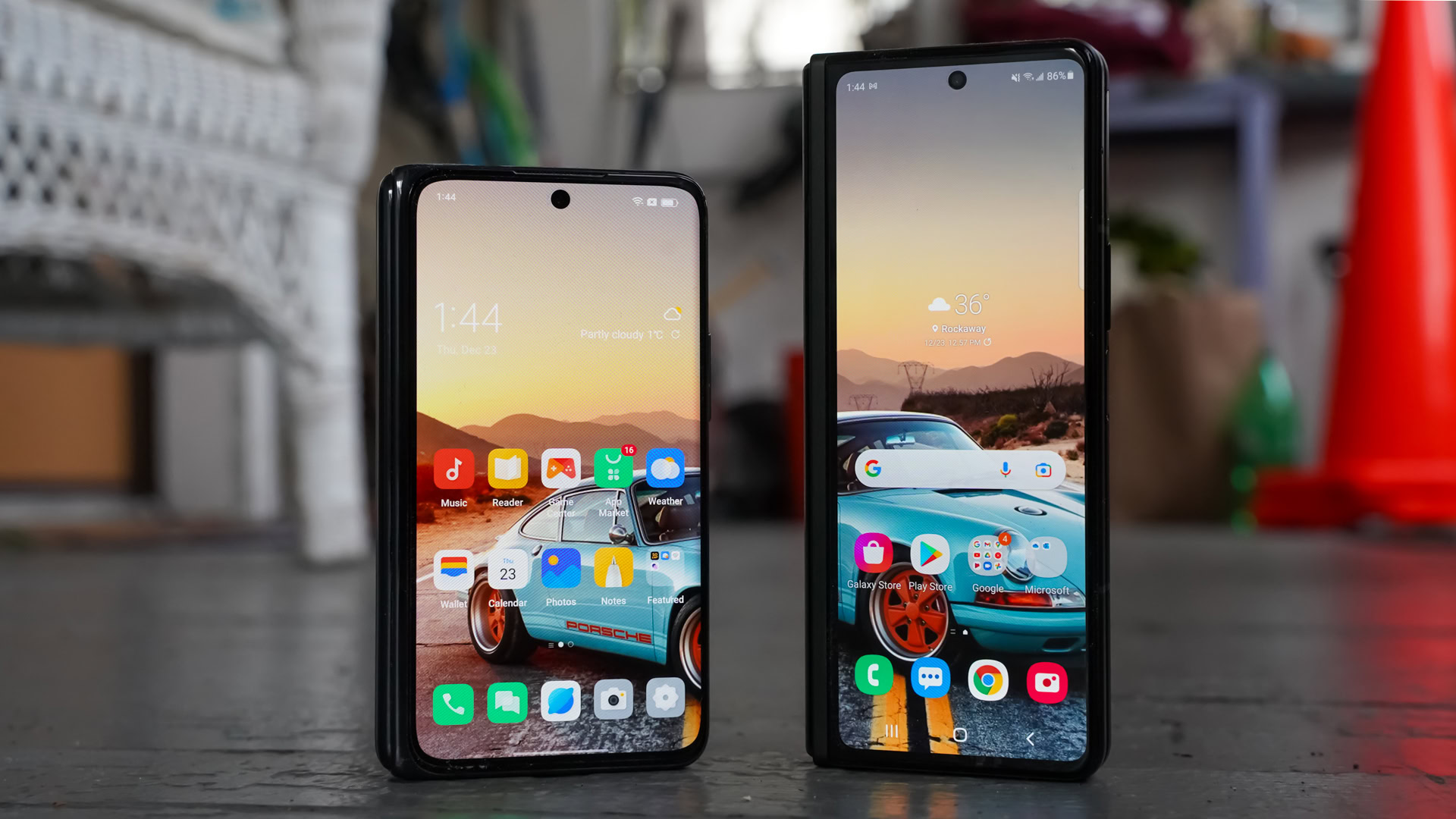
There’s an old idiom that suggests the bigger the better. In the case of folding phones, however, we might have to reevaluate that statement.
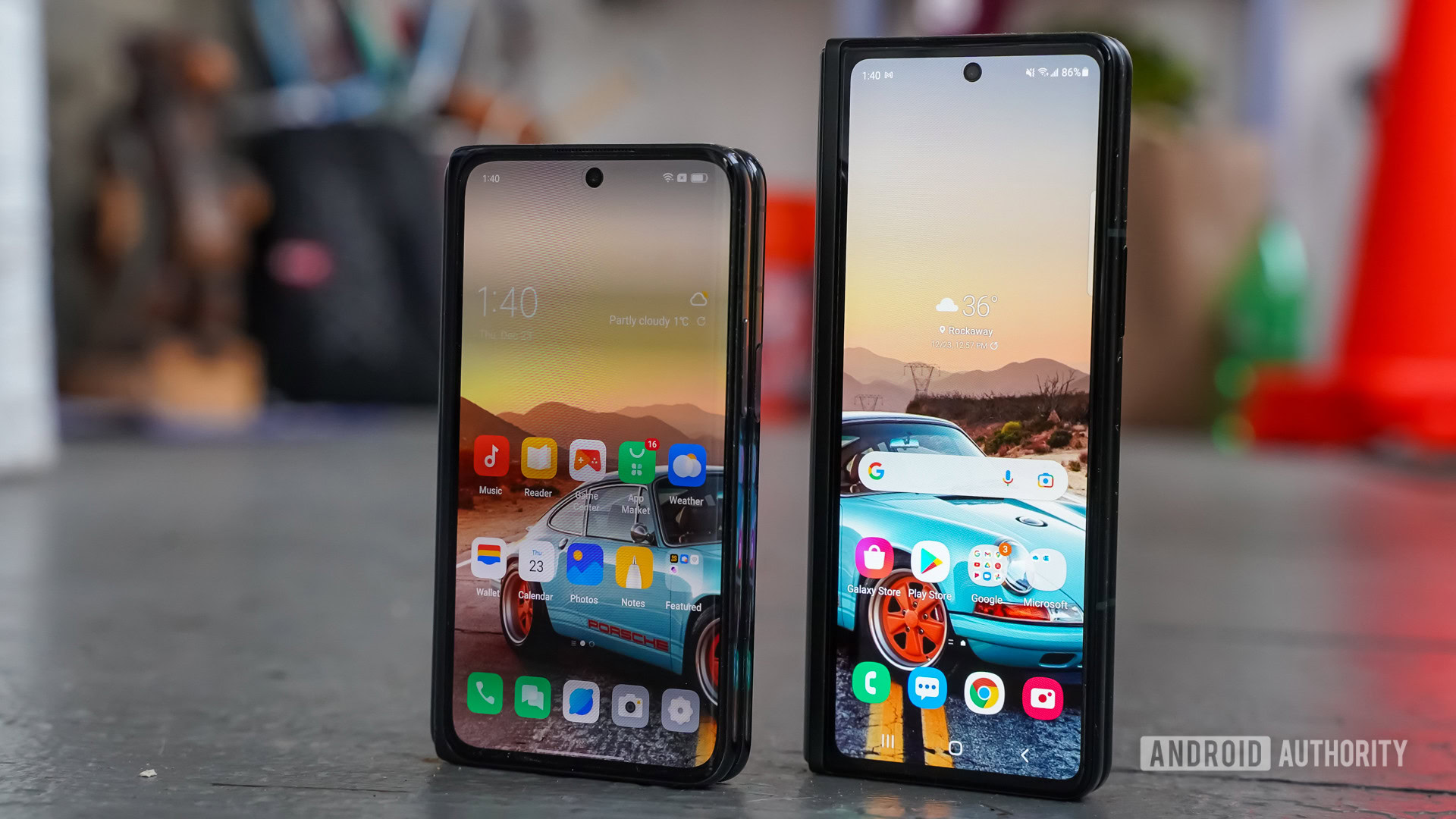
The most obvious, and perhaps most compelling, difference between the Find N and the Galaxy Z Fold 3 is the size and shape. The Find N is about three-quarters of the height of the Z Fold 3 (when closed), though it’s a bit wider. The phones measure 133 x 73 x 18mm and 159 x 67 x 16mm, respectively. The Find N looks substantially smaller and more like a regular phone when flipped shut. That in and of itself might be all the appeal it needs to woo the foldable-curious because, let’s face it, the Z Fold looks a little weird.
Our verdict: Samsung Galaxy Z Fold 3 review | Samsung Galaxy Z Flip 3 review
There’s no question that the Find N is more comfortable to tote around in your pocket. I wish it were thinner and lighter, but the reduced footprint goes a long way when walking with the phone tucked away. Samsung’s Z Fold 3 is a monster in comparison. Cramming it into your jeans is a literal pain sometimes. The better pocketability of the OPPO is a major victory for those of us who actually like to bring our phones with us everywhere we go.
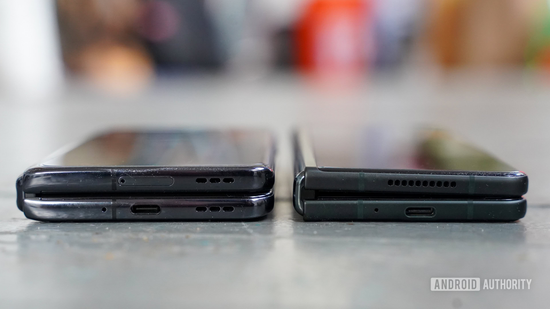
OPPO was able to best Samsung in at least one respect: the gap.
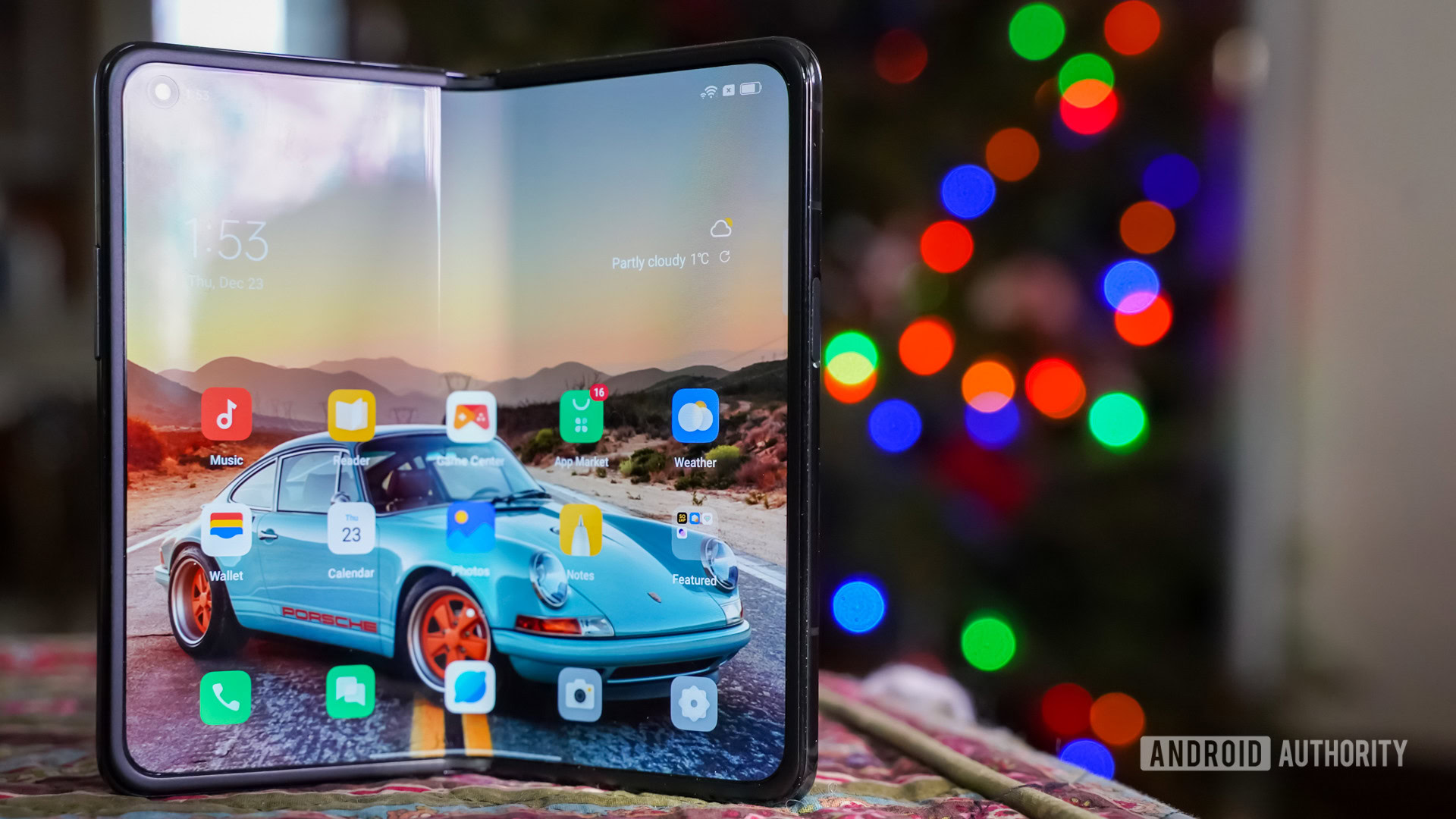
OPPO bested Samsung in at least one design respect: the gap. The Find N is able to fold entirely flat against itself, meaning there’s no gap between the two halves of the phone when it’s closed. The Z Fold 3, conversely, has a narrow triangle-shaped gap where there’s space between the halves of the inner screen. This means the Find N sits completely flat when on a level surface such as a desk or table while the Z Fold 3 has a slight tilt to it. It’s a little thing, but still something that was easy enough to notice while using the foldables over the course of a few days. Further, OPPO created a flexible glass display that doesn’t exhibit a crease down the center. The Z Fold 3’s crease is off-putting to some, so it’s a win for the OPPO in that respect.
Apart from the size and shape, the two phones share plenty of basic features. Each boasts a pair of metal frames sandwiched between glass that are held together by a robust hinge. Samsung has spent several years perfecting its hinge and it’s solid as hell. OPPO’s hinge is similarly strong and smooth in its action. The company says the hinge is certified for 200,000 activations, which should give it plenty of life. The Find N’s hinge does have just a tiny amount of springiness when compared to the Z Fold 3’s. Once you get it 80% of the way open it’ll go the rest of the way on its own. With Samsung’s phone, you have to unfold it all the way yourself.
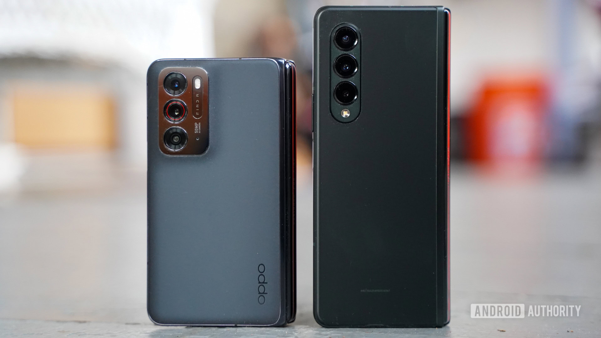
Both phones pack bottom-mounted USB-C ports, stereo speakers, side-mounted fingerprint readers, and triple rear camera configurations. They also both have punch-hole style outer and inner selfie cameras. You’d be forgiven for thinking OPPO may have found some Samsung-flavored inspiration when it was designing the Find N.
See also: The best foldable phones you can get
If you were worried that OPPO slapped together a shoddy piece of hardware, think again. With the Find N, the company has assembled a refined device that is every bit as classy as the Z Fold 3.
How about those displays?
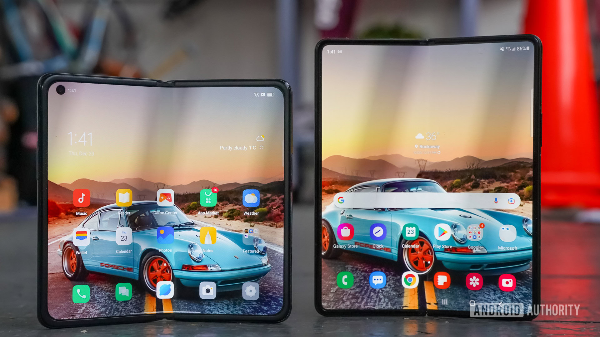
A smartphone’s screen does much of the work in defining the experience of using it. With foldables, there’s a lot of screen action to worry about.
More reading: What is an LTPO display and how does it help conserve battery?
Like the shape of the phone itself, the Find N’s outer display is shorter and wider than that of the Z Fold 3. It measures 5.49 inches across the diagonal with FHD resolution in an 18:9 aspect ratio. In other words, it’s a size and shape we’re all used to (if a little bit small compared to today’s standards.) In comparison, the Z Fold 3’s outer screen measures 6.2 inches across the diagonal and has 2,268 x 838 pixel resolution with an awkward 24.5:9 aspect ratio. There’s no question the Find N’s outer screen delivers a better overall experience.
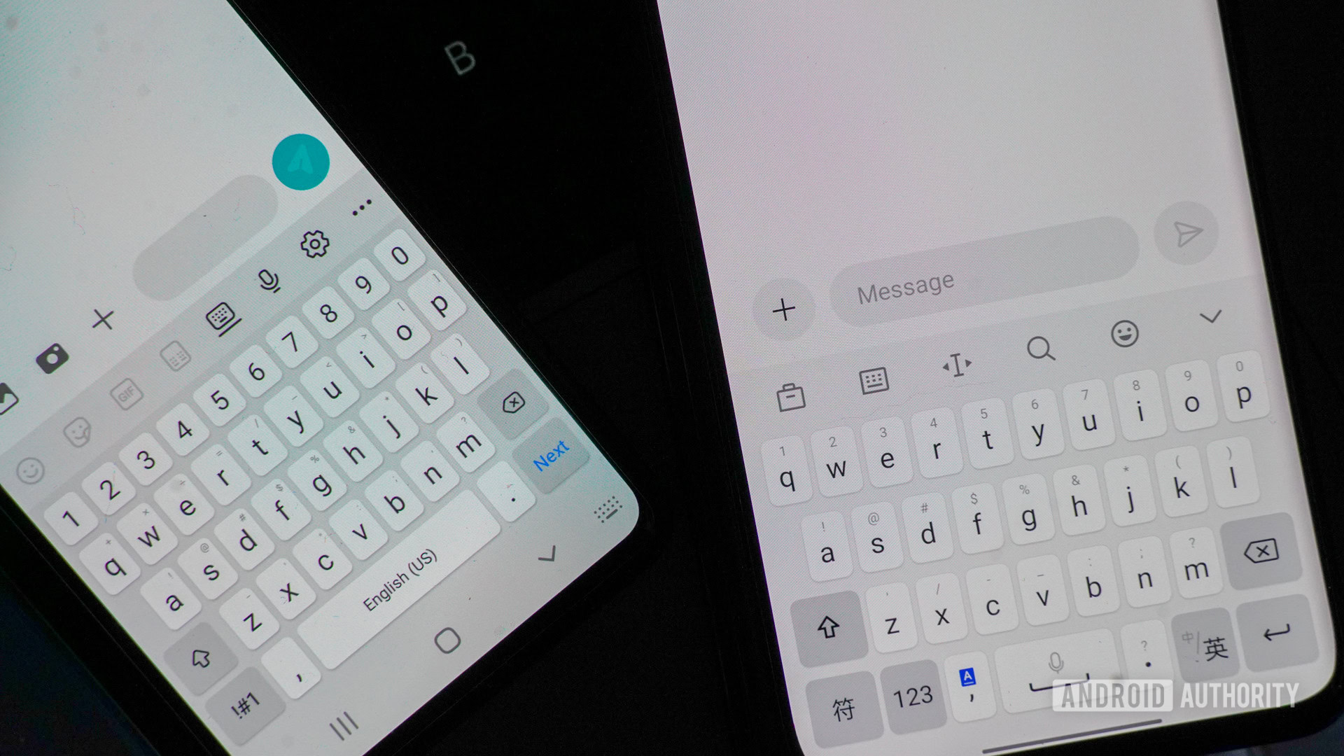
Due to its tall and skinny shape, the Z Fold 3’s screen is among the least hand-friendly on a modern phone. Typing on it, in particular, is a dreadful experience. It’s simply too narrow for a fat-fingered fool like me to accurately peck out messages. I almost always have to resort to unfolding the Fold to compose emails and such. This isn’t true of the Find N. The display’s width is just fine and interacting with the software keyboard felt natural and easy. Moreover, the apps that you’re accustomed to using on a regular Android phone will look and flow more naturally on the outer screen of the Find N than they do on the Z Fold 3.
The experience evens out a bit when you switch to the foldables' inner displays.
Things even out a bit when you switch to the foldables’ inner displays. The Find N has a 7.1-inch OLED screen at 120Hz with an aspect ratio of 8.4:9. It packs in an impressive 1,920 x 1,792 pixels for a density of 370ppi. It is wider than it is tall, which feels natural to me. The Samsung has a 7.6-inch OLED panel at 120Hz with an aspect ratio of 16.9:13.6. It includes 2,208 x 1,768 pixels for a density of 372ppi. It is taller than it is wide, which doesn’t feel as natural. In the end, half an inch and about 300 pixels separate the two screens.
See also: How to take screenshots on OPPO phones
The Find N’s inner display may be smaller than that of the Z Fold 3, but here the size (ahem) doesn’t matter. Both phones offer more than enough real estate to run two apps side-by-side, which is the killer feature of a folding phone. At this point, the defining difference between the two phones is no longer the hardware, but the software.
Is OPPO’s software good enough?
After using the Find N for a couple of days, it’s abundantly clear that Samsung has spent more time refining its software experience. Samsung has the benefit of years of customer feedback to make tweaks along the way — and it has, improving the Z Fold series with each generation. Samsung’s foldable software is still far from perfect, but it’s unquestionably better than OPPO’s here and now at the close of 2021.
First, we need to point out that the OPPO Find N is a China-only phone, while the Samsung Galaxy Z Fold 3 is a global phone. The Find N’s preinstalled software is limited to mostly China-centric apps and services. The Google Play Store is on board, but syncing with Google services is a no-go. In other words, stuff like Gmail doesn’t work on the Find N. That’s the case for most China-only phones, so it was to be expected.
What really matters is the way apps interact with the two displays. Similarly to how apps behave on the Z Fold 3, the majority of apps you open on the outer display will automatically transition to the inner display when you open the phone up. Some apps have been optimized for the larger screen and others have not. For example, the messaging app splits into two panels allowing you to see a list of all conversations on one side of the screen and the details of a single conversation on the other. The notes and contacts apps works in the same way. Conversely, the calendar, clock, and files apps simply fill the entire screen as though the Find N were a tablet. It would be nice to see more of OPPO’s native apps take advantage of the additional screen real estate in a usable way.
Oppo's software feels unpolished and leaves the company plenty of room to make improvements to the experience.
As far as multitasking is concerned, there are several tools on board the Find N. The phone supports a basic split screen mode allowing two apps to run side by side. You can also choose to take advantage of flexible windows, which act like minimized apps that you can drop anywhere on the display. There’s a laptop mode for when you want to use the device like a miniature laptop, as well as a tool for splitting a single app into two separate windows. Not all of the apps support all of these modes and it’s a bit of a learning curve to assess which do and which don’t. What I dislike is that there’s a lot of settings to be adjusted to get these features activated or working properly. The flow of multitasking is a bit more natural with the Z Fold 3.
Then there’s the whole S Pen thing that the Z Fold 3 has going for it. While Samsung’s foldable can’t garage the stylus, it supports the S Pen and offers lots of software for taking notes and performing other creative feats.
As much as I appreciate the work OPPO has done here with its first consumer foldable, it feels unpolished and leaves the company plenty of room to make improvements to the experience.
Odds and ends
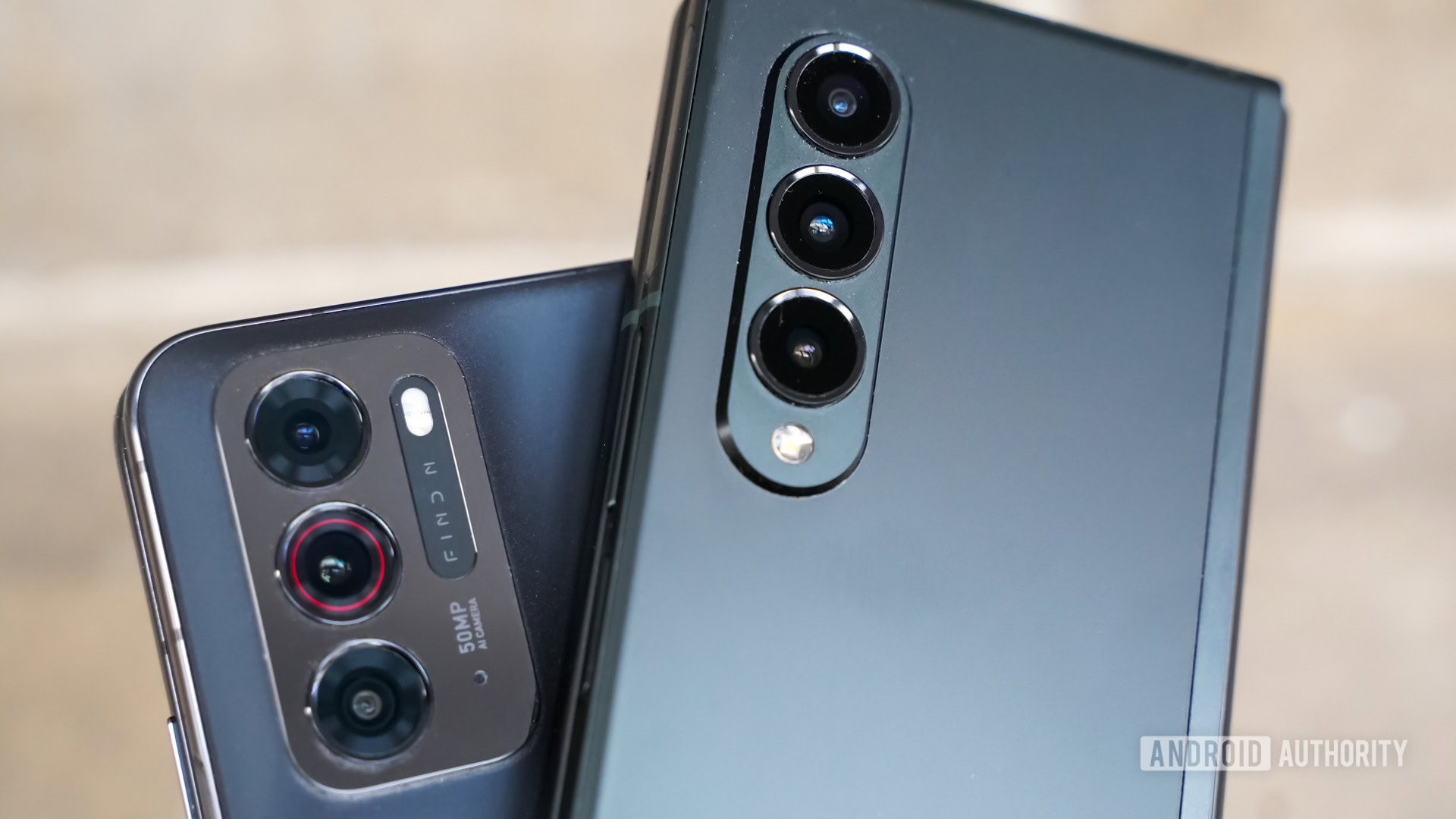
When it comes to the specs and features of the OPPO Find N vs Galaxy Z Fold 3, the phones are on somewhat even footing.
For example, both run the Qualcomm Snapdragon 888 processor and offer a hefty 12GB of RAM and up to 512GB of storage. That said, the Find N ran somewhat slowly while I was evaluating it. I didn’t run any benchmarks, but it was noticeably more sluggish than the Z Fold 3, which ran like butter.
Related: Here are the best Snapdragon 888 phones you can buy
The Find N has a 4,500mAh battery that compares well with the Z Fold 3’s 4,400mAh battery in terms of raw capacity. Both foldables held their charge for a full day with heavy testing. The Find N supports 33W wired charging and 15W wireless charging, and claims a full recharge takes about 70 minutes. The Z Fold 3 is a little slow on the charging front, with support for 25W wired and 10W wireless. It takes a bit longer to charge at 85-90 minutes.
The cameras differ significantly. The Find N sports a triple rear camera system (50MP IMX766 main, 16MP ultra-wide, 13MP 2X tele), a 32MP selfie cameras on both the outer and inner displays. The Z Fold 3 has a triple system as well, though all three cameras capture 12MP images. We’ve already determined that the Z Fold 3’s camera system is good, but could be better. We have not yet put the Find N’s camera through its paces.
OPPO Find N vs Samsung Galaxy Z Fold 3: The verdict
OPPO has done its homework on foldables. The Find N is an excellent first effort, at least as far as the hardware is concerned. Comparing the Find N vs the Z Fold 3 shows that OPPO put lots of thought into the design and engineering of its foldable, which offers many of the same features as the Samsung in a somewhat more usable package due to the differences in size and shape.
OPPO still has some work to do when it comes to software. The company certainly has its foot in the foldable door, but needs to refine the experience and expand the utility of running multiple apps at once. More of OPPO’s own apps should support the inner display’s real estate, for example, and the multitasking features should be easier to enable and use.
The Find N offers many of the same features as the Z Fold 3 in a more usable package due to the difference in size and shape.
Last, OPPO has a bit of a price advantage when compared to Samsung. The Find N runs from about ~$1,210 to ~$1,414, while the Z Fold 3 costs $1,799 to $1,899. On the other hand, the Z Fold 3 is available almost globally, while the Find N is a China exclusive.
If you’re in China, the Find N is at least worth checking out at your local wireless shop. If you’re anywhere else in the world, the Z Fold 3 still provides the best foldable experience. For now.