Affiliate links on Android Authority may earn us a commission. Learn more.
OPPO N3 unboxing and first impressions
December 5, 2014
When OPPO first released the N1 last year, it offered a unique rotating camera module with a screen size that many thought was too big. The phone ended up falling a bit short, especially when it came to camera quality, its defining feature. With their follow up device, it seems as though OPPO has fixed many of the complaints we had with the original. The N3 has an improved camera, more manageable screen size, and much more.
Join us as we unbox the OPPO N3 and give our first impressions of the handset.
Unboxing

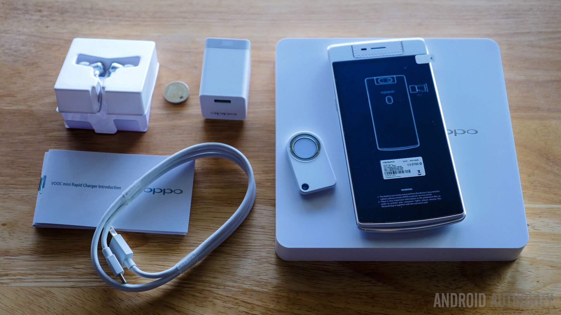
The box itself is heavy, thick, and simple. When the top of the box is taken off, we’re immediately presented with the N3. The giant rotating camera is the first feature we notice, followed by the big 5.5-inch screen. Once the phone is out of the box, lifting up the bottom panel reveals all of the extras OPPO included in the package. They’ve included some standard documentation, SIM tray removal tool, MicroUSB cable, quick-charge wall adapter, and a nice pair of in-ear headphones – an accessory we’re always pleased to see inside the box. We also see OPPO’s O-Click remote shutter accessory (with included battery), mainly to be used for camera control.
First Impressions

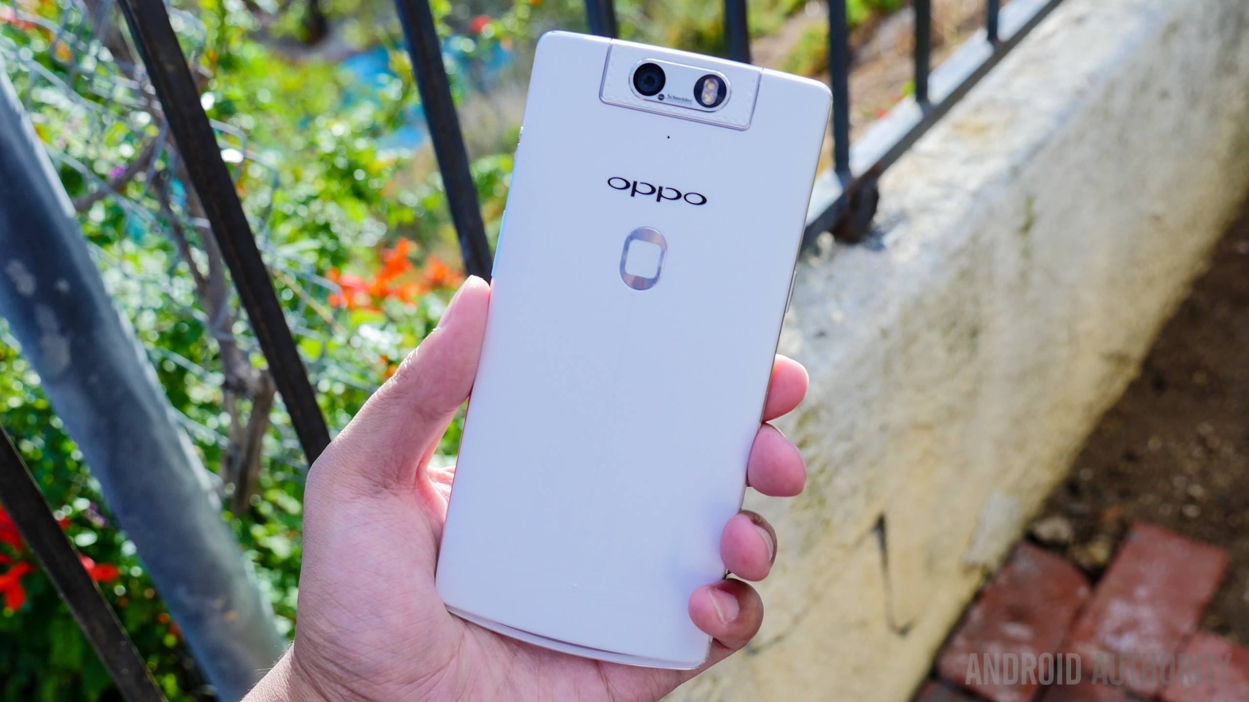
When compared to the N1, users will be pleased to see that OPPO has reduced the screen size of the N3. Although only reduced by a half-inch, the N3’s 5.5-inch display really helps the device fit well in the hand. In terms of design, the N3 almost blends in with the competition, as they use a familiar combination plastic and aluminum alloy frame around the chassis. OPPO also decided to include some faux-leather stitching solely on the camera module, similar to the material we’ve seen on the Galaxy Note series.
In terms of in-hand feel, let’s face it… this is a pretty big device. That said, OPPO’s addition of the aluminum alloy frame protrudes a bit, allowing for some extra grip. The power button and MicroUSB can be found on the left side of the device, and the right side is toting the 3.5mm headphone jack.
The display is a 5.5-inch TFT display with 1080p resolution with a pixel density of 403 ppi. The N3 also brings a quad-core Qualcomm Snapdragon 801 processor, 2GB of RAM, all backed by an Adreno 330 GPU. All of these features are powerful enough for most users, and offer a smooth experience when running OPPO’s custom overlay.

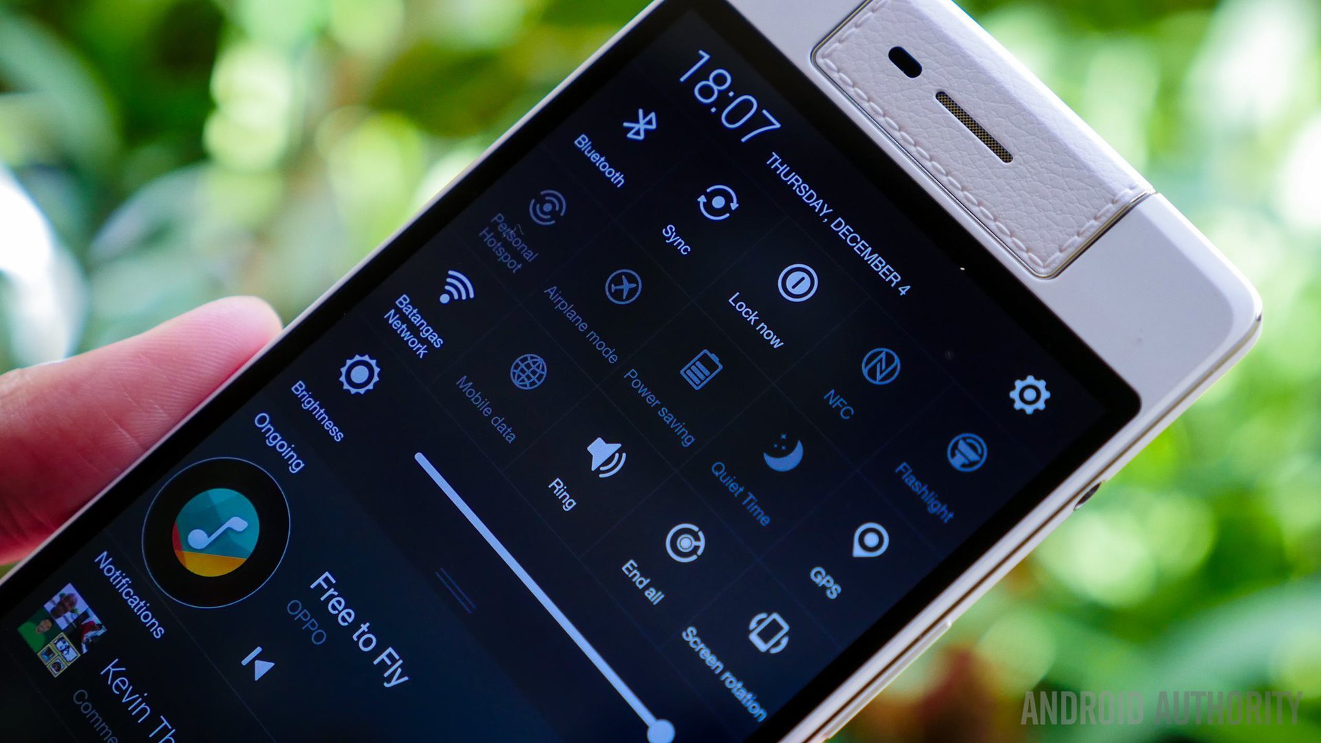
In terms of software, we’re presented with OPPO’s familiar Color OS. A few aspects of the software have been changed around a bit, but we’re still seeing the same Color OS that we’re used to. The nice widgets, home screen layouts, and lack of an app drawer have all basically stayed the same from OPPO’s previous iterations.
By far, the most unique feature on this device is the camera. Its module rotates around, giving you the ability to use it as both the front and rear-facing camera. The camera module is now motorized, which we feel is a big improvement over the N1. When inside the camera app, gestures control the camera module, but you still have the ability to move it manually. The camera software has mostly stayed the same, offering a simple, easy-to-use interface. Ultra HD and manual shutter mode are the features that stuck out to us the most, definitely enhancing the N3’s experience.

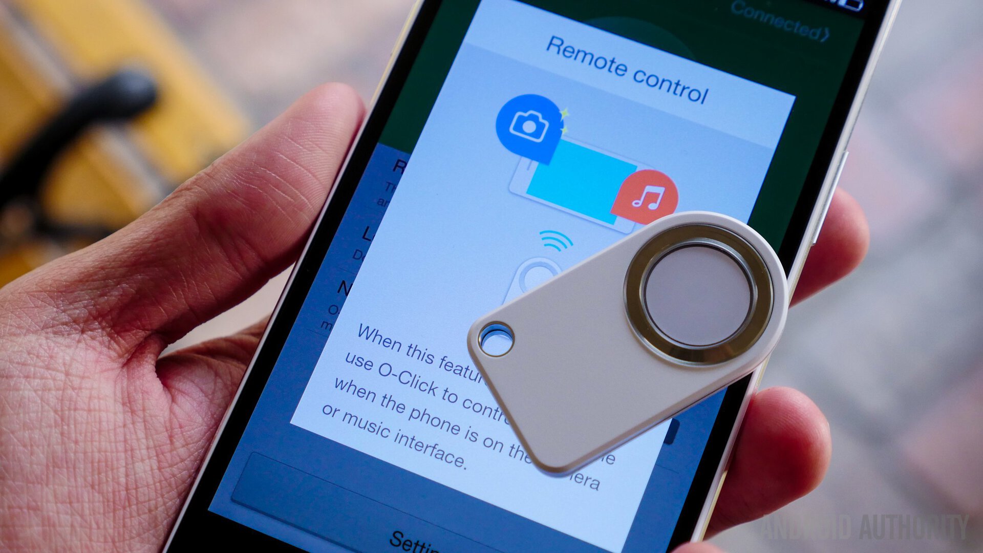
The N3 still has the O-Touch button on the back that can be used as a shutter button, but now with the added functionality of a fingerprint scanner. This can be used to unlock the device, and can also be programmed to launch different applications on the device. Perhaps a more unique camera feature is the inclusion of the O-Click, OPPO’s remote shutter accessory. It’s been redesigned and offers more functionality than last year’s model. The O-Click can control the direction of the camera, as well as pull up the camera from the home screen and much more. Initial impressions of the N3’s camera are generally pretty positive, though we’d like to reserve our final thoughts until we spend some more time with it.
So there you have it – a quick look and unboxing of the OPPO N3! We’re excited to dive more in-depth with OPPO’s added features, and find out if they’ve improved on the O-Click, camera, software, and much more. With certain improvements to the device coupled with its competitive price point, the OPPO N3 is sure to attract quite a bit of attention in a way its predecessor didnt. Be sure to stay tuned for our full comprehensive review of the N3!
Are you looking to purchase one for yourself? Check out the full specs and availability details in our roundup post!