Affiliate links on Android Authority may earn us a commission. Learn more.
OPPO R15 Pro hands-on: Notch too bad
April 3, 2018
OPPO R15 Pro
What we like
What we don't like
OPPO R15 Pro
Oppo is slowly creeping into just about every region of the world. Whether in China or India, the company has become synonymous with the rapidly expanding Asian phone market. This isn’t a company that makes flagships though (that’s OnePlus‘ job); it makes affordable mid-ranged devices for everyone. But what happens when the line between a high-end and budget device begins to blur?
That’s what OPPO is trying to accomplish with the new R15 range. This is the OPPO R15 and R15 pro hands-on.

OPPO wants to blur the line between budget and flagship by sacrificing small features it thinks people will overlook.
Generally, we judge a smartphone’s worth by the age of its SoC. Does it have the newest Snapdragon? Flagship. Latest Exynos? Flagship. Last year’s Snapdragon? LG. What OPPO is trying to do with the R15 is create a mid-range device that, besides the chipset, is so similar to other current high-end devices that the line between them gets seriously blurred.
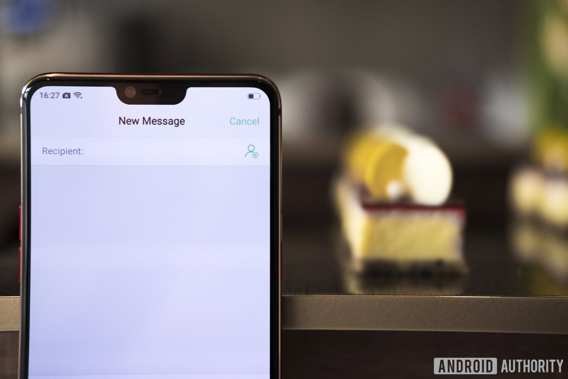
The OPPO R15 and OPPO R15 Pro use the MediaTek Helio P60 and Qualcomm Snapdragon 660 respectively, which are, by definition, mid-range options. If you take the brains out of the equation, the 128GB of storage and 6GB of RAM will likely throw you for a loop. The number-crunching SoCs don’t run at the highest clock speeds, but you’ll be able to store your entire media library on this thing (with optional expandable storage) and jump between apps faster than you can blink.
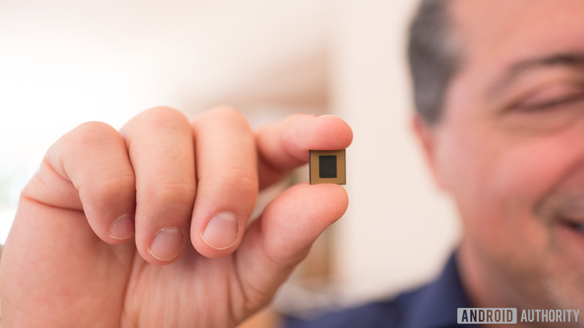
OPPO wants this phone to be full of compromises you don’t really notice. This phone isn’t QHD. It’s got the oh-so strange resolution of 2,280 x 1,080. But… it has an OLED panel.
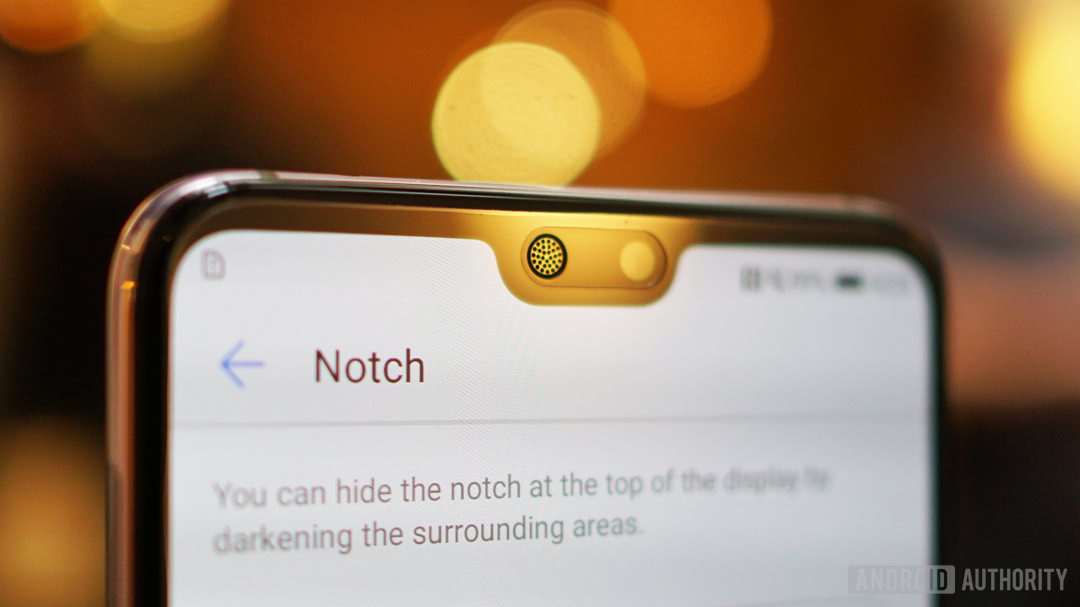
Do you see what I mean? The OLED screen overshadows its relatively low resolution. The 20MP front-facing camera and 18.99:9 (or 2.11:1) aspect ratio make the phone’s notch seem like a less of a problem. The compromises at the core of this phone make it affordable, and the “misses” are almost always overshadowed by a benefit the average user will likely care about more.
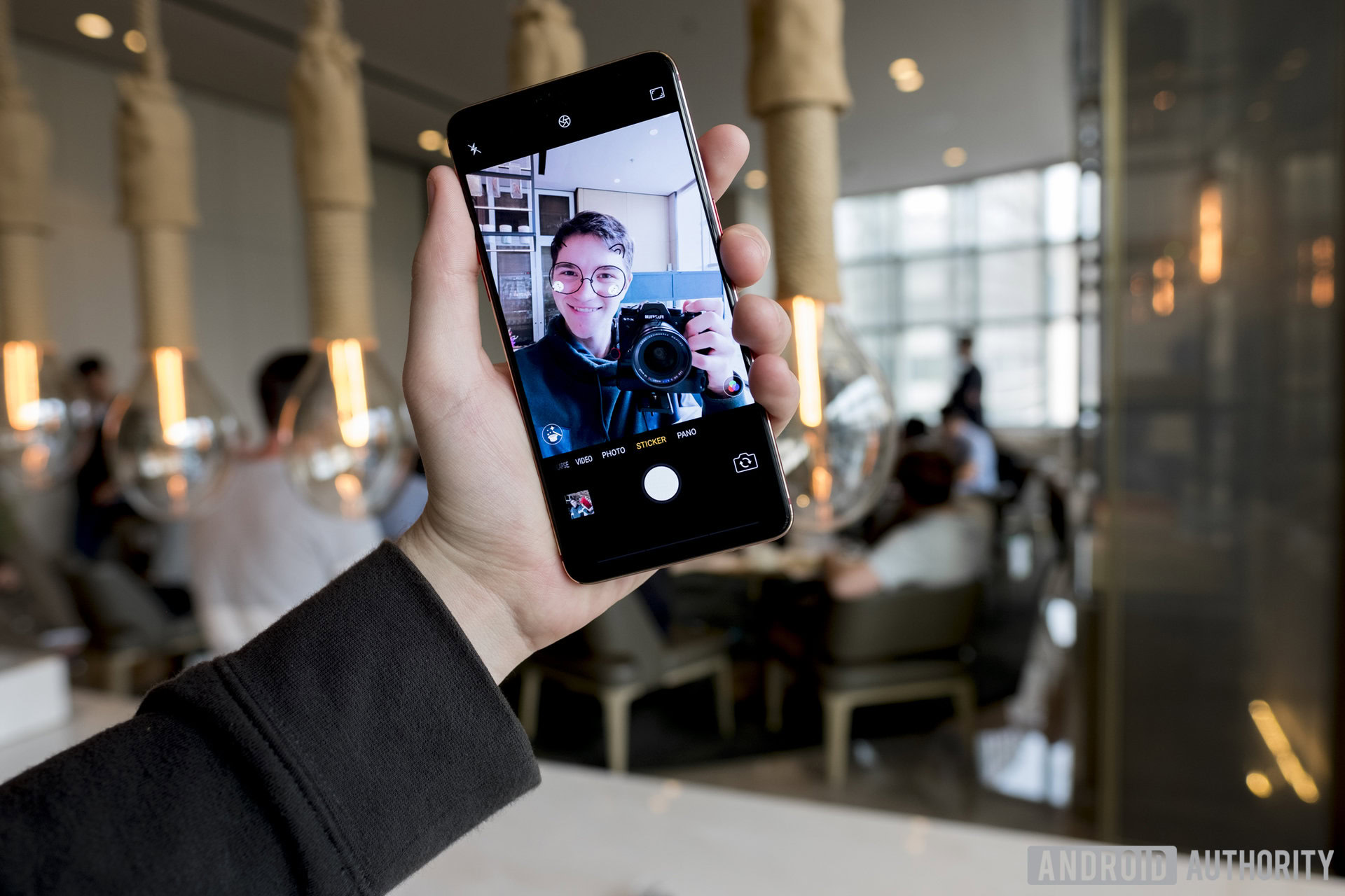
That front-facing camera I mentioned earlier is paired with some “AI” tech that can map cat ears to your face and help soften your skin. It’s a gimmick and will probably get old after one or two photos, but it’s still fun. OPPO can brand the features whatever it wants as long as they map accurately to my face, which they do.
USB Type-C needs to become the standard for every device.
The rear cameras (I say this casually as dual cameras are normal now) are high quality too. The standard model carries resolutions of 16MP and 5MP, and the Pro variant sports 16 and 20MP shooters. The resulting images looked good, though a bit washed out, during our hands-on time with the devices. OPPO also showed us the phones in an extremely well lit and photogenic room, so we’ll have to take this thing out into the real world to test it in a more realistic environment.
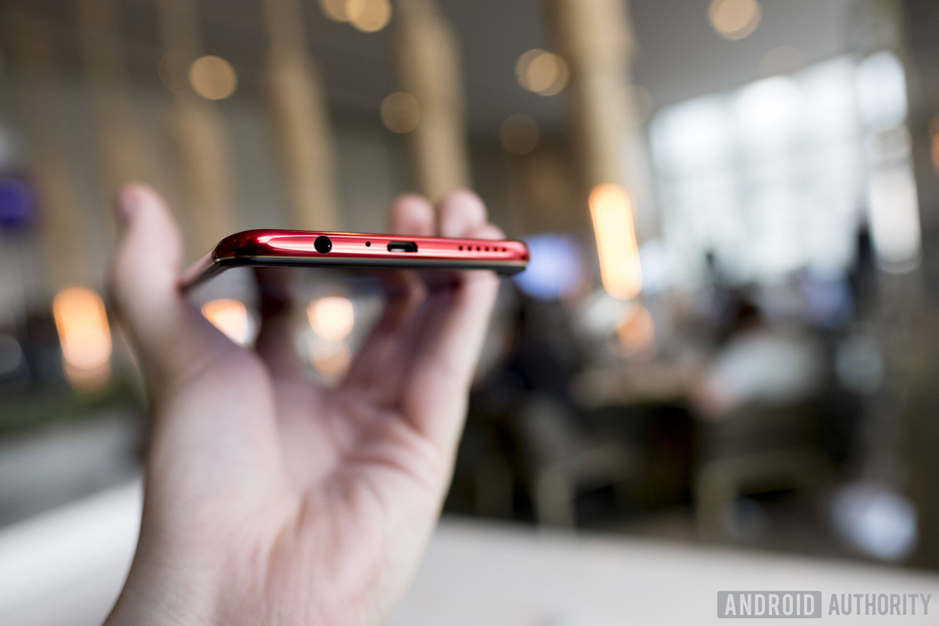
The bottom of the phone houses a speaker, Micro-USB port, and a headphone jack. The lack of USB Type-C is something I personally don’t think OPPO has any excuse for, but it’s just another compromise, this time overshadowed by being able listen to your music with normal headphones, instead of having to rely on Bluetooth or dongles. VOOC Flash Charge is also available on this device, so while I will not forgive the abandoning of a reversible connector, it will still be able to get a quick battery boost from a few minutes on the brick.
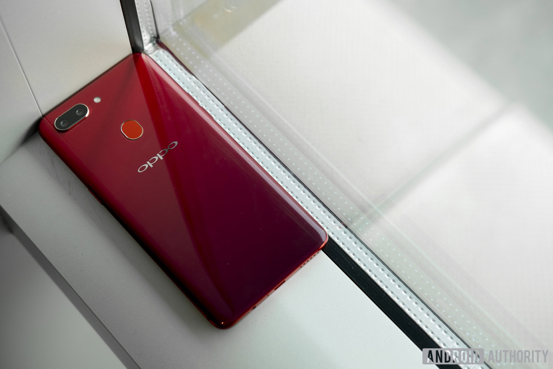
Biometric security options include an elongated fingerprint reader on the rear (the correct placement) and a face unlock feature. The face unlock feature is already acting inconsistently in my first day with the phone, so I would likely just use the fingerprint sensor to avoid unnecessary annoyances.
Other compromises include a lack of proper waterproofing (forgivable) and NFC capabilities (unforgivable), though OPPO told me it may add these features to select markets as it releases the device in new regions. The severity of these compromises are obviously tailored to the user, but an NFC chip should be included in every phone on the market, no matter the cost. I live in San Fransisco, but contactless payments and NFC chips are everywhere!
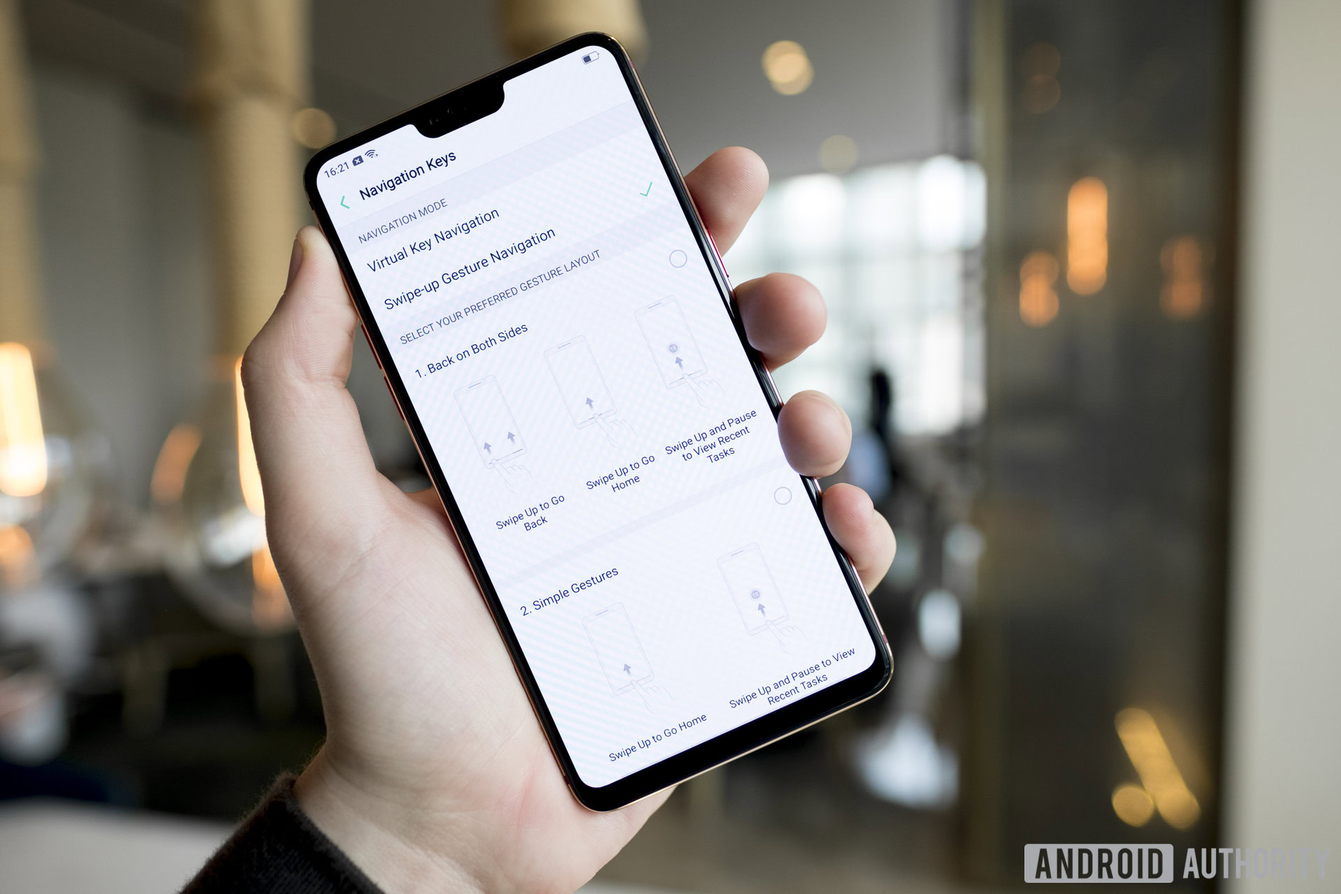
If you like iOS, you’ll like the OPPO R15’s ColorOS 5.0. There is no app drawer and swiping to the left reveals an eerily familiar set of widgets and quick functions. You can even enable swipe-up gestures to get rid of the navigation bar and take advantage of the extremely small bezels. I don’t really care if this is a blatant copy, I like it. This OS is based on Android 8.1, so kudos t0 OPPO for at least giving us the latest Google has to offer (for security’s sake).
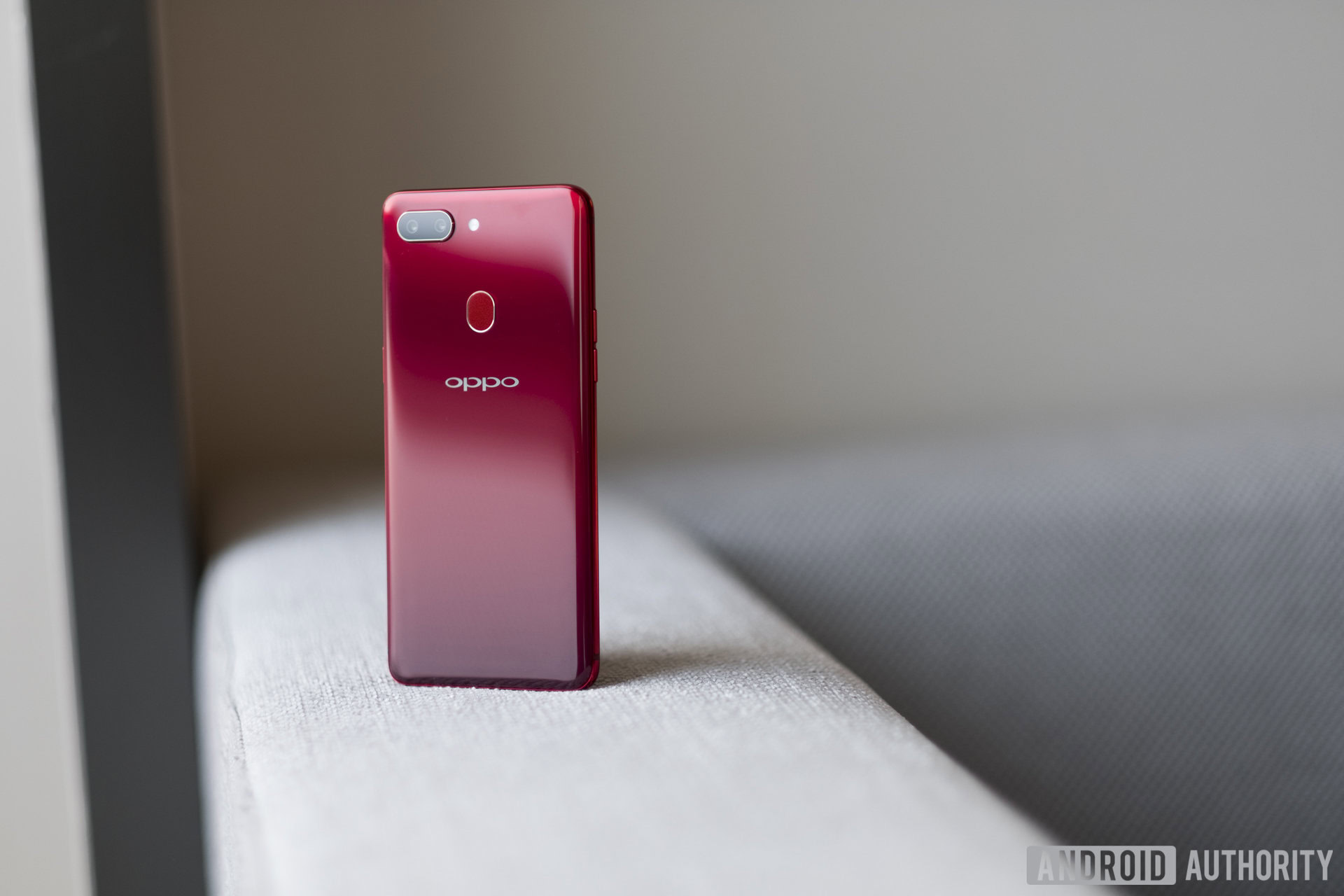
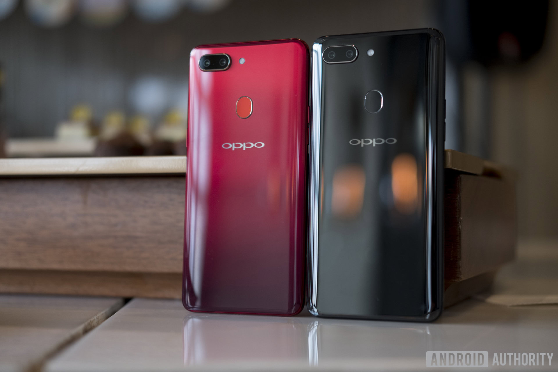
The OPPO R15 and R15 Pro are very attractive phones, depending on how you feel about the notch. The standard model comes in three colors including Rogue Red, Frost White, and Nebula Purple (a gradient from dark purple to black). The Pro comes in Infinity Black and Ruby Red (another gradient from red to black). Why all these companies got together and decided to make gradient phones I will never know, but I’m very happy they did.
We’ll have the opportunity to spend much more time with the OPPO R15 and OPPO R15 Pro in the coming weeks. Until then make sure you watch the video above to get a good sense of what the phone looks like and stay tuned to Android Authority for more gradient-colored notch device news and reviews.
Thank you for being part of our community. Read our Comment Policy before posting.