Affiliate links on Android Authority may earn us a commission. Learn more.
OnePlus details controversial Oxygen OS 11 design changes
Published onAugust 31, 2020

- One-handed use is a key focus area for OnePlus.
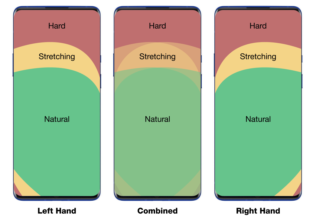
- Anthropometric measurements were used to create a heatmap of touchpoints.
- Stock Android is a good base, but OnePlus wants to create value additions through features.
Update, September 2, 2020: Want to read more about the Oxygen OS 11 changes? Check out our behind the scenes interview with the OnePlus team.
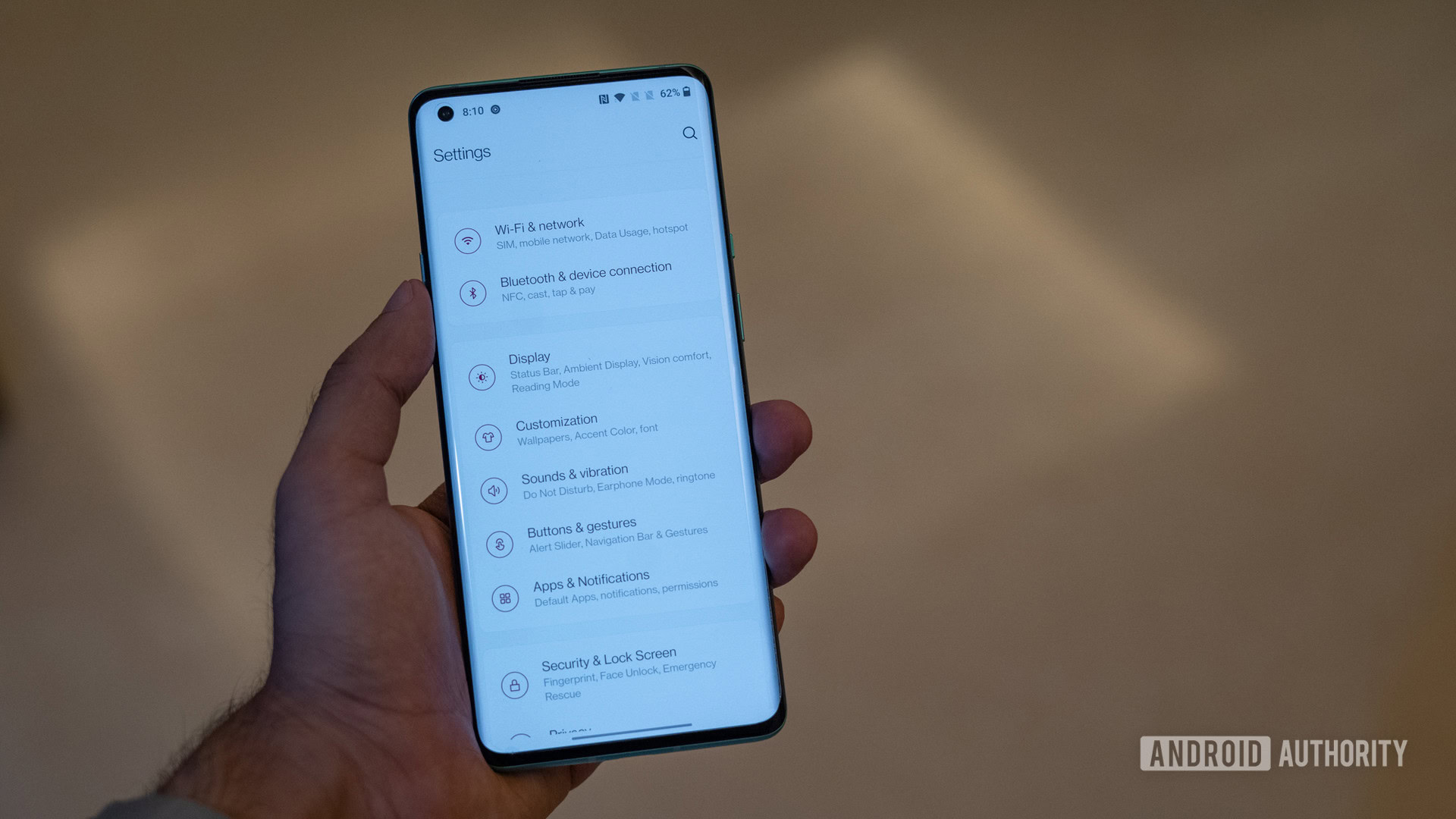
Original article, August 31: Earlier this month, OnePlus released a developer preview for Oxygen OS 11. Along with much-awaited features like an always-on display, it also brought along a revamped design language.
Since then, the renewed visual identity has had its fair share of criticism with many calling it a One UI rip-off. Today, OnePlus took to its community forums to talk about some of the key changes to the visual identity of the upcoming software build.
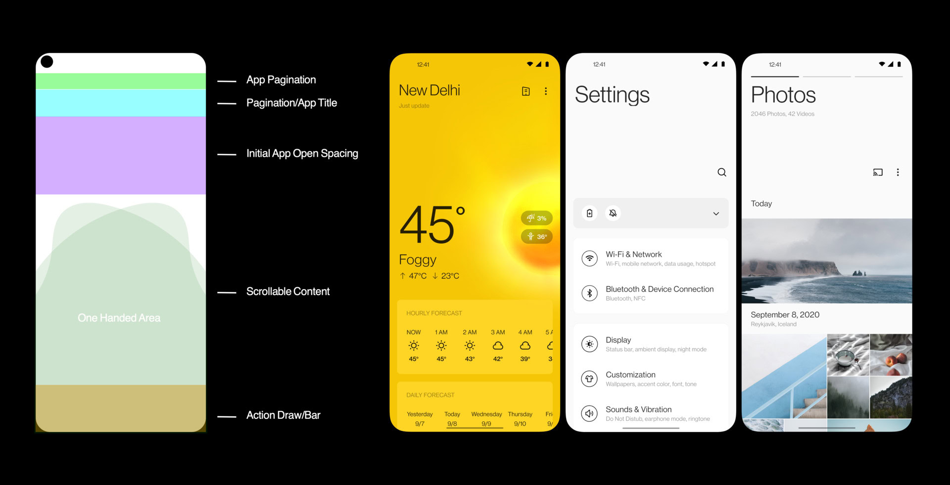
The blog post details how OnePlus uses stock Android as a starting point for building Oxygen OS, but wants to add value through key features on top. It goes on to talk about how stock Android simply hasn’t been optimized for modern large screen displays and usability was a key aspect when designing the new interface elements

OnePlus claims to have conducted A/B testing with users to determine the ideal size for text elements in say, the settings app. These data points were used to decide the headline-body hierarchy in Oxygen OS 11.

OnePlus then goes on to talk about how it used anthropometric data to create a heat map of human interactions to create a golden ratio for optimizing content and UI elements. This leaves the lower half of the display open for thumb based one-handed navigation while the upper half gives an unobstructed view for content.
Android Authority spoke to Sam Twist, Senior Product Manager at OnePlus to get some thoughts about the design changes in Oxygen OS 11, and he had this to say:
It’s about providing a fast and smooth user experience where we’re adding as little as possible to the device. We’re tuning something that we think is great, and where we’re kind of pushing something away that we maybe don’t think are as great.
According to OnePlus, Oxygen OS keeps the ethos of stock Android with a fast and fluid interface but builds upon the feature-set with a data-driven approach. Community feedback plays a large role as well in software development at the company as we recently talked about in our interview with OnePlus India R&D, Vice President, Ramagopala Reddy.
We’ll be talking a lot more about the company’s shifting directions with Oxygen OS very soon, but the community post makes it obvious that while OnePlus wants to retain the blazing-fast experience of stock Android, it is making moves to create its own unique identity, both visually and with feature additions.
What are your thoughts on Oxygen OS?