Affiliate links on Android Authority may earn us a commission. Learn more.
Android 11 on OnePlus 8: Hands-on with all the new Oxygen OS 11 features
Published onSeptember 11, 2020
Google released Android 11 earlier this week and — in a welcome change — a whole host of smartphones are compatible with beta versions of the update. OnePlus announced an Android 11 developer preview earlier in the month but has now joined the party with an open beta for Oxygen OS 11 for the OnePlus 8 and 8 Pro.
I’ve been running the beta for the past week on a OnePlus 8. Doing this gave me a feel for all the changes coming with Android 11 as well as Oxygen OS 11. However, having run the dev preview released earlier in the month, I had a fair idea of what to expect.
The open beta, however, adds an extra layer of polish to the release. Here’s a quick look at all the new features coming to Oxygen OS 11 with Android 11 on the OnePlus 8.
A new look Oxygen OS: Familiar yet fresh
I’ll be honest, the revamped interface in Oxygen OS 11 threw me off at first. As a long time OnePlus user, I’ve become accustomed to the stock-like way of doing things.
Turns out, most of the changes are for the better. The OnePlus Sans font is the most obvious change and is quite a departure from Roboto. The thinner and cleaner typeface makes use of significantly wider spacing to reduce visual clutter.
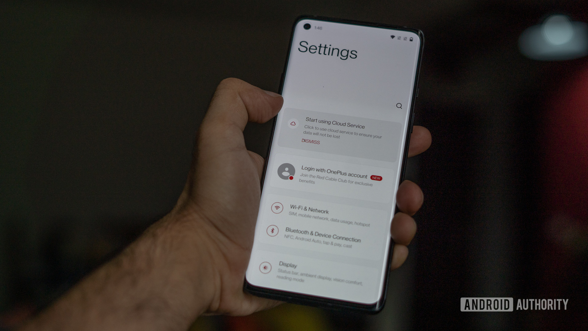
As a fan of minimalism, the typeface sat really well with me and I got accustomed to it quickly enough. I went in skeptical about readability from a distance, but that was a non-issue.
Most of the UI changes are designed to ease one-handed use.
The other major change is the copious use of white space. In our recent behind the scenes interview with Sam Twist, Senior Product Manager at OnePlus, he explained that this was meant to improve one-handed use.
I didn’t observe a huge benefit on the regular OnePlus 8. On the other hand, an even taller phone like the OnePlus 8 Pro would absolutely benefit from the interface enhancements. Having the initial touchpoint at about halfway through the larger display makes it much easier to quickly tap and scroll through the settings screen.
This same design idea extends to the magazine-style refreshed Gallery app as well, though the effect isn’t quite as pronounced. OnePlus also claims that Oxygen OS 11 makes use of AI to pull up the best photographs to display in a larger size.
If you don’t shoot as many photographs, the wasted space might come across as a bit off-putting. That said, the ability to quickly share images from the camera app without having to dive into the gallery is a nifty addition to Oxygen OS 11.
Similarly, I’m not really convinced by the changes to the Weather app. It’s the kind of app where users want to pop-in, glance at information, and get on with their work. OnePlus has done a good job at maintaining design consistency across the board but it comes at the cost of usability.
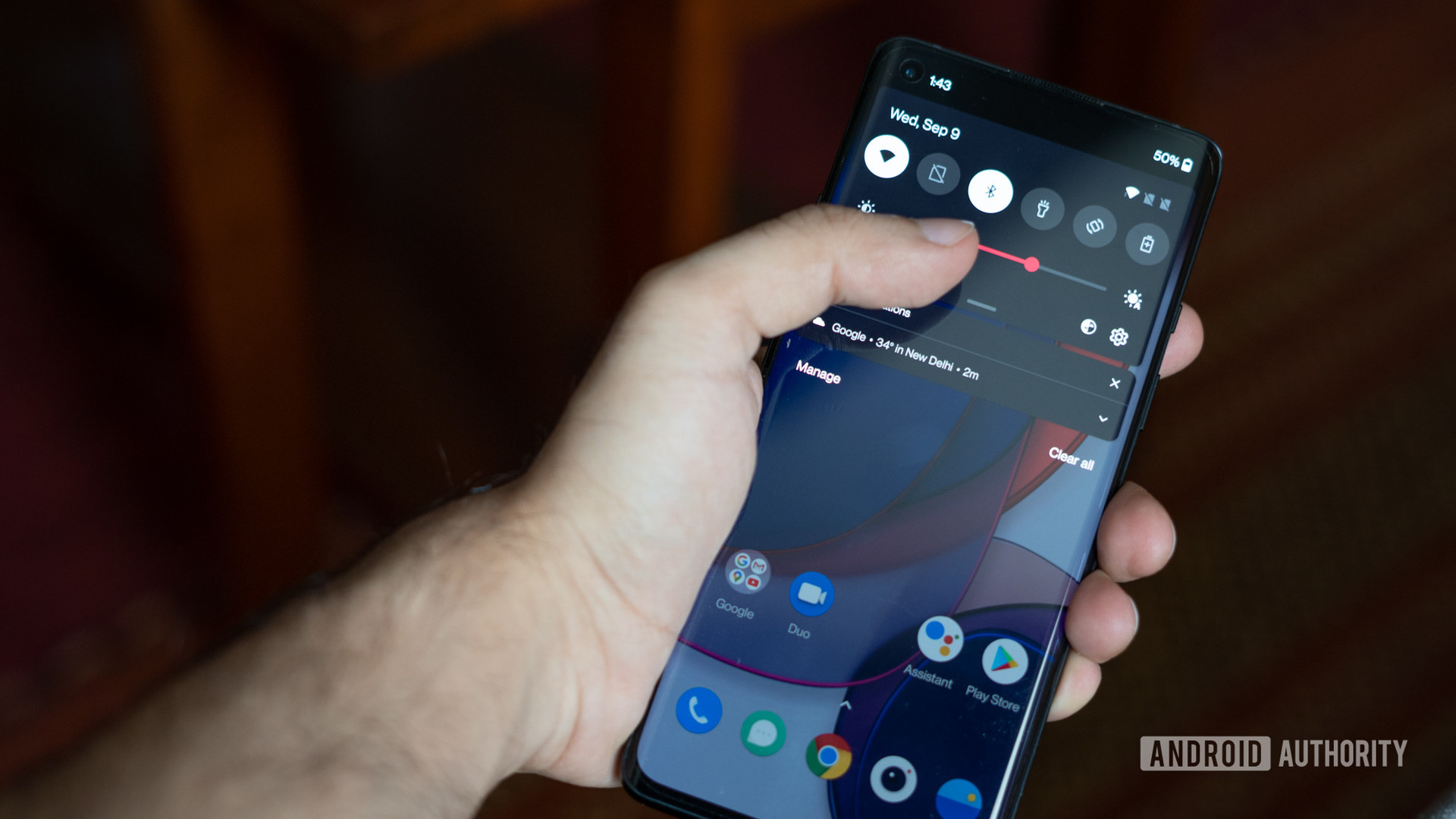
Ironically, my favorite design change is perhaps the most subtle of them all. You no longer need to pull down the full notification shade for access to the brightness bar. A single swipe gives you access to key toggles and lets you adjust screen brightness levels. Perfect.
Seguing from brightness to darkness, the integrated dark mode can now be scheduled to trigger at sunset or at a custom time.
New features for Android 11
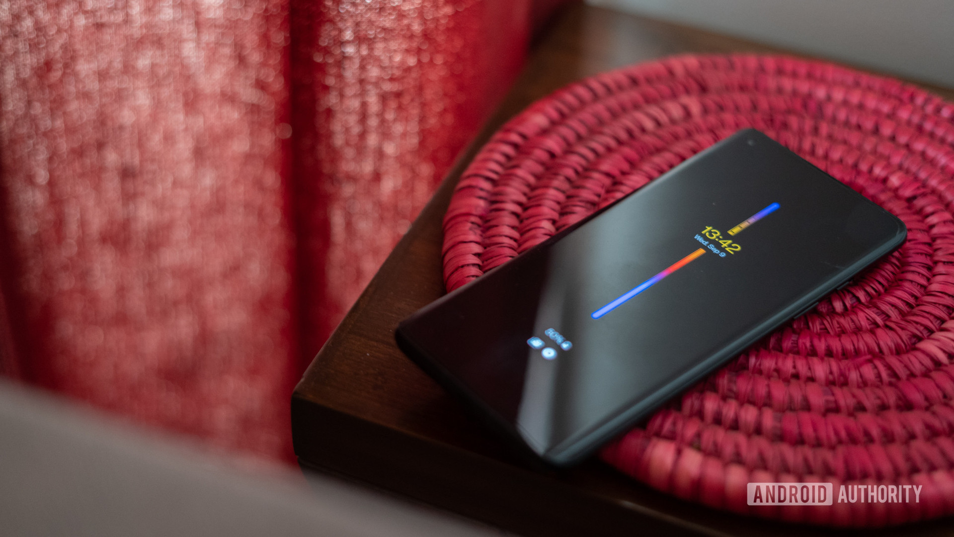
In other major changes, OnePlus has finally introduced an Always On Display. It’s coupled with the 11 different design options, which gives you plenty of ways to customize it. I opted for one of the more information-dense options.
Unfortunately — at least in the beta release — the Always On Display is a battery hog and takes away a significant percentage of charge overnight.
Meanwhile, OnePlus has collaborated with the Parsons School of Design for an option that shows you the number of times you’ve unlocked your phone. There’s also a visual indicator for how long you’ve been using your phone.
It’s a nifty tie-in to Zen Mode and Digital Wellbeing. But for someone like me — whose day involves extended use of the smartphone — it wasn’t the most intuitive option.
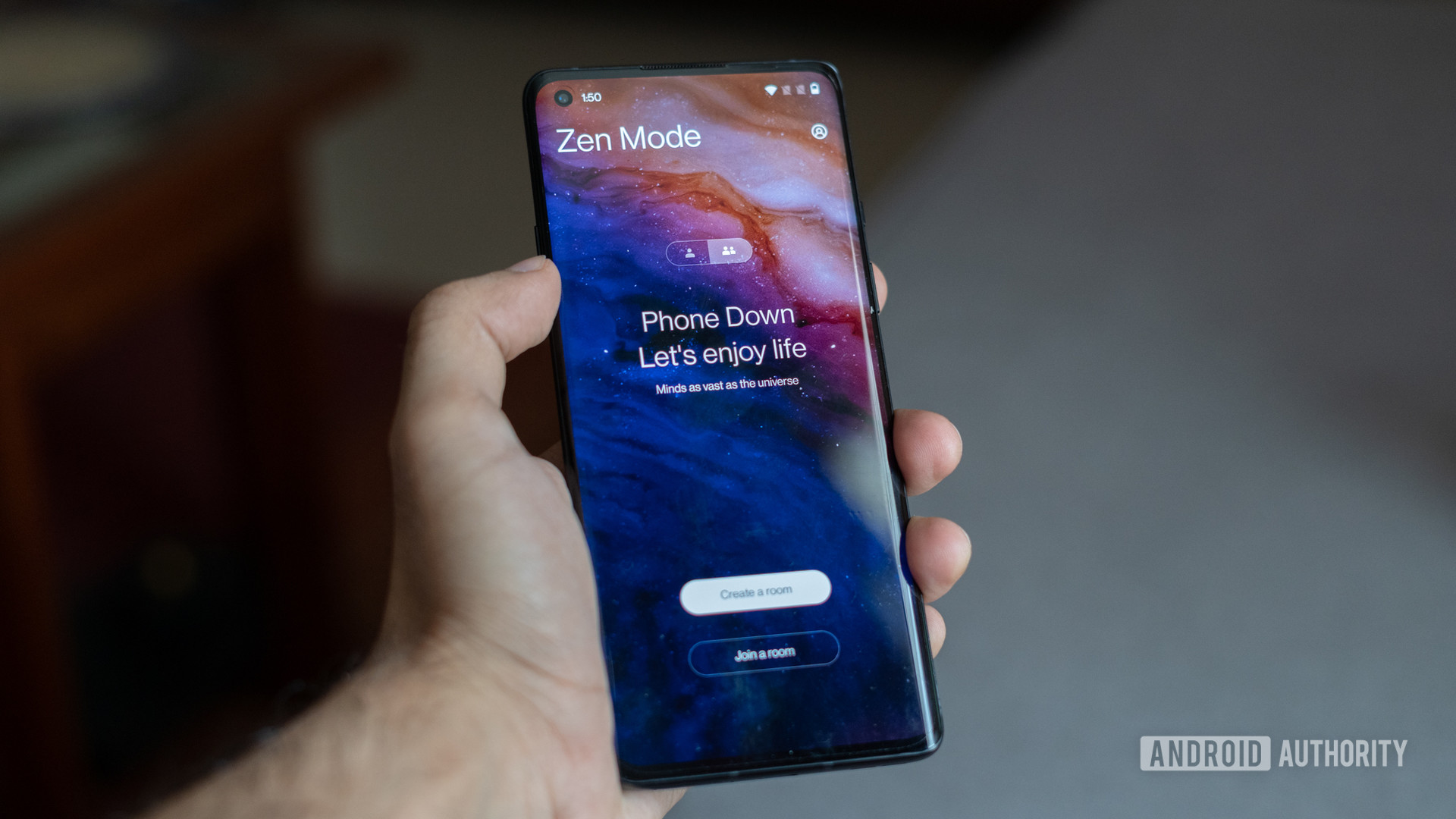
Speaking of Zen Mode, there have been improvements here too. I often end up using the digital detox-style feature when I have a deadline emerging and I really don’t want to be disturbed by app notifications. The productivity feature locks up access to all apps except the Camera. It won’t let in any notifications other than phone calls.
Read more: OnePlus interview — Behind the scenes with the controversial Oxygen OS 11 update
This time around, Zen Mode can be configured for a range of intervals starting at one minute and going all the way to 120 minutes. Additionally, you can create a room and invite friends using OnePlus phones for a collaborative phone detox session.
While the former worked as expected, I can’t imagine myself using the latter all that often — if ever. Additionally, OnePlus has added three new themes to the app.
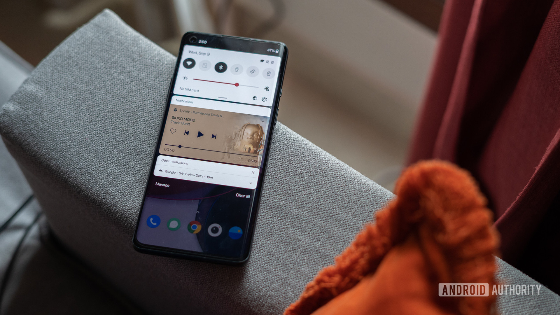
In addition to all the custom enhancements to Oxygen OS, the upgrade also gets some — but not all — of the features Google introduced with Android 11. Case in point, it appears that OnePlus hasn’t enabled the new Quick Settings Music Player yet. However, you do get chat bubbles for supported apps.
Oxygen OS 11 enjoys some useful upgrades thanks to Android 11.
It’s still the early days for Oxygen OS 11, with more changes and fine-tuning expected in the final release. That said, I like most of the tweaks here. Other than the omission of the new music player in the notification shade, the release is shaping up to be a step in the right direction.
Despite the concerns raised by a vocal group of enthusiasts, the changes in Oxygen OS 11 are mostly for the better. It manages a nuanced balance between bringing in new features and subtly tweaking the interface for ease of use.
What are your favorite Oxygen OS 11 features? Let us know in the comments section.