Affiliate links on Android Authority may earn us a commission. Learn more.
Oxygen OS 13 beta hands on: A dash of color
Published onAugust 14, 2022

It’s been an entire year since OnePlus began the process of consolidating software development between its Oxygen OS and OPPO’s Color OS.
Back in 2021, OnePlus CEO Pete Lau announced that this new unified operating system would be the future of Oxygen OS and would embrace all the features traditionally found on OPPO devices. Predictably, that announcement didn’t go down too well with long-time OnePlus fans. The company decided to later reassure them by saying that it was giving the decision a rethink: Oxygen OS 13 would be taking a step back from its consolidation efforts and keep the light, burden-less design that fans loved.
Oxygen OS is Color OS for all intents and purposes.
So when OnePlus announced Oxygen OS 13 based on Android 13 alongside the OnePlus 10T, it came as a rude shock that the company had once again reneged on all its promises. Debuting a new ‘aquamorphic’ design, Oxygen OS is Color OS for all intents and purposes. But how deep does the consolidation run? We’ve got the first Oxygen OS 13 beta up and running on a OnePlus 10 Pro, and here are our first impressions.
Also read: Oxygen OS guide — Everything you need to know about OnePlus’ Android skin
Oxygen OS 13: A material overhaul
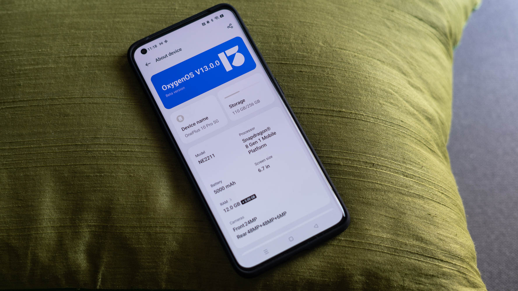
A first glance at the home screen of Oxygen OS 13 would suggest that not much has changed. However, all it takes is a quick swipe down of the notification shade to show off the beginnings of a dramatic visual overhaul.
The entire top row of the notification shade now comprises upsized tiles that can be replaced but not entirely removed. Meanwhile, the media player tile can’t be removed at all, and I can foresee some users raising issues with that. Personally, I don’t mind it so much.
The notification and Quick Settings pull-down comes with a few questionable choices.
On the other hand, I’m not too happy with the reduced density of notification toggles. While Oxygen OS 12 could accommodate six icons in a row, Oxygen OS 13 drops it down to five. Finally, the clear all button has now been replaced by a single large cross button that sits below the notification shade.
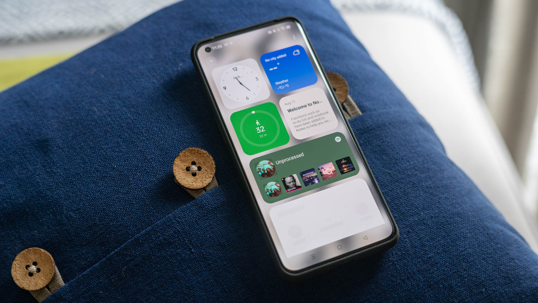
With Oxygen OS 13, OnePlus is finally fully embracing Material You guidelines, and the icons can now be set to dynamically adjust colors based on the wallpaper. This feature extends to all apps that support Material You enhancements and helps build cohesiveness.
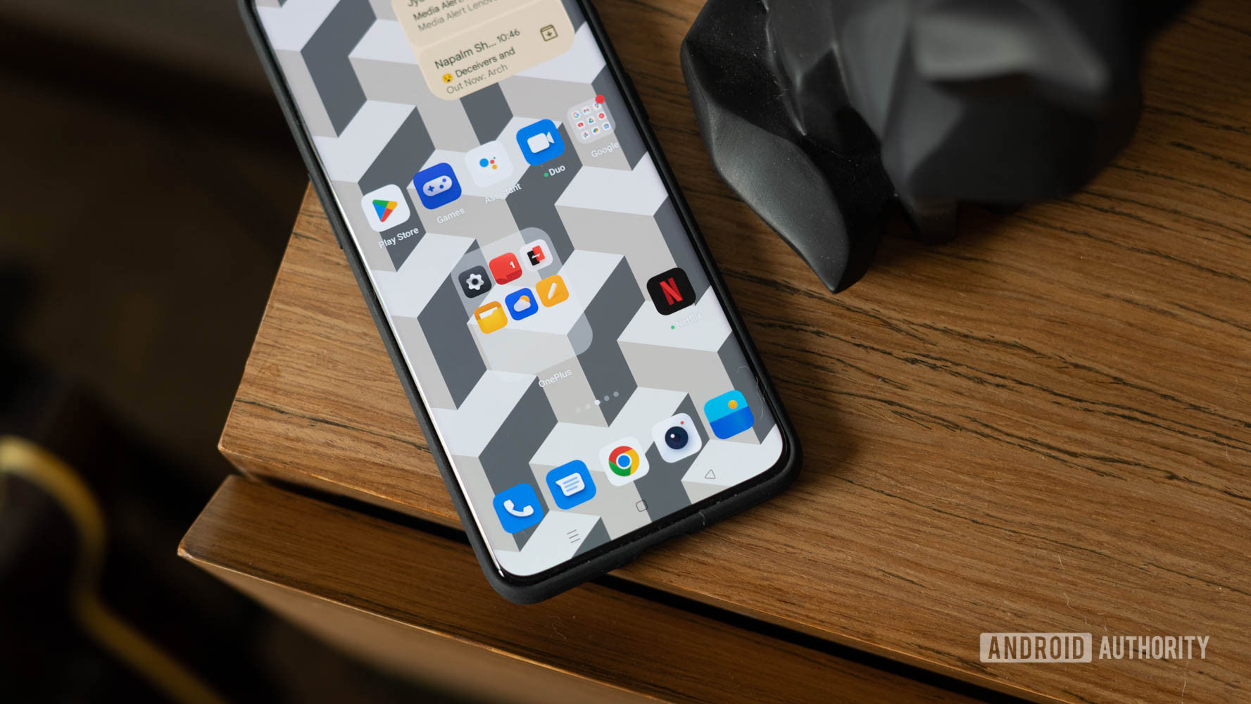
Meanwhile, the homepage gets a new expanded folder option. It’s exactly what you would expect and lets you pop open apps directly from the home screen instead of opening the folder first. Think of it as a middle ground between conventional folders and tossing icons straight up on the home screen.
A more custom always-on display
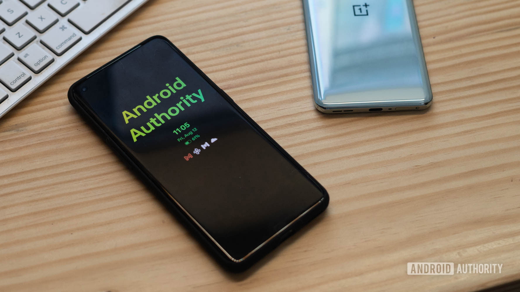
The always-on display gets special attention in Oxygen OS 13 and has gained a wide range of options to customize it to your liking. Fresh options for adding custom text, text with an image, custom-generated patterns, and even your “Omoji” profile are all there, and I found it to be a fun way to add some personality to the phone.
The always-on display gets a serious overhaul and adds a lot of personality.
The new additions go in-depth and let you adjust text sizes, alignment, colors, and even line spacing. Meanwhile, the custom pattern generator allows users to generate animated patterns based on pre-existing shapes.
Usability tweaks and nice OPPO additions
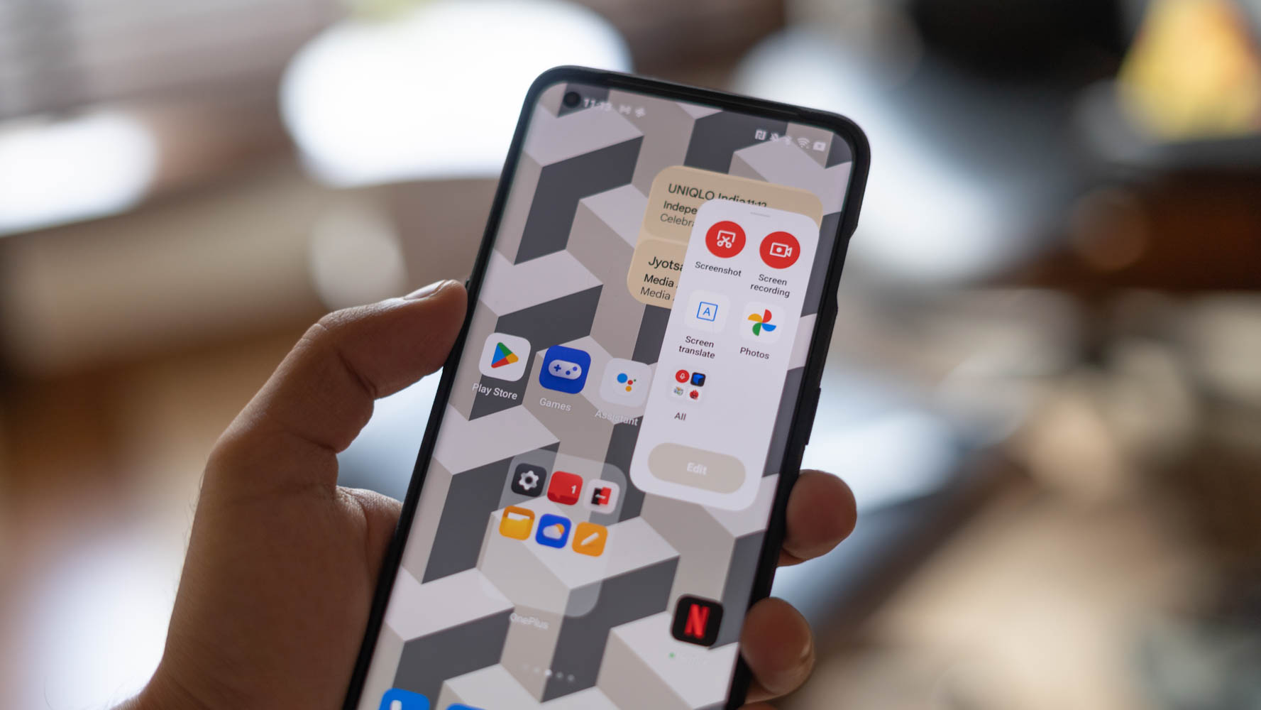
The similarities with Color OS run more than skin deep. With Oxygen OS 13, OnePlus is also porting over some of the deeper usability tweaks we’ve previously seen on OPPO’s phones. Tucked away under a special features menu, all of these additions are optional.
Oppo's optional extra features are fantastic additions to OnePlus devices.
The ability to create a floating app out of any running app is a nice tweak to the existing split-screen formula. However, I wish it supported more than just a single app at a time. Elsewhere, a new smart sidebar takes a page straight out of OPPO and Samsung phones and has shortcuts for screenshots, screen recording, as well as recently used apps. The phone will also offer up contextual app suggestions in the sidebar should you enable the option.
Also cribbed from Color OS are a Kids Space and Simple Mode. I found the Kids Space feature to be very well thought-out, with toggles to disable Wi-Fi and/or mobile network access, app whitelisting, and notification pop-ups to warn about low ambient light. Needless to say, exiting kids mode requires biometric or password input. The feature should be a nifty addition for parents who tend to hand over their smartphones to younger users.
Similarly, Simple Mode is a good move towards improving accessibility for older users. The mode bumps up icon sizes and simplifies the settings page. We’ve seen both these features on OPPO phones before, but contrary to the complaints of the very vocal OnePlus community, I think they are fantastic additions to OnePlus devices.
More features
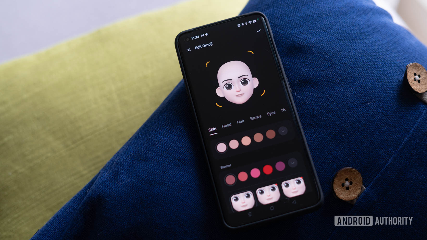
In addition to the major tweaks we’ve talked about already, Oxygen OS 13 introduces minor quality of life changes and a few apps that are borderline bloatware.
- Screenshot Editor: I’ve always liked the screenshot editor on OnePlus phones, and with Oxygen OS 13, it is getting an overhaul to support a pixelation feature which can be useful to hide phone numbers, pictures, or account information.
- Ohaptics: While it has been possible to adjust the intensity of the haptics with Oxygen OS 12, the upgraded Ohaptics app now lets you switch between a crisp and gentle setting. The difference is quite noticeable, and I found the crisp setting to be significantly tighter in its response.
- Omoji: OPPO’s answer to Apple’s Memoji also finds a spot here. The app lets you create a virtual avatar that can be used as a profile picture, displayed on your always-on display, or even shown in chats.
- OnePlus Shelf: A minor change that bothered me was that the long-standing Never Settle branding is now gone from the shelf. While it doesn’t affect the functionality in any way, it comes across as the final death knell of the true origins of Oxygen OS and OnePlus phones.
- Hyperboost Game Engine: OnePlus claims that the Hyperboost engine has been upgraded to offer more stable frame rates and lower power consumption. I didn’t notice a major difference in my limited testing.
Oxygen OS 13 beta: Release date and eligibility
OnePlus has confirmed that both the OnePlus 10 Pro and OnePlus 10T will receive the Oxygen OS 13 update in 2022. Additionally, flagships going all the way back to the OnePlus 8 can also expect an upgrade, though the company hasn’t committed to a timeline. Similarly, most Nord phones starting off with the OnePlus Nord 2 will receive the update at some point.
Oxygen OS 13 won't do anything to change your mind about where OnePlus is headed, but the feature additions are generally useful for mainstream users.
If you’re not a fan of the direction OnePlus is taking under OPPO, Oxygen OS 13 will do precious little to change your mind. It’s time to accept that Color OS with a smattering of Oxygen OS visual elements is the future for the brand.
Spending a day with the phone, I can see the value in adding some or even most of the new features as OnePlus tries to become even more of a mass-market brand. What I don’t really like much are the visual changes. The reduced icon density, forced widgets, and pre-bundled bloat like Omoji get in the way of the stripped-back, performance focus that OnePlus phones have traditionally had.