Affiliate links on Android Authority may earn us a commission. Learn more.
Let's talk about the Apple MacBook Pro notch: Was it really necessary?
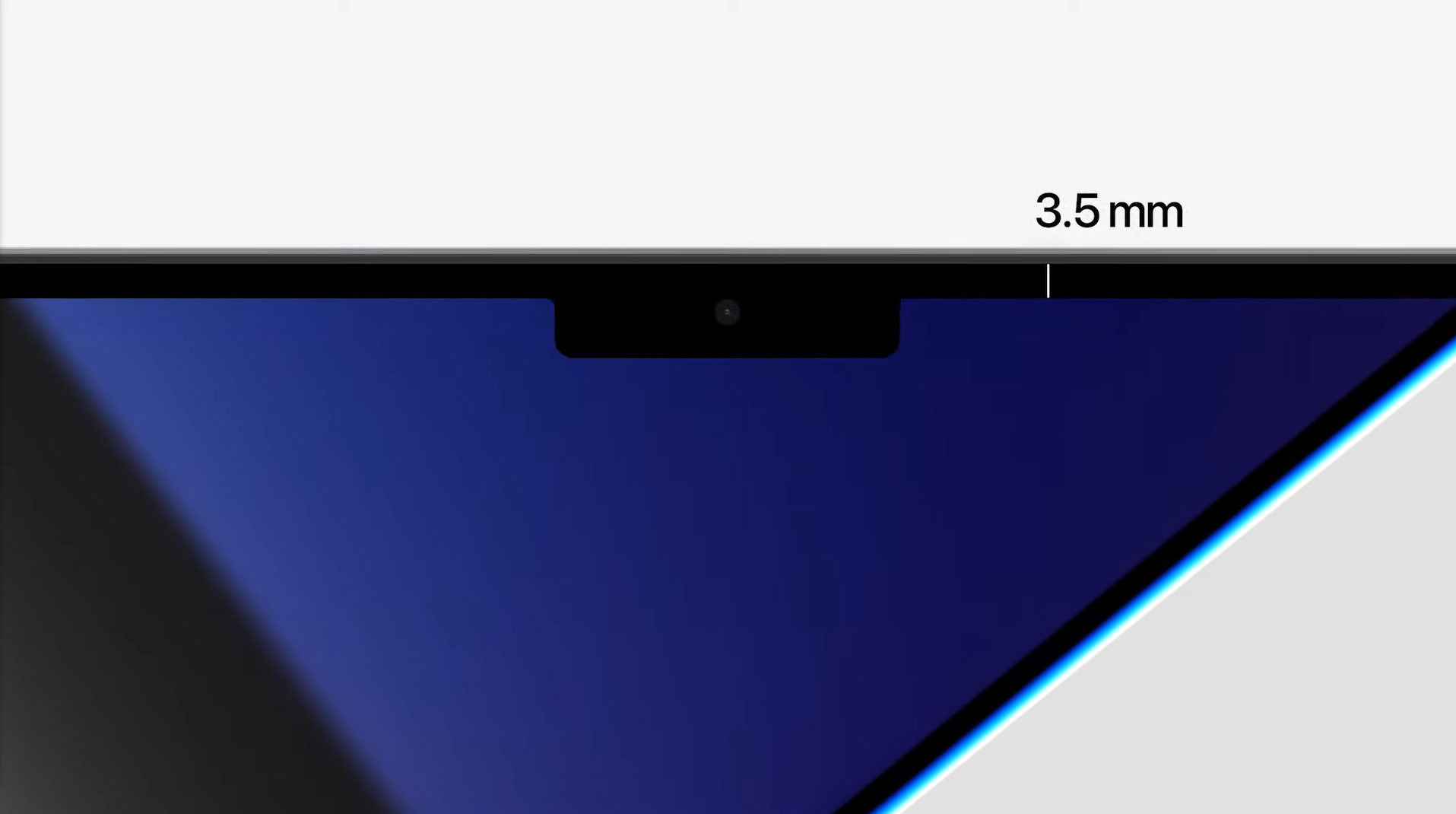
Rejoice! The MacBook Pro is back. After a long run of terrible updates, Apple has finally made an iteration worthy of the “Pro” tag. There is so much to like here. Two sizes, crazy powerful silicon with every configuration available across both sizes, necessary ports brought back, and the screens made even better. A dream machine for professions, except that it comes with an asterisk — or more precisely, a notch.
Now, all the innovations aside, a notch on a laptop seems like one of those things that ideally shouldn’t exist. Yet, Apple chose to bring the iconic and infamous notch from the new generation of iPhones, to the new generation of MacBooks. Was it really necessary though? Or is it just another Apple thing that doesn’t make sense?
Why is there a notch on the new MacBook Pro?
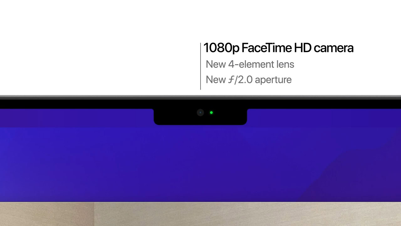
When Apple introduced the notch to the iPhone, it tried to give us enough reasons as to why it went in that direction. Slimmer bezels, no chin, and a more secure biometric authentication in the form of Face ID. While the debate will rage on until Apple drops the notch from its phones, there’s a least some need and benefit to having it. However, with the MacBook Pro, Apple doesn’t seem to have even tried to justify it.
We’re getting the thin bezels, of course. 3.5mm is a respectable figure when it comes to bezels. That’s all there is, though.
The 1080p camera is nice to have, but surprisingly, there is no Face ID.
Despite having the room for the necessary extra sensors for 3D face recognition, the MacBook Pro doesn’t have Face ID — the main reason behind the notch on iPhones. This seems like a glaring omission given the absolute size of the MacBook Pro notch. Instead, Apple didn’t try to sell us off on the camera housing at all, and that’s likely because it’s come to be one of those Apple things we’ve all learned to accept.
A case of forced cohesive design
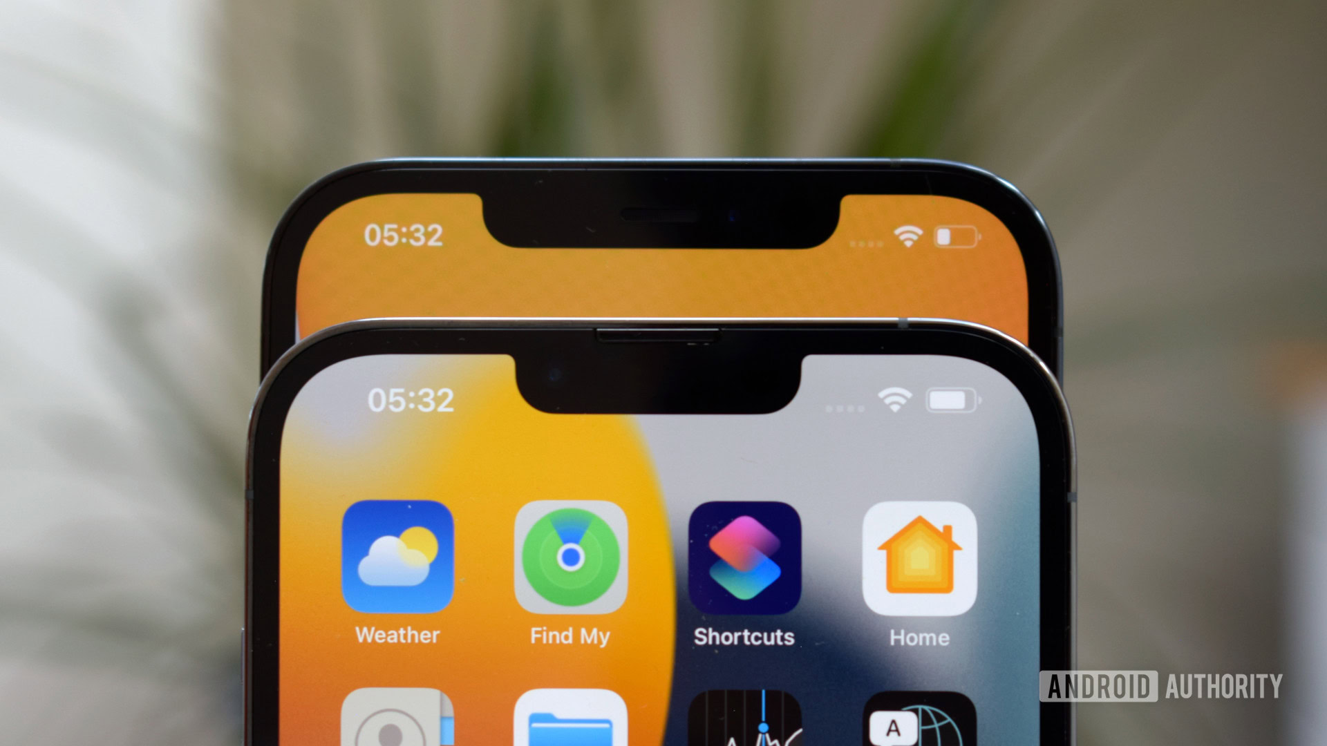
If you’ve seen the camera assembly on any previous MacBook, or any laptop for that matter, you know that it doesn’t take a huge amount of space. Given that Apple is skipping Face ID here, there’s not much of an obvious reason to have a notch that huge. Unless of course, this is a case of Apple trying to maintain a cohesive design.
The MacBook Pro design has been ripped off to death by a lot of other laptop manufacturers over the years. With the new MacBook Pro, Apple is bringing back elements from the 2015 design. It looks remarkably like a 2015 MacBook redux, bearing a striking resemblance to the old design. The extra ports make a great return, and the keyboard is a mix of old and new, with full-sized function keys that replace the oft-maligned Touch Bar. It’s as striking as the new iPhones, 12 and later — undeniably Apple.
However, it seems like the company wanted it to have an extra dollop of identity. Cue the notch, a design feature Apple ecosystem power users are already very well acquainted with thanks to the iPhone.
So, was the MacBook Pro notch necessary?
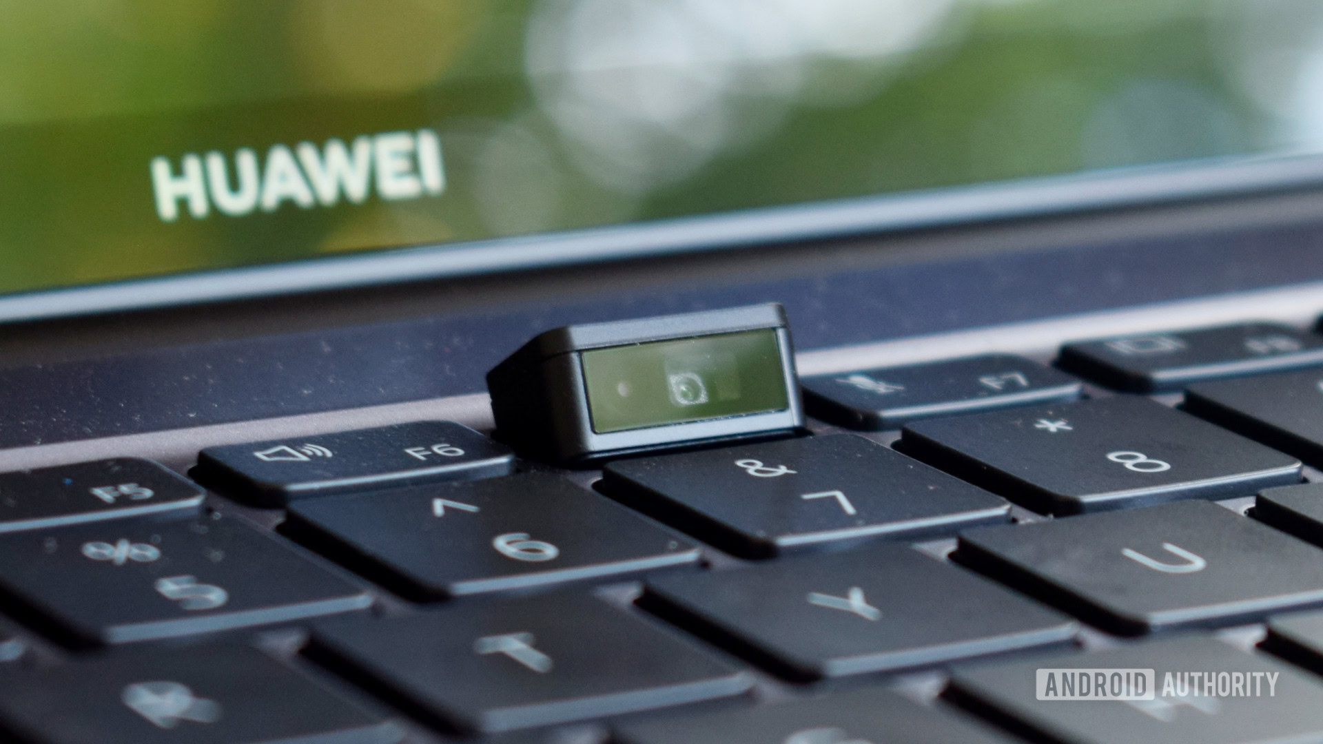
To me, the notch ruins what is an amazing display on paper, although Apple and most potential buyers probably won’t see it that way. While the front camera situation on phones has been evolving quickly over the last few years, laptops have had a less flattering journey. We’ve seen implementations like the infamous nose cams on the Dell XPS 13, and the HUAWEI MateBook series, while some other manufacturers have skipped including a webcam entirely.
So when it comes down to it, it’s possible that Apple didn’t have an alternative at all without rethinking the display design. You could argue that the notch was the best implementation here if Apple were to set this MacBook apart without making an even more radical choice.
See also: The best Apple MacBook accessories
While that’s perhaps true to an extent, it seems like something that could have easily been avoided. The top bezel could have been thinner than previous MacBook Pros, but still kept thick enough to accommodate the camera without a notch. Alternatively, the MacBook Pro notch could’ve been a lot smaller — there’s a lot of unused space in that notch where those Face ID sensors should’ve been!
There will be growing pains too. The MacBook Pro screens have great pixel density numbers, so it remains to be seen how the notch will play with the menu bar with different text scaling options. It’s likely that Apple will keep the menu bar just as fat regardless of the settings, only to get it to blend with the notch, but it’s bound to be an eyesore in at least a few cases.
The notch could ruin what looks to be an amazing display, but many won't care.
Apple’s updated human interface guidelines say that app developers will have an option to enable compatibility mode, in case their menus stretch too far wide to accommodate the notch. Under compatibility mode, the notch will just blend in with a black stripe, and the app will run below the notch length, with no interference. I’m hoping a third-party app will show up to let users force compatibility mode system-wide. Especially because the cursor will be able to move under the notch (groan).
Despite the notch, the new MacBook Pros are still a net positive
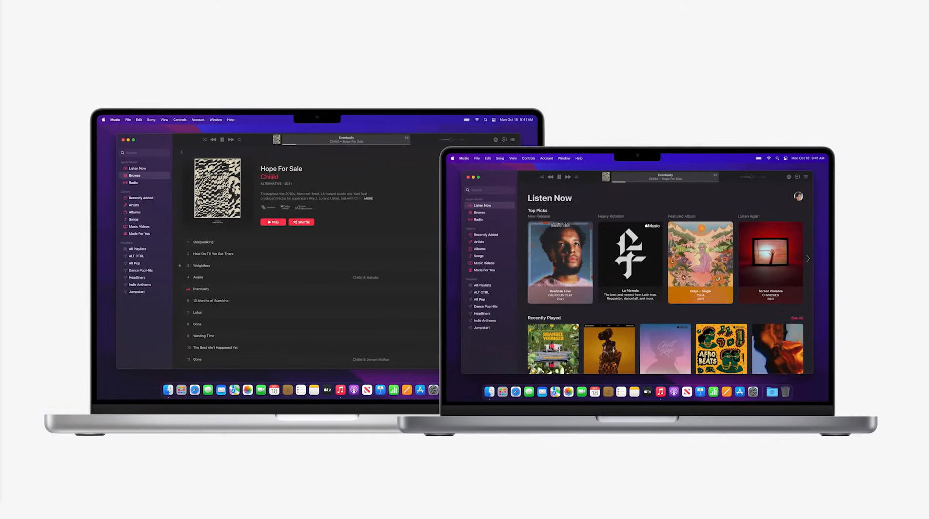
That dreaded notch may have made me swear off buying a nice and shiny new MacBook Pro, but I cannot ignore that the new MacBook Pros are a net positive. There is so much good about these machines that even the notch can’t do much damage here. Sure, it will affect the buying decisions of a few passionate, notch-hating folks like me, but the overall reception will no doubt be positive because of the sheer number of wrongs Apple has righted for its MacBook Pro line after so many years of pain.
The MacBook Pro looks to be a near-perfect machine for professionals and a great upgrade for existing users. It’s got nearly everything users have been asking for since the 2016 iteration of the MacBook Pro dropped, and some more. As far as the idea of the fully perfect pro machine goes, we may have to wait until Apple introduces under-display cameras, and hope that there’s no One More Thing to ruin the experience then.