Affiliate links on Android Authority may earn us a commission. Learn more.
Samsung gives Galaxy Wearable app a more modern look, but stops short of full redesign

- Samsung has revamped the look of its Galaxy Wearable mobile app.
- The biggest changes have been made to the home page, Watch faces menu, and hamburger menu.
- The Apps screen, Tiles, and Quick panel pages appear to be untouched.
If something seems different about the Galaxy Wearable app, you would be correct. Samsung has given the app a bit of a facelift in some notable areas.
Spotted by SamMobile, the Galaxy Wearable app has undergone several changes. However, it appears Samsung didn’t revamp all of the UI, only some parts of the app have been updated with a fresh look.
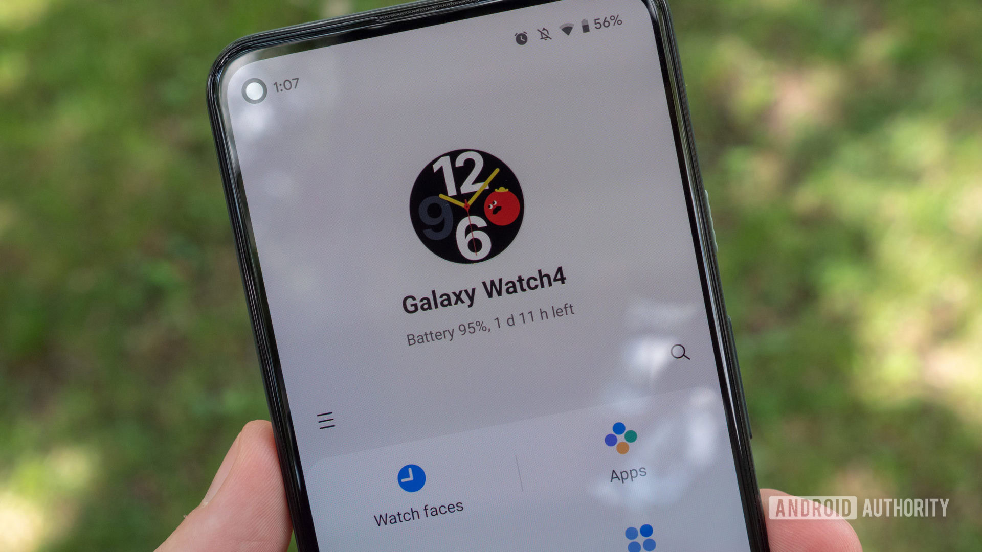
One of the biggest changes was made to the home page. The Watch preview at the top of the screen is bigger and more prominent than before. It also has more detail, adding the button layout for whatever Galaxy model you have. You may also notice that the buttons for Watch Faces, Apps screen, Tiles, and Quick panel now appear alongside each other in a line. Previously, these buttons appeared in a two-up-top and two-below orientation, creating a square shape. And it looks like almost all of the icons on this page have been recolored.
Meanwhile, the old hamburger menu that you would use to see all of your connected wearable devices is now gone. It has been replaced by a new button at the bottom of the screen. You’ll tap this button to see or hide your connected device list.
Finally, a few small changes were made to the Watch faces page. Samsung has replaced the Manage text with a new button. The pill-shaped “Customize” button is now a little chunkier and darker than before. More Watch face categories have been added, and the background of those categories is a darker shade of gray.
Strangely, it seems Samsung left the Apps screen, Tiles, and Quick panel pages untouched as they still have the old elements. It’s possible that the tech giant could be planning to release another round of changes in the future.