Affiliate links on Android Authority may earn us a commission. Learn more.
Hands-on: Pantech Vega Iron 2 - the Galaxy S5 that Samsung couldn't make
Published onFebruary 3, 2015

By now it’s no small secret that Samsung’s Galaxy S5 didn’t light up the sales charts like the Korean OEM may have believed it would. While sales in the USA were quite pleasant, elsewhere things were a bit less desirable. There is no single reason that can be held accountable for the relative relegation, there are a lot of complaints to be had from the consumer-side of things: namely that the phone was lacking any semblance of new design (or premium materials), and failed to include either a 2K screen or OIS-equipped camera. On the other hand, Samsung threw in some features that had questionable value to some: a fingerprint sensor, waterproofing, a heart rate monitor, and such.
Little does anyone realize however, that the “real” Galaxy S5 exists, but it’s not made by Samsung. For that matter, it’s not a knock-off counterfeit either. The product in question is 100% legitimate and, unfortunately, was passed by in seemingly 99% of the world. The product? Pantech’s Vega Iron 2, or as I’d like to suggest, the Galaxy S5 that never-was-but-should-have-been.

Background
A curious creation lied in (a) store some weeks ago and it caught my attention. As a “purist” of sorts, I prefer to have a product from the country its manufacturer originates in, so as to enjoy the device as it was “meant to be.” To this end, I will seek out Korean versions of Korean devices (i.e. Samsung and LG products). While I had some knowledge of the Pantech Vega series, as a one of the models released in Japan, I had no idea the Vega Iron 2 existed. A shame really, because this phone is literally everything the Galaxy S5 isn’t, which is to say it’s everything the S5 needed to be and should have been. In fact, it’s arguably what the S6 will have to be in order for Samsung to make a difference this year.
Before digressing into a Samsung stipulation, allow me to offer some impressions of the Vega Iron 2.
Solid specs
The Vega Iron 2 features specs that equal, if not surpass, those of the Galaxy S5. The phone runs Android 4.4.2, has a Qualcomm Snapdragon 801 (MSM8974AB) CPU, Adreno 330 graphics, 3 GB of RAM, an OIS-equipped 13-megapixel rear camera, a 2.1-megapixel front camera, a 5.3-inch 1920 x 1080 AMOLED display, Bluetooth 4.0, LTE-A connectivity, NFC, a 3220 mAh battery, and 32GB of storage.
Chances are someone is having a flashback here, as most were assuming Samsung was going to include some of these specs in its Galaxy S5, namely the OIS-supported rear camera and the three GB of RAM. But wait. It gets even better.
The build and body
Considering how this phone looks, one might be excused for thinking it was “inspired” by the Samsung Galaxy A series/Note 4. If anything, Samsung was inspired by Pantech given that the Iron 2 released in July 2014.
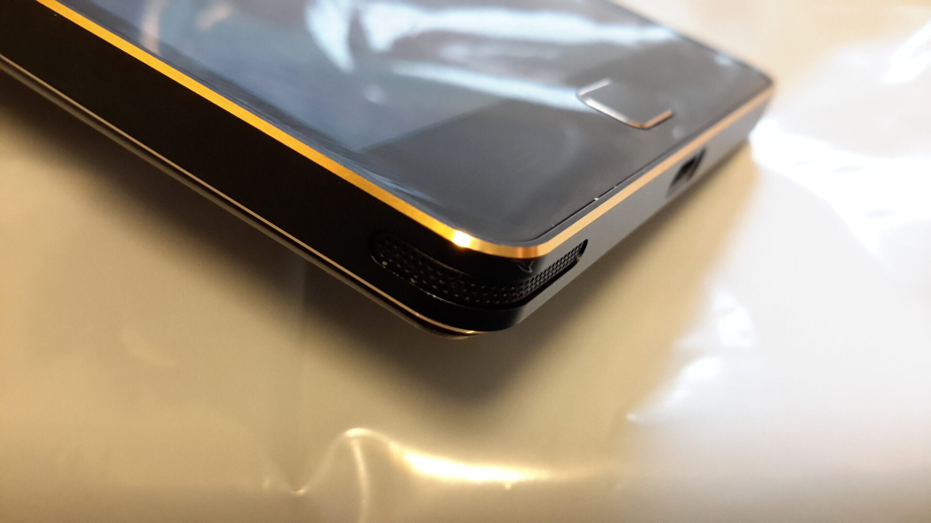
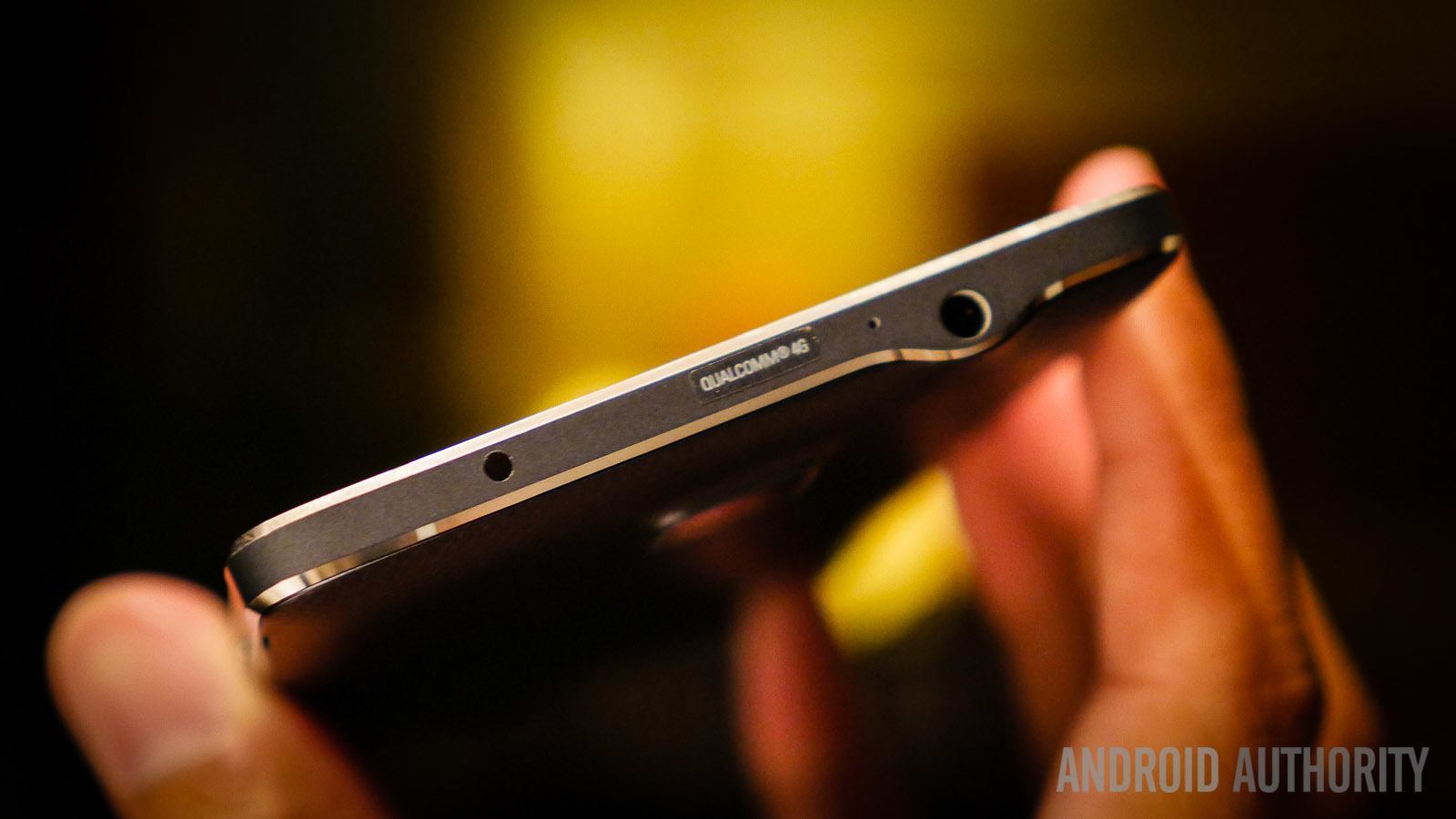
The Vega Iron 2 features a plastic back, and a chamfered, striped metal frame. Sounds familiar? Yes, it does, for Samsung used a similar design in its Galaxy Note 4 series, save for slightly flared-out corners along with metal side buttons (whereas the Iron 2 feels like plastic). Indeed, this product has more to it than meets the eye.
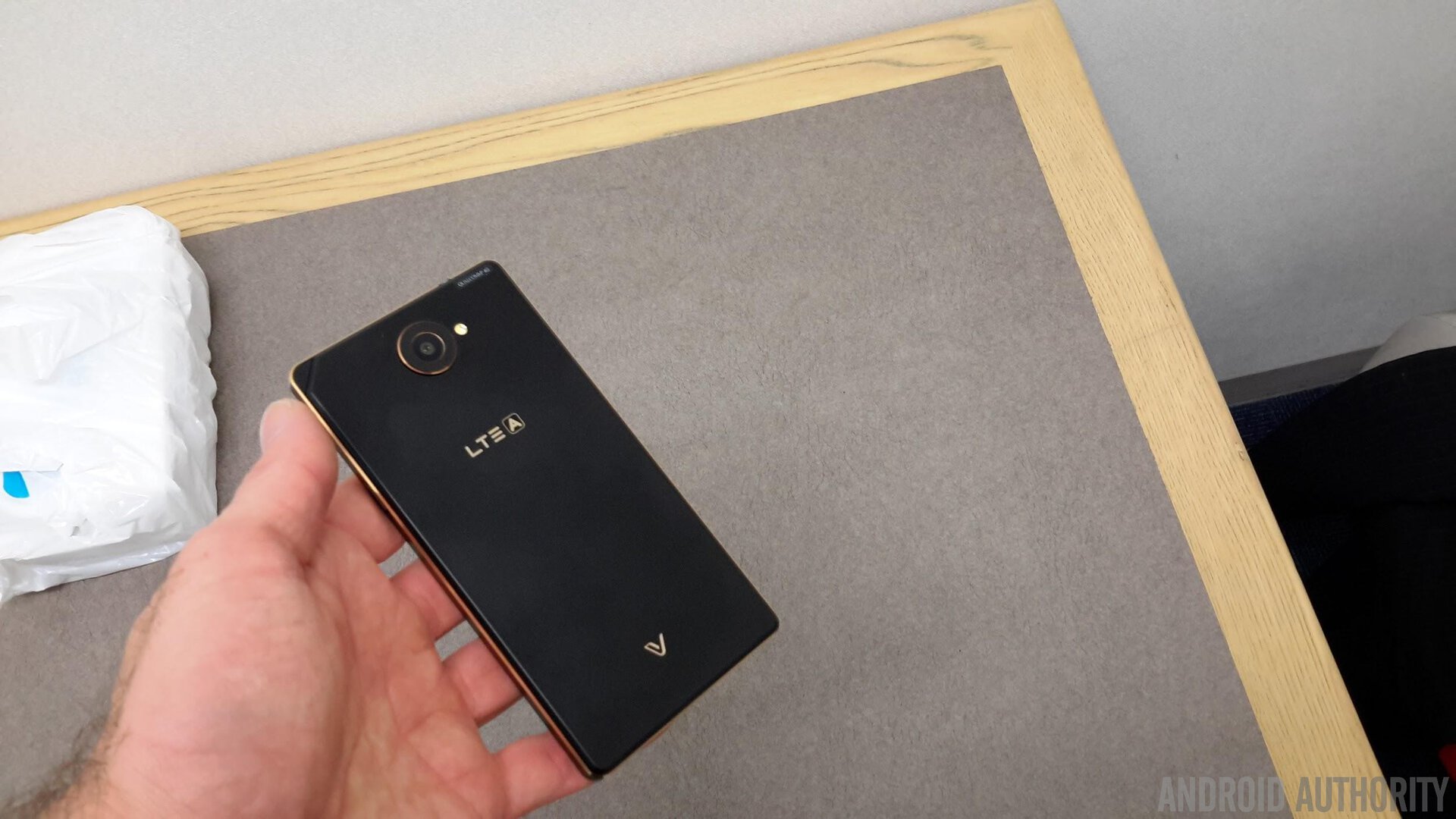
Stylish design with substance to spare
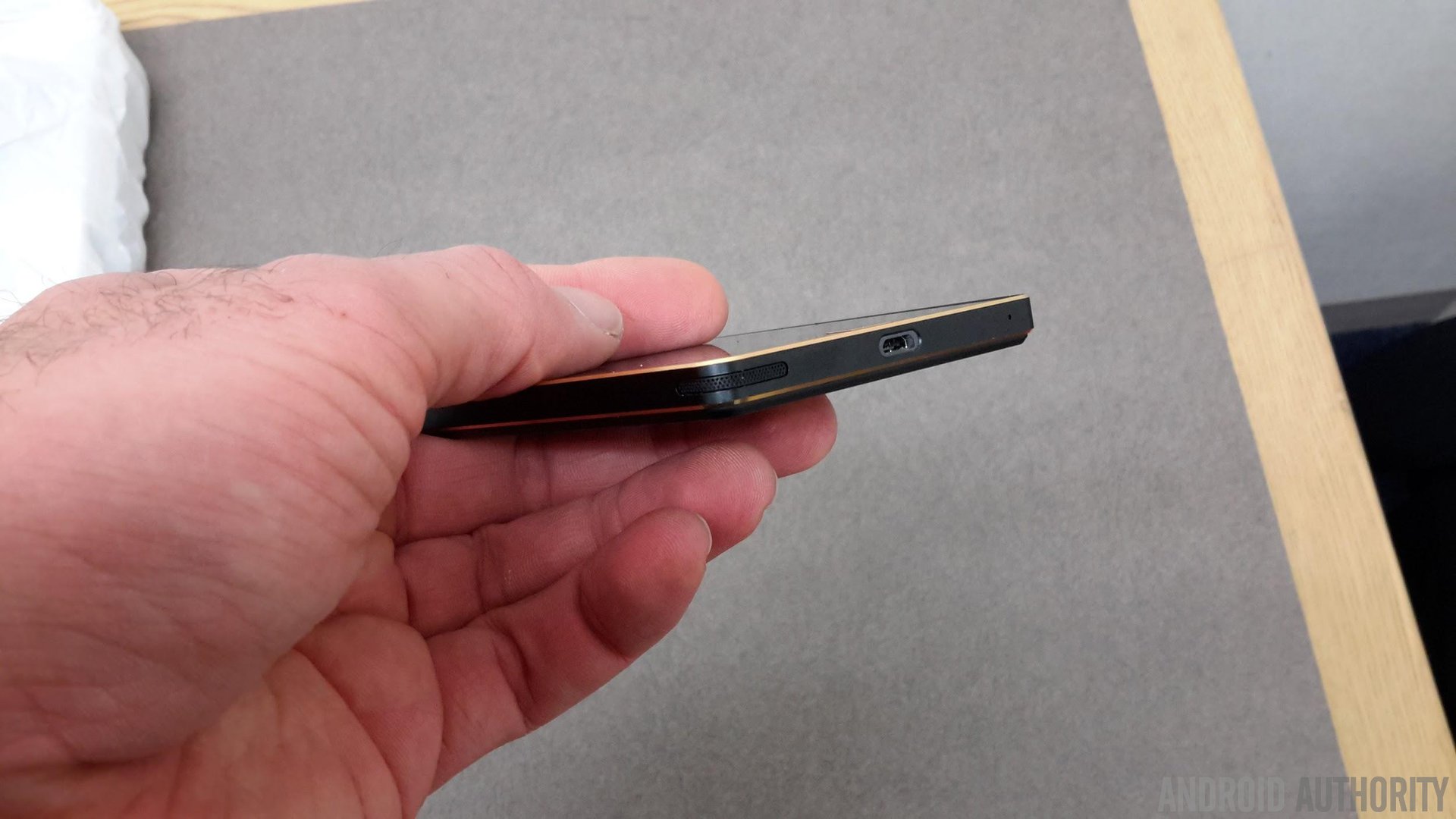
For ages now, there has been an eternal complaint about how OEMs continuously relegate the speaker to the back of the device, totally destroying sound quality when said product is placed flat on a table, or when your finger obscures the grill. Sometimes the “sound holes” are moved to the bottom of the frame yet the finger-placement issue still becomes a problem. Save for an approach like HTCor Motorola have taken with front-facing speakers, it seemed like no one else got the issue. Another brilliant element of the Iron 2’s design is the speaker.
Despite the metal frame, Pantech has drilled speaker holes into the sides of the bottom-left corner. Yes, that’s right. Sides. The entire corner has ventilation thus allowing for sound to circulate even when you might cover part or all of one edge. It’s absolutely brilliant, and something not even Apple has bothered to try. While the product would arguably better if two of the opposing corners had speakers (for stereo), this design flourish is without rival (that I know of, at least),
Front and back balance
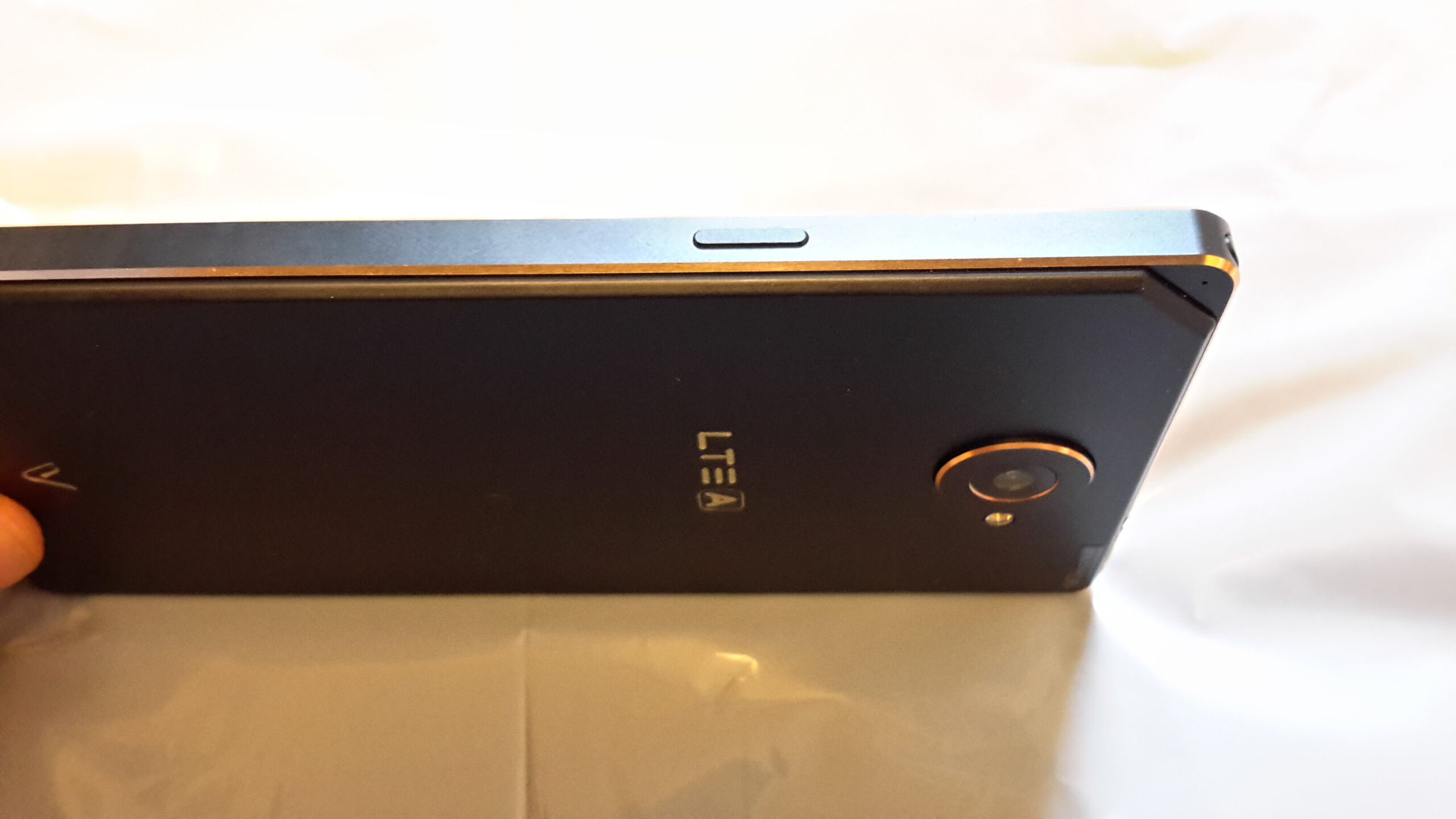
I’ll be honest: the first thing that actually caught my eye was the top right corner of the device, which functions as a notification LED. The Korean-only DMB digital TV antenna is also stored within the device here as well. I don’t know why, but the asymmetrical approach to the front glass just oozes cool for me. Years back, Sharp released a feature phone here in Japan that had a similar corner and I loved it, too. The light itself is a bit too small given that the indicator is just larger than a pin-hole, but at least it extends to the front and back side, something that is also essentially unheard of in mobile design.
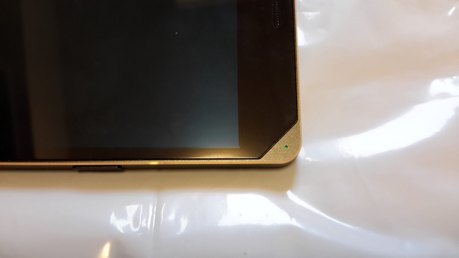
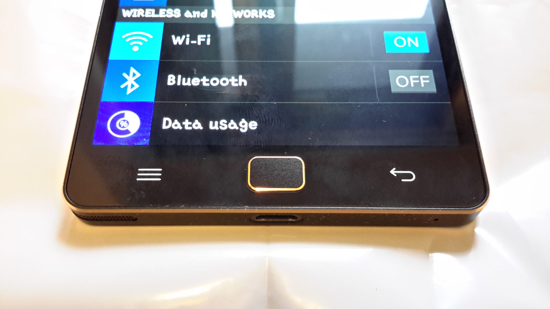
Similar to Samsung, Pantech has included a rectangular “home” button, though its much more compact than the elongated shapes the Galaxy-series now features. Along either side is a menu and back capacitive touch-sensitive area, just like Samsung includes.
Also similar to Samsung, the back panel is removable and plastic, though admittedly the material used here feels like it could be snapped in half if you tried. On the good side however, it’s rubberized, at least on the Black Gold model I have. I absolutely love it to be honest: it basically ensures the device won’t slip as much, and it feels very nice to hold.
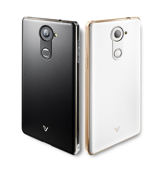
Perhaps most amazing however, is the fact that Pantech actually designed its device with a fingerprint sensor in mind, yet decided not to force it upon those who weren’t interested. Take a look at the back of the Iron 2, sans cover:
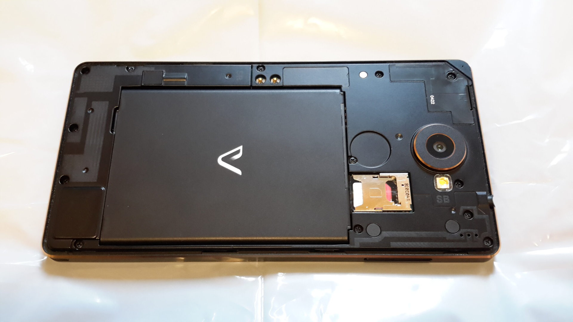
Notice the curiously large, circular space that is located just below the camera? This is for an optional accessory, a back cover that adds a fingerprint sensor! By the look of it, the panel has a leather surface, or at least a textured plastic. Sadly I was not able to test out the fingerprint sensor (the phone was purchased used in Japan remember) so I can’t offer any commentary as to how well it worked (or didn’t), though it looks like a swipe-based sensor a la Samsung (not Apple). Still, kudos for Pantech for thinking to include it as an optional element.
It’s also worth mentioning that the 5.3 inch AMOLED panel used in this device is not only larger than that of the Galaxy S5, but actually looks every bit as good (to me at least). The colors Pop so loud that Snap and Crackle are being kept up at night, and the auto-brightness works wonderfully. I would liked to have seen a screen mode option a la Samsung however.
Solid software
Update: Please note: The font used in the screenshots is not the default font.
As this is not a formal review of the Iron 2, and as I’d wager 99% of readers have not and will never use it, I am going to avoid a long digression into the heavily-skinned software. Pantech, just like Samsung and LG, has completely remade Android in its own image. Some of the English used to describe the features is quite bad, but ironically the features themselves are killer cool:
1. The Iron 2 features a dizzying array of features seemingly lifted from its most lofty of rivals. In particular, I liked “Live up” which is essentially Motorola’s “Ambient Display”: when you pick up the device, it will display notifications and such on the lock screen. Also present is the ability to double-tap to turn on the display when sleeping.
2. The customization options are just astounding. Until now, I thought that LG had the most creative skin, as it allows users to change the pictures of all the icons and edit the on-screen navigation buttons. The Vega Iron 2 features endless amounts of options. The icon “themes” can be changed to one of 4 pre-installed options, and more can be downloaded via the OEMs dedicated store. The icons themselves can be further edited however, like Nova or similar launchers, wherein you can add a background to them, and even alter the physical shape and opacity. Likewise, the pre-installed lock and home screen backgrounds can be customized with different colors, and even the size of the design itself. Heck, even the OEM keyboard can be altered!
3. The Setting Menu is radically different from any vanilla AOSP build, but it works a lot smoother than TouchWiz. The nice color use and the customization window at the top add to the experience.
Plus point: battery
Battery life is absolutely fantastic. I have used this device all day to browse the web, watch videos on YouTube, send e-mails, text, and various other activities, and yet at the end of the day it was only about half empty. It’s actually a mystery to me how Pantech did this considering how heavy its skin is. When I had the Galaxy S5, the thing drained quite quickly and required charging every day without question, and, mind you, I disabled almost all the extra features such as motion control.
Wrap up
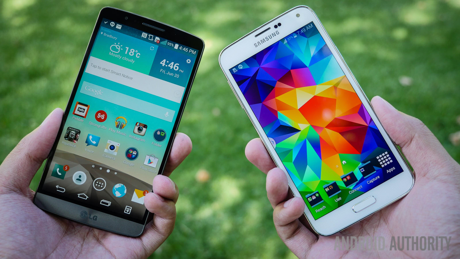
The Pantech Vega Iron 2 is a fantastic phone that fans of Samsung or LG will absolutely love. Android purists need not feel as if they missed anything obviously. It has (what I feel is) a great design, killer components, a fantastic and crisp display, and customization options up the wazoo.
The real dilemma here is not for the consumer, but for Samsung. It seems almost inconceivable that a tiny domestic rival like Pantech could not only produce a phone this good, but actually put out a product that is in every way, arguably, superior to the Galaxy S5. Seemingly every single hardware complaint has been addressed, from the presence of metal to the OIS camera, to the inclusion of a 3rd GB of RAM, to a design that looks radically different from the Galaxy S4 or S5, or even the original Iron Vega for that matter.
With the endless amount of hype building up to the March unveiling of the Galaxy S6, Samsung needs to truly deliver a product that will not only impress, but set itself apart from the numerous rival devices that will enter the market this year. In considering the Vega Iron 2 however, Samsung also needs to match wits with a product from 2014 as well.