Affiliate links on Android Authority may earn us a commission. Learn more.
Change my mind: The Pixel 6 design is amazing, actually
Published onOctober 20, 2021

Let me whisk you, for a moment, back to the days of late October 2015. Android 5.0 Lollipop had just landed, along with a shiny new slogan to celebrate the new operating system. “Be together. Not the same,” it read. It felt like a timely saying, not only for myself as a young college student in a new place but also for the wide variety of Android designs on the market.
After all, 2015 was the year of the ultra-customizable Motorola Moto G. It was also the first year that Samsung adopted a sleek metal and glass design for its Galaxy S6 flagship. More importantly, from a Google perspective, 2015 was the year of the Nexus 6P, the last pre-Pixel device.
Need more nostalgia? The history of Android
Now everything feels different. Android phones look more alike than ever before. OEMs seem to be leaning into “the same” rather than “together.” Now, the Google Pixel 6 series offers one of the most unique designs on the market, and I’m all in. I think that the design of the Google Pixel 6 is fantastic, and I dare you to try to change my mind on this.
Take a look at the gallery above for just a moment — notice anything?
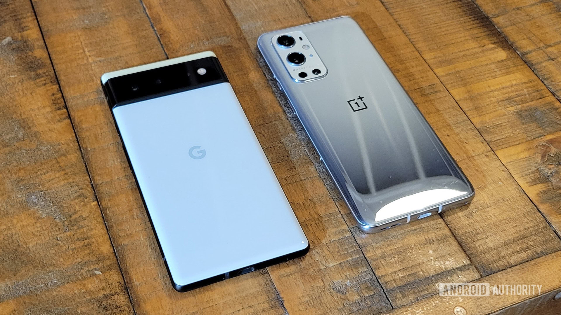
Those are four completely different phones, with one nearly identical design. Sony, OnePlus, Samsung, and Xiaomi have all pushed the camera bump into the corner, and the most significant difference between the back panels is whether you want a glossy finish or a matte one. In short, they’re the same more than simply together.
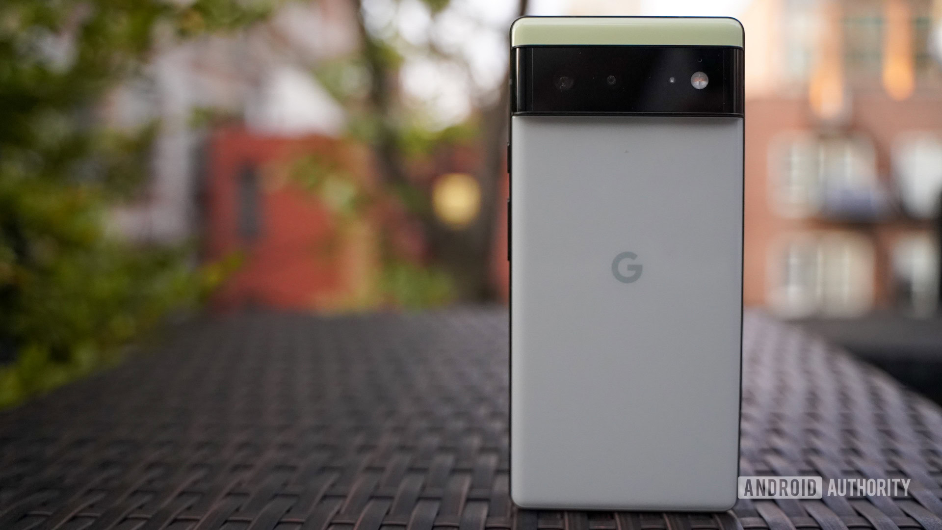
Now, consider the Google Pixel 6 series and its camera bar. While most OEMs are zigging towards a unified design, Google is zagging in its own direction. Is the camera bar the smallest housing in the world? No, but it’s a significant departure from the formula that Google has held ever since its first Pixel device. In fact, the last Google device to sport such a camera bar was none other than 2015’s Google Nexus 6P. Samsung flirted with the camera bar design on its Galaxy S10, too, and I personally wish that it doubled down for the Galaxy S20 and beyond.
The camera bar isn’t just an aesthetic decision for Google, either, as it packs the sharpest camera of any Pixel device. Google has finally moved to a 50MP primary camera that’s worthy of its image processing power. Add in the 12MP ultra-wide lens and the Pixel 6 Pro’s 48MP telephoto, and Google is nearly ready to reclaim the camera phone crown.
Of course, the camera bar allows Google to bring back one of my favorite design cues from the days of Pixel’s past — the two-toned design. We didn’t get a new version of the “Panda” Pixel 2, but it’s hard to complain about five unique colors to choose from. The Pixel 6 gets the fun-loving Sorta Seafoam and Kinda Coral designs, while the Pixel 6 Pro comes in classy shades like Sorta Sunny and Cloudy White. The only color that the two devices share is Stormy Black, which blends a black back panel with dark gray accents to great results.

Google’s color choices don’t stop at the back panel — you can now choose between matte side rails on the Pixel 6 and metallic ones on the Pixel 6 Pro. Those side rails make the Pixel 6 feel more like a successor to the Pixel 4 than last year’s Pixel 5 ever truly was. While Google isn’t the only OEM to save its best materials for the highest-end device, I don’t think you can lose with either model this time around.
See also: Here’s everything you need to know about the Google Pixel 6
The Pixel displays have also taken some much-deserved flak in the past. We can’t look past the massive notch on the Pixel 3 XL or the move back to the bigger forehead on the Pixel 4 series. Even the Pixel 5 had a rather large punch hole compared to the competition. Now, the Pixel 6 is righting some wrongs. The punch hole is in the center, it’s lost some weight, and the bezels are plenty thin, especially on the Pixel 6 Pro design. Google even added a 120Hz refresh rate to the Pixel 6 Pro with a sharp Quad HD+ resolution to boot. In short, Google did everything that fans could ask for short of prematurely adopting an under-display selfie camera.
What do you think of the Pixel 6 series design?
As much as I love the design of Google’s Pixel 6 series, I don’t think it’s perfect. Gorilla Glass Victus is tough as nails, but I was a big fan of the bio resin-coated aluminum of the Pixel 5. It gave a unique look and feel, even if the design itself wasn’t nearly eye-catching. The size of the Pixel 5 was also just right for me — it’s much easier to wield a 6-inch device than a 6.7-inch one, even at the cost of battery life. Maybe we’ll get the best of both worlds in the Pixel 7, but until then, the Pixel 6 is as amazing as they come.
That’s my opinion, and now it’s time for yours. If you don’t think that the Pixel 6 design is all that special, head to the comments section and tell me why I’m wrong — see if you can change my mind on this! I’ll do my best to respond to as many comments as possible to get the conversation going. Also, feel free to share if you do agree with me — I’d love to see who’s on my side.