Affiliate links on Android Authority may earn us a commission. Learn more.
The camera app on the Pixel 8 has ruined one of my favorite Pixel features
Published onOctober 20, 2023

I take thousands and thousands of photos on my phone every year. It started with Nokia’s excellent cameras back in the mid-2000s and for the past six years, I’ve had Pixel phones as my daily drivers. So, you can imagine that I’ve become accustomed to the Pixel camera app. I love its simplicity, and I’m mostly enjoying its updated interface — save for that annoying selfie camera button switch — but I wasn’t expecting Google to ruin another aspect of its Camera app on the Pixel 8 series specifically.
When I started shooting those 180+ photos with the Pixel 8 Pro, I immediately noticed that the sliders were gone. You know, the ones you use to adjust brightness, shadows, and white balance. Weird, I thought. I went into Settings to enable them, because that’s where those sliders can be toggled on and off, but they weren’t there. Huh?
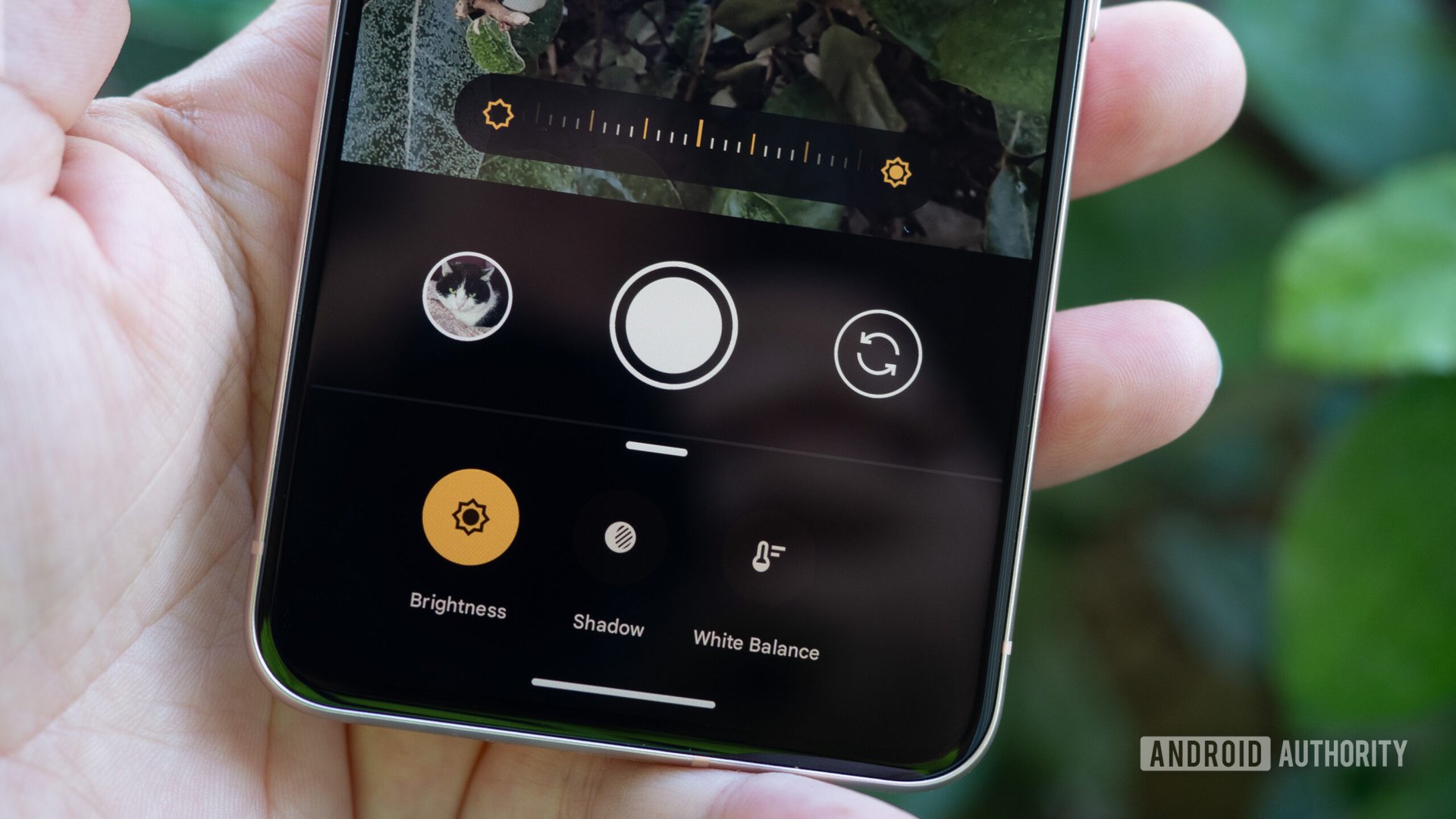
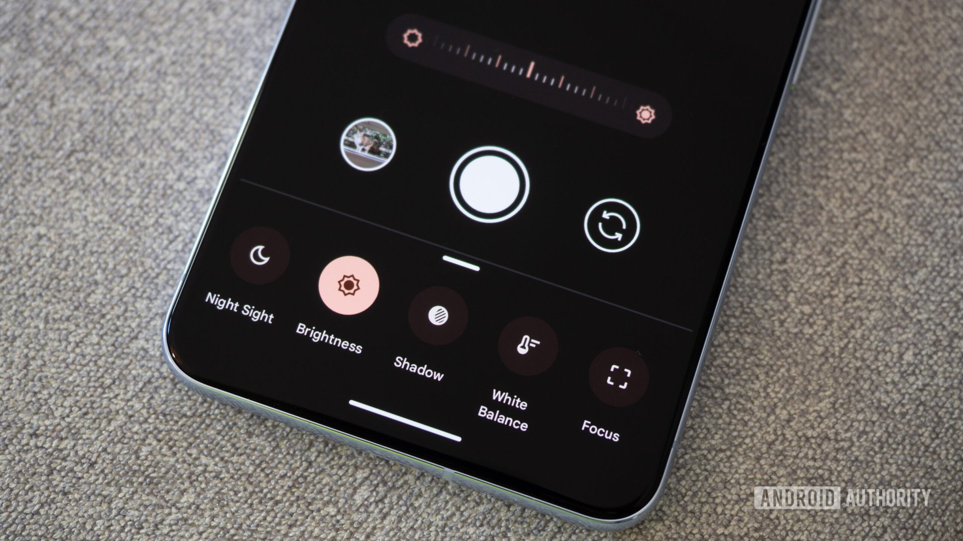
Google moved the three easily accessible brightness, shadow, and white balance sliders into three separate menus under manual controls.
For a while, I thought I was going crazy until I remembered that I’d spotted those options in the manual controls of the Pixel 8 Pro. They wouldn’t, would they? As it turned out, they did. Google moved the three, easily accessible, on-screen sliders into three separate menus under manual controls. And this affects both the Pixel 8 Pro and 8, even though the latter doesn’t have any special manual controls.
To quote myself as I shared that discovery with the rest of the Android Authority team when I first started testing the Pixel 8, “I’m LIVID.”
Do you use the camera's adjustment sliders on your Pixel phones?
One extra tap is one tap too many, but three?

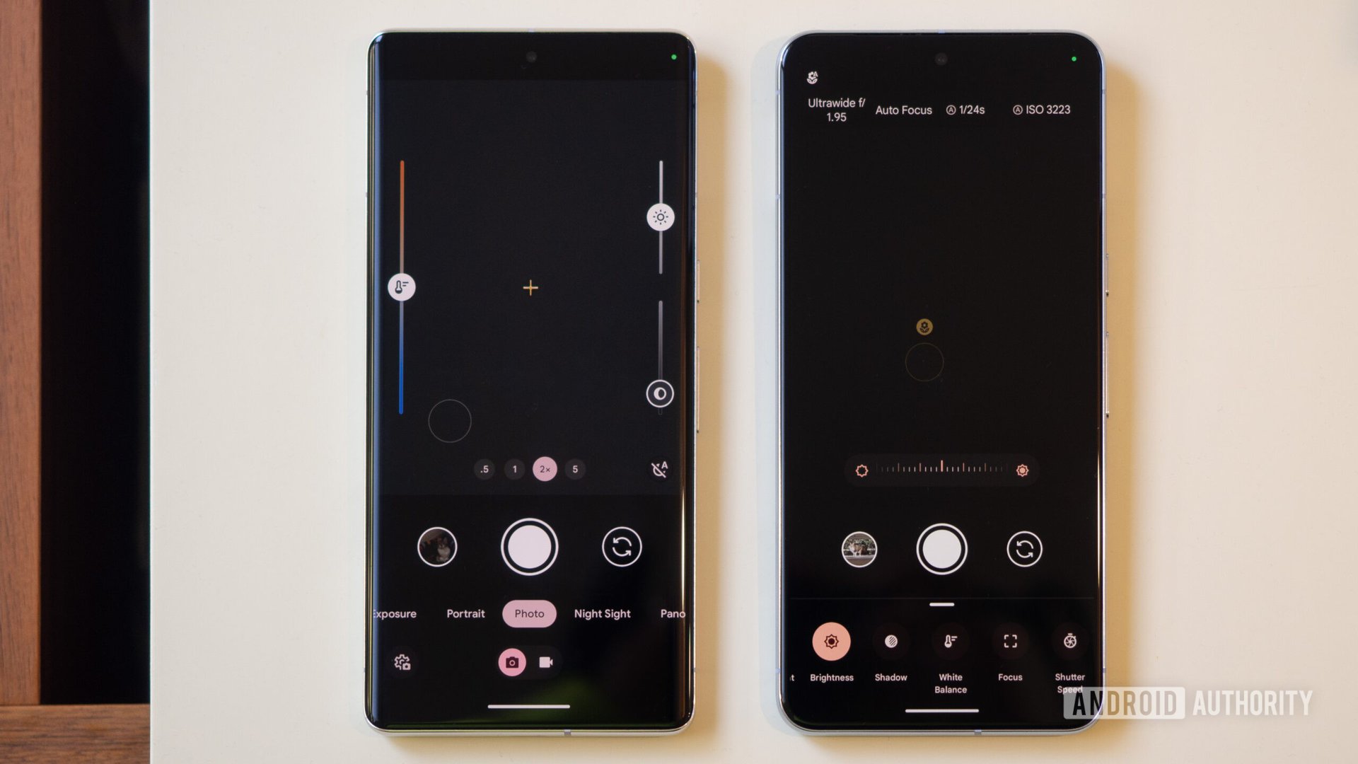
Say I want to change the brightness of a photo before shooting it. On the Pixel 7 series and earlier, I just move the brightness slider. Boom. Done. I can readjust a million times on the fly as I move around to capture my photos exactly how I want them. It’s one of my favorite features.
On the Pixel 8 and 8 Pro, I have to tap the manual controls button on the bottom right first, then change the brightness. (It defaults to brightness first.) One extra tap doesn’t seem like much, right?
But what about changing shadows or white balance? For the Pixel 7 and earlier phones, it’s also as simple as sliding the on-screen meters. For the Pixel 8 series, I have to go to manual controls first, then select the shadow or white balance menus, and then use the slider. Two extra taps.
It's a lot of extra tapping. It's time-consuming. And by now I've likely missed my shot.
OK, then, what if I wanted to change all three aspects of a photo? Well, once again, just slide them on the Pixel 7. Or grab your Pixel 8 and do the most annoying maneuver of opening the manual controls, adjusting brightness, selecting shadow and changing it, and then selecting white balance and fixing it. And that’s assuming I’m perfectly content with my choice and only move each slider once. If I need to readjust something, I have to tap to go back to it. So three extra taps, at least. And a very time-consuming process. By now, I likely missed my shot.
The brightness, shadow, and white balance sliders no longer show up on the screen on the Pixel 8 and 8 Pro. To get them, you have to tap the manual controls button on the bottom right (see the red pointer in the screenshot) and then you can control brightness, shadow, and white balance.
This is feature regression with no option to go back

That is feature regression, plain and simple. I understand why this seemed like a good decision. For one, it’s cleaner and clearer to put all manual controls under one menu, especially on the Pixel 8 Pro where you also get shutter speed, focus, and ISO. For two, Pixels are some of the best camera phones and their camera app is usually good enough to snap a great photo by itself, without any manual modifications.
Pixel cameras aren't foolproof. I used to love how I could fix shadows and white balance on the fly.
But Pixels aren’t foolproof cameras — far from it. As someone who’s taken thousands and thousands of photos, I can say that I use the sliders on average about 10% of the time to really get the snap I want and the one I think is more realistic. That’s not an inconsequential percentage to negatively affect in usability.
Also, why is this not an option? Why, after so many years of muscle memory and convenience, am I forced to use an inferior camera interface on the newest phone? Just add the sliders option in settings so that those like me, who love manually controlling some parts of their snaps, can continue to do so. And those who just point and shoot can have a cleaner and simpler UI.
I used to love how I could fix shadows and white balance on the fly on my Pixels. Now I’m a bit annoyed each time I have to do it because it’s become an unnecessary slow and cumbersome process. Fix it, Google, please.