Affiliate links on Android Authority may earn us a commission. Learn more.
Pixel Launcher will soon let you choose whether to truncate app names
Published onApril 26, 2024

- Android 15 could introduce a new toggle to “show long app names” in the search results and apps list of Pixel Launcher.
- The launcher currently truncates too-long app names to ensure that they don’t overlap in the list.
- Some users don’t like seeing truncated app names, so this new feature will be good news for them.
Google Pixel phones ship with the company’s Pixel Launcher app as the default home screen provider. Because it’s both the default and the only option that integrates with Google’s universal search, it’s what most Pixel users end up using, even though there are a plethora of amazing, alternative Android home screen launchers to pick from. There’s nothing wrong with using the Pixel Launcher, though, especially because Google keeps adding new features to it in every Android update. The upcoming Android 15 update, for example, is poised to add yet another long-awaited feature to the Pixel Launcher: the ability to stop app names from being truncated.
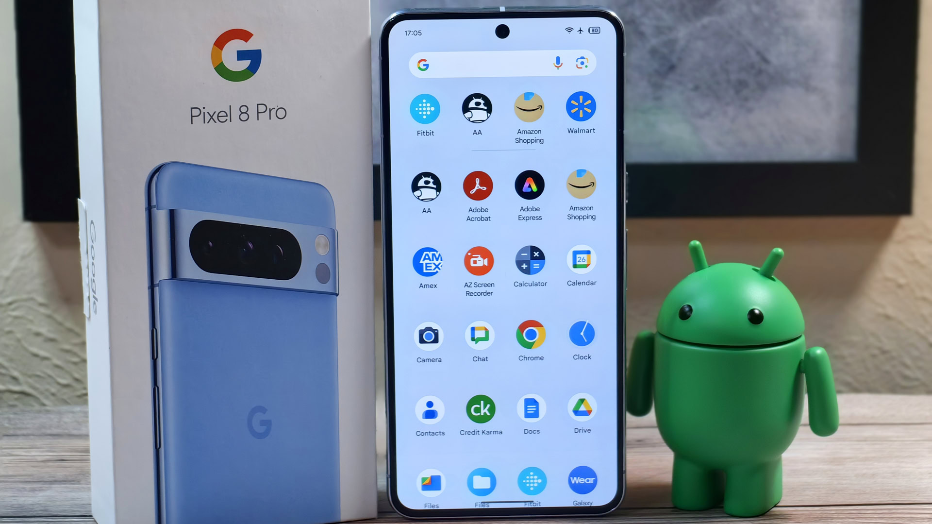
In order to always show rows of four icons in the app drawer, the Pixel Launcher currently truncates app names that are too long. This leads to app names like “Adobe Acrobat”, “Amazon Shopping”, and “Galaxy Wearable” being shown as “Adobe Acrob…”, “Amazon Sho…”, and “Galaxy Wear…” respectively. This truncation happens in the app drawer, in search results, and on the home screen. While it makes sense always to truncate app names on the home screen to ensure consistent spacing, it doesn’t make as much sense to always do so in the app drawer or in search results, especially since you’re accessing these to find and launch a specific app.
Google, aware of this issue, has been working on changes to the Pixel Launcher that would allow for showing two-line app labels in the app drawer and in search results. A hidden flag for these changes was first spotted all the way back in early 2022 with the release of Android 12L’s second beta, but it was disabled by default until Android 14 QPR2 Beta 2 rolled out last December. Much to some users’ disappointment, though, the flag was once again disabled by default when the stable release of Android 14 QPR2 rolled out this March. Thankfully, Google is working on bringing back this feature as an optional toggle in the Pixel Launcher’s settings.

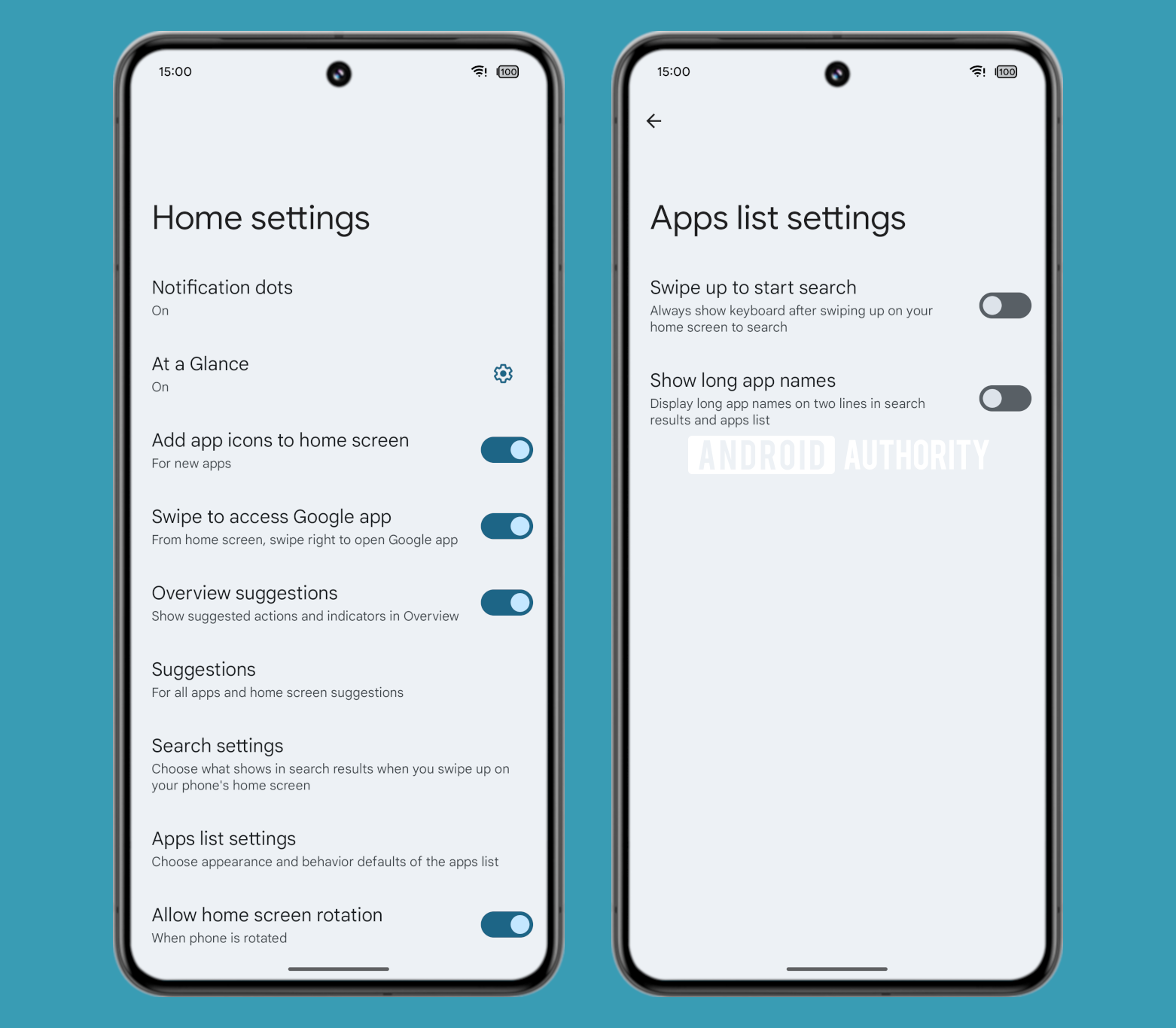
While digging through the latest Android 15 Beta 1.2 update, I managed to surface a new “show long app names” toggle under the “apps list settings” page in the Pixel Launcher’s settings. The description for the “show long app names” toggle reads as follows: “Display long app names on two lines in search results and apps list.” Enabling it does exactly what it says: App names are now shown in two lines in the app drawer and in search results, though not on the home screen.
Adding a toggle to “show long app names” in the app drawer and in search results is a minor change, but I’m sure one that’ll be welcomed by some users. This, of course, isn’t the only change coming to the Pixel Launcher in Android 15, as there’ll also be new animations as well as updates to the widget picker and recents screen. You can read about those changes in our previous report covering new features of the Pixel Launcher in Android 15.