Affiliate links on Android Authority may earn us a commission. Learn more.
The Pixel Watch 3 debuts grid-style app launcher
Published onAugust 13, 2024
- Thanks to Wear OS 5, the Pixel Watch 3 features a grid-based app launcher.
- This long-awaited feature has not officially been available within the Wear OS experience in the past.
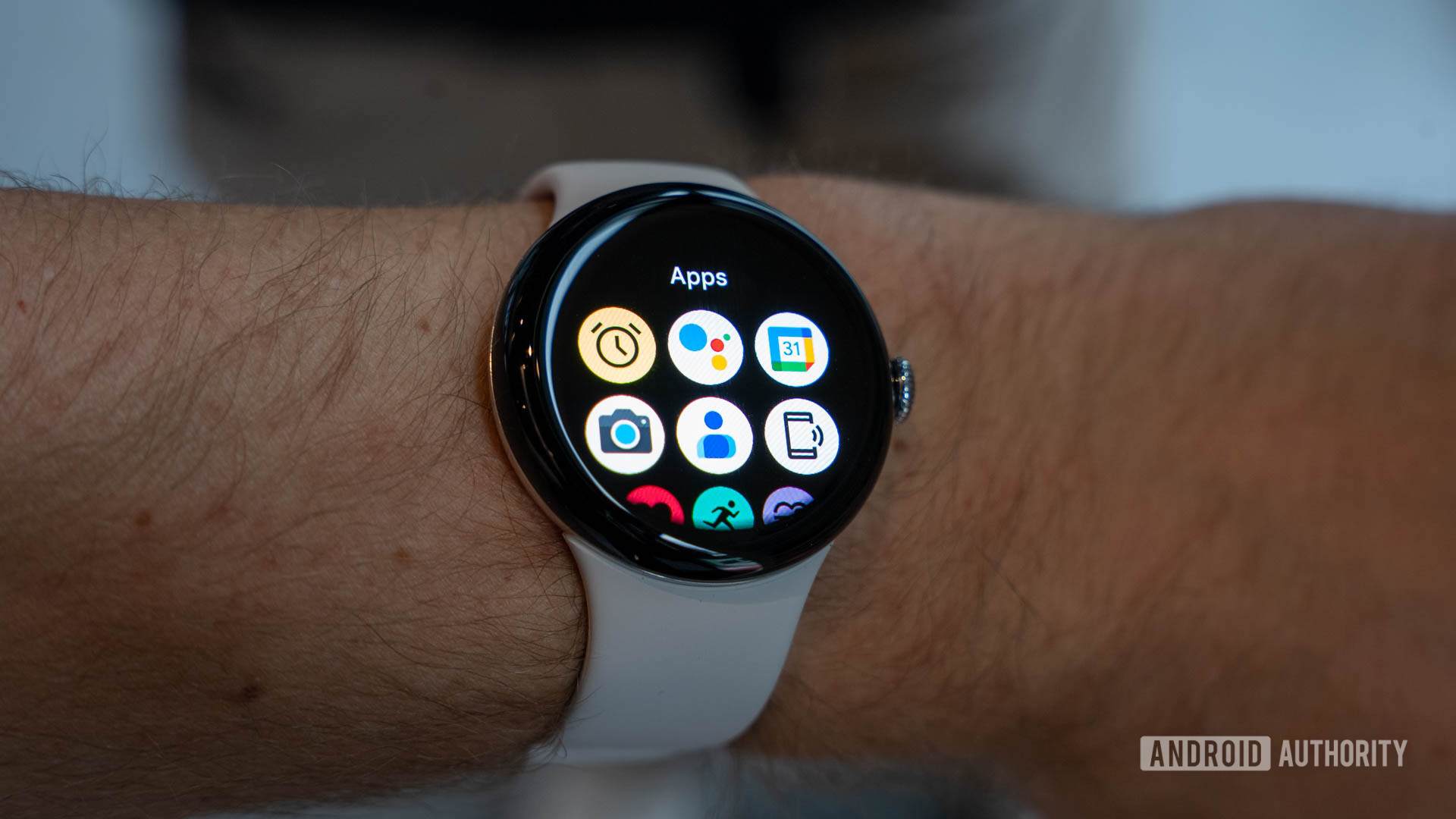
Google Pixel Watch 3 users can now access apps more efficiently than ever with a new grid-style view available within the device’s library of installed apps. In the past, users were limited to a list-style app drawer, which often meant excessive vertical scrolling. The grid view speeds up the process by showing more apps on screen at a time. The option is particularly attractive given the increased screen real estate of the newest lineup, especially on the new 45mm model.

Notably, the original app list displayed both the icon and name of each installed app. With a grid view, the watch displays only the apps themselves, so users will need to have a good knowledge of which tools they have installed. Given that many smartwatch users keep a lean list of apps, this shouldn’t be a huge concern for most. If, however, you have a lengthy app list with selections you don’t often use, you may need to memorize a few icons before switching to grid mode.
Users can also always choose to retain the original format and stick with a list-style app drawer. Like on the Apple Watch, both organizational options are readily available. Either way, Pixel Watch 3 users have plenty of new updates to explore related to apps, including the brand-new Recorder app, offline capabilities within Google Maps, and more. The device is available for pre-order now and is scheduled to officially hit shelves on September 10.

