Affiliate links on Android Authority may earn us a commission. Learn more.
Plex has overhauled its mobile app, here's how you can try it today
November 22, 2024

- Plex is beta-testing a brand new version of its mobile app.
- Along with a new look, the updated design will allow all Plex apps for all platforms to share a similar codebase.
- Plex has instructions for how to try this on your Android or iOS device now, ahead of an early 2025 rollout.
Over the years, Plex has expanded from a niche service for folks with the time and resources to build their own media servers to a way for anyone to discover, find, stream, and rate all manners of free content. Unfortunately, the Plex interface people have used on their smartphones has remained clunky and relatively unchanged for years. Well, that changes now.
Today, Plex is fundamentally redesigning its mobile app for both Android and iOS devices. It’s better organized, bolder, more image-heavy, and feels more modern overall. Most importantly, though, it represents a shift in how Plex is approaching its entire ecosystem of apps across the myriad platforms it supports.
One of the big problems Plex faces that most other streaming giants don’t is the breadth of its platform support. If you own an internet-connected device that can display content, chances are it can support a Plex app. While that’s great, it puts a lot of extra work on Plex’s plate as it needs to figure out creative ways to make all these apps look cohesive and offer the same functionality as other platforms.
The new mobile redesign is the first significant step the company has taken to fix this. Under the hood, the new Android/iOS apps run on a newer codebase, one that all other Plex apps will eventually share. This will allow Plex to design a new feature for its apps and roll it out to all platforms simultaneously, allowing it to work faster with fewer resource commitments.
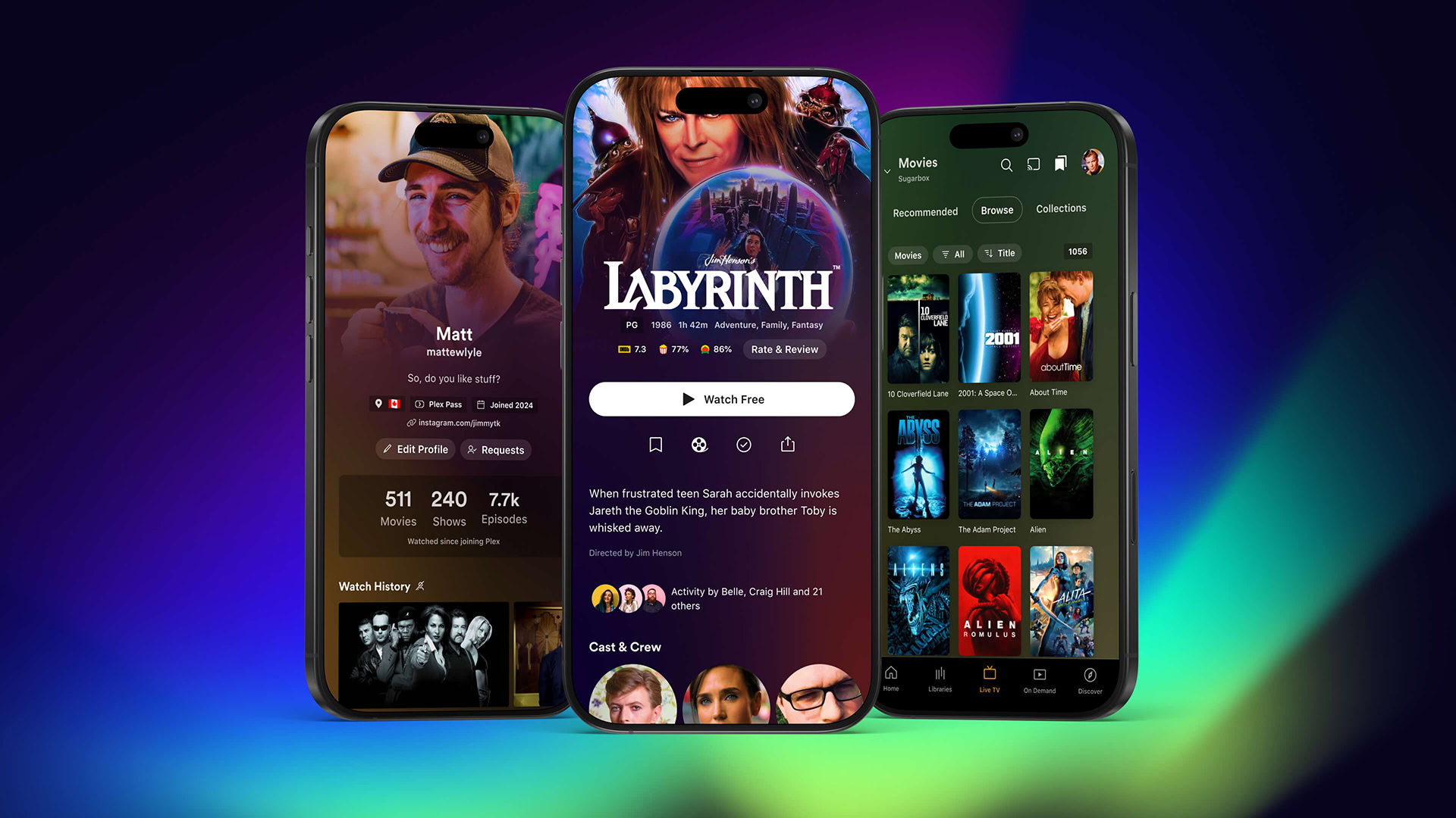
Even ignoring that, the new app design just looks really nice. It’s got a lot more images to make it pop off your screen, including a long-requested feature: title artwork. In the image above, you can see that Labyrinth — the 1986 cult favorite — has the actual “Labyrinth” logo at the top rather than a simple typeface shared across all other movies and shows. It’s the little things!
Most of the features you’ll find on other platforms are also here, including a newly designed profile page. Plex also made efforts to keep the overwhelming scale of the Plex app more organized. And, for those of you with your own media servers, you haven’t been left in the dust: there’s a new “Libraries” tab at the bottom that will house all your server connections.
If you want to give the new mobile app a shot, Plex has instructions at its support forums. There are a few things to note: there will be a limited number of slots for iOS users and there will be a few missing features (playlists and cast support, for example). However, this is a beta, so that’s to be expected.
Plex hopes to roll this out in stable form in early 2025.
Thank you for being part of our community. Read our Comment Policy before posting.